On this page
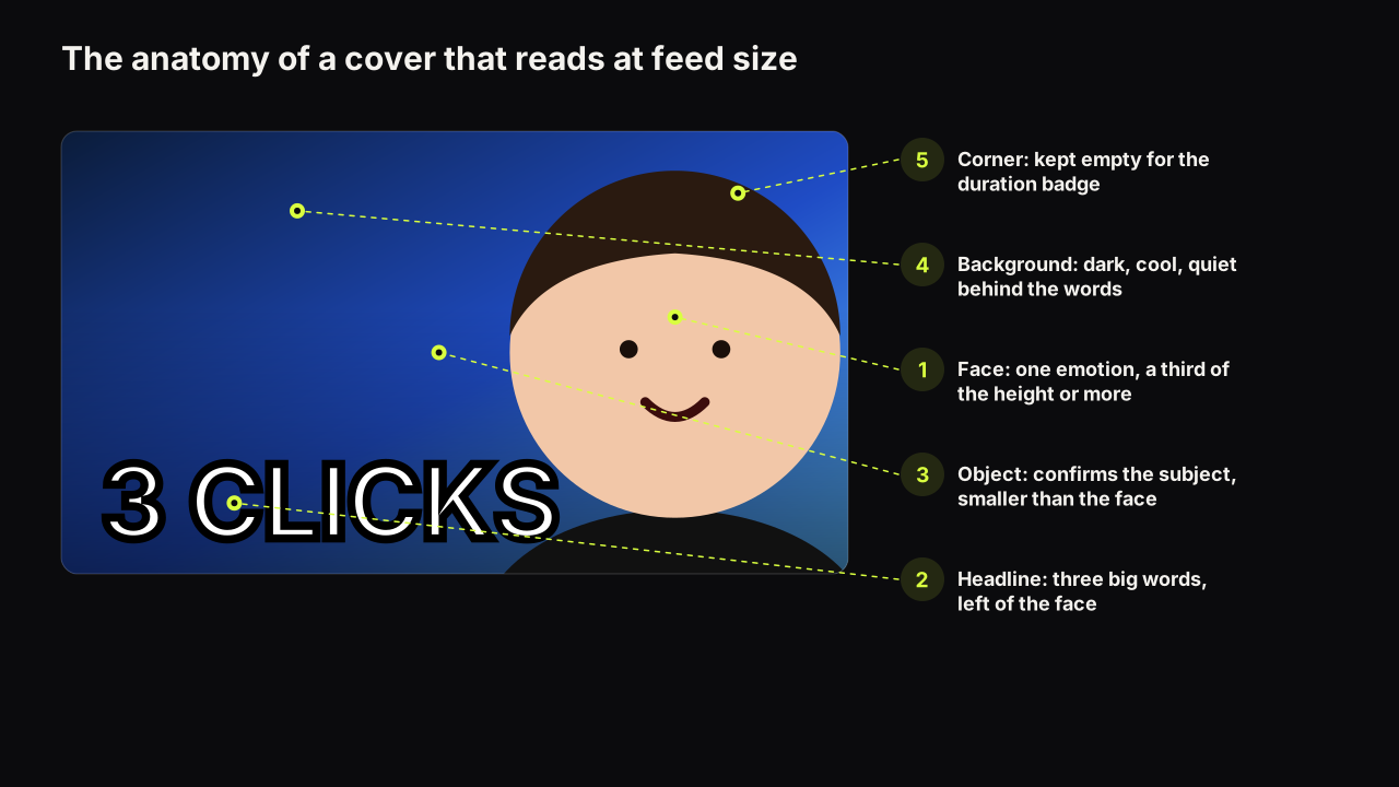
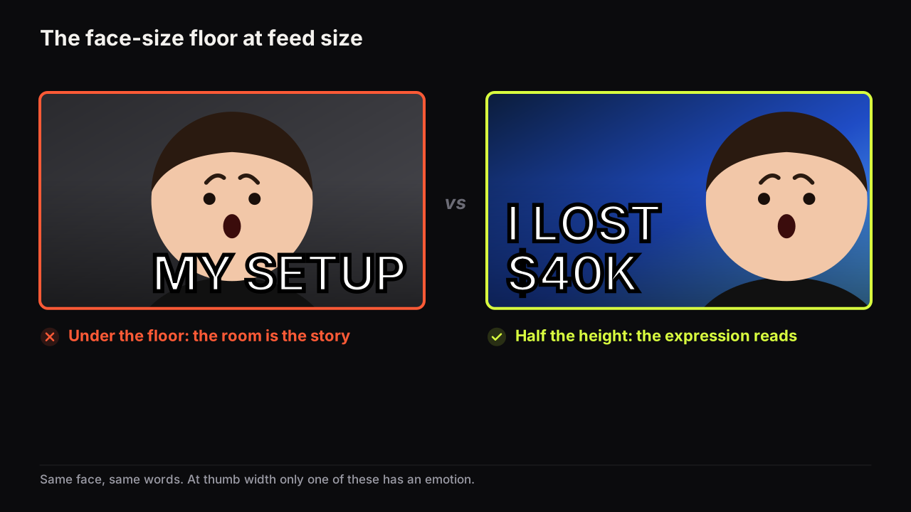
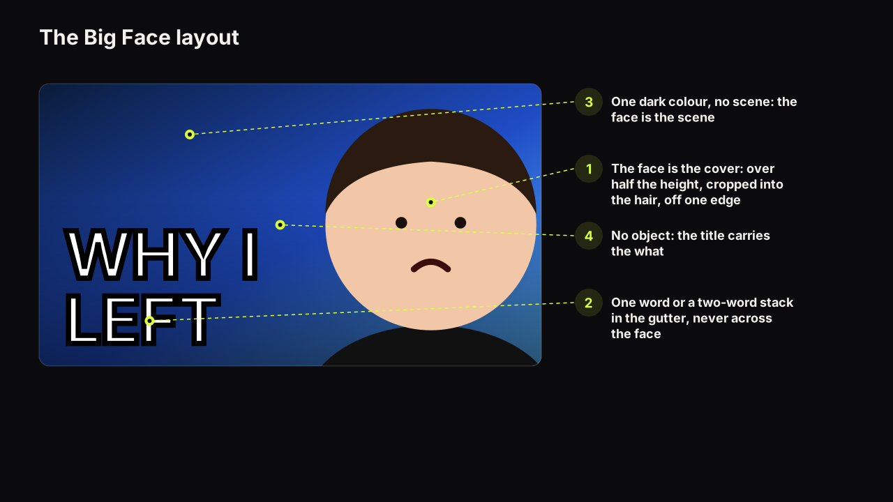
The Big Face layout is a thumbnail in which the face is the cover: it fills more than half the height and usually more than half the width, it is cropped into the hair and often off one edge, and everything else on the cover is a caption to it. It is a different thing from the face-size floor, which says a face in any layout should fill at least a third of the height; Big Face goes far past the floor and gives up the object and most of the headline to do it. That trade is a promise about the video. The promise is right for reaction, commentary and story channels and wrong for tutorials, reviews and travel.
What the layout promises
A layout is a promise before a single word is read, and Big Face makes a specific one: the reason to watch is this person's experience, feeling or opinion. There is no object, so the cover cannot promise a thing. There is no room for a number, so it cannot promise stakes in a figure. What it can promise is a person and a state, and it promises them louder than any other layout because there is nothing else in the frame.
Two things follow. The first is that the title has to carry the what. On a face-right, headline-left cover the words can name the subject; on a Big Face cover the words are one or two, so the viewer's second look goes to the title for the subject. Cover says who and how, title says what: the division of labour is the same as everywhere else, but here it is total. The second is that the layout assumes recognition. A big face of someone the viewer knows says "a video from them, and this is how they feel about it". A big face of a stranger says "a large stranger".
Our view is that Big Face is a layout for channels whose face is already the brand, or that have decided to make it one and will accept a slow start. It rewards recognition it did not create. A channel in its first year is usually better off with a face at half height, a headline and an object, and can move to Big Face for the uploads where the person is the story once the audience finds them in the row by face.
The pillar on hierarchy, contrast, simplicity and readability lists Big Face among the layouts that settle where the eye lands first; this piece is the detail on that row.
Where it wins and where it loses
The layout wins where the person is the promise and loses where the promise is a thing, a place, a result or a number.
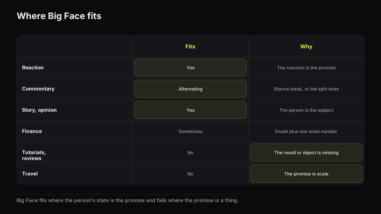
| Niche | Big Face fits | Why |
|---|---|---|
| Reaction | Yes | The reaction is the promise; the moment sits in an inset |
| Commentary and news | Yes, alternating | The stance is the promise; a split with the subject is the other house layout |
| Story, confession, opinion | Yes | The person is the subject and the feeling is the hook |
| Vlog with a known face | Yes | Recognition is the click; the place can wait for the title |
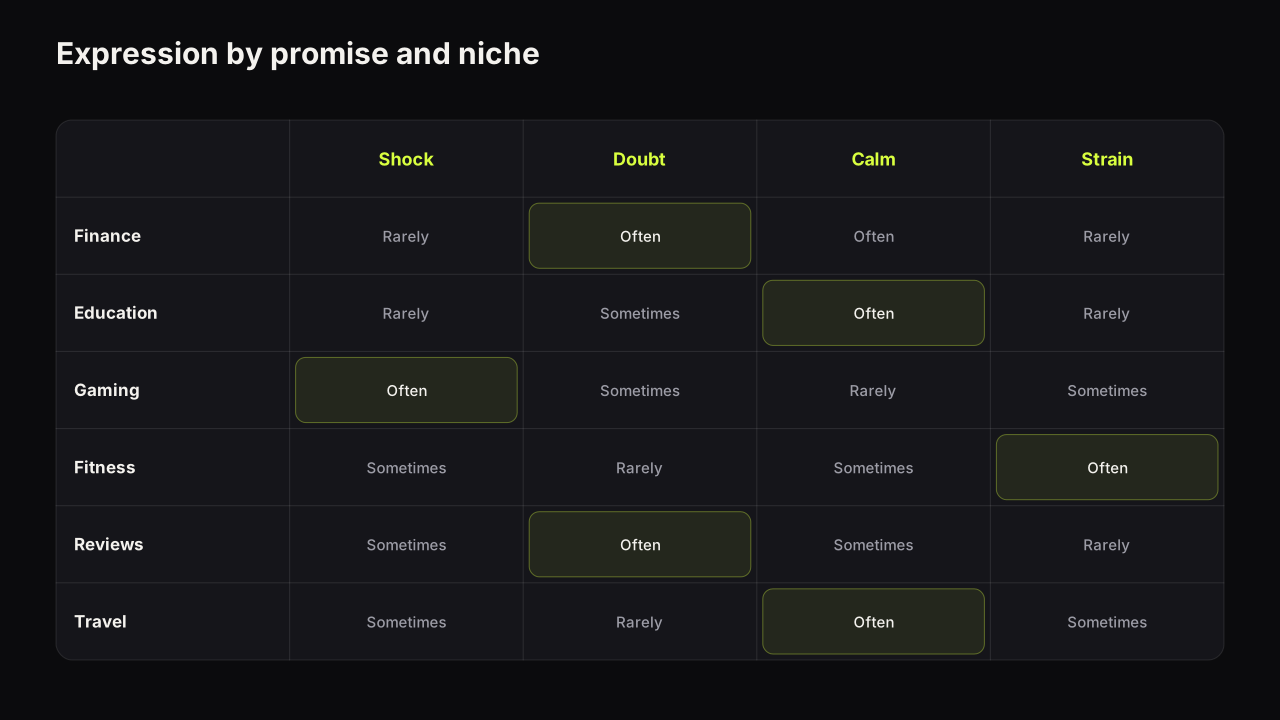
| Finance | Sometimes | Doubt or confidence plus one number in the gutter works; the number cannot be large |
| Gaming | Sometimes | First plays and reactions, with the game small; versus and clutch layouts need the object |
| Tutorials and education | No | Calm fills the frame with nothing; the result is what the viewer is buying |
| Reviews and tech | No | The object is the subject and the face is only the verdict |
| Travel | No | The promise is scale, and a big face is the opposite of scale |
Two of the wins have their own guides. The reaction cover is Big Face with a window for the moment, and the commentary cover alternates between Big Face and a split depending on whether the story or the stance is leading.
The headline placement it forces
A face that takes two thirds of the width leaves a gutter about a third wide on the other side, and a band along the bottom across the shoulders. Those are the only places words can go, and they hold one or two words at a readable size, not three.
Choose one of three treatments and no more. One word, large, in the gutter at eye height. A stack of two short words in the gutter, the top one heavier. Or nothing, with the title carrying the subject. If the video needs three words on the cover, it needs an object too, and the layout is no longer Big Face; make a face-right cover instead of squeezing a full headline around a face that leaves no room for it.
Two placements are out. Words across the eyes or the mouth destroy the information the layout exists to show; if the only clear space is over the face, the face is too central, and the fix is to push it to one side and off the edge. And the bottom-right corner stays empty, because the duration badge sits there on most surfaces. The general rules for where words go, including the bottom band and the 9:16 case, are in where the words go on a thumbnail, and the three-word ceiling that Big Face forces down to one or two is explained in how many words a cover can carry.
Lighting a face that fills the frame
At half the height a flat-lit face is forgivable. At full size it is a passport photo, because the layout has removed everything that might distract from how the face was lit. Big Face exposes lighting more than any other layout, and three things have to be there.
- Shape. A key light from one side, so the nose and the cheek cast a shadow. Shadow is what gives a face form at feed size; a face lit evenly from the front is a flat oval with features drawn on it.
- An edge. A rim light on the shadow side, or an outline on a cut-out, so the face separates from the ground. On Big Face the ground is usually dark and plain, so a warm face separates by temperature as well, but the edge is what holds the silhouette when the cover shrinks.
- Light in the eyes. The eyes carry the expression and a catchlight is what makes them read as looking rather than as two dark shapes. If the eyes are dead the expression is dead, however large it is.
Among the Big Face covers we look at, the ones that read as fake at feed size are rarely badly composed. They are over-smoothed: skin with no texture, no shadow under the cheekbone, eyes with no light. A face this large shows skin, and skin that looks like plastic makes the viewer distrust the expression on it. Keep the texture; a face that fills the frame should look like a face.
The background is one colour, dark or mid, with no scene, because the face is the scene; the four kinds of thumbnail background has the reasoning, and for Big Face the answer is almost always the dark studio kind. How to build the light with a key, a rim and a phone, and when a render replaces the shoot, is in lighting a face for a thumbnail.
The gaze is the whole eye path
With no object and one word, the face's gaze is the only thing directing the viewer's eye. At the viewer, it is contact, and it suits confessions and opinions. Toward the gutter, it points at the word and suits a cover where the word is the twist. Off-frame at nothing, it walks the viewer out of the cover, and on Big Face there is nothing else to catch them. Which direction does what, and when eye contact starts to read as a sales pitch, is the subject of eye direction and gaze in thumbnails.
Three ways Big Face fails
A mild expression. The layout has staked everything on the face, so a face doing nothing is a cover doing nothing. Half a smile at full size is a headshot, and a headshot promises a LinkedIn profile rather than a video. The expression has to be one nameable feeling, and it has to be a feeling the video delivers; which expression fits which promise is the reference, and the rule for Big Face specifically is that calm is the one feeling the layout cannot carry unless the calm is the twist.
The same big face on every upload. A face the audience sees at full size on forty consecutive covers stops being a signal and becomes the channel's logo. Habituation is one of the four things creators call fatigue, and it is the one Big Face channels meet first, because there is no object or headline changing around the face to keep the cover new. Telling habituation from the other three causes matters here, because the fix is rotation of expression and alternation of layout, not a redesign. We would cap Big Face at every second or third upload even on a channel where it wins, and even though that means passing up the layout on some uploads where it would have been the strongest choice, because habituation to a face at full size sets in before the numbers show it, and rotating early is cheaper than recovering late.
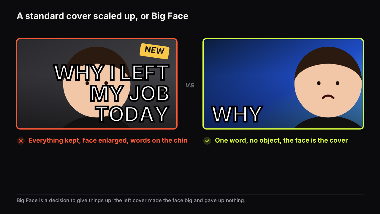
Crowding. The most common failure is not a Big Face cover at all: it is a face-right cover scaled up until the face fills the frame, with the three words and the object kept and squeezed into whatever is left. Everything competes, nothing arrives first, and the words end up across the chin. The fix is a decision. Either it is Big Face, with one word and no object, or it is a standard layout with the face at half height. It cannot be both.
Take a hypothetical commentary cover for a video about a streamer's apology. The host's face sits dead centre at three quarters of the height, lit by a ring light so there is no shadow anywhere, "HE APOLOGISED" in white across the chin, and a small screenshot of the streamer tucked bottom-left. The viewer infers a headshot with a caption, and cannot tell whether the host is amused or angry, because the words cover the mouth and the flat light has removed the rest. The Big Face version of the same photo: push the face right until the ear leaves the frame, key it from the left so the cheek has a shadow, one word in the left gutter at eye height, "REALLY?", and no screenshot; the title names the streamer. Same video, same face, and now the cover says who and how.
Big Face on the bench
Big Face is one of the eight styles on the bench, the layout this piece describes with its hierarchy already set; the eight styles are shown side by side on Explore. Two reference cards in the free library push the layout further: Extreme Close-Up as the subject look crops into the head the way this piece describes, and Dark Studio as the background gives the face the plain dark ground it needs. The face itself comes from Face Lab, which cuts out one selfie and renders eight expressions from it, so the mild-expression failure is a matter of picking a different one rather than reshooting; the faces it renders are those of people who agreed to be on your thumbnails, and the acceptable use policy sets out the rest.
The Big Face check
- Is the person the promise of this video, rather than a thing, a place, a result or a number?
- Does the audience already know this face, or is this the upload where they start to?
- Is the face cropped into the hair and off at least one edge, not floating in the centre?
- Is the headline one word, a two-word stack, or absent?
- Are the words clear of the eyes and the mouth, and is the bottom-right corner empty?
- Does the face have shape from one side, an edge against the ground, and light in the eyes?
- Is the expression one nameable feeling that the video delivers?
- Did the last two uploads use a different layout or a different expression?
Common questions
Is Big Face the same as making the face bigger?
No. The face-size floor says a face should fill at least a third of the height in any layout. Big Face is a layout choice in which the face is the cover, more than half the height and usually more than half the width, and the headline is reduced to one or two words or removed. You can meet the floor without using Big Face, and most covers should.
Where do the words go on a Big Face thumbnail?
In the gutter the face leaves on the opposite side, as one word or a two-word stack, or along the bottom band across the shoulders. Never across the eyes or the mouth, because those carry the expression the layout exists to show. If the cover needs three words, it is not a Big Face cover.
Can a Big Face thumbnail work without a known face?
Rarely. The layout promises that the person is the reason to watch, and a stranger's face at full size is a large stranger. A new channel is usually better served by a face at half height with a headline and an object, and by earning the Big Face layout as the audience learns the face.
What to do next
Take your next three planned uploads and write the promise of each in one sentence. If the sentence is about a thing, a result or a place, Big Face is the wrong layout for it. If it is about how you felt or what you think, try the layout: crop into the hair, push the face off one edge, keep one word, light it from one side, and check that the expression is nameable at thumb width. Then read where the eyes should look, because on this layout the gaze is the only path the viewer has.