On this page
- What design has to achieve before it can be judged
- Hierarchy: the eye meets your elements in an order you chose
- Contrast: separation inside the cover and against the feed
- Simplicity: one idea, three elements
- Readability: nothing counts until it survives the shrink
- Layouts that work and why
- The background is a support, not a fourth element
- Consistency without sameness
- A critique walkthrough: rebuilding a weak cover
- The design review checklist
- Common questions
- If it were our channel
- What to do next
The most common design fault on YouTube is not ugliness. It is a tie: two elements the same size and the same brightness, both asking to be looked at first, so the eye bounces between them and the viewer moves on. Good thumbnail design comes down to four principles that prevent ties: hierarchy (the eye meets the elements in an order you chose), contrast (each element separates from what is behind it, and the cover separates from its neighbours), simplicity (one idea, three elements at most) and readability (all of it survives the shrink to feed size). Every layout that works on YouTube applies those four. Every cover that fails in a feed has broken at least one, and once you know them the break is usually visible in a second look.
A thumbnail is judged at a size where nothing subtle survives. Design, on YouTube, is mostly the discipline of deciding what to make big and what to leave out.
What design has to achieve before it can be judged
A thumbnail is a promise shown at a glance, in competition, at a small size. Design has three jobs in that order: get the cover seen in a row of others, get it understood (what is this and why does it matter), and get it believed (the promise looks keepable). The title shares the second and third jobs; the two together are what creators call packaging, and treating title and thumbnail as one promise is the habit that makes the principles below pay off.
Design is the means, not the end. The reasons a viewer clicks (a question they want answered, a face carrying a feeling, a number with stakes) are covered in the psychology behind why people click. Design decides whether those reasons are visible at feed size. A curiosity gap the viewer cannot read is not a gap. A shocked face too small to name the emotion is an oval.
Nothing in this guide guarantees a click. The principles raise the probability that a cover is seen, read and believed. The video still has to keep the promise, and YouTube's own testing tool judges covers by watch time share, not clicks.
Hierarchy: the eye meets your elements in an order you chose
Visual hierarchy is the order in which a viewer's eye meets the parts of an image. On a thumbnail you set that order with four tools: size, brightness, position and isolation. If you do not set it, the viewer sets it for you, and they will usually land on the wrong thing.
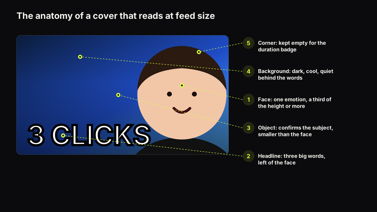
We recommend the order face, then headline, then object, with the background last. The face goes first because faces are where human attention goes before anything is read; that is why a face is worth its space at all, and why the expression on it carries so much of the message. The headline goes second because words need a moment of recognition that a face does not. The object goes third because its job is confirmation: yes, this is the laptop, the ramen, the console. By the time the eye reaches the object the viewer already has the promise and is checking that it is real.
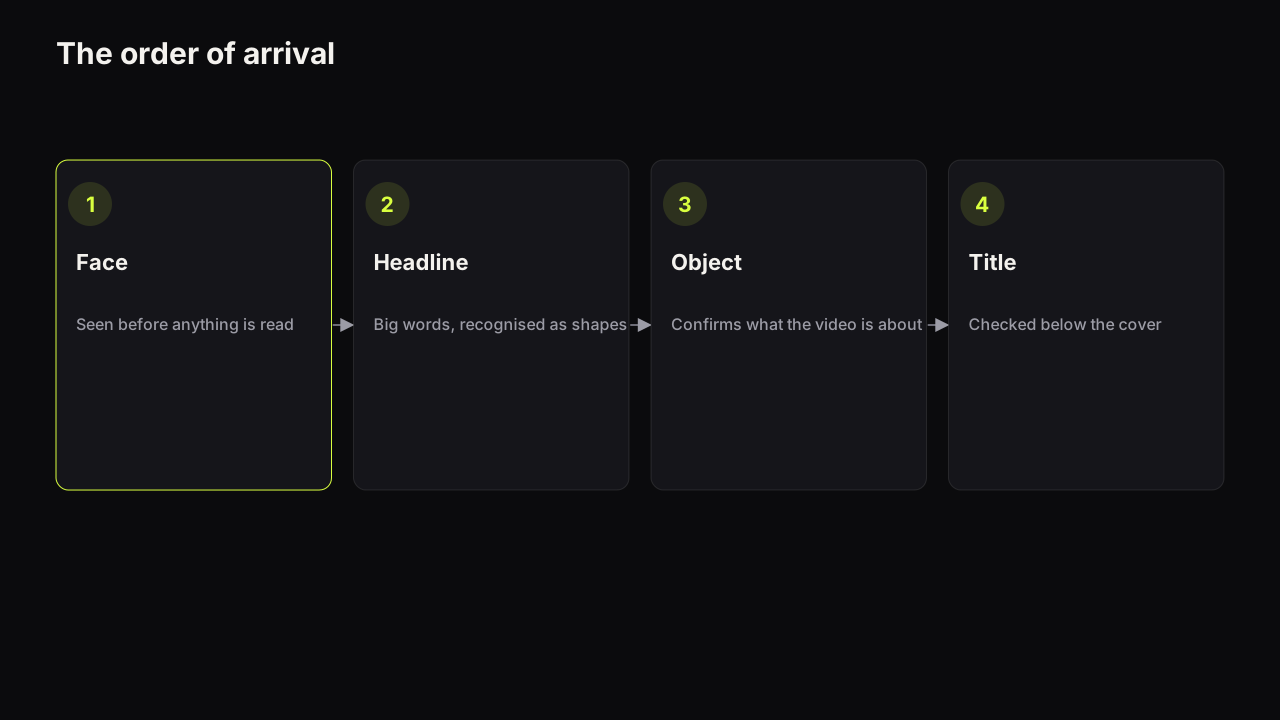
The four tools of hierarchy
- Size. The largest thing arrives first. This is the tool creators under-use, because at full size everything looks big enough. Judge size at feed width, where only the largest element still reads.
- Brightness. On a dark cover the brightest element arrives first; on a light cover the darkest does. A face lit brighter than its background wins the first glance even when it is not the largest element.
- Position. Faces pull the eye wherever they sit. Put the headline where the eye goes next: beside the face, on the side the face's gaze points to. In left-to-right languages that usually means text left, face right.
- Isolation. A thing surrounded by empty space arrives before a thing surrounded by detail. Empty space is not wasted space. It is a hierarchy tool.
The size ladder
Give the three elements three different sizes: one big, one medium, one small. Two elements at the same size compete, the eye bounces between them, and neither arrives first. A face at half the height, a headline at a third, an object at a quarter is a ladder. A face, a headline and an object all at a third is a tie. We would hold to the ladder even when it means the object ends up smaller than feels fair to a product the whole video is about, because a cover where the eye knows where to go beats a cover where every element got its due.
The ladder has one deliberate exception, and knowing it stops you applying the rule where it does harm. A versus cover, two phones or two players or two recipes side by side, wants the halves at the same size. The tie is the point: the viewer is being asked to compare, and a bigger left half would tell them the answer. What breaks the tie on a good versus cover is the third element, a small "VS" badge or a single word in the seam, which the eye reaches after it has taken in both halves. The ladder is still there. It is just two big and one small instead of big, medium, small. When we see a versus cover fail, it is nearly always because one half is brighter than the other, so the comparison has been decided by lighting before the viewer had a say.
The eye path should close
After the object, the eye should have nowhere else to go. The face's gaze, pointed at the viewer or at the headline or the object, closes the loop. A gaze pointed off-frame at nothing opens a door the viewer walks out of. Arrows and circles are a patch for a path that does not close on its own; they are not wrong, but when you reach for one, first ask what broke. Often the fix is moving the face's gaze or making the object larger, and the arrow is no longer needed.
Contrast: separation inside the cover and against the feed
Contrast on a thumbnail is separation, and there are three kinds. Each element must separate from what is behind it, warm elements must separate from cool ones, and the whole cover must separate from the covers around it in the feed. The first kind is the one most covers get wrong, because hue and brightness are different things.
Brightness contrast beats hue contrast. A red word on a green ground has plenty of hue difference and almost no brightness difference. On a bright monitor you can read it. On a phone at low brightness, in sunlight, or at the edge of vision while the viewer scrolls, hue differences collapse before brightness differences do, and the word merges into the ground. A pale yellow word on a dark navy ground has a large brightness gap and reads under every one of those conditions. The pairs that hold up and the pairs that fail are in colour and contrast that survive a phone screen.
Temperature contrast is the second kind. Skin is warm. A warm subject on a cool ground (blues, greens, dark neutrals) separates without any extra work. A warm subject on a warm ground (oranges, reds) needs a rim light or an outline to keep its edge, because face and background share a temperature and a brightness.
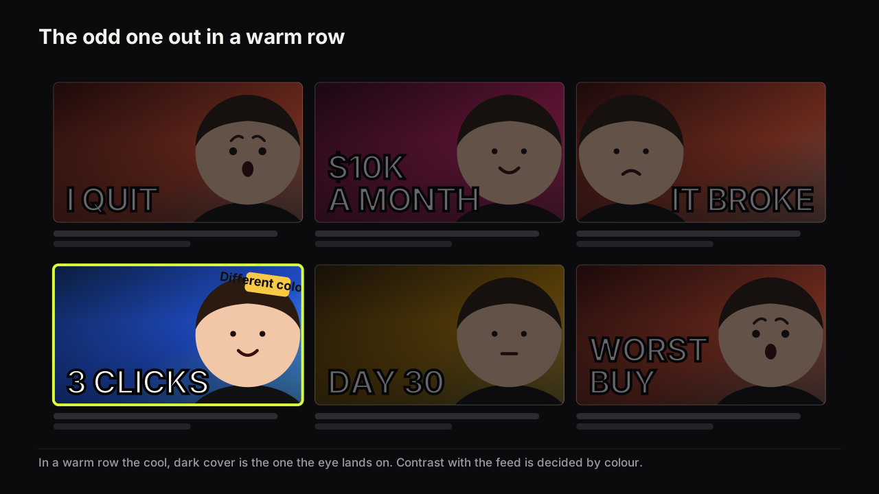
Feed contrast is the third kind, and it is the one you cannot judge on your own screen. The cover sits beside six to twelve others from the same niche. If every neighbour is red and yours is red, yours is one of the row. If yours is the only light cover in a dark row, or the only cool cover in a warm row, the eye stops on it before reading anything. This is why studying the covers that already work in your niche is a design step, not just a research step: you need to know what the row looks like before you choose the dominant colour.
In the channels we look at, the covers that lose the first glance are rarely ugly. They are the same brightness as the feed background and the same colour as their neighbours. Nothing is wrong with them except that nothing separates them.
Simplicity: one idea, three elements
A thumbnail carries one idea, expressed with at most three elements: a face, a headline and an object. The background supports those three; it is not a fourth element unless you give it a subject of its own, at which point it is, and the cover is over budget.
Simplicity is a lever in its own right because most competitors lack it. A row of busy covers with one clean cover in it reads the clean cover first, for the same reason the eye finds the isolated element first inside a cover. YouTube's own thumbnail and title tips page says the same thing in plainer words: use a font that is easy to read, and don't make the design too complex.
Two tests keep a cover inside the budget.
- The one-sentence test. Say the promise of the cover in one sentence. If the sentence needs an "and", the cover has two ideas. Pick one; the other belongs to a different video or to the title.
- The occlusion test. Cover each element with your thumb in turn. If the cover still says the same thing, the element you are covering is decoration. Remove it, or give the space to something that does carry the promise.
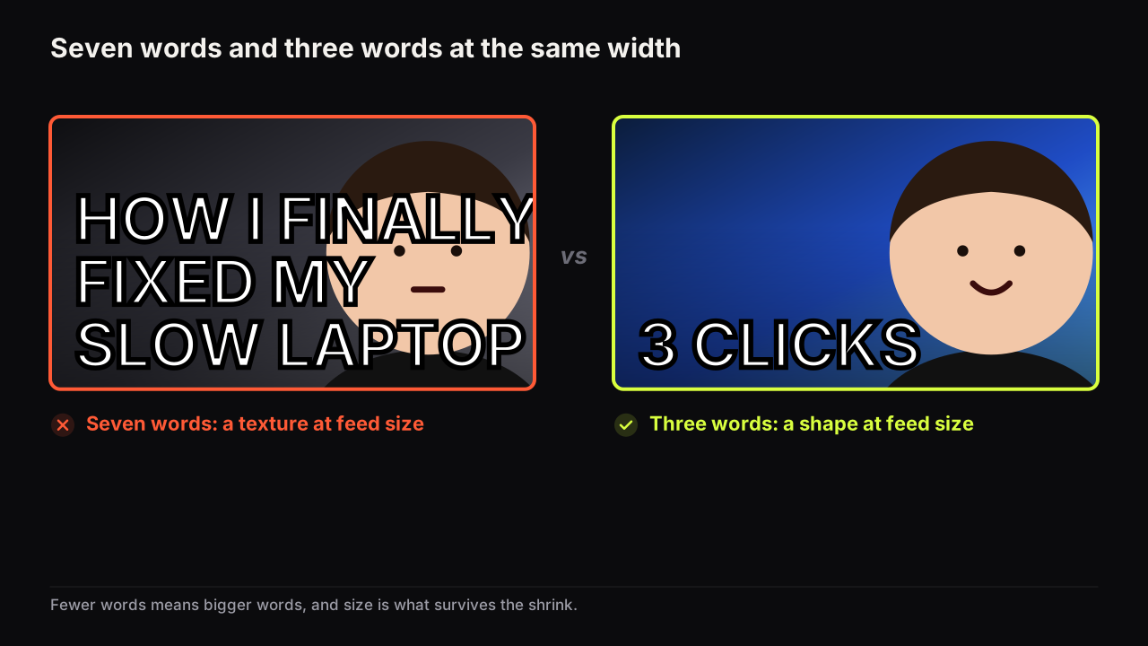
The three-element rule is why the words matter so much. The headline is one of your three elements and it has to add something the picture cannot show; if it only captions the picture it is spending an element on nothing. How many words a cover can carry is a short read, and the answer is three big ones, or five if two are small.
Removing something is the edit I make most often. Usually it is a second object or a second line of text. The original looks more complete as a piece of graphic design; the simpler version communicates faster, and that is the whole job. Thumbnail design and ordinary graphic design are not the same discipline. A thumbnail has about a second to land an idea, and anything that slows that down has to justify being there.
Readability: nothing counts until it survives the shrink
A cover is designed at upload size and judged at feed size. The gap between the two is the whole reason readability is a principle rather than a courtesy. Fine detail, thin strokes, small text and low brightness contrast all vanish as the image shrinks, and they vanish in that order.
Three distances, each with its own payload:
| Distance | What the viewer gets | What has to carry it |
|---|---|---|
| Across the room | A shape, a colour, a face-sized blob | The dominant colour, the face's silhouette, the brightest element |
| Arm's length | The expression, the big word | Face at a third of the height or more, the headline set large |
| Close | The object, the small word, the detail | The object, the two small words of a five-word headline |
Every cover should deliver something at each distance. A cover that only works close up never gets looked at closely, because it lost the viewer across the room. The phone is where most of those distances collapse into one small rectangle, and designing for the phone feed turns this into a routine check.
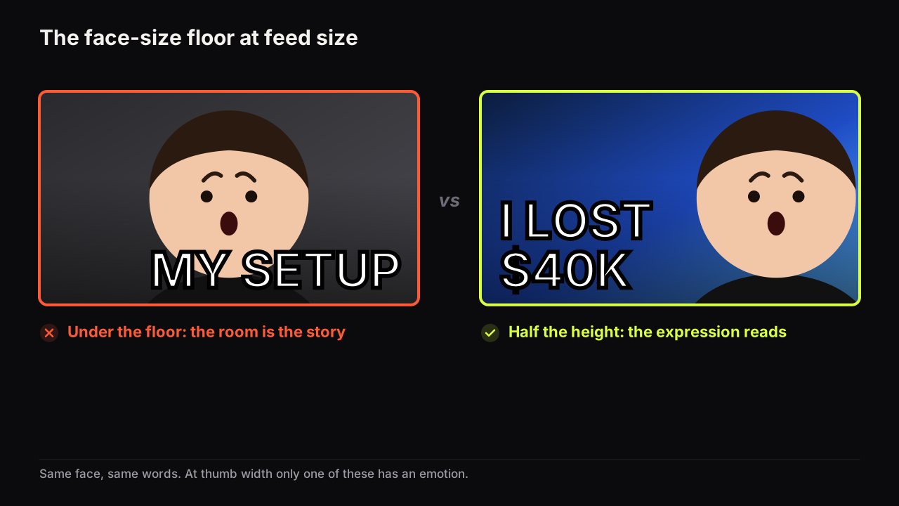
Two elements set the readability floor. The face has to be big enough for the eyes and mouth to be visible shapes, because that is where the expression lives; we recommend a face that fills a third of the height at least, and half is better. The headline has to be set in a heavy face at a size where each word is recognised as a shape rather than read letter by letter.
We would take a heavier, plainer typeface over a more refined one on every cover, and accept that the result looks less designed at full size. Refinement is invisible at feed width; stroke weight is not. The only time we would reach for a lighter face is the two small words under a big headline, where the contrast in weight is itself doing hierarchy work.
Judge nothing at full size. Shrink the cover to the width of your thumb and ask three questions: can I read every word, can I name the emotion, does it separate from the covers around it? We would run this check even on a cover we were sure about, because being sure is exactly the state a monitor at full size puts you in. Our free thumbnail tester drops a cover into a mock search result and a phone feed so you can see the answer without guessing.
Layouts that work and why
A layout is a hierarchy decision made in advance. Each of the layouts below has become common in feeds because it settles where the eye lands first and where it goes next; the table says which principle each one relies on and where it tends to break.
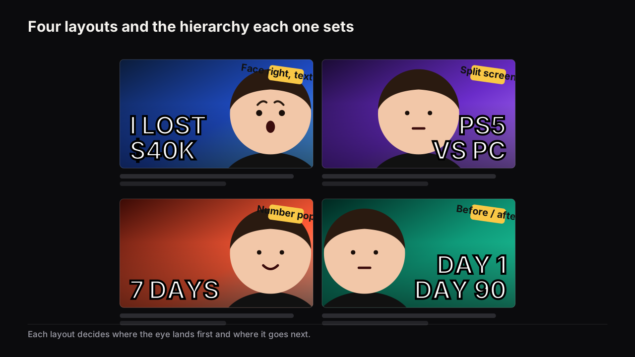
| Layout | Order of arrival | Best for | Breaks when |
|---|---|---|---|
| Face right, headline left | Face, headline, object | Stories, opinions, anything with a nameable emotion | The face is under a third of the height, or the headline repeats the title |
| Split screen | Two halves, then the label between them | Versus, comparisons, reactions to something | The halves are the same brightness and there is no clear winner to look at |
| Number pop | The number, then the face, then the context | Money, day counts, scores, anything with stakes in a figure | The number has no unit or context and reads as decoration |
| Before / after | Left half, right half, the gap between them | Fitness, renovation, restoration, any transformation | The two halves are shot under different light so the difference reads as lighting, not change |
| Object-led | The object, then the verdict on the face | Reviews, tech, food, unboxings | The object is small and centred, leaving nothing for the eye to do next |
| Big face | The face, then a single word or nothing | Reaction and commentary channels with a known face | The expression is mild, or the channel uses it on every upload and the audience stops seeing it |
The eight styles on the bench are these layouts made repeatable: Big Face, Split Screen, Number Pop, Before / After, Neon Glitch, Clean Edu, Money Stack and Reaction. You can see the eight styles side by side on Explore, each with the hierarchy already set, so the decision you make is which order of arrival suits the video rather than how to build it.
The background is a support, not a fourth element
The background has three jobs and no others: separate the face, set the scene in a glance, and leave a quiet zone for the headline.
Separation comes from brightness and temperature, as above. A dark, cool, slightly blurred ground behind a lit face is the most reliable configuration we know, which is why so many channels converge on it. Scene-setting is a single cue, not a description: a kitchen counter, a screen, a road, a stack of notes. One cue tells the viewer where the video happens; three cues make the viewer read the background instead of the face. The quiet zone is the part of the ground behind the headline. It should be plain, or darkened, or blurred enough that the words sit on something close to a flat colour.
A background acquires a subject when it contains a second person, a readable screenshot, a product with its own label, or text of its own. At that point it competes with the three elements and the cover is over budget. The fix is almost always to blur, darken or crop, not to shrink the foreground to make room.
Consider an illustrative food cover where the quiet zone is the whole problem. A photo of a loaded plate fills the frame, and the headline "£2 DINNER" has to sit somewhere on it. Wherever the words go, they land on food, and food is busy: highlights, edges, three colours. There are two honest fixes and they are not equal. Darkening a band behind the headline keeps the plate whole but puts a grey stripe across the appetising part, which costs the cover the one thing food covers sell. Cropping so the plate sits in the right two thirds and the left third is bare table, then darkening only that table, keeps the food untouched and gives the words a flat ground. We would crop, even though the plate gets smaller, because a smaller plate that still looks like dinner beats a bigger plate with a stripe through it.
Consistency without sameness
A channel benefits from being recognisable in the feed, and it suffers when every cover looks the same. The way through is to separate the constant from the variable.
The constant is what makes a returning viewer recognise you before reading: the face and where it sits, a dominant colour, a type style, a corner mark. Keep it steady across uploads. The variable is what makes this upload different from the last: the headline, the expression, the object, the accent colour. Change it every time. A channel that keeps the constant and varies the variable is recognisable and fresh. A channel that keeps both is the same cover with different words, and after enough uploads the audience's eye slides over it; that habituation is one of the four things creators lump together as thumbnail fatigue, and it has a different fix from the other three.
We think the safest constant is the face and its placement, and the safest variable is the expression. We would keep the face in the same place on the right for a year even when a particular video's object wanted that side, because viewers learn to find you by your face in the row, and moving it costs more recognition than the one cover gains in layout. The expression is what tells them which kind of video this one is. Changing colour palette every upload makes you harder to find; keeping the same expression every upload makes you easy to ignore.
A critique walkthrough: rebuilding a weak cover
This is the kind of cover we see most often, and what changes when the four principles are applied one at a time. The video is a laptop-repair tutorial; the title is "How I fixed my slow laptop".
Before. A wide shot of the creator at a desk, filmed from the webcam. The face is in the centre and about a fifth of the height. The wall behind is mid-grey. Along the bottom, in a thin white font, seven words: HOW I FINALLY FIXED MY SLOW LAPTOP. The laptop is on the desk, visible but small.
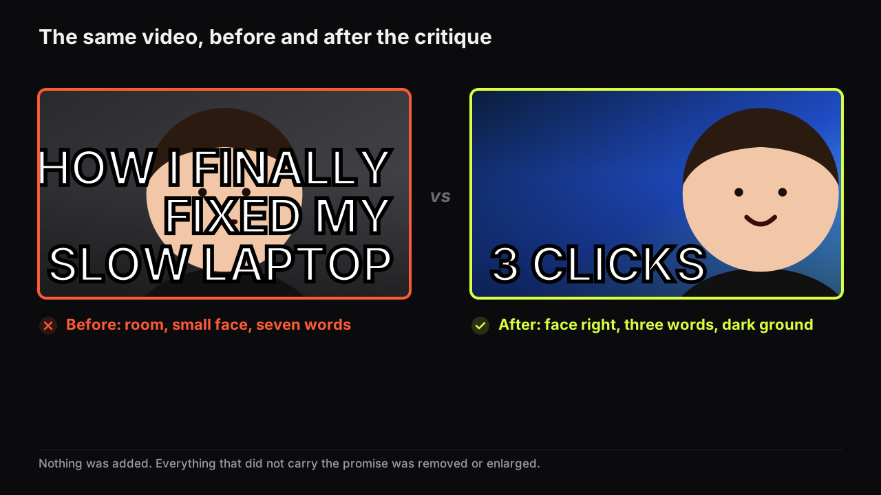
- Hierarchy first: crop until the room is gone. The room is not the story. Cropping into the shot until the head fills half the height makes the face arrive first, and the desk, chair and wall disappear without being deleted.
- Move the face to the right. Centred, the face left two thin gutters that could hold nothing. On the right third it leaves the left two thirds for the headline and the laptop.
- Simplicity: cut the headline to the words the picture cannot show. The picture shows a person and a laptop, so HOW I FIXED MY SLOW LAPTOP captions it, and the title already says the same thing. What the picture cannot show is that the fix is small. The headline becomes 3 CLICKS, set large, with the two small words "that's it" beneath in a lighter weight. The title still says what the video is; the cover now says why it matters, and the second look is rewarded rather than repeated. That division of labour is the whole argument in whether thumbnail text should repeat the title.
- Contrast: replace the grey. The mid-grey wall was the same brightness as the app's own interface. A dark navy ground puts the warm, lit face and the pale headline on a cool, dark field. Brightness gap, temperature gap, and a colour that differs from the mostly white and red tech covers around it.
- Readability: heavier type, one accent. The thin white font becomes a heavy, tight face. The 3 gets the single accent colour so it arrives before the word next to it.
- The object and the gaze. The laptop moves under the headline at about a quarter of the height. The creator's expression changes from neutral to a pleased, slightly surprised look, directed at the laptop. The eye now lands on the face, reads 3 CLICKS, drops to the laptop, and stops.
Nothing was added. The cover went from four competing elements and a caption to three ranked elements and a promise. Repeating the walkthrough on your own covers is the fastest way we know to internalise the principles: pick the weakest recent upload and apply the six steps in order.
The design review checklist
Run this on the finished cover at thumb width, before the full pre-upload checklist, which adds the promise and spec checks.
- Name the order of arrival: face, headline, object. Is that the order your eye actually takes?
- Are the three elements three different sizes?
- Does the face separate from the background in brightness or temperature, or both?
- Is the headline three big words or fewer, set heavy, on a quiet zone?
- Does the headline add something the picture cannot show?
- Cover each element with a thumb. Does anything survive that does not carry the promise?
- Is the dominant colour different from the app's greys and from the covers around it in your niche?
- Does the eye path close on the face's gaze or the object, without an arrow?
Common questions
Should the text go on the left or the right of a thumbnail?
In left-to-right languages we recommend text on the left and the face on the right. The eye lands on the face first wherever it is, then travels to the words; putting the words on the left keeps that trip short and lets the face's gaze point back at them. The reverse works when the object needs the right side, as long as the path still closes.
Do thumbnails need a border or outline?
Not as a rule. A border is one more element and it rarely helps at feed size. What a cover does need is separation from the feed around it, which comes from a dominant colour that differs from the app's greys and from the neighbouring covers. An outline around the face or the headline is a different thing and often helps, because it adds brightness contrast at the edge that matters.
How many colours should a thumbnail use?
One dominant colour and one accent, plus the natural colours of the face and the object. A third colour is fine if it does a job, such as a warning red on a single word. Four accents behave like none, because the eye has nowhere to land.
If it were our channel
Suppose we ran a maths-tutoring channel for exam students and the next video was the five-minute method for a question type most of them get wrong. This is how the four principles would settle the cover, as a plan, not a report.
Hierarchy first, and it starts with a decision about the face. Education audiences trust calm, and calm expressions are hard to read small, so the face would go to half the height, on the right, with a slight raised-eyebrow "watch this" rather than a smile. The headline is the second element and it should carry the thing the face cannot: the payoff. "5 MINUTES" in the accent colour, with "not 50" small beneath it. The object is a single handwritten line of working on a dark board at a quarter of the height, placed under the headline so the eye lands, reads, drops, stops. Three sizes. No tie.
Contrast next, and this is where the row decides for us. Most tutoring covers in the Suggested row are white boards, black marker and a face at a fifth of the height. So our dominant is a deep green board, the face warm and lit, the chalk line pale. Brightness gap and temperature gap inside the cover, and the only dark cover in a white row.
Simplicity has a temptation to resist. The video covers two common mistakes, and the second one is interesting. It does not go on the cover. The one-sentence test says "the five-minute method for this question", full stop; the second mistake goes in the title or the next video.
Readability is the last check and the only one we would not skip under time pressure: the cover at thumb width in the tester, next to four white-board covers. If "not 50" disappears, it goes. If the chalk line turns to a grey smudge, it gets thicker or gets cut. The face and the "5 MINUTES" must survive; everything else is negotiable.
The constant for the channel would be that green board and the face on the right, upload after upload. The variable would be the expression and the number.
What to do next
Take your most recent upload and run the critique walkthrough on it: crop, move the face, cut the words, fix the ground, weight the type, close the path. Then check the result at feed size before anything else, because that is where every one of these principles is tested. If you are starting from scratch rather than fixing, the full thumbnail guide covers the process from idea to upload, and the pre-upload checklist linked above is the thing to run before every upload from now on.
The principles above bend by niche and surface. Faceless covers replace the strongest element and pay for it in contrast; covers seen on a TV need fewer words and a bigger subject; gaming, finance and education each reward a different expression and layout. For the words themselves, the eight editor fonts tested at feed size shows which faces survive shrinking, and a method for generating thumbnail ideas turns a promise into four candidates.
Each layout and device gets its own treatment: the Big Face layout, split-screen and versus covers, honest before-and-after frames, number-led covers and the Neon Glitch look. For the supporting elements: backgrounds that do not compete, arrows, circles and badges, where the words go, lighting a face for a cover, contrast ratios as a yardstick for text, and why templates make channels look the same.