On this page
- The size floor and why it exists
- Why most channels sit under the floor
- Where the face goes
- How to crop a face
- Lighting and separation
- Gaze and expression
- Two faces on one cover
- When a face is the wrong choice
- Getting a face at the right size without a photoshoot
- The face test
- If it were our channel
- Common questions
- What to do next
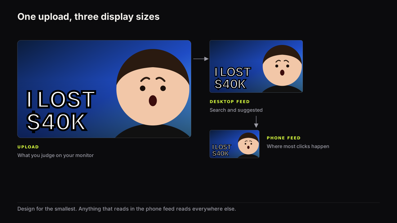
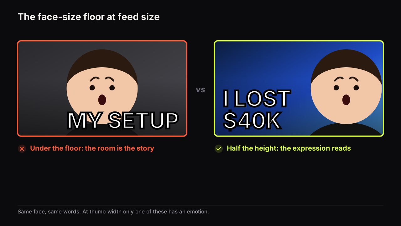
Open your most recent cover on your phone and put your thumb over the face. If the thumb hides it with room to spare, the face is too small to do its job. A face on a thumbnail should fill at least a third of the cover's height, and half is better. Below that floor the expression stops reading at feed size, and the expression is the reason the face is there. This is a recommendation, not a YouTube rule, but it is the one design rule we would keep if we could keep only one: it is the rule most channels break, and it has the clearest fix.
Faces pull the eye. In any picture, viewers tend to find the face before anything else, which is why a cover with a face gets looked at. Whether the look becomes a click depends on what the face says, and a face can only say something if it is big enough to be read.
The size floor and why it exists
The face should fill at least a third of the cover's height. Half is better. We would crop to half even when it means losing the studio, the shelves and the microphone the creator spent money on, because none of that is the information; the eyes and mouth are, and at feed size they are the first thing to vanish. What it costs is context. A face at half height cannot also show the room, and for most videos the room was never the point.
The reason is where expression lives. The eyes, the eyebrows and the mouth carry almost all of it, and those are small features of a face. When the cover shrinks to feed size, small features vanish before large ones, so the face has to be large enough for the eyes and mouth to remain visible shapes. A calm face and a shocked face at a fifth of the height are the same oval. At half the height they are two different stories, and the story is the information the viewer needs before the words.
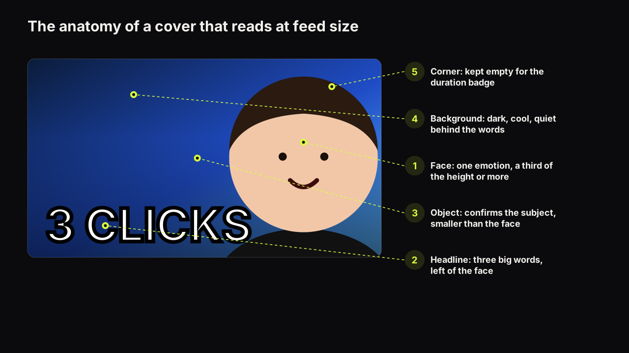
This is also why the face is worth one of the three element slots at all. A cover has room for a face, a headline and an object, and the face earns its slot by carrying the feeling words cannot, which the facial-expression guide matches to each kind of promise. A face too small to carry a feeling is spending the slot on nothing.
Why most channels sit under the floor
The usual cause is the source photo. Creators film themselves in a room, then use the whole frame because it is the frame they have. The room is not the story. Crop until the room is gone.
In the channels we look at, faces under the floor almost always come from a webcam or a wide phone shot, framed from the waist up with the wall filling most of the picture. The fix is never a new camera. It is a crop that starts at the shoulders and ends above the eyebrows.
Take an invented webcam frame: 1920 x 1080, the creator centred, head about a fifth of the height, a desk, a monitor, a plant. Crop from the top of the shoulders to just above the eyebrows and the head fills roughly half the height of the new frame. The plant and the desk are gone. If the video is about the plant, the answer is a second element (the plant cut out and placed beside the face as the object), not a wider crop that shrinks both. If the video is about the creator's opinion, the crop was the whole fix.
The second cause is timidity about cropping into the head. Creators keep the whole head inside the frame because that is how portraits look. Thumbnails are not portraits. Crop into the forehead or the hair, keep the chin and mouth, and the eyes move up toward the upper third of the cover, where the viewer's eye expects them.
Where the face goes
Put the face on one side, not the middle. A centred face leaves two thin gutters that cannot hold a headline. A face on the right third leaves the left two thirds for the words and an object, and it sets up the most common eye path in left-to-right languages: the eye lands on the face, travels left to the words, drops to the object, and stops.
Face right, words left is the layout you will see most in successful feeds, and the path is the reason. The reverse works when the object needs the right side, as long as the face's gaze still closes the loop. The general rules of ordering are in the design principles guide, and the layout built around a single large face has a piece of its own.
How to crop a face
Cropping is where the size floor is won or lost.
- Crop into the forehead, not the chin. The eyes and mouth are the payload. Losing hair costs nothing; losing the mouth costs half the expression.
- Cut at the shoulders or the collar, not the waist. The shoulders give the head a base without bringing the room with it.
- Keep the eyes in the upper half. Viewers expect eyes near the top; a face whose eyes sit low reads as sunken or small.
- Let the head touch the top edge if it needs to. A face that bleeds off the top reads as close and large. A face floating with space above it reads as far away.
- Tilt is fine; rotation is not. A slight head tilt adds energy. A face rotated to fit a layout reads as a mistake at feed size.
One case where we would break the forehead rule: when the hair, the hat or the headphones are the subject. A barbering channel cropping into the fade it just cut is deleting the product. There, the full head stays in frame, the face can sit nearer a third of the height than a half, and the words carry the promise the expression was going to carry (FIRST FADE, or the price). The floor still holds. What changes is which feature earns the room.
Lighting and separation
A face that is the same brightness and temperature as its background disappears when the cover shrinks, however large it is. Separation is the second half of the size floor.
Skin is warm, so a cool background (navy, teal, dark green, near-black) separates the face without any extra work. On a warm background the face needs a rim light on one side, or a cut-out with a bright edge, to keep its outline. Flat front lighting, the kind a ring light in front of a webcam produces, makes a face look like a passport photo and gives it no edge; light from one side creates a bright edge and a shadow side, and the bright edge is what survives the shrink. Lighting a face for thumbnails goes through the setups, and the reasoning about brightness and temperature is in colour pairs that survive a phone screen.
A cut-out face (the background removed and replaced) is the standard way to get a clean edge, and the reference library on the bench includes subject looks such as Sticker Cut-Out and Neon Outline that add a visible boundary around it. An outline is the one border we recommend on a thumbnail, because it is a border where the contrast matters.
Gaze and expression
The face should look at the viewer or at the thing. Eyes at the camera create contact; eyes pointed at the object tell the viewer where to look next. Eyes pointed off-frame at nothing lose both, and they open a door the eye walks out of. Eye direction has the layouts for each.
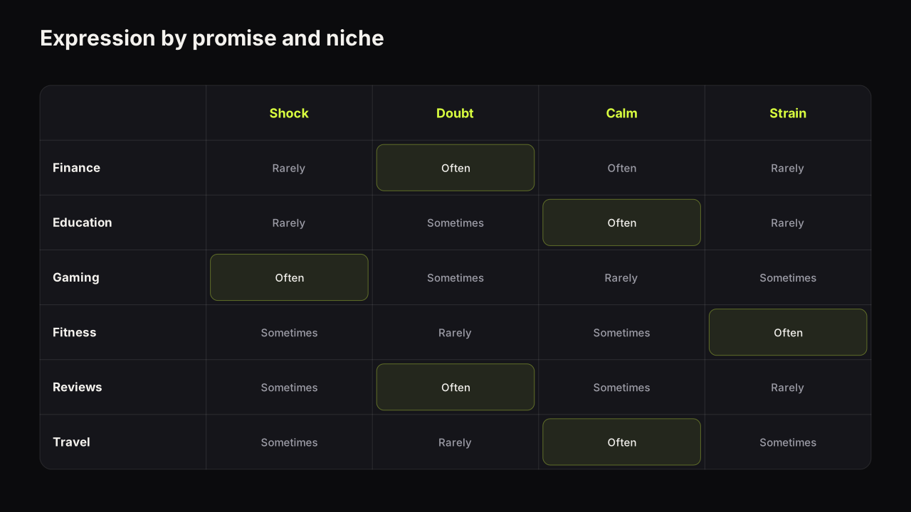
The expression should be one nameable feeling: shock, doubt, delight, disgust, calm. Half a smile reads as nothing. The short version of which feeling fits which promise: shock suits surprise, doubt suits reviews and comparisons, calm suits tutorials, and the shocked face on every upload is how a channel teaches its audience to stop looking. The face carries much of the emotional lever in why people click a thumbnail. It is information about what the video will feel like, not decoration.
Two faces on one cover
Podcast and clip channels often need two faces: host and guest. Two faces at a quarter of the height each are two ovals. Either give both the size (a split layout, each face filling most of its half, expressions that disagree with each other), or choose one face at half the height and reduce the other to a small inset.
An invented episode shows the choice. The host is the brand; the guest is a known name in the niche. If the guest is why people will click, the guest gets half the height and the host is a small inset, and the host's ego pays for the click. If the guest is unknown and the episode is really the host's take, reverse it. Two equal faces are only right when the disagreement between them is the promise. Same size, same smile, is a group photo, and a viewer scrolls past group photos. Podcast covers and co-host and client faces go further.
When a face is the wrong choice
A face earns its space when its expression adds something the picture and the words cannot. In several niches it does not, and forcing one in costs an element you needed for the object.
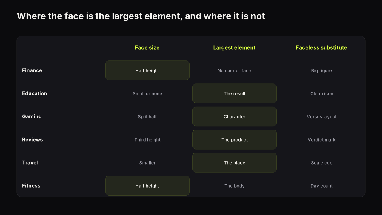
| Niche | Face's role | Largest element | Faceless substitute |
|---|---|---|---|
| Finance, business | Doubt or confidence beside a number | The number, or the face at half height | A stack, a chart shape, a single big figure |
| Education, tutorials | Calm, small or absent | The result or the diagram | The finished thing, a clean icon |
| Gaming | Reaction, often split with the game | The character or console | Character art, a versus layout |
| Reviews, tech | The verdict expression | The product | The product with a verdict mark |
| Travel, vlog | Awe, smaller against the place | The place | The place with a scale cue, such as a road or a figure |
| Fitness | Effort or pride, before and after | The body as object | Day counts, the before and after halves |
These are observed patterns, not rules; the channels that already win in your niche will tell you which applies, which is the argument for studying the covers that already work in your niche before deciding. On a faceless channel something has to replace the pull of a face: hands doing the thing, a prop, a result, and stronger colour contrast than a face-led cover needs.
On a personality-led channel we would put the face on nearly every cover, even on the videos where the object alone would make the stronger single thumbnail, because the face is what a returning viewer recognises in the Suggested column before reading anything, and that recognition is worth more across a year of uploads than one better cover. The exception is the video whose object is the whole story; there the face drops to an inset or goes.
Getting a face at the right size without a photoshoot
The face floor is a cropping and lighting problem, and it is easier to solve when you are not depending on the one frame you happened to film. On the bench, Face Lab takes one selfie (head and shoulders, facing the camera; what makes a good one), cuts it out automatically, and renders eight expressions from it: Shocked, Surprised, Happy, Excited, Angry, Curious, Scream and Sad. Any saved face can be placed into any render, painted into the scene's light and angle, so it arrives at the size and side the layout asks for rather than the size the webcam gave you. The Extreme Close-Up subject look in the reference library pushes it further toward the floor.
One rule comes with that: only faces of people who have agreed to appear on your thumbnails. Your own, a co-host's, a client's with permission. No public figures without consent and no minors, as the acceptable use policy at /aup sets out. AI generators in general have the same constraint and the same strengths and failures with faces, which the guide to AI thumbnail generators covers in detail.
The face test
Run this at thumb width, not full size. Checking the cover at feed size is the habit that makes the floor real.
- Shrink the cover to thumb width. Can you name the emotion? If not, the face is too small or too calm.
- Does the face fill at least a third of the height? Half?
- Is the face on one side, with room for three big words that do not touch it?
- Does the face separate from the background at a glance, by brightness, temperature or an outline?
- Are the eyes in the upper half of the cover?
- Is the gaze pointed at the viewer or at the object?
I don't work to a fixed percentage myself, because that turns into another fake thumbnail rule. What I check is whether the emotion is instantly readable. If someone has to enlarge the cover to tell shocked from confused, the face isn't doing its job. At the same time, an enormous face just because big faces get clicks becomes predictable. Context matters.
If it were our channel
Suppose we ran a home-repair channel, filmed on a phone on a tripod, and the next video was fixing a leaking tap in fifteen minutes. The frame we have is the whole kitchen with us small in it, and we would not use it. We would take one selfie against a plain wall, chin slightly down, and crop it from the collar to just above the eyebrows, so the head fills half the height, on the right third, eyes in the upper half. The expression would be doubt (one eyebrow up), not shock, because the promise is "this is easier than you think" and shock says the opposite. The tap, cut out and large, sits left of centre where our gaze points, with 15 MIN above it. A cool teal ground behind warm skin, so no outline is needed. Then thumb width on the phone: can we name the emotion, is the tap a tap, do the digits read. If any of the three fails, the fix is the crop, again, before anything else.
Common questions
Should the face be in the centre of the thumbnail?
No. A centred face leaves two narrow gutters that cannot hold a headline or an object. Put the face on one side, usually the right in left-to-right languages, and give the other two thirds to the words and the object.
Can the face be cropped at the top of the head?
Yes, and it usually should be. Cropping into the forehead or hair lets the eyes and mouth sit larger in the frame, and those are the features that carry the expression. Avoid cropping the chin or mouth, because the expression loses half its information.
Do I need a face on every thumbnail?
No. Reviews, tutorials, travel and faceless channels often do better with the object, the place or a result as the largest element. A face earns its space when its expression adds information the picture and words cannot.
What to do next
Open your last five covers and measure the face against the height of the cover by eye. Any face under a third of the height is the first thing to fix on that video, and the fix is a crop, not a reshoot. Then read which expression fits which promise (the facial-expression guide linked above), because once the face is big enough to read, what it says is the next decision. The rest of the cover's rules are in the full thumbnail guide.