On this page
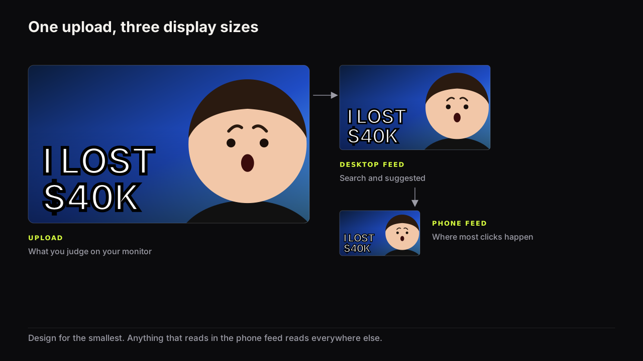
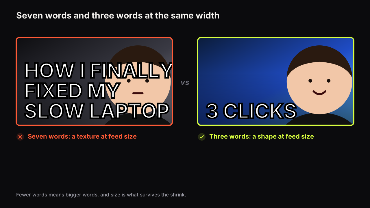
HOW I FINALLY FIXED MY SLOW LAPTOP is seven words. Spread across a cover, each one is roughly a third of the size three words would be, and on a phone, in a feed, that is a row of texture. Our recommendation is that a thumbnail should carry three big words or fewer, and up to five if two of them are set small. The limit is about size, not reading. Fewer words means each word can be set bigger, and size is what survives the shrink from the file you upload to the rectangle the viewer sees. Nobody counts the words. Everyone notices the ones they cannot read.
The direct answer and the rule behind it
For what the top channels actually do, the word-count study counted 8,668 covers: the median is four words, four in ten have three or fewer, and a quarter of all covers have none.
Three big words or fewer. Up to five if two of them are small and clearly secondary. The words must add something the picture cannot show; if the cover works without them, use none. We hold to this even when the fourth word is the clever one, because a clever word nobody can read is a blank, and a headline set large enough to read from across a table is worth more than a joke set small.
The rule follows from two facts you can check on your own screen. The width of a cover is fixed, so every word you add takes width from the rest. And only large words survive the shrink to feed size. A seven-word headline is not a longer message. It is a message set at a size nobody in the feed can read.
Why words fail at feed size
Nobody reads a feed. The eye moves down a column of covers and stops on the ones that catch it, and the words on a cover are seen the way a road sign is seen: shapes recognised at once or not at all. A short familiar word set large in a heavy typeface is a shape. A sentence set small is texture, and texture does not stop a scroll.
Short words beat long ones. The rule says three words, but the constraint underneath is width. Three long words can read worse than four short ones, because the long words have to shrink to fit. CHEAPEST is one word and as wide as I LOST $40K. Given the choice, take the short word, the digit and the symbol: 3 over THREE, $ over DOLLARS, VS over VERSUS.
Weight matters more than style. A heavy, tight typeface holds its shape when it shrinks; a thin or decorative one loses its strokes first. YouTube's own thumbnail tips page puts it as "use a font that is easy to read", which at feed size means heavy and plain. Effects that add a bright edge (an outline, a hard shadow, a bevel) help because they add brightness contrast where letter meets ground, which is where readability is decided. Which fonts hold up is its own piece.
None of this is about how fast people read. It is about whether a word is large enough to be recognised at all at the size the feed gives it, and you can answer that by shrinking the cover and looking. Why phone readability decides most clicks covers the check in detail.
What the words are for
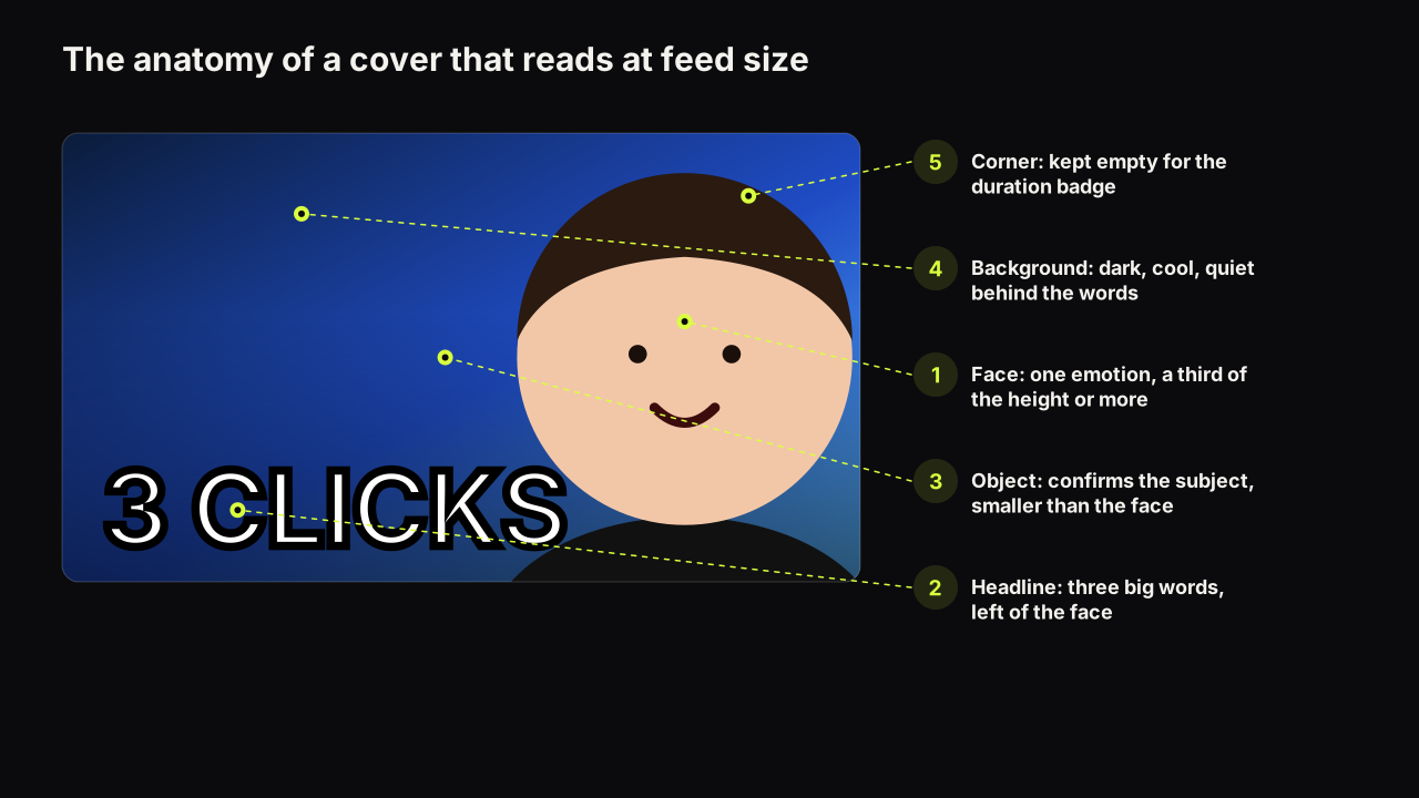
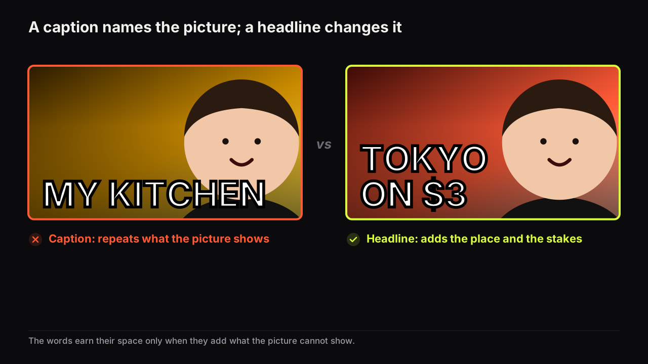
The cover words are not a summary of the video. The title does that, and it sits directly under the cover. The words on the cover have one job: add the thing the picture cannot show. A face can show shock; it cannot show $40K. A kitchen can show ramen; it cannot show TOKYO. A laptop can show a laptop; it cannot show that the fix took three clicks.
That is the difference between a headline and a caption. A caption names what is in the picture. A headline changes what the picture means. HOW I FIXED MY LAPTOP over a person and a laptop is a caption. 3 CLICKS over the same picture is a headline, because it adds the stakes (this is easy) and opens a question (which three?). The question is what earns the click; opening a question the video has to answer is the psychology, and the cover words are usually where the question lives.
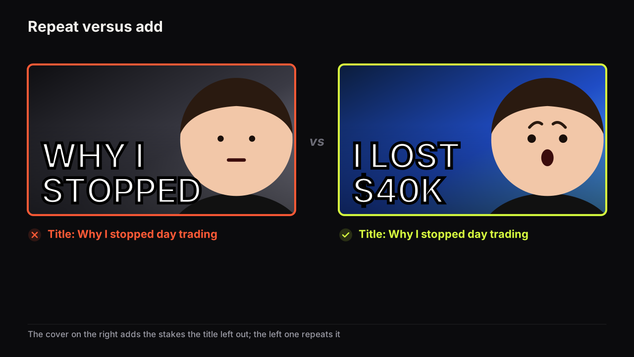
The title relationship follows the same logic. If the cover says I LOST $40K and the title says "I lost $40K", the viewer gains nothing on the second look. If the title says "Why I stopped day trading", the two halves tell a story together. We have a full piece on whether cover text should repeat the title; the short version is add, do not repeat.
The two-tier headline
Sometimes the idea needs four or five words. That is fine if two of them are small. Set the big words as the headline and the small words as a whisper: I LOST huge, "everything in one night" small beneath it in a lighter weight. The eye reads the big words in the feed and the small words only if it stays, which is the order you want.
Three rules keep the tiers working.
- The big tier stands on its own. Cover the small words with a finger; the headline must still make sense.
- The tiers look different, not just smaller. Heavy caps above, lighter mixed case below, so the eye knows which is which before it reads either.
- The small tier is one line. Two lines of small text is a paragraph, and a paragraph is a caption.
The rule breaks in one place we know of. Commentary and reaction channels sometimes have a quote that is the whole promise, and it runs to five or six short words: SHE SAID IT WAS FAKE. Splitting that into tiers kills the line. We would set it as one tier, smaller than we like, on two conditions: every word is short, and there is a face beside it doing the stopping, because the words no longer will. Six long words never qualify. Six short ones occasionally do, and reaction video covers has more on the quote layout.
When zero words is right
A cover with no words is right when the picture is the whole promise and the title carries the rest: object-led reviews with a strong verdict expression, a before-and-after where the change is obvious, a well-known face in a scene that explains itself. The test is the same as for a headline. Would the words add anything the picture cannot show? If the honest answer is no, the words are a fourth element, and the three-element budget says to cut them.
Channels that drop the words tend to be ones whose title does the specifying: "I tested the cheapest 4K monitor" under a cover that is only the monitor and a doubtful face. Channels that need the words are the ones whose picture is generic: a person talking, a desk, a screen. If your covers are mostly you at a desk, the words are doing most of the work and you should give them the size.
I don't remember my longest headline, but I have definitely made the mistake of trying to say too much in thumbnail text. My preference now is dramatically shorter: text you absorb rather than text you read. If a viewer has to stop and process a sentence, the cover is asking the words to do too much of the work. And I don't believe every thumbnail needs text. Sometimes the strongest copy is none.
Writing the three words
The words that work are nouns, numbers and short claims. Verbs cost words and add little; "how I", "why you", "the truth about" are three words spent before the promise begins.
| Weak (caption or sentence) | Strong (headline) | What changed |
|---|---|---|
| HOW I FINALLY FIXED MY SLOW LAPTOP | 3 CLICKS | The picture shows the laptop; the words add the stakes |
| MY TRIP TO JAPAN | TOKYO ON $3 | A place and a number: specific and open |
| I LOST A LOT OF MONEY TRADING | I LOST $40K | The figure is the stakes; the rest is the title's job |
| THIS IS WHY YOUR CTR IS DROPPING | NOT YOUR FAULT | A contradiction the video has to resolve |
| BEFORE AND AFTER 90 DAYS | DAY 90 | The layout shows before and after; the number adds the time |
The strong versions share a specific (a figure, a place, a count), a short word count, and a question left open that the video answers. Specificity is the lever doing most of that work.
Which specific to pick depends on the title, and an invented case shows how. Say a finance video is about paying off £18,000 of debt in fourteen months, and the picture is the creator holding up a cut-up credit card, face relieved. Three candidates: DEBT FREE, £18K GONE, 14 MONTHS. If the title is "How I paid off £18,000 in 14 months", all three repeat it, and the honest move is to change the title or run the picture alone. If the title is "How I paid off £18,000 of debt", the cover says 14 MONTHS, because the time is the detail the title lacks and it opens the question "that fast?". If the title is "I paid off my debt in 14 months", the cover says £18K, because the figure is the stakes. Write the title and the cover words in the same sitting. Choosing them separately is how both end up saying the same thing, and choosing them before you film is the argument in packaging the video before you film it.
Getting the words onto the cover
On the bench there are two ways to put words on a cover. The headline field ("Words on it", up to 80 characters) is painted into the image by the model, so the words share the scene's light and perspective. For exact spelling, a specific font, or the small second tier, the editor adds real text layers on top of any render, free and unlimited, with a set of heavy display fonts (Anton, Bebas Neue, Archivo Black and others) and controls for size, fill, outline, shadow and all caps.
For the file that goes up, we would set the big tier as a text layer every time rather than the painted headline, even though the painted version sits in the scene's light more convincingly and looks more like a photograph, because the one thing a headline cannot survive is a wrong digit or a missing letter, and a text layer is exact by construction. The painted headline is for the exploring stage, when you are finding out whether TOKYO or $3 is the word. The layer is for the upload.
If you brief a generator or a designer rather than typing the words yourself, keep the headline out of the scene description and give it separately; writing a thumbnail prompt covers the structure, and the headline is its own line in it.
The four tests
- Cover the picture with your hand. Do the words still mean something? If not, they are a caption. Cut them or change them.
- Cover the words. Does the picture still make sense? If not, the picture is weak, and more words will not save it.
- Say the words out loud. If they take more than one breath, cut one.
- Shrink the cover to the width of your thumb. Can you recognise every big word? If not, cut a word or set the rest larger.
If it were our channel
Suppose we ran a tech channel and the next video was a review of a budget 4K monitor that turned out to be good. The picture is settled: the monitor large, our face beside it, doubtful. The title is going to be "I tested the cheapest 4K monitor on Amazon", so the cover cannot say cheapest, 4K or monitor. We would list ten candidates in two minutes and cross out anything the picture already shows or the title already says: CHEAPEST (title), 4K (title), MONITOR (picture), REVIEW (obviously). What survives is the verdict and the stakes: £179, BUY IT, HONESTLY?, NOT BAD. £179 wins if the price is the surprise; HONESTLY? wins if the surprise is that it is good. We would set one of them large, on the left, as a text layer, run the four tests at thumb width, and only then ask whether a small second tier ("and I kept it") earns its place. Most weeks it would not.
Common questions
Should thumbnail text be in all caps?
Usually yes for the big words, because capitals in a heavy font make a solid block that holds its shape when shrunk. Keep any small secondary words in mixed case so the two tiers look different. YouTube's tips page advises limiting all caps in titles; that advice is about the title field, not the cover.
Does the thumbnail text have to match the title?
No, and it should not repeat it. The title says what the video is; the cover words add what the picture cannot show, such as the stakes, the number or the twist. If both say the same thing the viewer learns nothing on the second look.
What font size should thumbnail text be?
There is no fixed size, because the cover is displayed at many sizes. The test is relative: shrink the cover to the width of your thumb and every big word should still be recognisable. If it is not, cut a word and set the rest larger.
What to do next
Take the headline of your next video and cut it to three words the picture cannot show. Set them as large as the layout allows and run the four tests. The rest of the cover's decisions, where the face goes and what colour the ground is, are in the design principles guide linked above, and the words are the first item on the pre-upload checklist.