On this page
You are about to redesign your thumbnails. The click-through rate has slid for six weeks, the covers look the same as the ones that used to work, and a new look feels like the obvious move. Before you open the design tool, open the traffic-source report, because the thing creators call thumbnail fatigue is four different problems and a redesign fixes at most two of them.
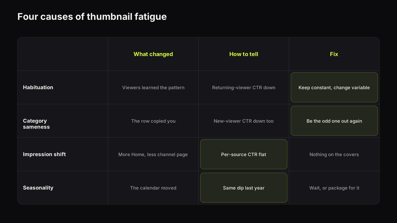
Thumbnail fatigue is a click-through rate that drifts down across many videos while the covers stay the same. Either the audience has habituated to your pattern, the niche has copied it until it is invisible, the mix of impressions has shifted towards surfaces with a lower CTR, or the season has changed. Each has a different tell and a different fix. This is the diagnosis in the order that avoids throwing away a style that still works.
The four things called thumbnail fatigue
| Cause | What changed | How to tell | Fix |
|---|---|---|---|
| Habituation | Your returning viewers stopped noticing the pattern | CTR down most among subscribers and returning viewers; new-viewer CTR steady | Keep the constant, change the variable |
| Category sameness | Competitors adopted your layout, colour or expression | Your covers look like the row; CTR down among new viewers too | Become the odd one out again: colour, layout, expression |
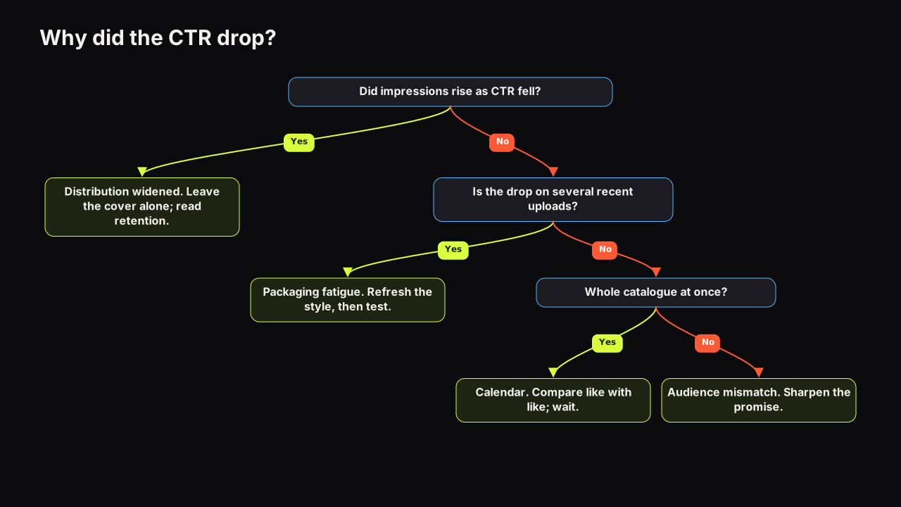
| Impression-mix shift | More impressions from Home or Suggested, fewer from the channel page or search | Blended CTR down, per-source CTR flat; impressions up | Nothing on the covers; read per source |
| Seasonality | The audience's attention moved with the calendar | Same dip in the same weeks last year; the whole niche moved | Wait, or package for the season |
Habituation is the audience learning your pattern. A viewer who has seen the same red background, the same open-mouthed face and the same yellow word forty times no longer reads it as a signal. It has become the channel's wallpaper, and the first pass of a click decision runs on difference.
Category sameness is the same thing happening across the niche rather than inside your audience. A layout that earned clicks because it was rare stops earning them once every channel in the row uses it. Your cover has not changed; its neighbours have.
Impression-mix shift is not fatigue at all, and it is the most common cause of the complaint. As a channel grows, more of its impressions come from the Home feed, where a thumbnail competes with everything the viewer might watch rather than with the channel's own videos.
YouTube's help page on impressions and click-through rate says a video that gets a lot of impressions, for example on the Home page, will naturally have a lower click-through rate, while videos whose impressions come mostly from the channel page may have a higher rate.
Seasonality is the calendar. Study channels move with term dates, finance channels with tax deadlines and market moods, fitness channels with January and summer. A dip that appears in the same weeks every year is not a cover problem, and how CTR moves with the calendar has the patterns by niche.
Diagnose in this order
Cheap checks first, expensive fix last.
- Check the impression mix before anything else. Open the traffic-source breakdown for the last three months against the three before. If impressions rose and the share from Home or Suggested rose with them, look at CTR per source. Flat per-source CTR with a falling blended CTR is a distribution shift, and the covers need nothing. Why a CTR can drop while a video is doing well covers this case in full, and what impressions click-through rate actually measures explains why the blended number misleads.
- Check last year. Same weeks, same dip? Seasonality. Compare with a few channels in your niche if you can see their upload rhythm slowing too.
- Split by viewer type. If CTR fell mainly among returning viewers and subscribers while new-viewer CTR held, the audience has habituated. If it fell for both, look outward.
- Look at the row. Screenshot the search results and the Suggested column for your main topics. If your cover could be swapped with three of its neighbours without anyone noticing, the category has caught up. Outlier research in your niche is the systematic version of this check.
What the first check looks like
An illustrative case, with invented numbers. A cooking channel's blended CTR has gone from about 6% to about 4% over a quarter, and the creator is sure the covers have gone stale. The traffic-source view says otherwise. Impressions have roughly doubled, almost all of the new ones from Browse features. CTR from Browse was about 3.5% before and is about 3.5% now; CTR from the channel page was about 9% and still is. Nothing on the covers has stopped working. The channel is being shown to more strangers, and strangers click less than subscribers. The right decision is to change nothing and to stop reading the blended number, which the guide to traffic sources and CTR explains how to do. Had the creator redesigned, next quarter's numbers would have been read as a verdict on the redesign, and the channel would have learned a lesson that was not there.
The complaint "my thumbnails stopped working" turns out to be an impression-mix shift more often than any of the other three, because it arrives exactly when a channel is growing. The cover looks the same, the number went down, and the instinct is to blame the cover. Most channels we look at would have kept a working style if they had read CTR per source first.
The AI-sameness version of category fatigue
Generators have added a fast route to category sameness. A model's default idea of a thumbnail (a centred subject, a glow behind the head, a warm-cool colour split, saturated everything) is the same for every channel that accepts it, so a niche can converge on one look in a few months without anyone copying anyone.
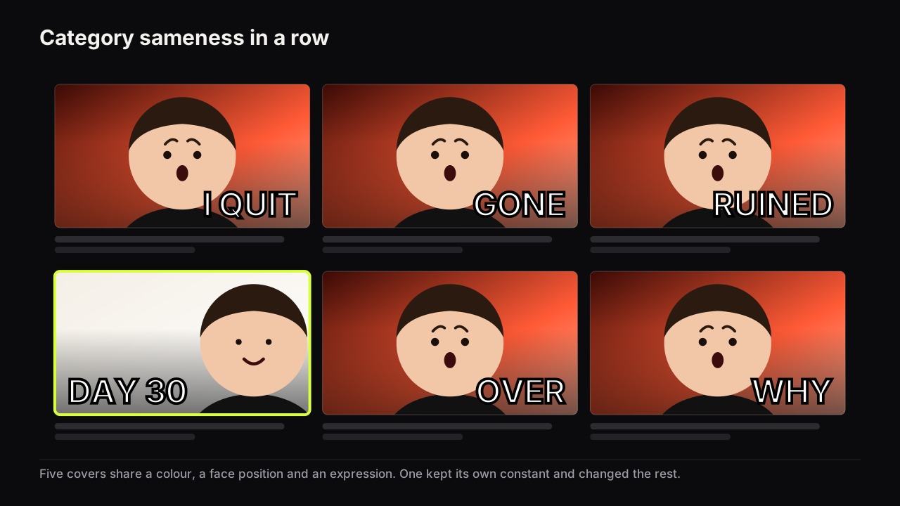
The tell is that the covers look finished and correct and still blend in. The fix is the same as for any category sameness, with one addition: override the model's defaults on purpose, with a colour from your niche's gap, an object from the actual video, and your own face rather than a drawn one. The guide to AI generators treats sameness as the most expensive failure precisely because nothing about it looks broken.
The style I've grown most sceptical of is the generic YouTube thumbnail look itself: huge face, bold text, arrow, glow, circle, screenshot. Every one of those devices can work. The problem is that creators learned the same rules, AI generators learned the same rules, and whole rows now look interchangeable. Standing out increasingly means knowing what everyone else in the row is doing and deciding, deliberately, where not to copy them.
A refresh that keeps you recognisable
The wrong response to habituation is a new look. Recognition is an asset: returning viewers find your videos in a row because something about the cover says "that channel".
Our view is that a full visual rebrand is the most expensive possible response to a CTR dip and almost never the right one. We would rather look slightly dated for another quarter than become unfindable to the viewers who already click, because a dated cover still gets recognised and a strange one has to earn the click from scratch. The exception is a channel whose whole look was borrowed from the niche's default in the first place; there is nothing to protect, and the rebrand is a first design under another name.
The better response is to separate the constant from the variable. The constant is the one or two things that make a cover yours: a dominant colour, where the face sits, a typeface, a framing. The variable is everything else: the expression, the layout, the object, the accent colour. Habituation is to the whole pattern. You break it by changing the variables while the constants hold, which is the whole difference between consistency and sameness.
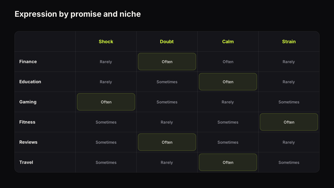
Pick one constant to keep on purpose, the dominant colour or the face position for most channels, and rotate the rest. We would do this even though it costs the neat, matching channel-page grid that looks so good in a portfolio, because a grid that matches perfectly is a grid the audience has stopped seeing. Change the expression first: it is the cheapest change and the one viewers habituate to fastest. A channel that has used a shocked face for a year usually gains more from doubt, calm or delight than from any layout change. Which emotions earn clicks and when the shocked face stops working sets out the pairings.
The layout comes next. If your constant is colour, you can move between a big-face layout, a split, a number-led cover and a before-and-after without losing recognition. If your constant is face position, vary the colour and the object. The design principles guide has the fuller reasoning.
When the constant is the problem
The keep-the-constant rule has one clear exception. Picture a personal finance channel whose constant is a deep green ground, chosen years ago because it read as money. The row screenshot shows six of the eight neighbours in Suggested are now some shade of green too, several because the same generator defaults to it for finance prompts. Here the constant is the source of the sameness, and rotating the expression will not rescue a cover that has vanished into its neighbours by colour alone.
We would break the rule and change the constant: a cream or a near-black ground, decided by the screenshot, with the face position and typeface promoted to constants so the channel stays findable. The cost is a few uploads where returning viewers relearn the look, which is a smaller loss than being the seventh green cover in a row of eight. Colours and contrast that survive a phone screen explains why brightness, not hue, decides whether the new ground separates.
A rotation plan instead of a rescue
Fatigue is easier to prevent than to cure. The prevention is a rotation that never lets one pattern run long enough for the audience to stop seeing it.
- Define two or three layouts your channel uses, each with the same constant. For a finance channel that might be a big number, a doubtful face beside an object, and a split.
- Rotate them across consecutive uploads so no two videos in a row share a layout. A viewer scrolling your channel page sees variety inside a recognisable whole.
- Change the expression across the rotation as well. A channel can carry surprise, doubt and calm without becoming three channels.
- Review quarterly. Pull the last three months of covers into one grid. If a layout has drifted into the row's default, retire it. If one has quietly become the highest-CTR layout per source, do not rotate it out; use it more and change its expression to keep it fresh.
- Test the replacement before committing. Two covers that differ in one variable, on one video, through Test & Compare where the video qualifies. The measured lesson goes into the plan.
Tweak on the bench is built for step five: a result becomes the source for the next render, so you can change the expression or the layout and keep the palette and headline identical, which is what a fair second variant needs.
When it is not fatigue at all
Two other explanations are worth ruling out before any refresh, because a new cover cannot fix them.
The topic has moved. If the falling videos share a subject the audience has stopped caring about, the cover is reporting the loss of interest rather than causing it. Check whether videos on a different topic, in the same style, are holding.
The promise has drifted. Covers that got bolder over a year while the videos stayed the same make promises the videos no longer keep, and the audience learns to discount them. The tell is a CTR that held or rose while retention in the first minute fell. The fix is to bring the promise back in line with the delivery, not to make the cover louder.
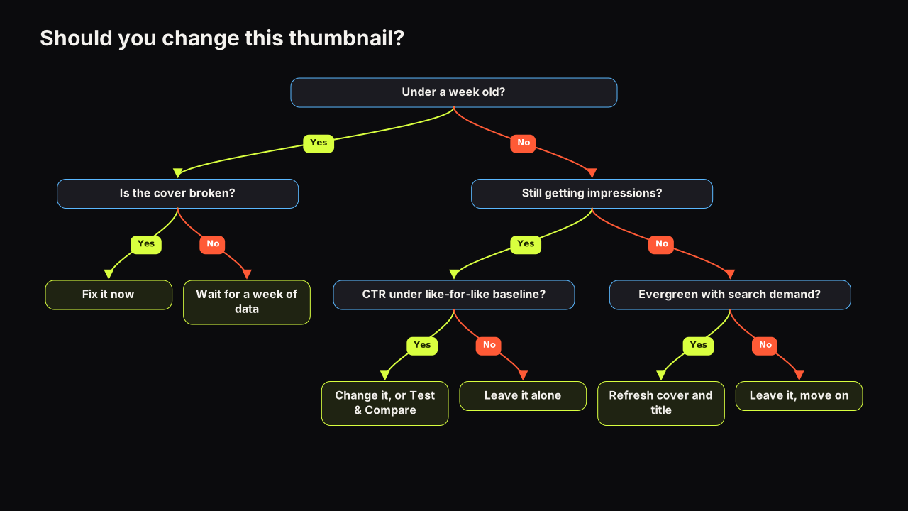
The narrower question, whether to change the cover on one underperforming video, has a decision tree of its own: whether to swap the thumbnail on a video that is already live covers the age, the impression volume and the like-for-like baseline. Fatigue is the channel-level version of that decision, and the answer is a plan, not a swap.
If it were our channel
Say we ran a channel of explainers on home energy (heat pumps, insulation, bills), the blended CTR had slipped for two months, and the covers were a warm orange ground, our face on the right, one big word.
First the traffic-source view. If impressions had risen, the extra ones were Browse, and per-source CTR was flat, we would close the tab and go back to making videos. No redesign, and a note in the log so the next dip does not restart the argument.
If per-source CTR had fallen too, the viewer-type split. A fall among returning viewers only would mean the audience had learned the orange-plus-face pattern. We would keep the orange and the face position and change the expression across the next three uploads: calm, then doubt, then a no-face cover with the heat pump at face size. One variable per upload, so the log can say which one moved.
If new-viewer CTR had fallen as well, the row screenshot. Should Suggested turn out to be full of orange, the orange goes and the face position becomes the constant. That is the rule-break case above, and we would accept the relearning cost.
Whichever branch we landed on, the first replacement cover would go through Test & Compare against the current style on one video, judged by what YouTube reports rather than by which one we liked.
What to do next
Run the four checks in order on the last three months: impression mix, last year, viewer type, the row. Write down which cause fits, because the fixes are different and the wrong one costs a working style. If it is habituation or sameness, name your constant, change the expression on the next upload, and put a two- or three-layout rotation in your thumbnail workflow so the next dip is a scheduled review rather than a surprise.