How to A/B test YouTube thumbnails: Test & Compare and the manual method
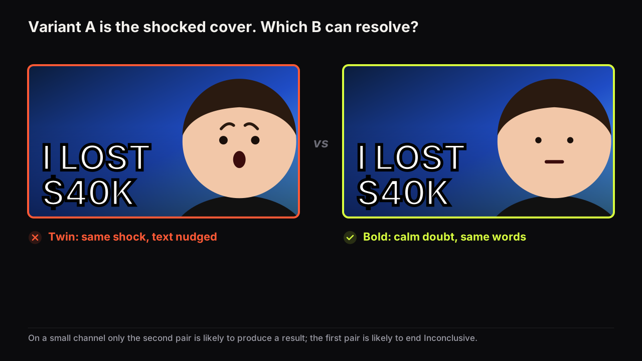
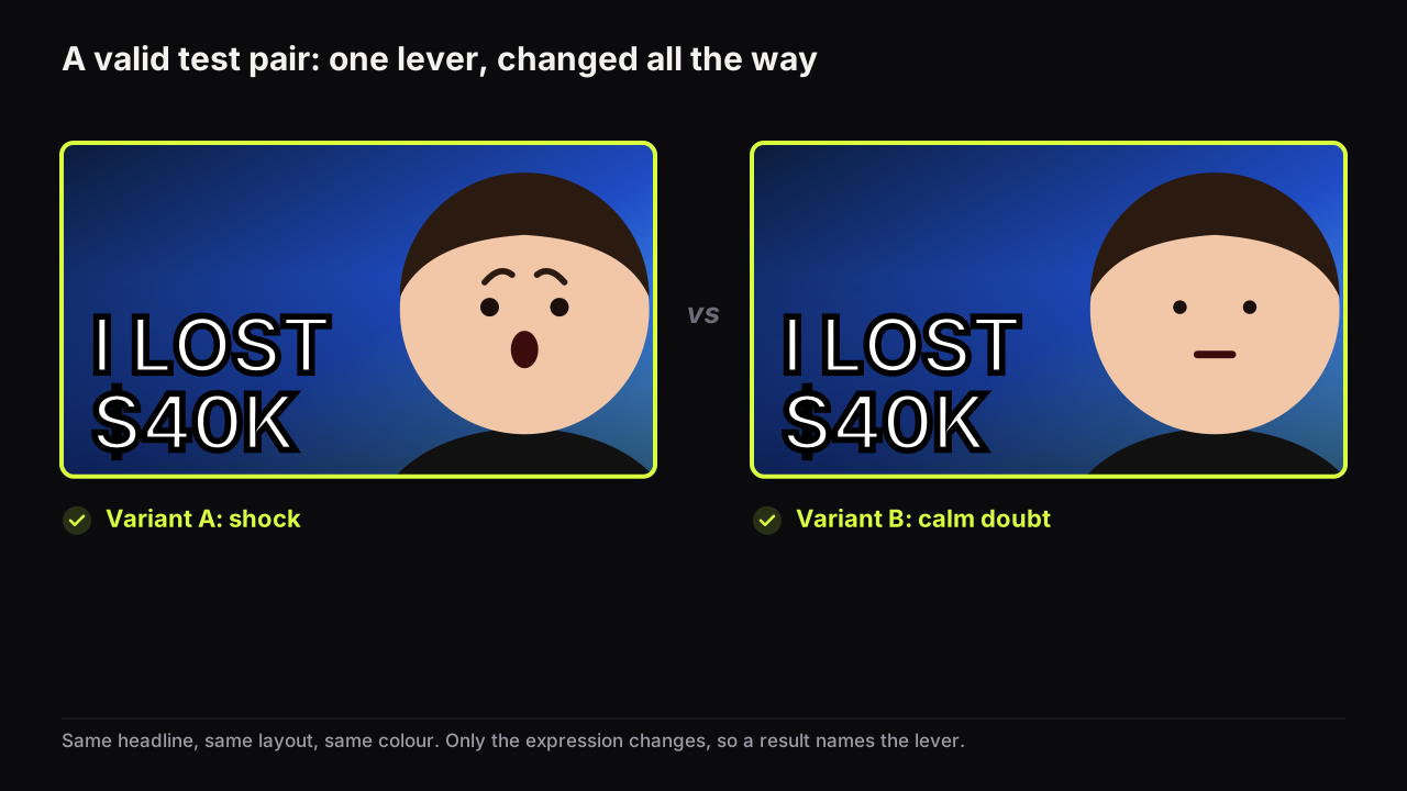
Test & Compare in YouTube Studio picks a winner by watch time share, not clicks. How to run it, design variants that resolve, and swap manually when it cannot.
Why viewers click, how thumbnails and titles work together, and how to test what you make. 54 guides written by people who look at thumbnails all day, with more added every week.
Each topic has a pillar guide that covers the ground and shorter pieces that go deep on one question.
The rules of the format: size, specs, what a thumbnail has to do in the feed, and the checklist every cover should pass before upload.
Why people click: curiosity gaps, emotion, stakes, specificity, novelty, and the first-second decision in a crowded feed.
Faces, text, colour, contrast, composition and mobile readability. The craft of a cover that reads in a glance at feed size.
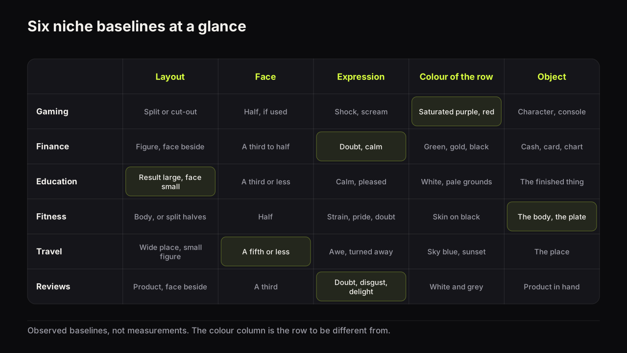
What each audience clicks: gaming, finance, education, fitness, travel, tech, food, commentary, music and reaction channels, each with its own patterns and traps.
What click-through rate measures, what a good number looks like in context, why it drops, and how to read it without fooling yourself.
How to test thumbnails properly: YouTube's Test & Compare, manual swaps, how long to wait, and how to analyse a cover before it goes live.
Studying what already works in your niche: outliers, swipe files, pattern analysis and the difference between borrowing a layout and copying a cover.
Making thumbnails with AI: what generators do well, where they fail, how to write a brief, and how to keep your own face in every cover.
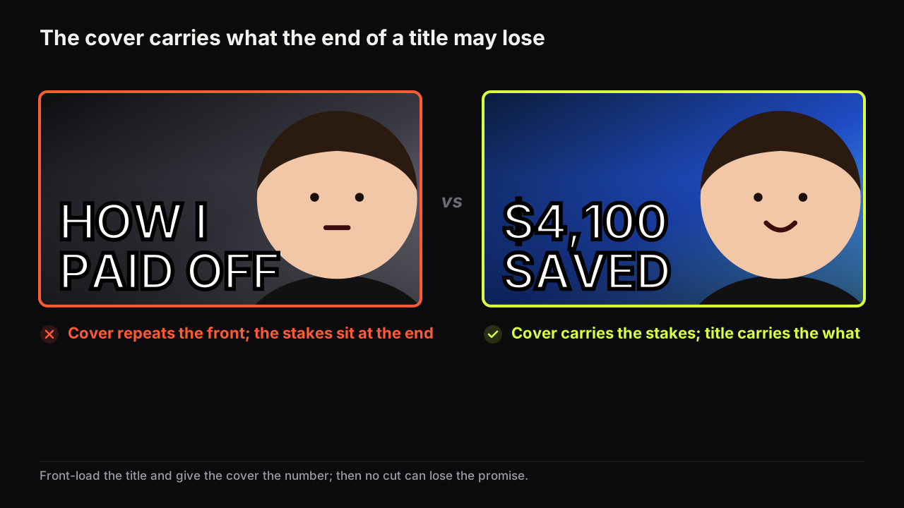
Title and thumbnail as one unit: promise alignment, the division of labour between them, and packaging an idea before you film it.
After the upload and around it: when to change a thumbnail, refreshing old videos, thumbnail fatigue, and a repeatable workflow for a channel.
Test & Compare in YouTube Studio picks a winner by watch time share, not clicks. How to run it, design variants that resolve, and swap manually when it cannot.
The four principles behind every thumbnail that reads at feed size, the layouts that apply them, and a before-and-after critique you can repeat yourself.
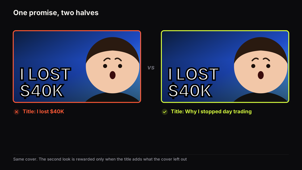
Video packaging is the title and thumbnail working as one promise. What each half should say, how to package before filming, and how to test the pair.
54 guides
Test & Compare in YouTube Studio picks a winner by watch time share, not clicks. How to run it, design variants that resolve, and swap manually when it cannot.
The four principles behind every thumbnail that reads at feed size, the layouts that apply them, and a before-and-after critique you can repeat yourself.
Video packaging is the title and thumbnail working as one promise. What each half should say, how to package before filming, and how to test the pair.
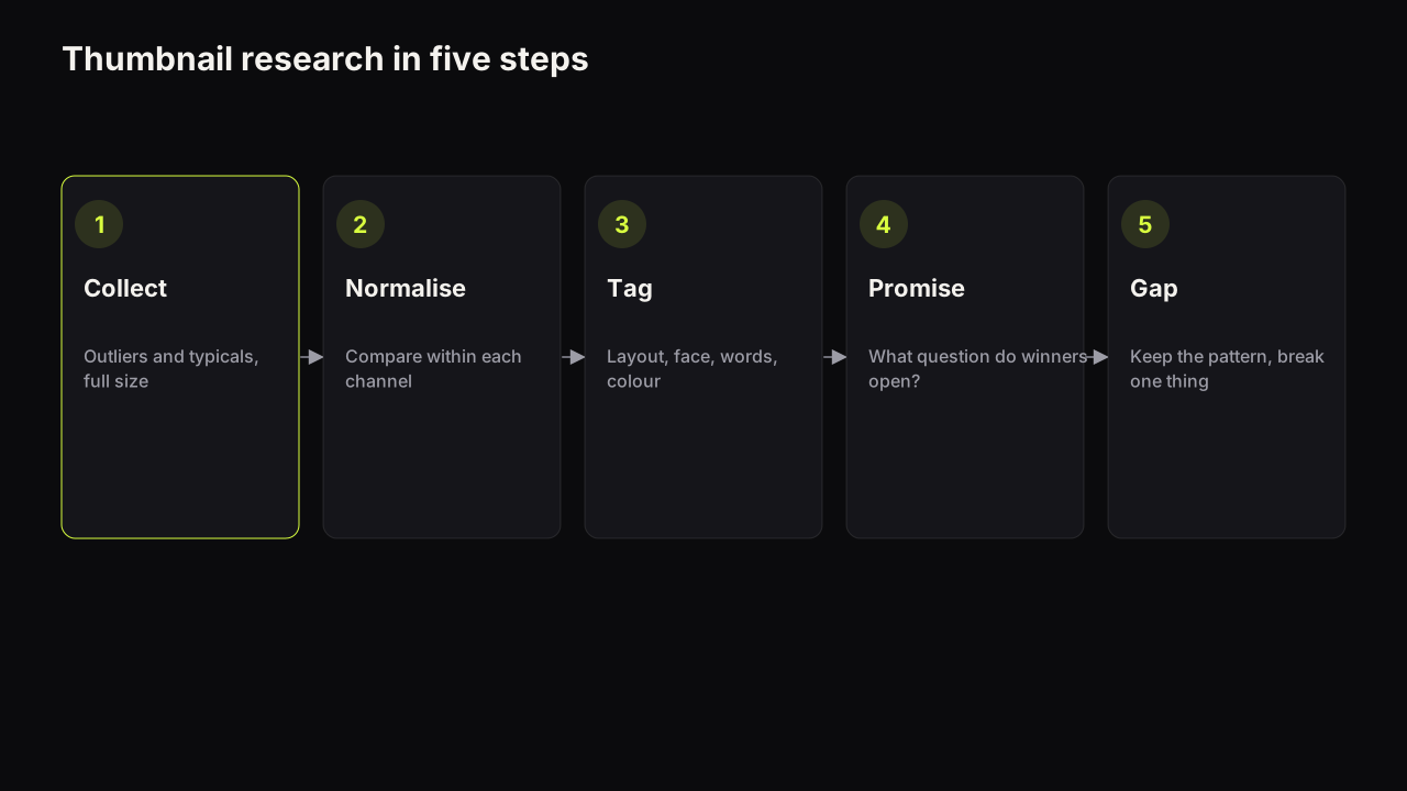
A five-step method for analysing competitor thumbnails: find outliers, normalise by channel, tag patterns, name the promise, borrow the layout, not the cover.
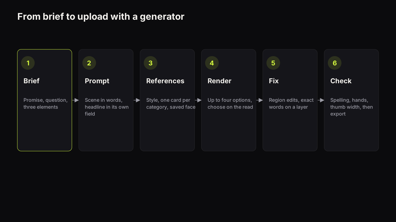
How an AI thumbnail generator turns a brief into a cover, the four ways it fails (spelling, hands, faces, sameness), and the workflow that fixes each one.
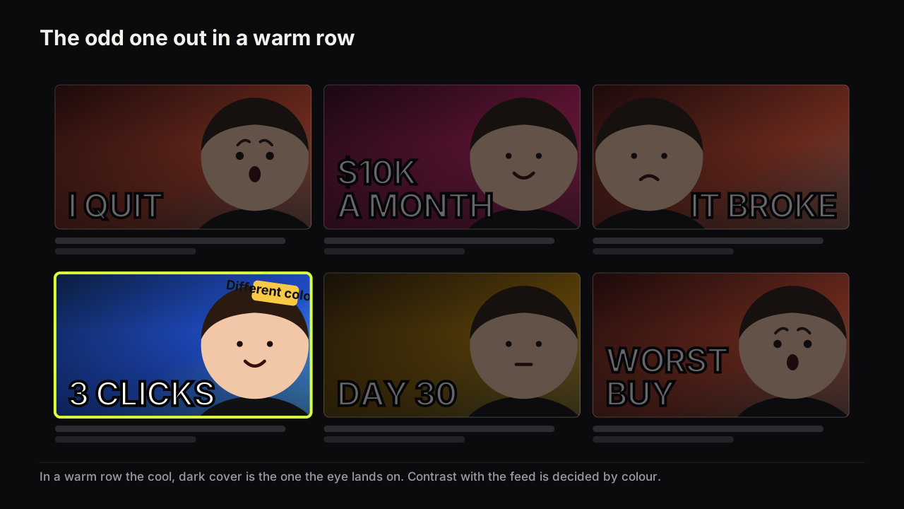
Ten niches in one table, the layout, expression, colour and object each audience reads, what fails in each row, and how to find your baseline and break it.
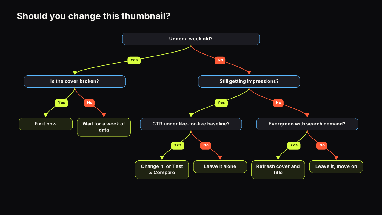
Change a thumbnail when the video still gets impressions and its CTR sits below a like-for-like baseline, or the cover is broken. The full decision tree.
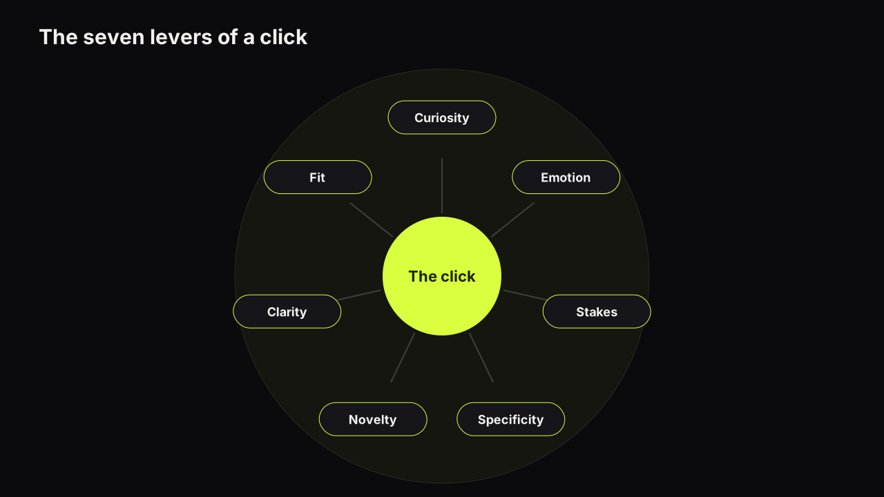
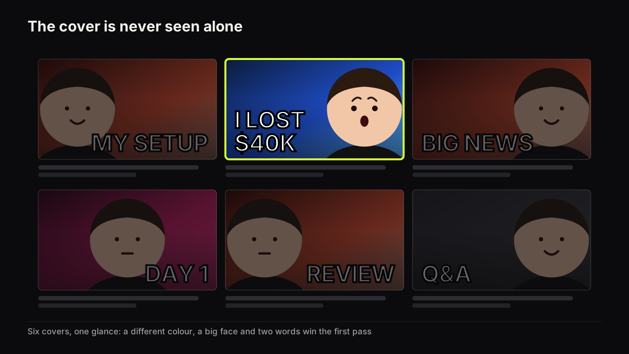
People click a thumbnail when it wins a glance against its neighbours, raises a question the title does not answer, and looks like a promise the video can keep.
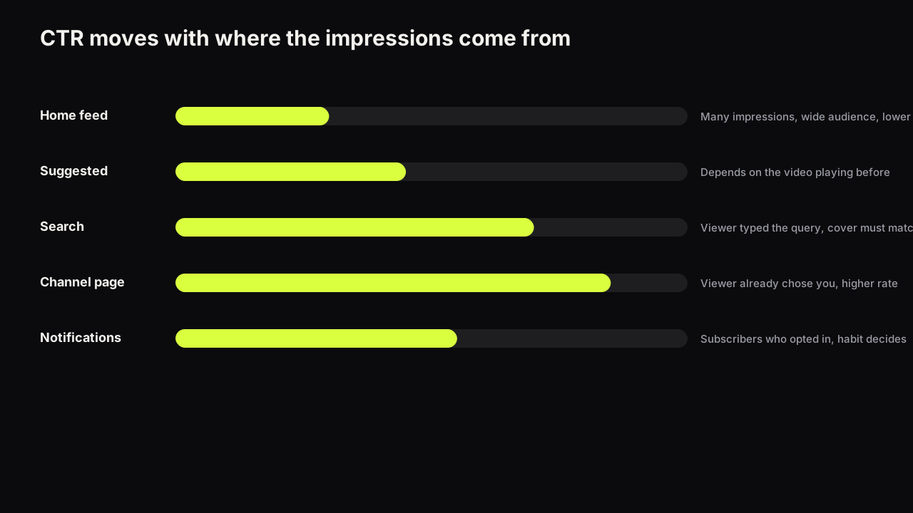
YouTube says half of channels and videos sit between 2% and 10% CTR. What the number measures, why niche benchmarks mislead, and how to build your own baseline.
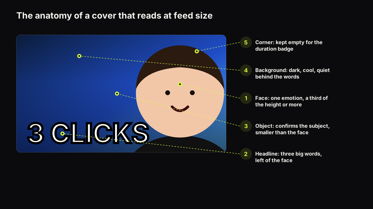
What a YouTube thumbnail has to do in the feed, the five parts of a cover, the eye path, the three rules, and the process from idea to test.
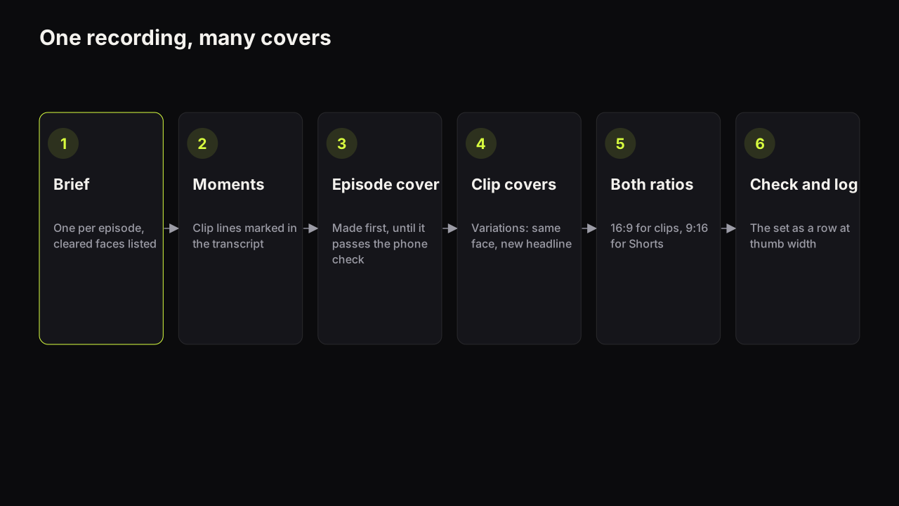
Episode covers, clip covers and show art do different jobs. A batch workflow for producing many covers from one recording, with guest consent built in.
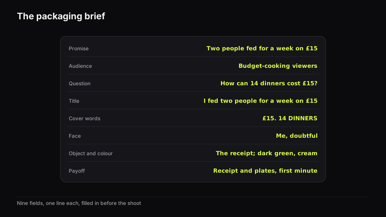
A nine-field packaging brief you can copy and fill in before you film, with a worked example and the render prompt the finished brief turns into.
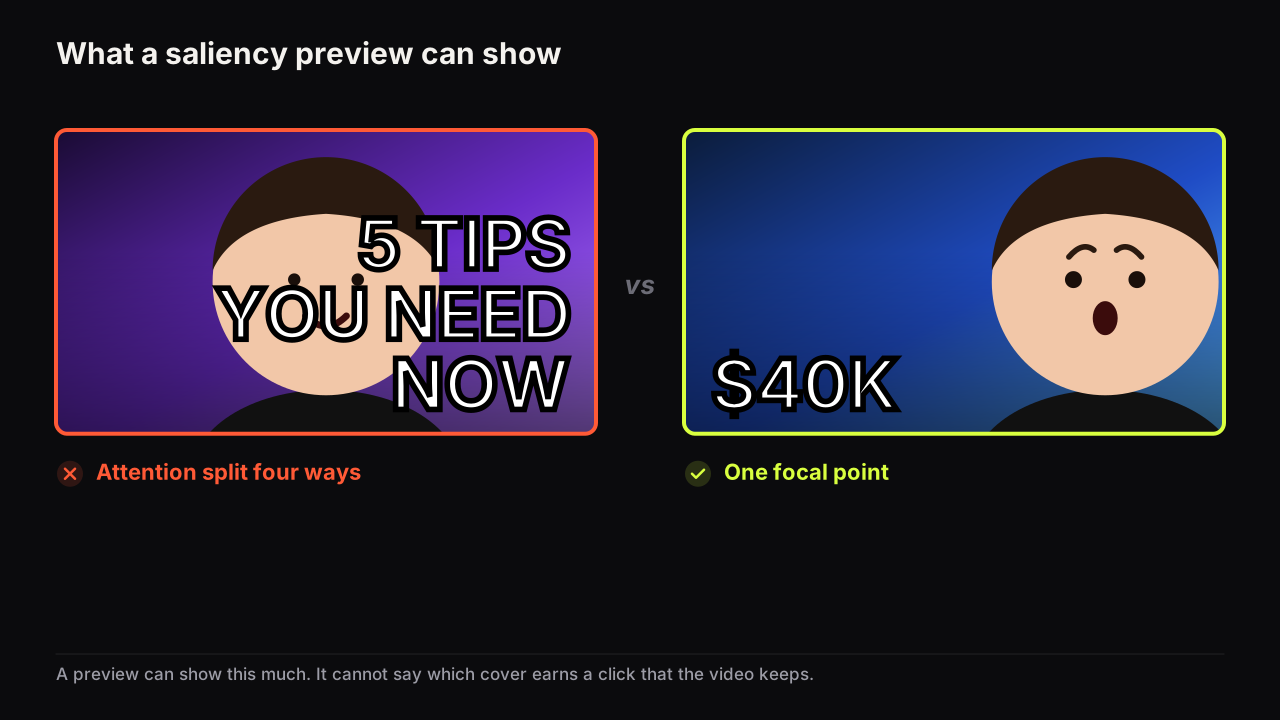
Thumbnail heatmaps predict where eyes might land on a generic image; they do not measure clicks or CTR. What a preview is good for, and what only a test shows.
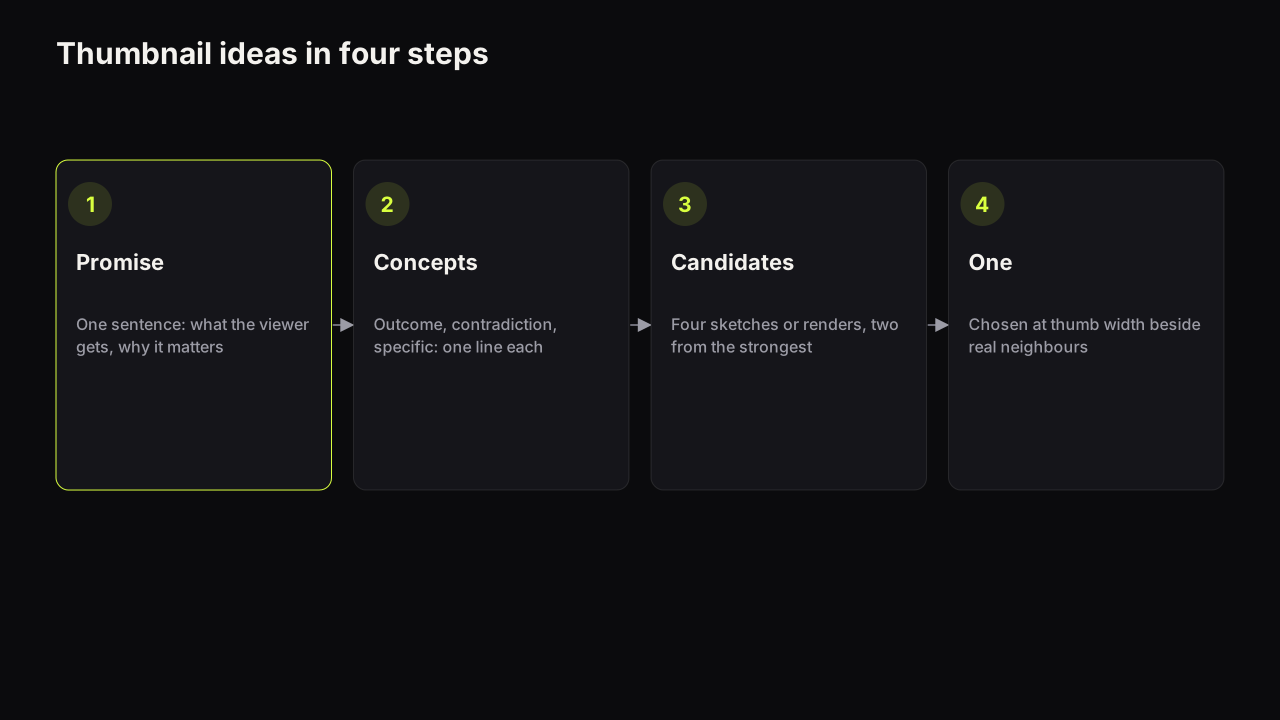
A four-step method for thumbnail ideas: write the promise, turn it into three concept types, sketch four candidates, choose one at thumb width.
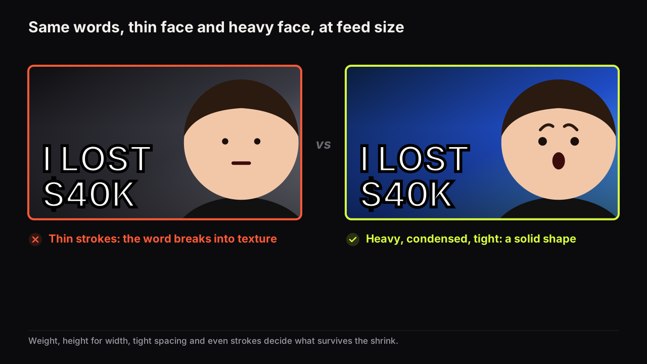
The best thumbnail fonts are heavy, tightly spaced and free of thin strokes. Eight open-licence faces shown at three sizes, plus the outline and shadow rules.
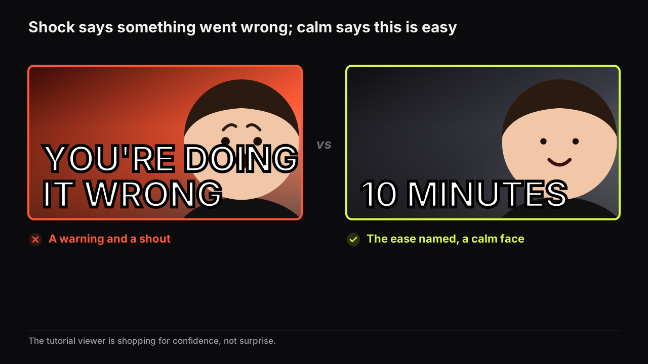
A tutorial cover promises that this is easy and you can do it. Why calm beats shock, the result as hero, words that name the outcome, and a consistent series.
YouTube titles are limited to 100 characters. Display can cut them shorter, and viewers read only the first words. How to write for all three limits at once.
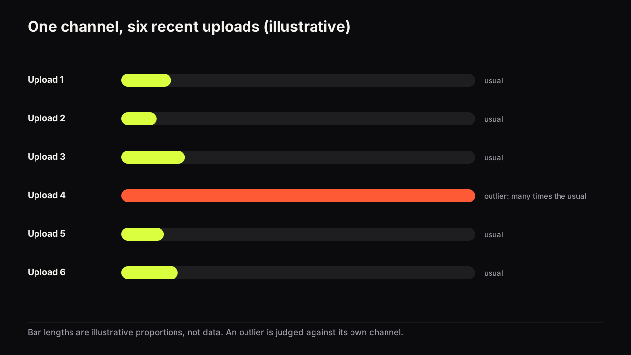
An outlier video is one whose views far exceed its channel's usual. Why the baseline, window and age adjustment change the score, and how to find them by hand.
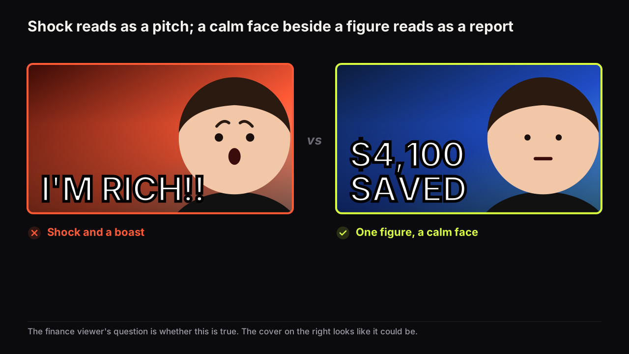
Finance covers work when one number carries the promise and the face carries doubt, not shock. Five patterns, the trust signals, and where the policy line sits.
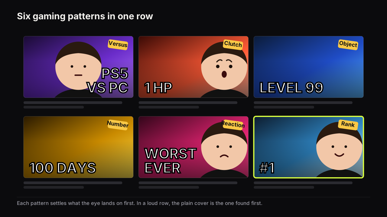
Six gaming thumbnail patterns (versus, clutch moment, character as object, saturation, reaction, number): when each fits, how each breaks, with mock examples.
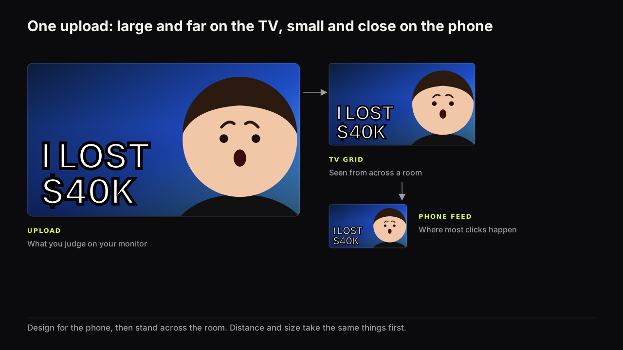
On a TV the cover is large but far away, in a grid, steered by a remote. What changes (fewer words, bigger face, no thin strokes), what does not, how to check.
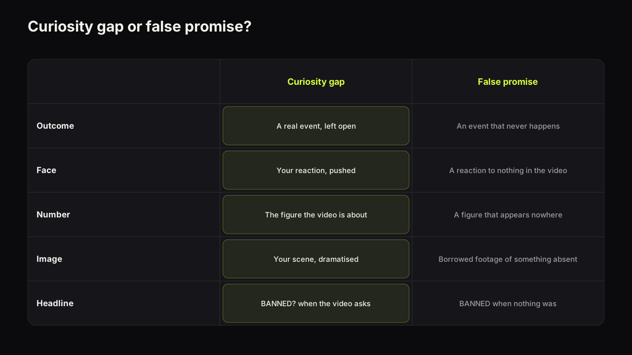
YouTube removes thumbnails that break Community Guidelines and treats packaging that promises absent content as deceptive. The mistakes, the line, and the fix.
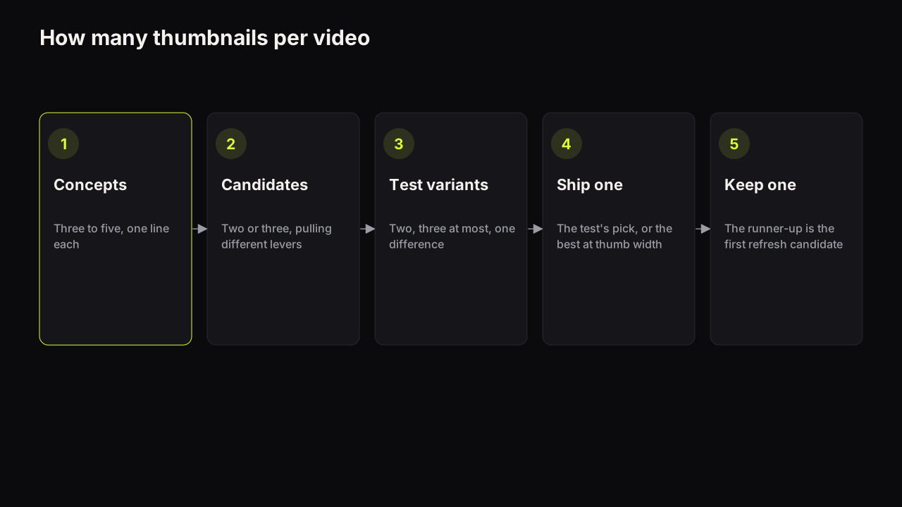
Make three to five concepts, two or three candidates, up to three test variants and ship one. The numbers by channel stage, and why more is not better.
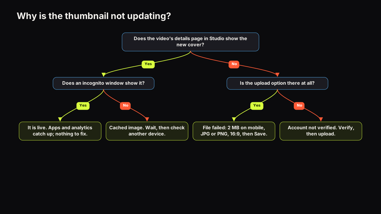
A thumbnail that will not update is usually a cached image, a rejected file or an unverified account. The causes in order of likelihood, how to check, the fix.
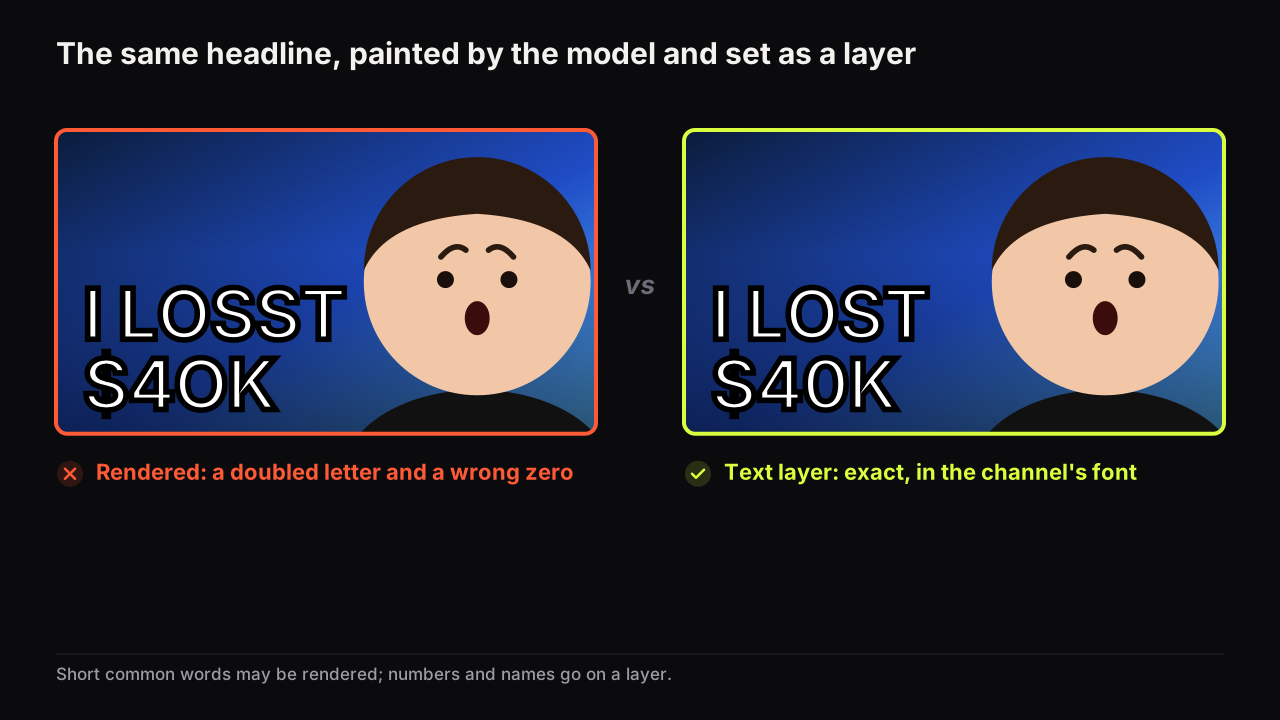
Image generators paint letters as shapes, so they misspell. Keep rendered words short, put exact text on a layer, and read every letter at full size.
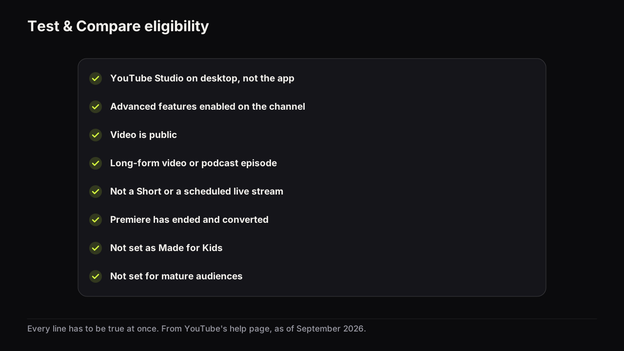
Test & Compare is missing because the video or channel fails one of YouTube's rules. Every rule in one checklist, the order to check, and what to do instead.
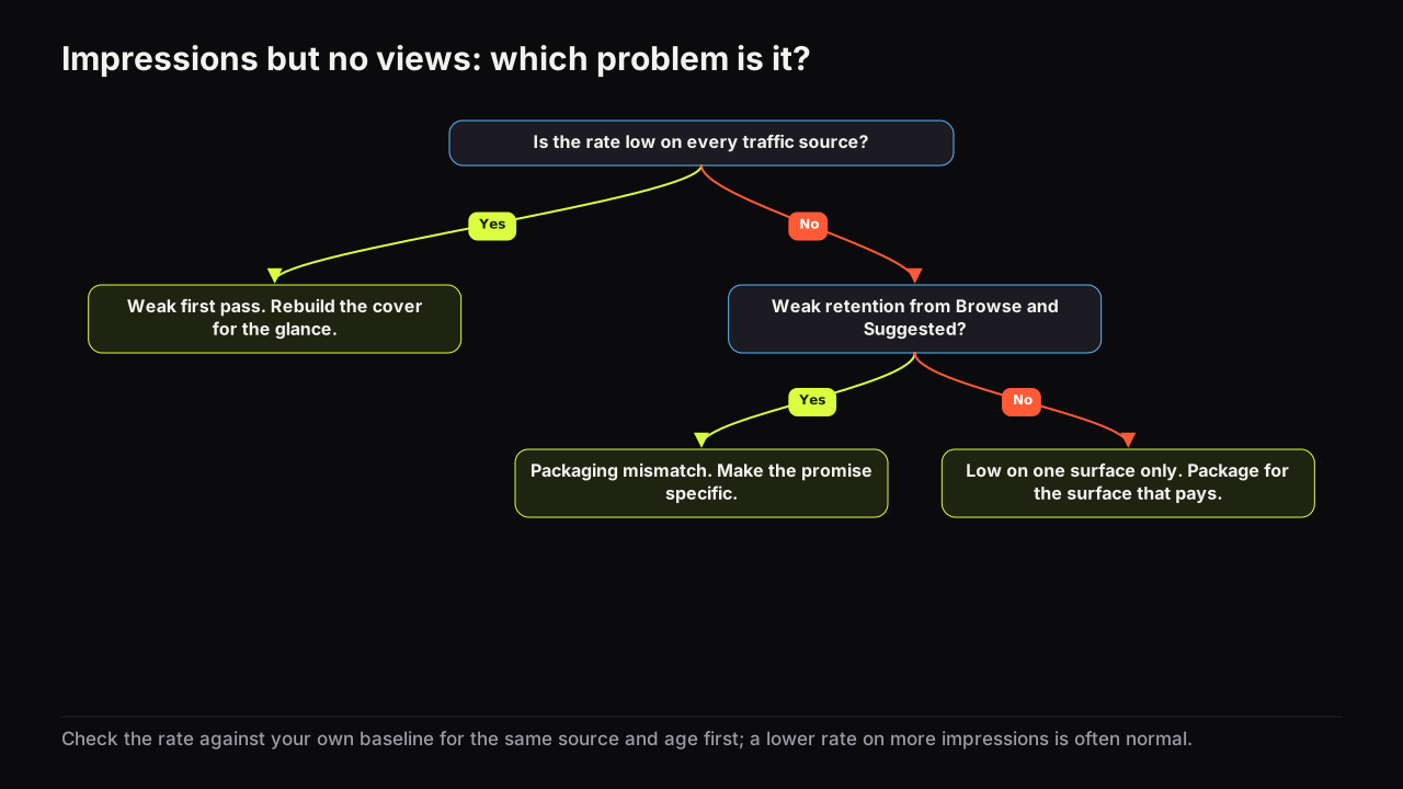
Impressions with few views means YouTube showed the cover and viewers did not choose it. The three causes, how to spot each in Analytics, what to change first.
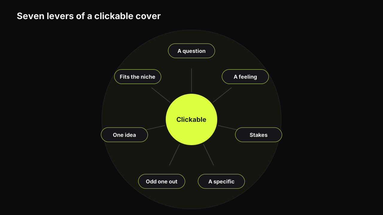
A thumbnail is clickable when it is seen before it is read, raises a question the title does not answer, and looks like a promise the video keeps. Seven levers.
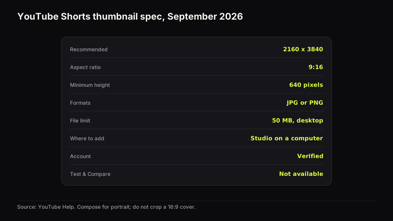
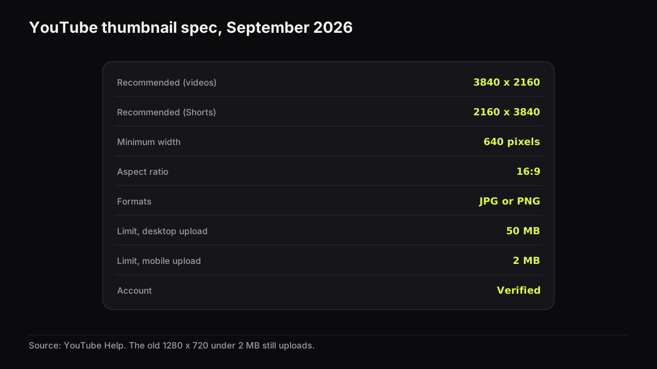
Shorts thumbnails are 2160 x 3840 at 9:16, added from YouTube Studio on a computer, and cannot be A/B tested. The spec, the steps, and composing for portrait.
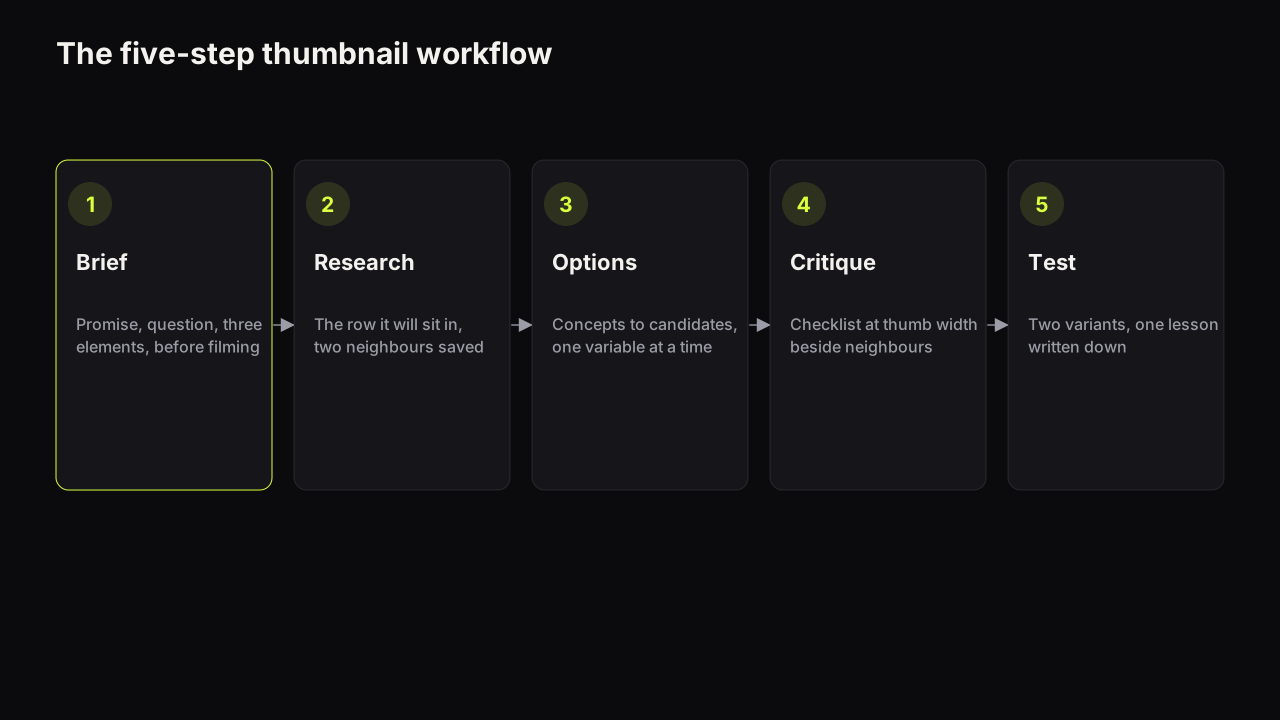
A five-step thumbnail workflow (brief, research, options, critique, test, record) that separates concepts from candidates, test variants and the one you ship.
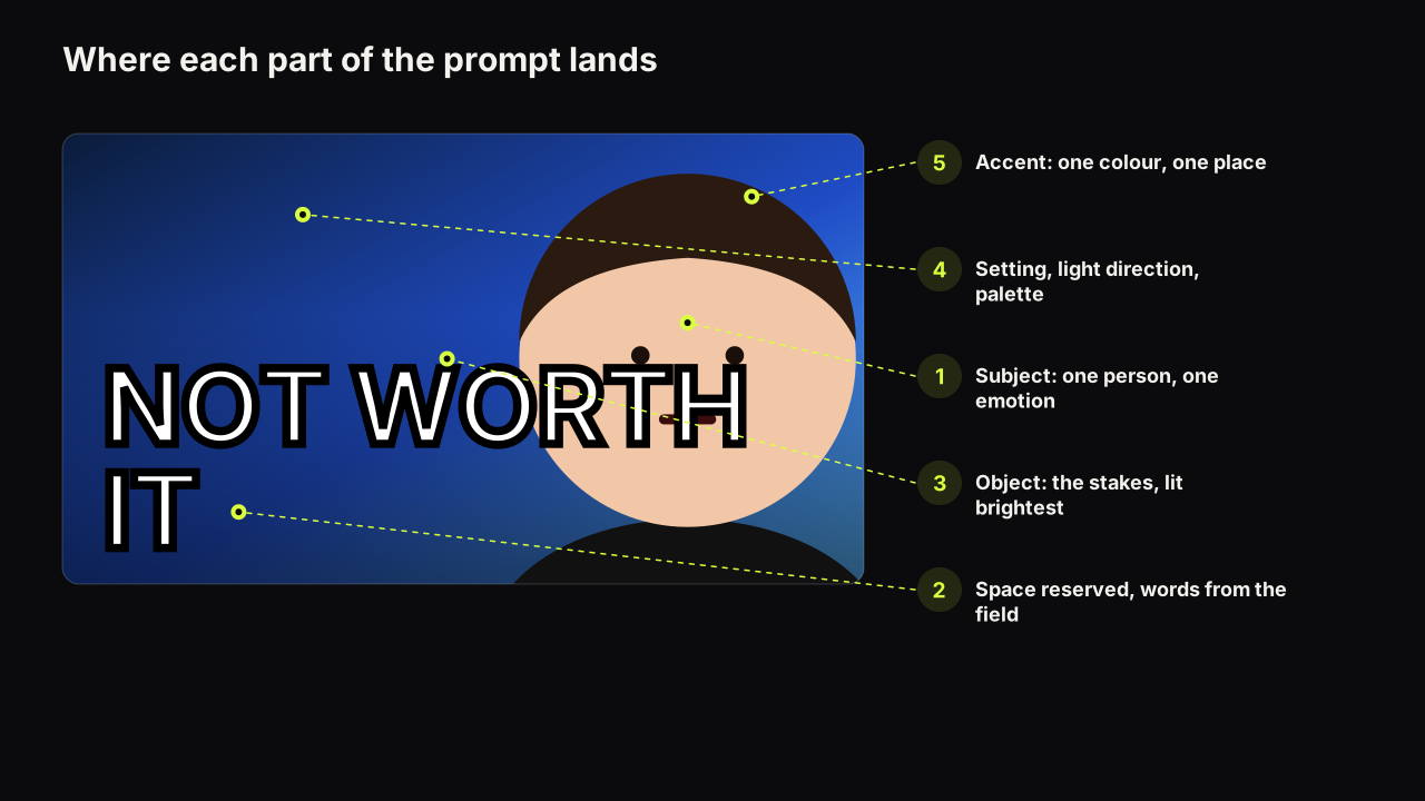
A brief structure for thumbnail prompts (subject, emotion, setting, light, palette, space for words) with one worked prompt for each of eight styles.
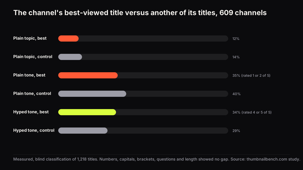
We compared 609 channels' best-viewed titles with another title from the same channel. No format wins. A title that only names the topic loses, by a little.
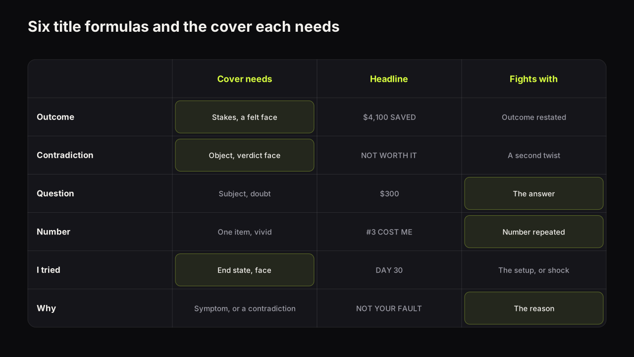
Six YouTube title formulas (outcome, contradiction, question, number, I tried, why), the cover pattern each one needs, and the cover pattern each one fights.
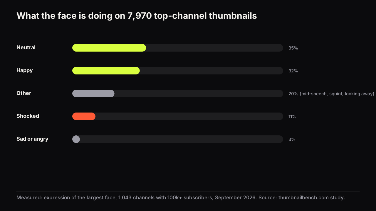
11,223 thumbnails from 1,043 channels with 100k+ subscribers, 11 niches. Faces, expressions, words, title repeats, and what big channels do differently.
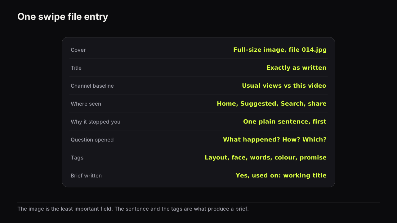
A swipe file is only useful if each entry can become a brief. What to capture, how to tag it, and a weekly review that turns saved covers into packaging.
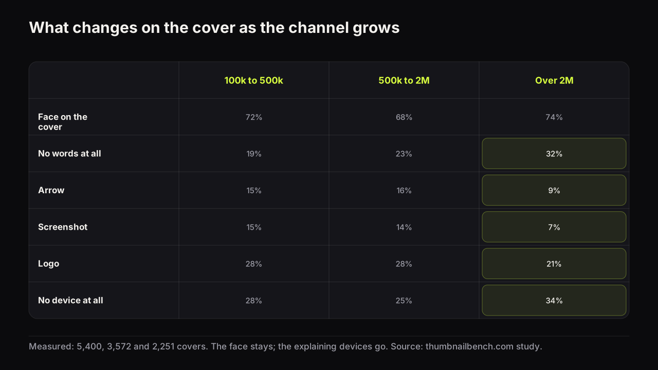
Channels over 2 million subscribers put text on fewer covers and use half the arrows and screenshots. The numbers from 11,223 covers, band by band.
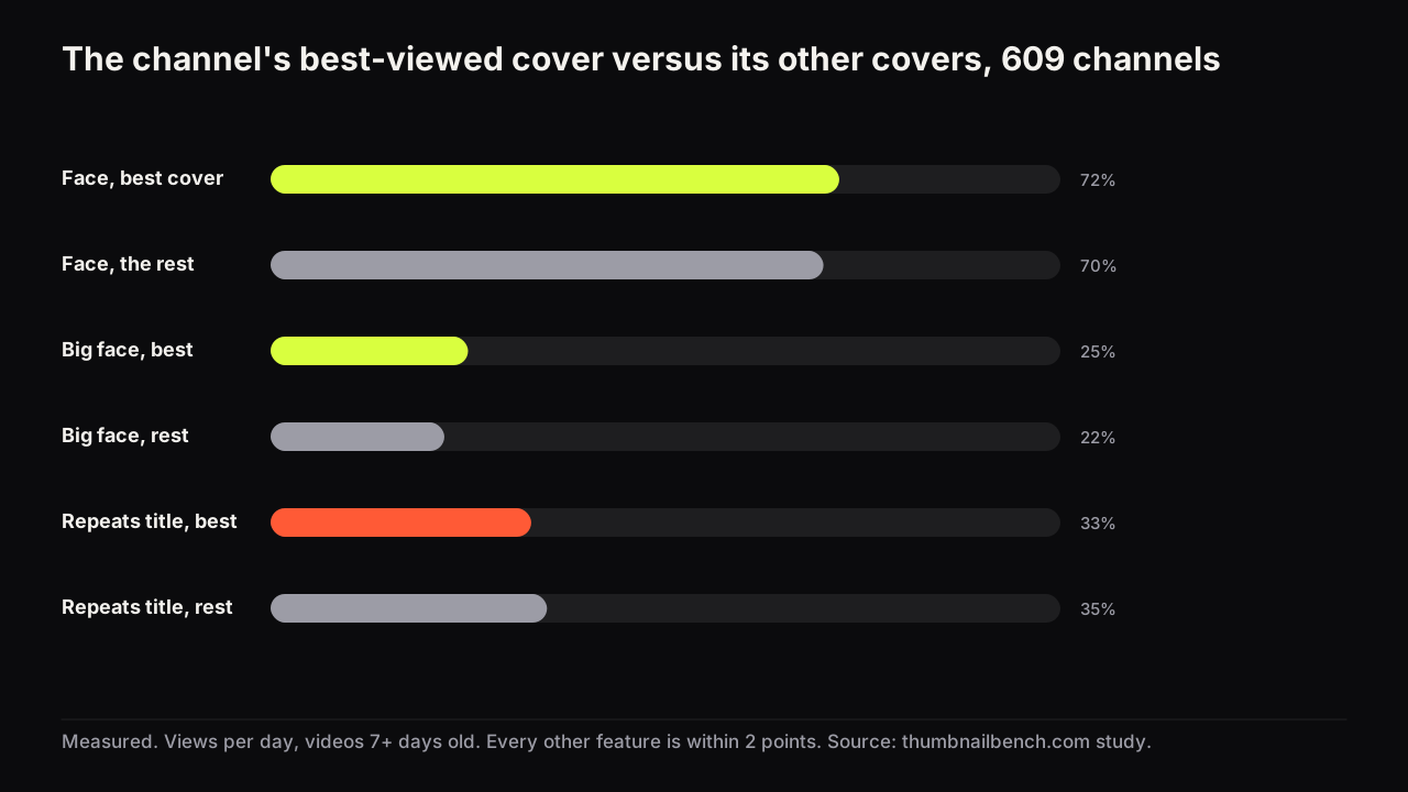
Each channel's best-viewed cover against its other covers on 24 features. A face is on the winner 2 points more often. The rest is noise.
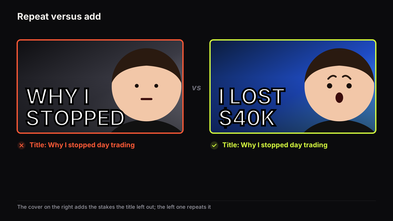
No. Thumbnail text should add what the title leaves out: a detail, the stakes or the contradiction. When repeating is fine, and three ways to split the job.
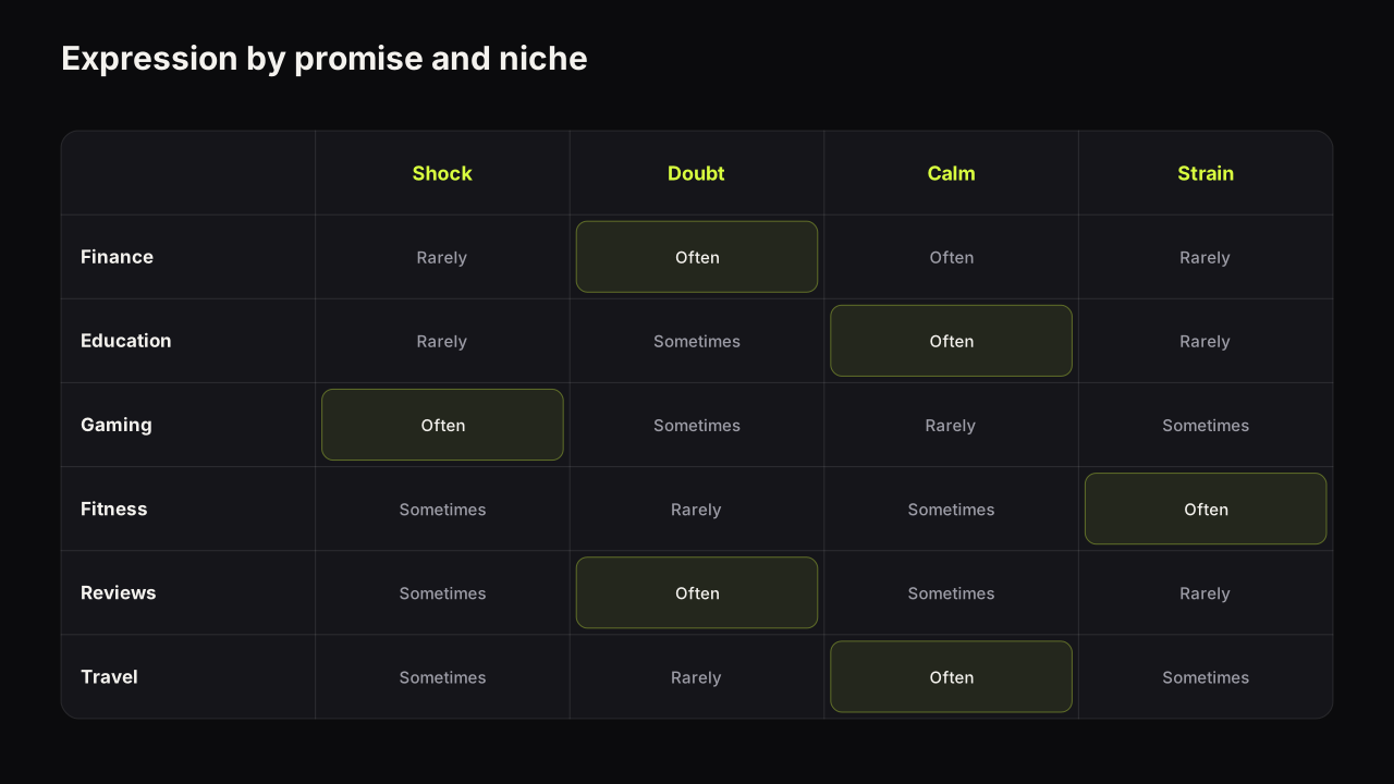
The expression on a thumbnail is information, not decoration. Which emotion fits which promise, why the shocked face wears out, and where the eyes should look.
Small channels can test thumbnails by running fewer, bolder tests and comparing one packaging idea across several uploads instead of two pictures on one video.
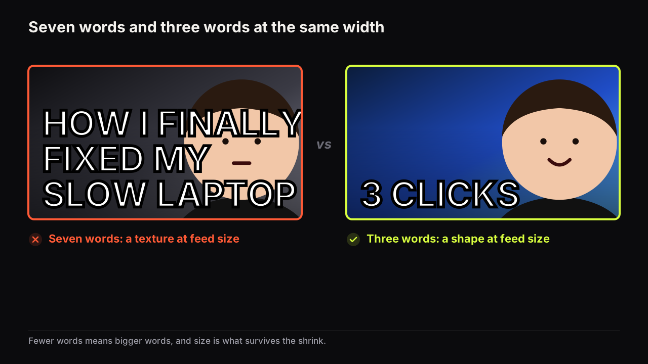
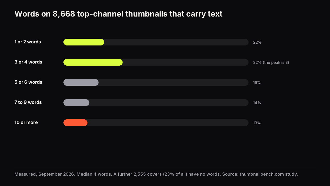
Three big words or fewer, up to five if two are small. Why the limit is about size rather than reading, what the words are for, and when zero words is right.
The median top-channel thumbnail has 4 words. A quarter of covers have none, one in eight has ten or more. The full distribution by niche and channel size.
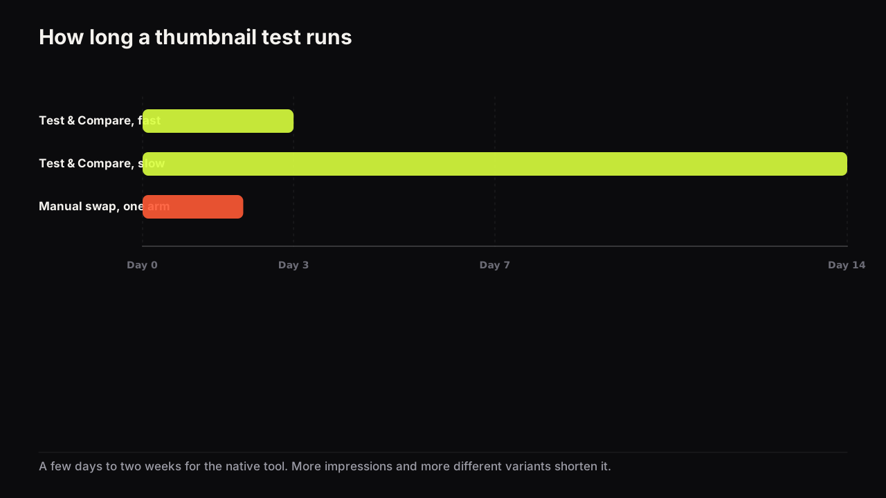
YouTube says a Test & Compare run takes a few days to two weeks and resolves faster with more different variants. Manual swaps need 24 to 48 hours per cover.
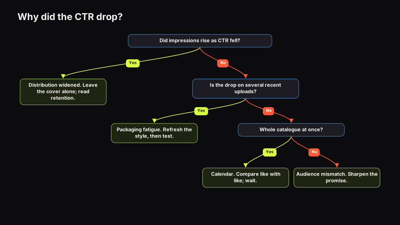
A falling YouTube CTR usually means wider distribution, not a worse thumbnail. The four causes, how to tell them apart in Analytics, and what to change.
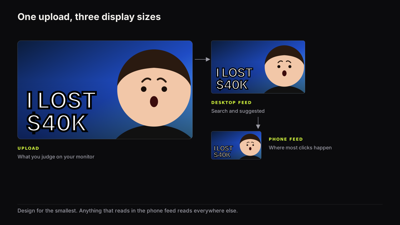
One file is shown at many sizes you do not control. Design for the smallest, check on a phone before upload, and know what breaks first when a cover shrinks.
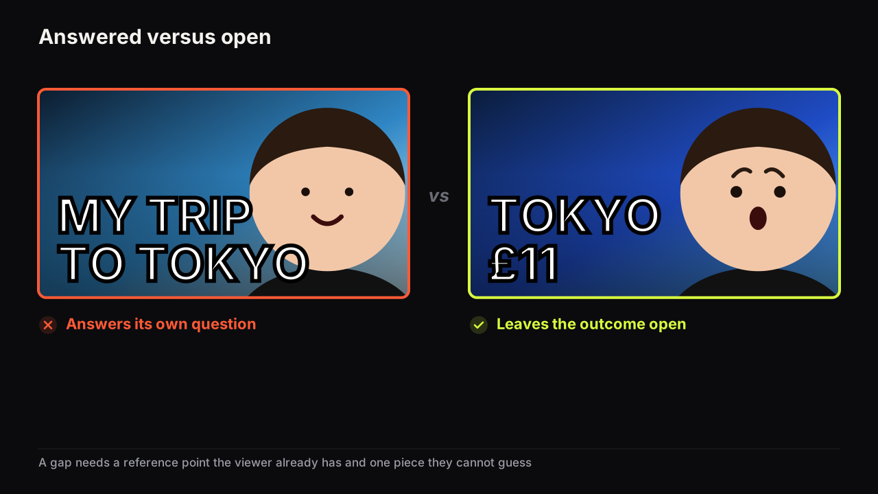
A curiosity gap is the distance between what a viewer knows and what they want to know. How to open one on a thumbnail, and why the video has to close it.
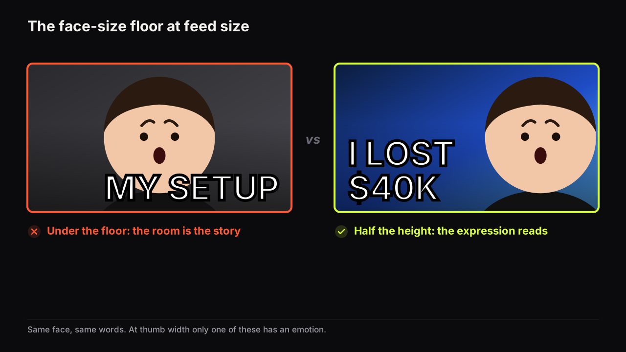
A face should fill at least a third of the cover's height, and half is better. Why the floor exists, where the face goes, and when a face is the wrong choice.
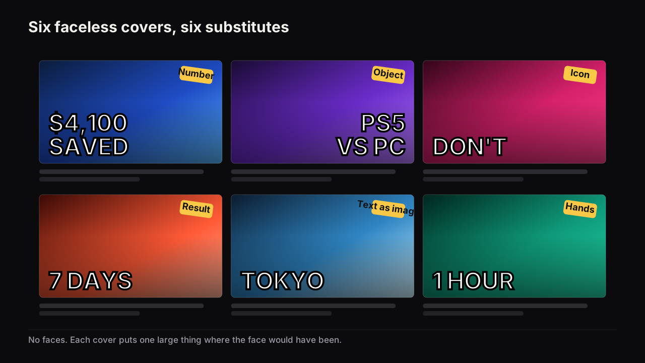
Six things that do a face's job on a faceless channel, what each carries, the honest cost of removing the face, and why contrast and simplicity have to rise.
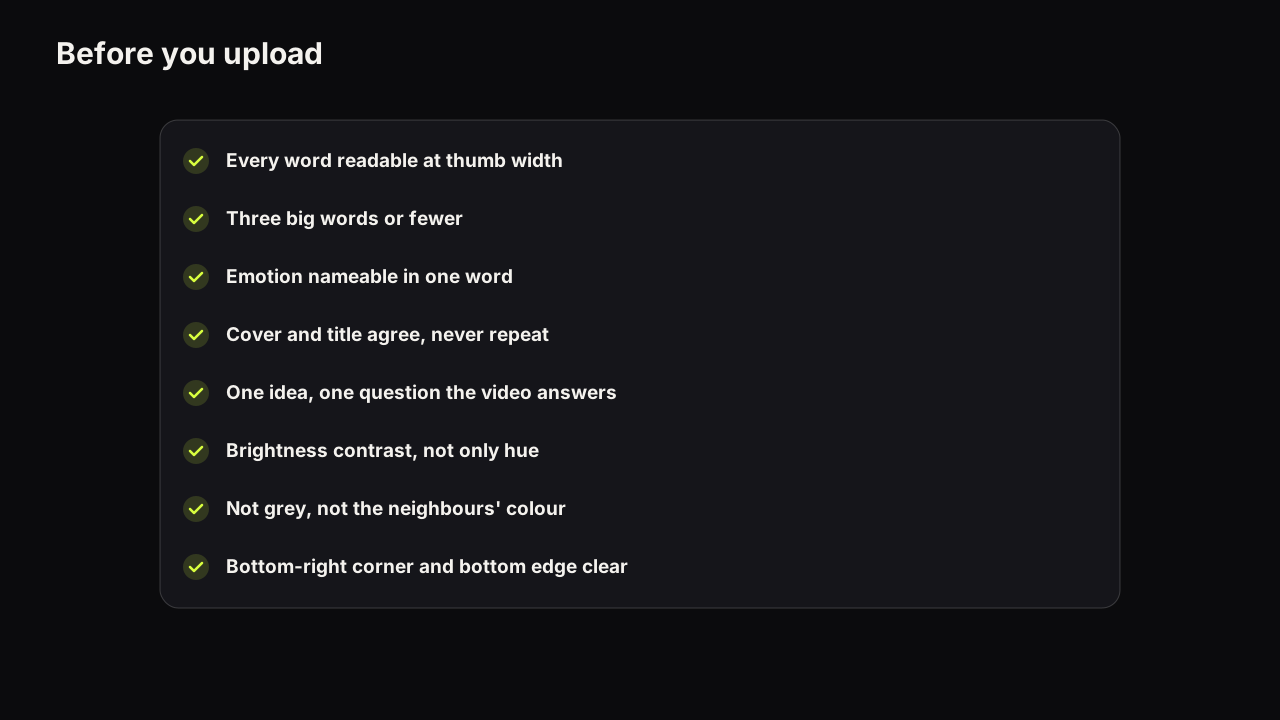
Twelve checks to run on a YouTube thumbnail before you upload, grouped as Read, Promise, Feed and Spec, each with the reason, a one-minute test and the fix.
The best colours for a thumbnail stay apart on a dim phone: one dominant, one accent, far apart in brightness, and different from the feed around them.
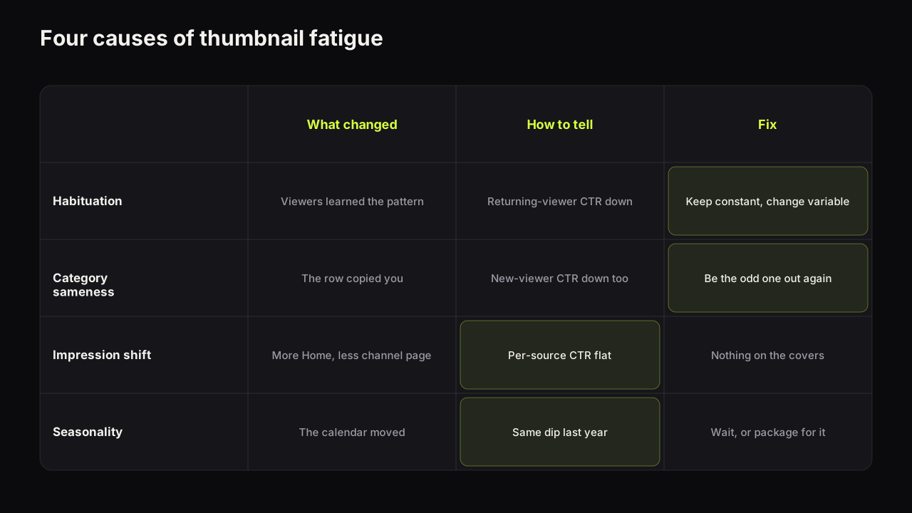
Thumbnail fatigue is four different problems (habituation, category sameness, an impression-mix shift, seasonality) with four fixes. How to tell them apart.
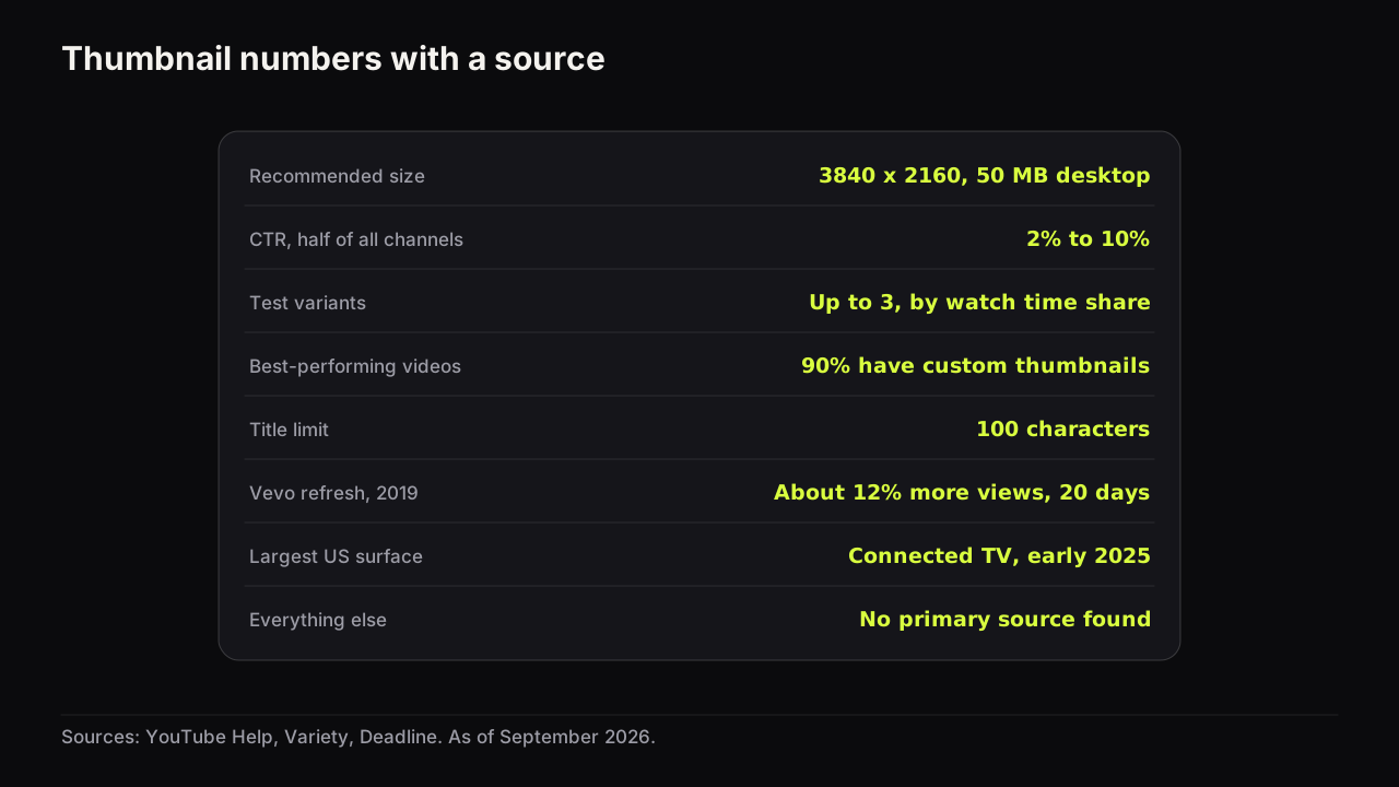
Seven thumbnail statistics have a primary source. The rest of the numbers that circulate do not. What each source actually says, and how to read a claim.
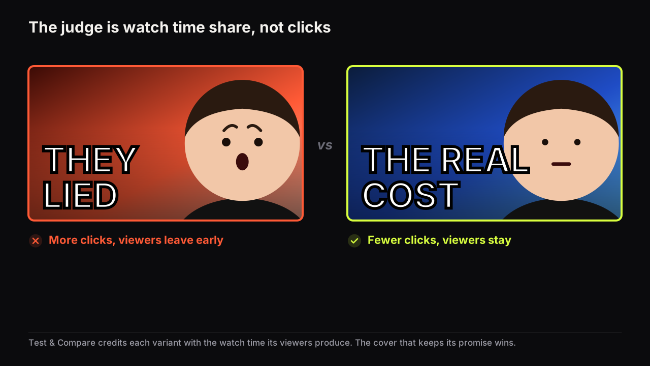
Test & Compare picks the winner by watch time share, not clicks. A worked example, what each result state means, and why a higher-CTR cover can lose.
YouTube recommends 3840 x 2160 thumbnails at 16:9, JPG or PNG, up to 50 MB from desktop or 2 MB from mobile. The full spec, what changed, and how to export.
Nothing matches that. Try a broader word, or tell us what you were looking for.