Thumbnail design principles: hierarchy, contrast, simplicity, readability
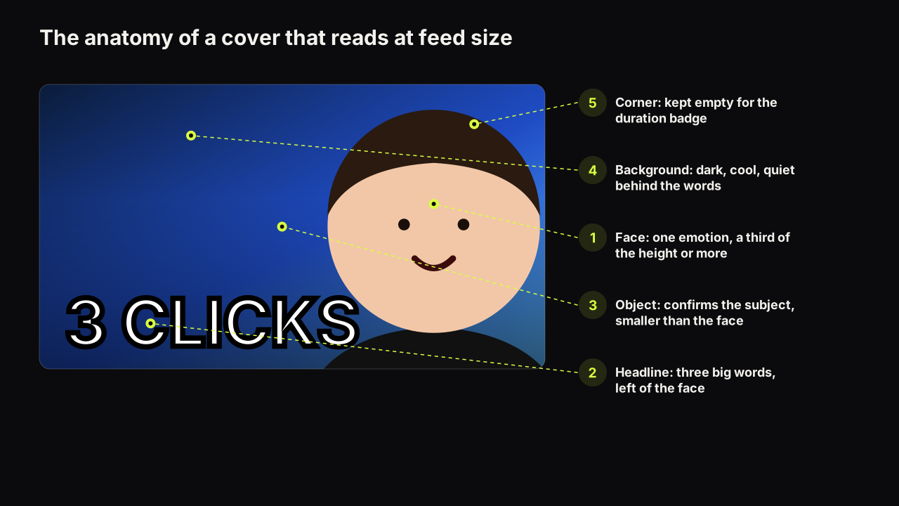
The four principles behind every thumbnail that reads at feed size, the layouts that apply them, and a before-and-after critique you can repeat yourself.
Faces, text, colour, contrast, composition and mobile readability. The craft of a cover that reads in a glance at feed size.
9 articles
The four principles behind every thumbnail that reads at feed size, the layouts that apply them, and a before-and-after critique you can repeat yourself.
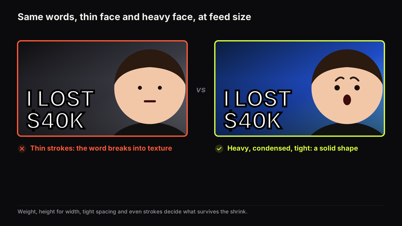
The best thumbnail fonts are heavy, tightly spaced and free of thin strokes. Eight open-licence faces shown at three sizes, plus the outline and shadow rules.
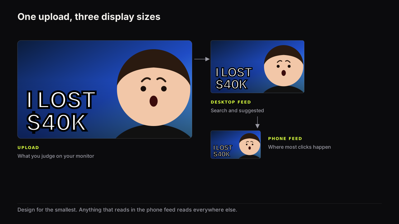
One file is shown at many sizes you do not control. Design for the smallest, check on a phone before upload, and know what breaks first when a cover shrinks.
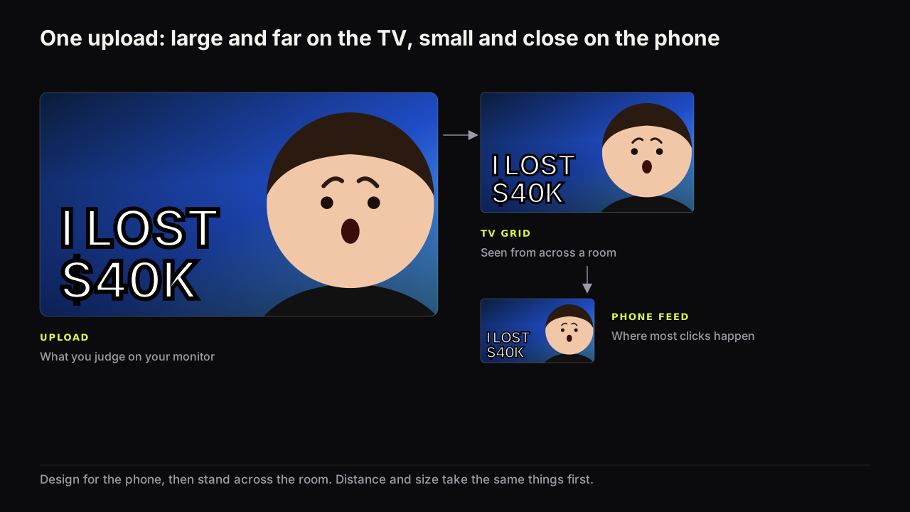
On a TV the cover is large but far away, in a grid, steered by a remote. What changes (fewer words, bigger face, no thin strokes), what does not, how to check.
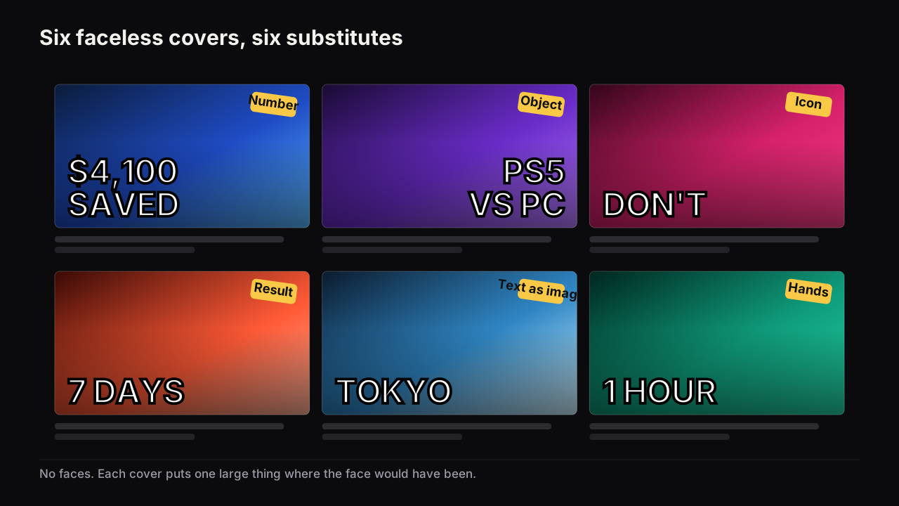
Six things that do a face's job on a faceless channel, what each carries, the honest cost of removing the face, and why contrast and simplicity have to rise.
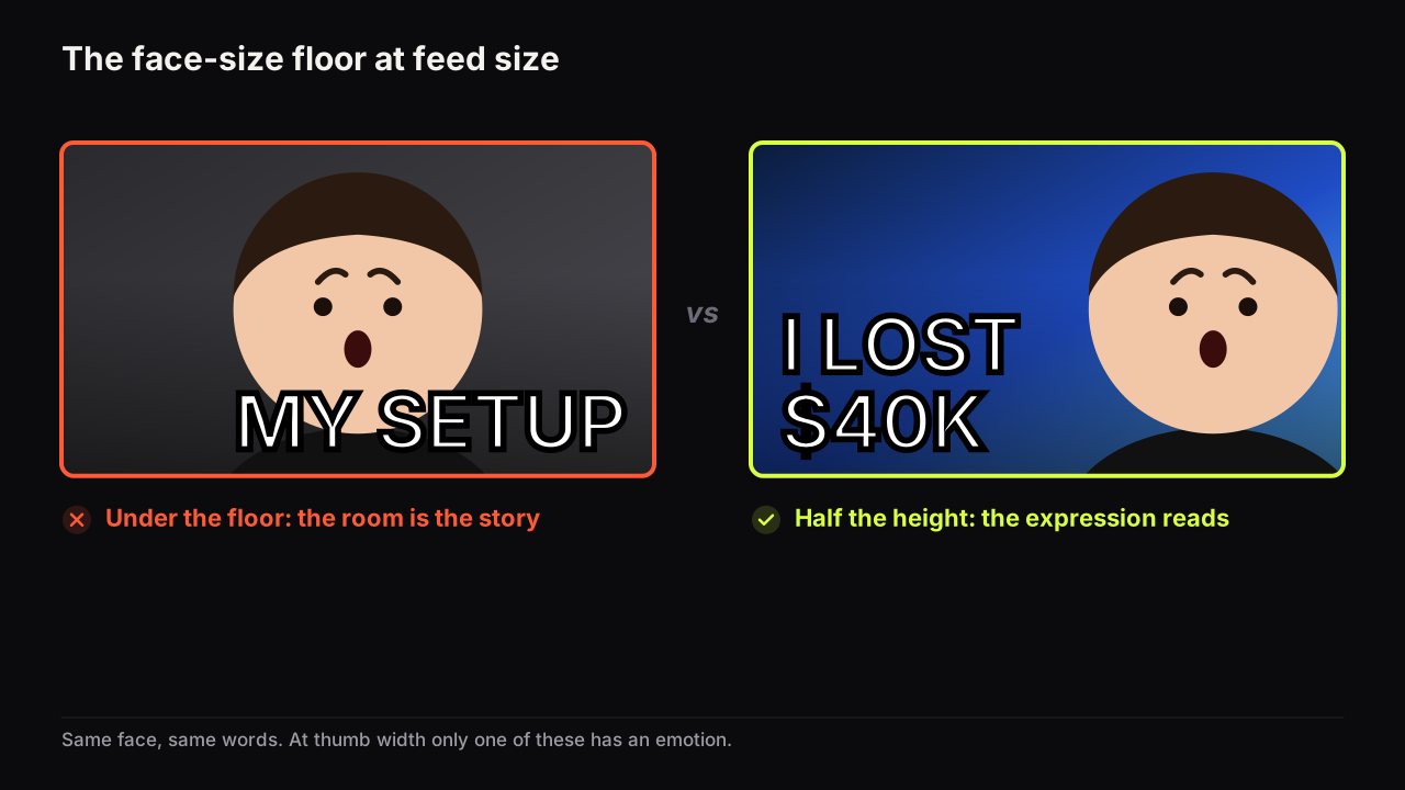
A face should fill at least a third of the cover's height, and half is better. Why the floor exists, where the face goes, and when a face is the wrong choice.
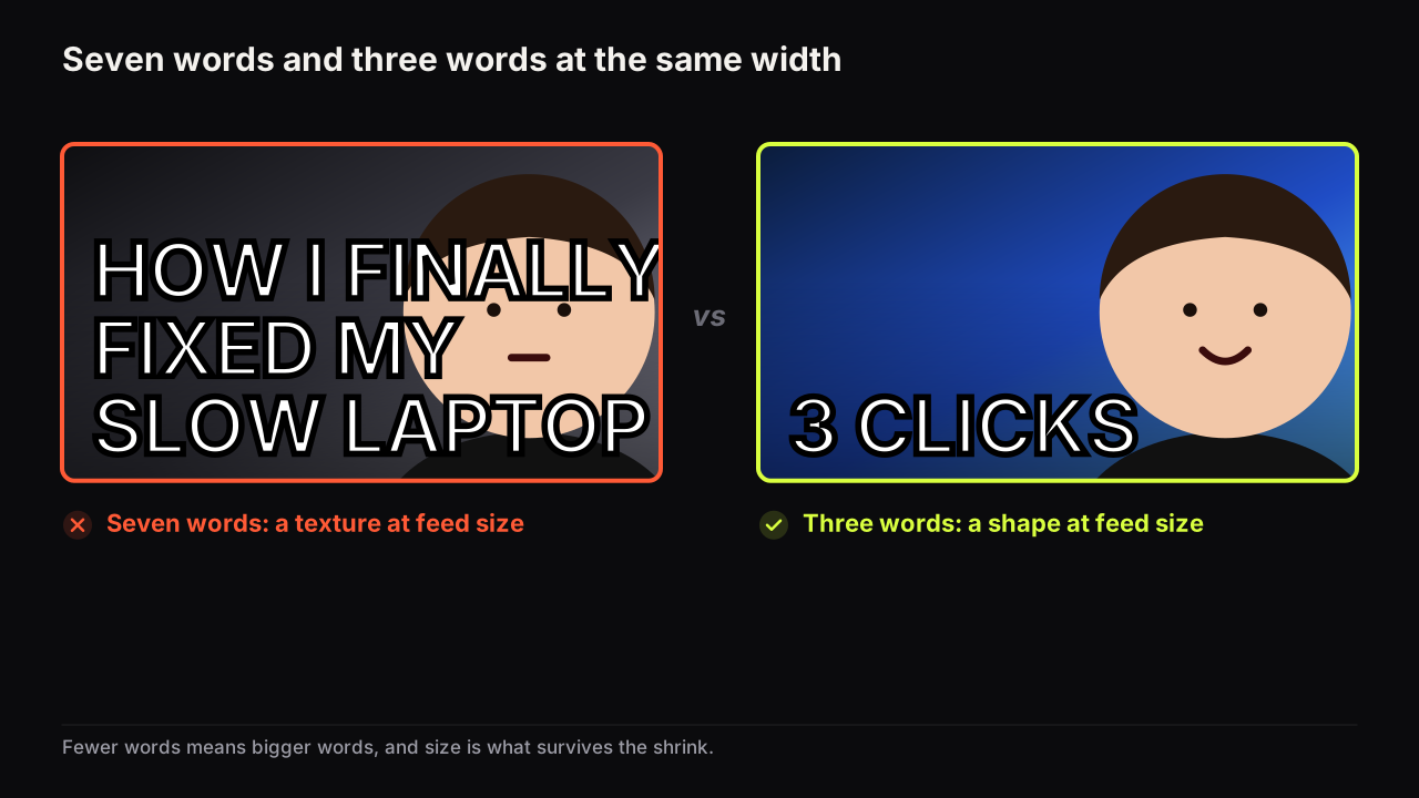
Three big words or fewer, up to five if two are small. Why the limit is about size rather than reading, what the words are for, and when zero words is right.
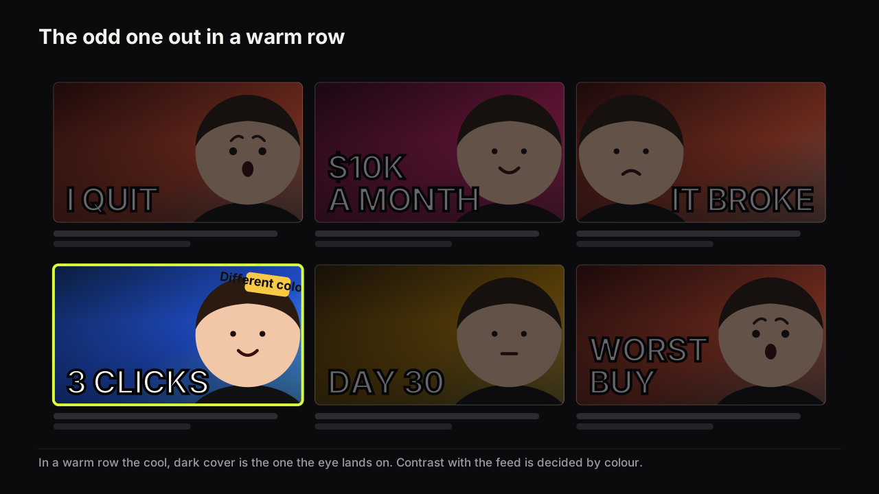
The best colours for a thumbnail stay apart on a dim phone: one dominant, one accent, far apart in brightness, and different from the feed around them.
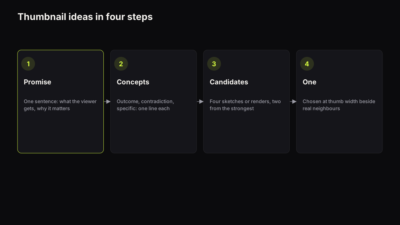
A four-step method for thumbnail ideas: write the promise, turn it into three concept types, sketch four candidates, choose one at thumb width.
4 free credits, 4 more after your first render. No card. Your first options in about a minute.