On this page
Image generators misspell because they paint letters as shapes rather than writing them as text, and the fix is a workflow rather than a cleverer prompt: keep model-rendered words to a short, common headline; put anything that must be exact (a number, a name, a long or unusual word) on a real text layer over the image; read every letter at full size before upload; and leave words out of the render entirely when the picture can carry the promise alone. The rest of this piece is that workflow, step by step, with the reason the failure happens first because it decides which words go where.
Why generators misspell
In general terms, an image model learns what writing looks like from the pictures it was trained on, in the same way it learns what a face or a kitchen looks like. It reproduces the appearance of text, letterforms in a style and a layout, without a dependable model of spelling underneath. Short, common words in capitals appear so often in training images that the model tends to get them right. Long words, unusual words, names and specific numbers are combinations it has seen rarely or never, and it produces something letter-shaped in their place. Models vary, and newer ones do better, but the tendency is a property of how they work rather than a bug in one product.
Three consequences follow, and they explain most of what you see. The failure is not random: common short words survive and everything else is at risk, which is why "DAY 30" renders and "ANNIVERSARY" does not. The model adds text where it expects text (a screen, a sign, a label, a book spine, a T-shirt) and fills it with marks that read as writing from a distance and as nothing up close. And the errors are small. A doubled letter, a mirrored character, an extra stroke on a K: invisible at feed size, which is why they get uploaded. The guide to how AI thumbnail generators work and where they fail lists text among the four reliable failure points; this article is the fix for that one.
The two paths for words on an AI thumbnail
There are two ways to get words onto a generated cover, and most bad results come from using the first path for a job that needed the second.
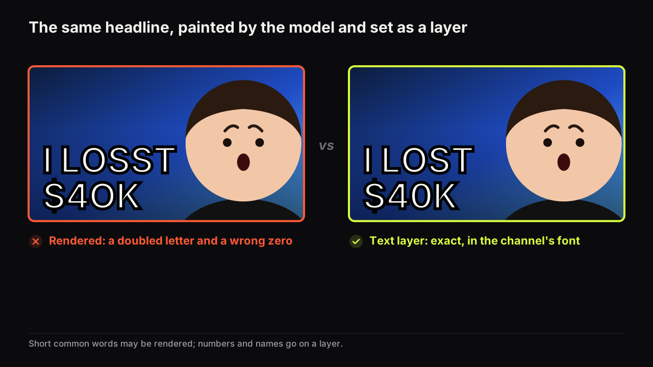
| Path 1: model-rendered headline | Path 2: text layer over the image | |
|---|---|---|
| How it works | The words are painted into the scene by the model | Real text set in a font on top of the finished image |
| Looks like | Part of the picture: shares its light, angle and texture | A graphic element; crisp, flat, deliberate |
| Spelling | Usually right for short common words; not dependable | Exact, every time |
| Best for | One to three common words in capitals, a rough first pass | Numbers, names, long words, the small second tier, brand consistency |
| Font control | None; the model picks a style | Full: face, size, fill, outline, shadow |
| Cost of a fix | A re-render or a region edit | Retype it |
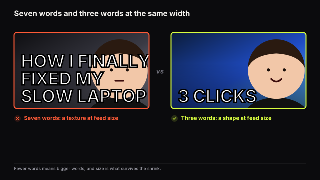
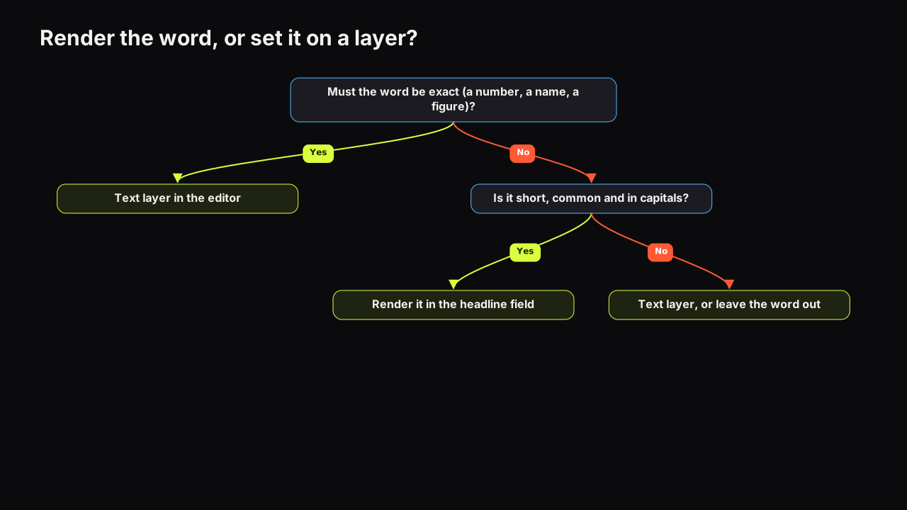
Path 1 suits the big, short headline when the integrated look matters and the words are ones the model has seen countless times: I LOST, DAY 30, VS, NOT WORTH IT. On the bench, the "Words on it" field takes up to 80 characters and the model renders them into the image; the working limit is still three big words, for the reasons in how many words a cover can carry, and three short capitals are also the words the model spells best.
Path 2 suits anything that must be exact. A dollar figure, a place name, a product name, a percentage, a date, any word longer than a short common one, and any small second line. In the editor text layers are free and unlimited, set in one of eight heavy display faces with size, fill, outline, rotate, shadow and all-caps controls. The guide to which fonts survive feed size covers choosing between them; for this purpose the point is that a layer spells what you typed.
Take a hypothetical cover for a video about restoring an old hatchback. The creator sits in the driver's seat with a doubtful face, the rusty bonnet fills the right half, and the whole headline goes into the render: "RESTORING MY 1987 COROLLA". What comes back, say, is "RESTORRING", a year that reads as 1937, and a badge on the bonnet carrying four letters the model invented. Split the job instead. The render carries "WORTH IT?" in two big words, which it will spell. "1987 COROLLA" goes on a layer in the corner in the channel's font, and the prompt asks for a bonnet with no badge. The viewer infers a verdict video about one specific car, and every letter is right.
Use the rendered headline for the one to three big common words, and a text layer for everything else. When you are not sure which path a word needs, it needs a layer. The cost of a layer is thirty seconds; the cost of a misspelt render is a cover you have to replace after it has already been seen.
When to leave text out of the render entirely
The strongest fix for misspelt text is to give the model no text to misspell. Two situations call for it.
The picture carries the promise. A verdict face beside a product, a before-and-after pair, a face lit by something out of frame. If the words would only caption what is visible, they are a fourth element as well as a spelling risk, and the case for zero words is made in the three-words guide linked above. The title still does its job underneath, and the relationship between the two is the subject of whether cover text should repeat the title.
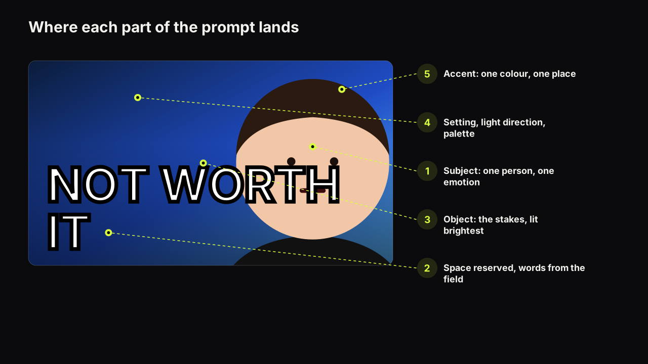
You will add the words on a layer anyway. Render the scene with no text at all, reserving an empty area for the words, and set the headline as a layer afterwards. This is the cleanest workflow for a channel that wants one font on every cover: the picture changes, the typography does not. We would take this route for the big headline too on any channel uploading weekly, even though a layered word loses the painted-in look that makes a rendered headline feel part of the scene, because the font becomes the channel's signature in the feed and the spelling check stops being a step at all. The prompt should say where the empty area is and what is in it (nothing), and should say "no text, no signs, no logos" in so many words. How to reserve space and what to exclude are two of the six parts in the guide to writing a thumbnail prompt.
Screens deserve their own rule. If the scene has a monitor, a phone or a TV, ask for it blank ("a plain bright white rectangle with no readable content"). A screen with content is garbled text, and it is the first thing a viewer notices at full size.
The check: read every letter at full size
The check is dull. It is also the step people skip. Errors that are invisible in the feed are visible on the watch page, in search results on a large screen and on a TV, and a misspelt cover reads as carelessness on exactly the surfaces where the viewer has time to look.
- Open the render at full size, not in the tool's preview grid. Zoom until one word fills the screen.
- Read each word letter by letter, out loud, pointing. Reading a word normally lets the eye correct it; reading it as letters does not.
- Look for the five common faults: a doubled or missing letter, a mirrored or rotated character, an extra stroke that turns one letter into another, a word broken across a shape, and letter-shaped marks anywhere you did not ask for text (screens, signs, clothing, backgrounds).
- Check the numbers twice. A 3 that is nearly an 8 and a $ with two bars are the errors most often uploaded.
- Fix without a full re-render. For one bad word, paint over the region and put the correct word on a layer; on the bench a region edit ("Selected area") changes only the box you draw and returns two options for two credits, so the face and the light stay. For a stray sign or label in the background, the same region edit removes it. Re-render the whole image only when more than the text is wrong.
- Then check at thumb width. Exact spelling that cannot be read at feed size is a different failure with the same result; the phone check in why the mobile read decides most clicks is the last step, not the first.
Of the covers with text problems we see, most were checked at feed size only, where a wrong letter and a right letter look the same. The second most common cause is a headline in the prompt as well as in the headline field, which produces the words twice, once correctly and once as a sign in the scene.
The workflow on the bench, end to end
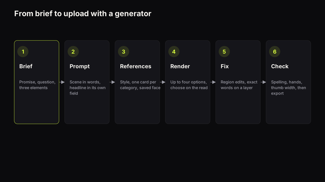
Putting the paths and the check together, the sequence we use for a cover with words is short.
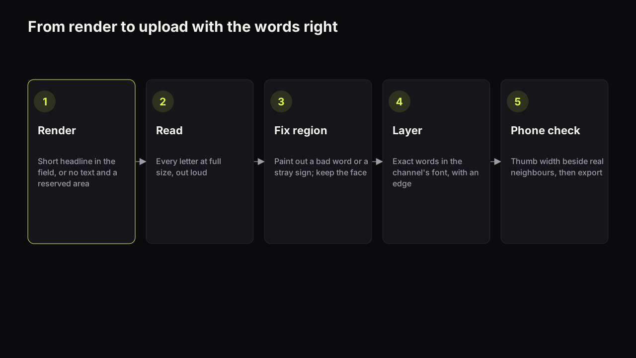
- Write the promise and cut the headline to three words or fewer.
- Decide the path for each word: short common capitals may be rendered; numbers, names and long words go on a layer. If every word needs a layer, render with no text and a reserved empty area.
- Render up to four options from the prompt, with the headline in the "Words on it" field if you are using path 1.
- Read every letter at full size on the option you prefer. Fix a wrong word with a region edit plus a layer; fix a stray sign with a region edit.
- Add the layered words in the editor in the channel's font, with an outline or hard shadow where the words cross a busy area. Every save is a version, so trying two treatments costs nothing.
- Check at thumb width, then export.
The same sequence applies with any generator; only the names of the buttons change. The order does not: exactness decided before the render, letters checked after it, feed size checked last.
A short checklist before upload
- Every rendered word is short, common and in capitals; anything else is on a layer.
- Every letter has been read at full size, out loud, including the numbers.
- No screen, sign, label or item of clothing in the scene carries letter-shaped marks.
- The headline appears once, not in the scene and again as a sign.
- Layered words use the channel's font and have an edge against the background.
- The words add something the picture cannot show; if not, they are gone.
- The cover has been checked at thumb width after the spelling was fixed.
Common questions
Why does AI put random letters on my thumbnail?
Image models learn what text looks like from pictures, so they reproduce the shape of writing without a reliable spelling of it. Anything in the scene that usually carries text, such as a screen, a sign or a label, gets filled with letter-shaped marks. Tell the prompt the screen is blank and there are no signs, and keep your own words to a short headline in the headline field or on a text layer.
Can I fix a misspelt word in an AI thumbnail without re-rendering?
Yes, in two ways. Paint over the region with a region edit and put the correct word on a text layer above it, or crop the bad word out if it sits near an edge. Re-rendering the whole image to fix one word usually changes the face and the light as well, which is a bigger loss than the word.
Should I put any text in an AI thumbnail at all?
Only if the words add something the picture cannot show. Many covers work with no words when the title carries the specifics and the picture carries the emotion. If the words are a caption of what is already visible, leave them out, and you have also removed the spelling problem.
What to do next
Take the last AI cover you uploaded and open it at full size. Read every letter. If one is wrong, replace the word with a layer today rather than re-rendering; if the picture has a screen or sign full of marks, paint the region out. Then, for the next cover, decide the path for each word before you render, and the problem stops arriving at the checking stage at all. The pillar guide linked above covers the other three failure points (hands, faces and the generic look) with the same kind of fix for each.