On this page
The best fonts for YouTube thumbnails are heavy, tightly spaced display faces with no thin strokes: condensed sans-serifs such as Anton and Bebas Neue, wide heavy faces such as Archivo Black, and rounded or comic faces such as Lilita One and Bangers where the niche allows the tone. The reason is not taste. A cover is designed at upload size and seen at a fraction of it, and a typeface either keeps its shape through that shrink or dissolves into texture. Four properties decide which happens, and the eight fonts in the Thumbnail Bench editor were chosen for them.
What a thumbnail font has to survive
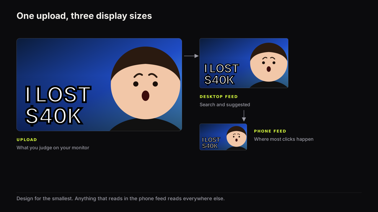
The file you upload is large and the rectangle the viewer sees is small, and the font is the element that suffers most in between. A face shrinks into a smaller face. A word shrinks into a smaller word until, at some size, its strokes become thinner than the screen can draw, its counters (the holes in a, e and o) fill in, and the gaps between letters close. Past that point the word is a grey smudge where words used to be.
YouTube's own advice stays general. Its thumbnail and title tips page says to use a font that is easy to read and not to make the design too complex. At feed size, easy to read has a specific meaning: every stroke of every letter must still be thick enough to draw, and every letter must still be a shape the eye recognises without effort. Fonts that manage this have mass; fonts that do not were designed for a page held at arm's length.
The four properties that decide it
Every font that works on a thumbnail shares four properties. A font that has three of them can usually be rescued with an outline; a font missing two cannot.
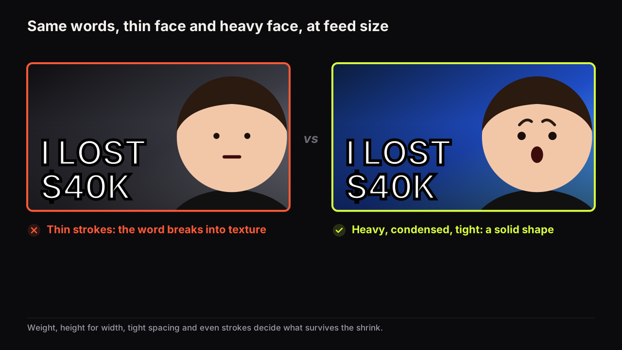
Weight. The strokes are thick relative to the letter height. Heavy, black and extra-bold weights survive; regular and light weights thin out first. This is the property that matters most.
Height for width. Capitals in a condensed face pack the most letter height into a fixed width, which is why the condensed heavy sans is the default thumbnail font in most niches. A wide face is just as heavy but each word costs more width, so the whole headline has to be set smaller to fit. Neither is wrong; the trade is height per word against the number of words you can afford.
Tight spacing. Letters set close together make one solid block, and a block holds its shape when shrunk. Letters set wide apart become separate marks, and at feed size separate marks read as noise. Most heavy display faces are spaced tight by design; adding tracking to make a word look elegant undoes the property that made the font work.
Even, plain strokes. No hairlines, no thin serifs, no swashes, no stroke that is much thinner than the others. In a font with uneven strokes the thin parts vanish first, and a letter missing a stroke is a different letter. Uniform stroke width means the whole word fades together rather than falling apart in pieces.
Choose a font by holding it to the four properties in this order: weight first, then height for width, then spacing, then stroke evenness. A font that is heavy, condensed, tight and plain will read at any size the feed shows it. A font that is merely bold will not.
Take a finance cover and imagine it twice. First version: a navy ground, a face on the right with raised eyebrows, and I LOST $40K set in a light geometric sans, white, tracked wide to look expensive. At upload size it looks like a magazine spread. At phone-feed width the strokes fall below what the screen can draw, the letters separate into dashes, and the viewer reads a face and a white smear; the number, which was the promise, has gone. Second version: the same three words in Anton, tight, white with a dark outline. Shrink it the same amount and the $40K is still a block with a recognisable shape, and the viewer reads the number before they read the face. Same cover, same words, one property changed.
The eight editor fonts at three sizes
The figure below is a real render, not a mock. Each row is one of the eight fonts in the Thumbnail Bench editor setting the same two words on the same blue tile at three widths: close to upload size on the left, about the size of a search or Suggested result in the middle, and close to a phone feed tile on the right.
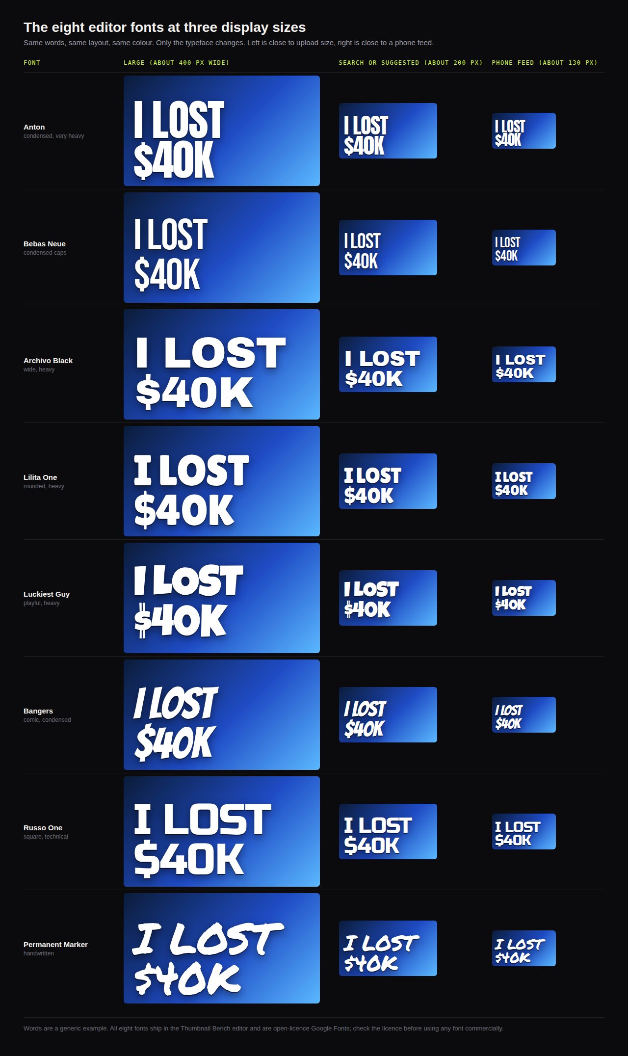
What the grid shows is the four properties at work. The condensed heavy faces hold up smallest: at the phone-feed width their words are still a block with a recognisable outline, and the dollar sign and the K keep their shape. The wide heavy faces stay legible but their words are shorter for the same tile, because width was spent on each letter. The rounded and comic faces survive on weight alone, and carry a tone with them that suits some niches and not others. The handwritten face is the first to suffer: its strokes are uneven, so the thin parts drop out before the thick parts, and at the smallest width it is the least readable of the eight. That is a reason to use it for one large accent word rather than the whole headline.
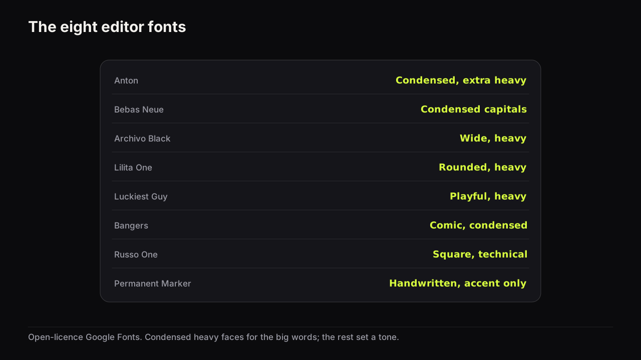
| Font | Character | Use it for | Watch out for |
|---|---|---|---|
| Anton | Condensed, extra heavy | The big word in any niche; numbers | Little to fault at small size |
| Bebas Neue | Condensed capitals | Long words that must fit; the small tier | Lighter than Anton; outline it on busy grounds |
| Archivo Black | Wide, heavy | One or two short words; big numbers | Spends width fast; three words get small |
| Lilita One | Rounded, heavy | Food, family, education, friendly tones | Reads soft; wrong for drama or finance |
| Luckiest Guy | Playful, heavy | Kids, comedy, casual gaming | The tone is the whole message; use it on purpose |
| Bangers | Comic, condensed | Gaming, reaction, commentary | The slant needs an outline to stay crisp |
| Russo One | Square, technical | Tech, cars, gaming hardware | Medium weight; give it an outline or a shadow |
| Permanent Marker | Handwritten | One accent word, an annotation, a crossed-out price | Never the main headline at small size |
Across the channels we look at, the condensed heavy sans is the working default and the other faces are used to signal a genre: rounded for friendly, comic for loud, square for technical, handwritten for a personal aside. A channel that picks a tone font for its main headline is making a genre promise on every cover, which is fine if the videos keep it.
Outline, shadow and fill
A heavy font on a plain ground needs no help. A heavy font on a photograph, a face or a gradient does, because readability is decided at the boundary between the letter and whatever is behind it, and a photograph puts light and dark pixels along that boundary at random. The treatments below add a consistent edge. The reasoning is the same as for the cover as a whole: brightness contrast survives the shrink and hue contrast does not, so the edge has to be a brightness edge.
Outline. A dark outline around light letters (or light around dark) gives every letter a dependable edge whatever sits behind it. The thickness has to scale with the letter: too thin and it vanishes at feed size, too thick and it closes the counters and merges neighbouring letters. Set it as thick as you can before the letters start to touch, then check at thumb width.
Hard shadow. A solid, offset shadow in one direction adds a second edge and a little depth. Keep the offset short and the shadow opaque; a soft, wide blur adds no edge, only a grey halo that lowers contrast. Match the direction to the scene's light if the words sit on a photograph, so the shadow does not argue with the shadows on the face.
Fill. White, or one bright colour that is not already the dominant colour of the cover. A gradient fill halves the contrast across the word for no gain at small size, and hollow text (outline only, no fill) turns each letter into two thin lines that disappear together.
One treatment, or two, not four. Outline and hard shadow together is the most a cover needs; bevels, glows and inner shadows add texture inside the letter, and texture is what feed size turns everything into.
In the editor, text layers have size, fill, outline, rotate, shadow and all-caps controls for each of the eight fonts, and every save is a version you can go back to, which makes trying two treatments on the same word cheap.
Fonts that fail on a thumbnail
The failures are the mirror image of the four properties, and most look fine at full size, which is why they get chosen.
- Light and regular weights of any face, including the light weights of fonts whose heavy weight works well.
- Scripts and handwriting with thin joins; the joins go first and the word becomes a row of fragments.
- Classic serifs with hairline strokes; the thick strokes stay and the thin ones vanish, so an E becomes three short bars.
- Condensed light faces, which have the height but not the mass.
- Decorative faces with texture, inline strokes or distressed edges; the detail becomes noise.
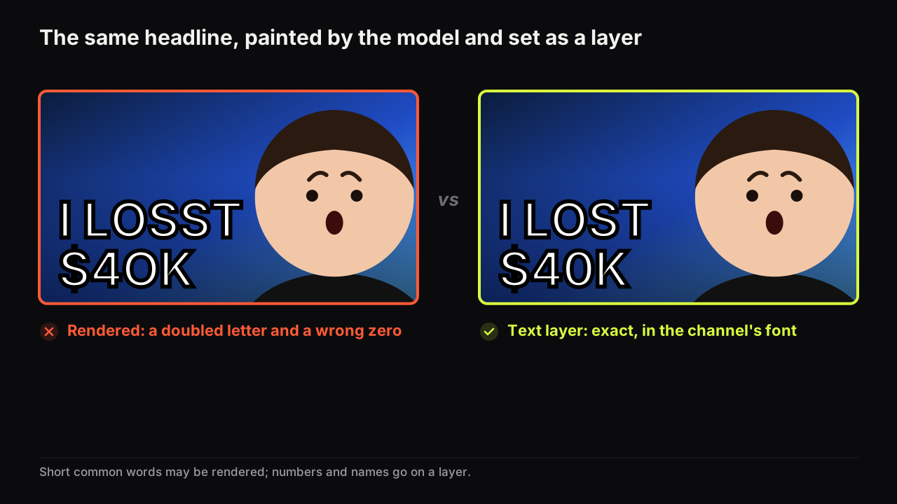
- Letters painted by an image model. Rendered headlines can look like any font, and the spelling and letterforms are sometimes wrong in ways you only notice at full size. The guide to getting exact text onto an AI thumbnail sets out when a rendered headline is fine and when a text layer is safer.
One font for the channel, two at most
A thumbnail font is also a recognition mark: viewers who have clicked your covers before pick the next one out of a row partly by the shape of its words, which only works if the shape stays the same. Pick one heavy face for the big words and keep it for every cover; change the words, the colour and the face, not the typeface. We would set every big word on a channel in one condensed heavy face even though that makes the channel's lettering look like half its niche's, because the difference between covers should come from the promise and the colour, and a font chosen to stand out is nearly always one that reads worse at thumb width. Consistency of this kind is not the same as sameness, and the difference is spelled out in the design principles guide under consistency versus sameness.
If you use a two-tier headline (big words plus a small line beneath), the second tier can be a second font, and should look clearly different in weight or case: Anton above, Permanent Marker or Bebas Neue below. Two faces that are almost the same look like an error; two that are obviously different look like a decision.
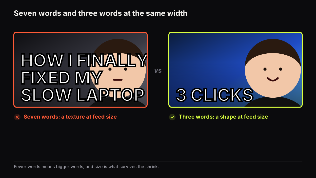
Our view is that font choice is the least important decision on a cover once the four properties are met, and the most over-thought one. Any heavy condensed sans will do the job; the time goes better into cutting the headline to three words and checking it on a phone.
The licence question
The eight fonts in the editor are open-licence Google Fonts, which is one reason they were chosen. For any other font, check the licence before you use it on a thumbnail, and again before you use it on a channel that earns money; terms vary by foundry and by use, and the responsibility is yours, not the tool's.
Check the font at feed size
The only test that counts is the one the viewer performs. Shrink the cover to the width of your thumb, or drop it into the free thumbnail tester to see it inside a mock phone feed, and run the list. The guide to why the phone read decides most clicks explains what breaks first and why.
- Every big word is still a solid shape at thumb width, not a texture.
- No stroke has vanished: count the bars of any E, the arms of any K.
- Counters are still open: the a, e and o have holes, the 0 is not a dot.
- Letters have not merged into each other under a thick outline.
- The word has a visible edge against every part of the background it crosses.
- Only one font carries the big words, and any second tier looks clearly different.
- The font's tone matches the promise: comic for loud, rounded for friendly, plain for anything serious.
Common questions
What font do most YouTube thumbnails use?
Nobody publishes a count, so we can only say what we see. Heavy condensed sans-serifs in the family of Anton and Bebas Neue are the most common choice across niches, because they fit the most letter height into a fixed width. The right question is not which font is popular but which one stays a solid shape when your cover is shrunk to a phone feed.
Can I use a serif font on a thumbnail?
Only a slab serif with heavy, even strokes, and only for a short word set large. Classic serifs have hairline strokes that drop out at feed size, so the word loses parts of its letters before it loses size. If the niche wants a serif tone, set one word in it and keep the rest of the headline in a heavy sans.
How many fonts should a channel use?
One for the big words and, if you use a small second tier, one more that looks clearly different. Two heavy faces that are almost the same read as a mistake. More than two fonts on one cover adds a fourth element the design does not have room for.
What to do next
Set your next headline in Anton or Bebas Neue, white fill, dark outline, and look at it at thumb width before you look at it any other way. If it holds, keep that face for every cover from now on. If the words still do not read, the problem is usually the count rather than the font; the pre-upload checklist has the readability check as its first item.