On this page
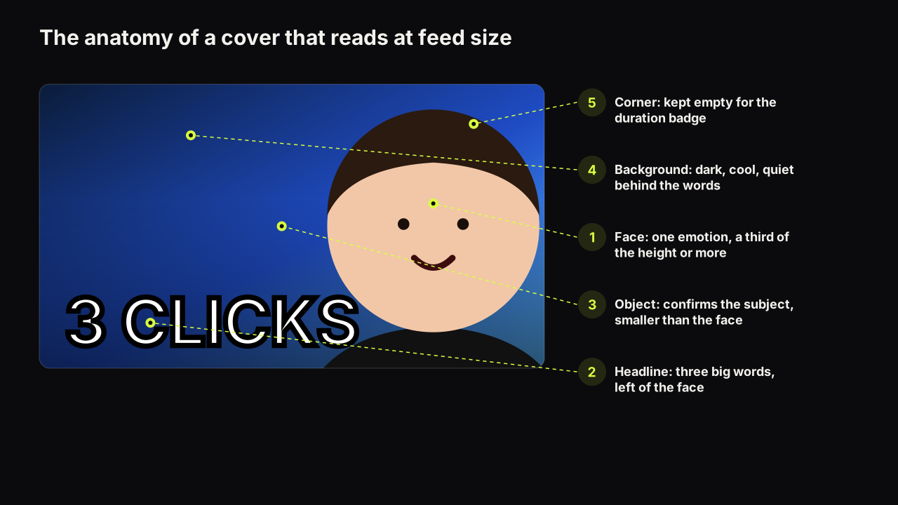
A good thumbnail prompt describes one frame: who is in it, what they feel, where they are, how it is lit, what colour dominates, and where the empty space for the words goes. It does not describe the video, it does not contain the headline, and it does not ask for "a YouTube thumbnail". Most bad renders come from prompts that break one of those rules, usually by describing the video.
The six parts of a thumbnail prompt
A prompt is a brief for a single picture. The parts below are in the order we recommend writing them, because each one narrows the next.
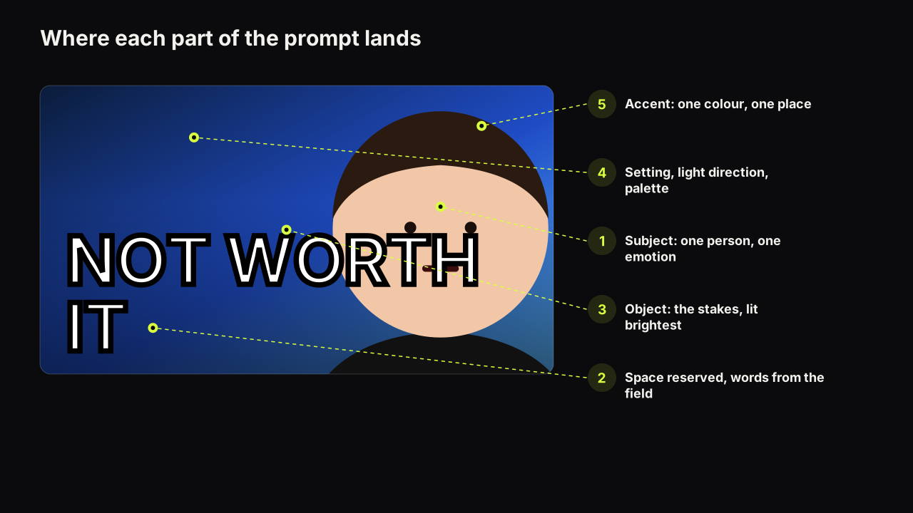
- Subject and emotion. One person or one object, and one nameable feeling. "A woman in her thirties, wide-eyed, mouth slightly open" is a subject with an emotion. "A creator reacting" is neither.
- Setting. One place, named specifically. "A cramped studio apartment kitchen" beats "a kitchen". The model fills in details from the specific noun.
- Light. One source and one direction. "Hard warm light from the left, dark shadow on the right" produces separation between the face and the background, which is what survives the shrink to feed size.
- Palette. One dominant colour and one accent, named as objects or surfaces where possible. "A flat mustard-yellow wall, a red mug" is more reliable than "yellow and red colour scheme".
- Space for the words. Say where the empty area is. "The left third of the frame is clean dark wall with nothing in it." If you do not reserve space, the model fills the frame and the headline lands on a face.
- What to leave out. "No text, no logos, no other people, no hands in frame." The model will otherwise add its defaults: signage, a second person, a glow.
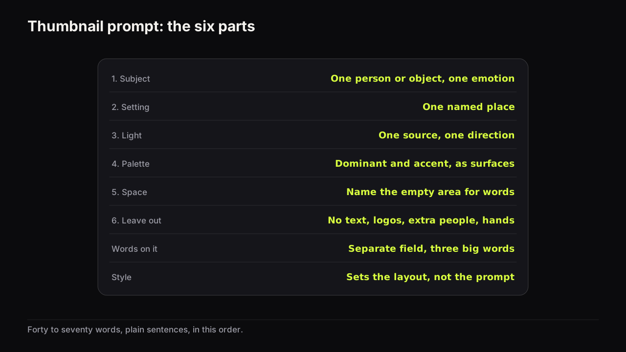
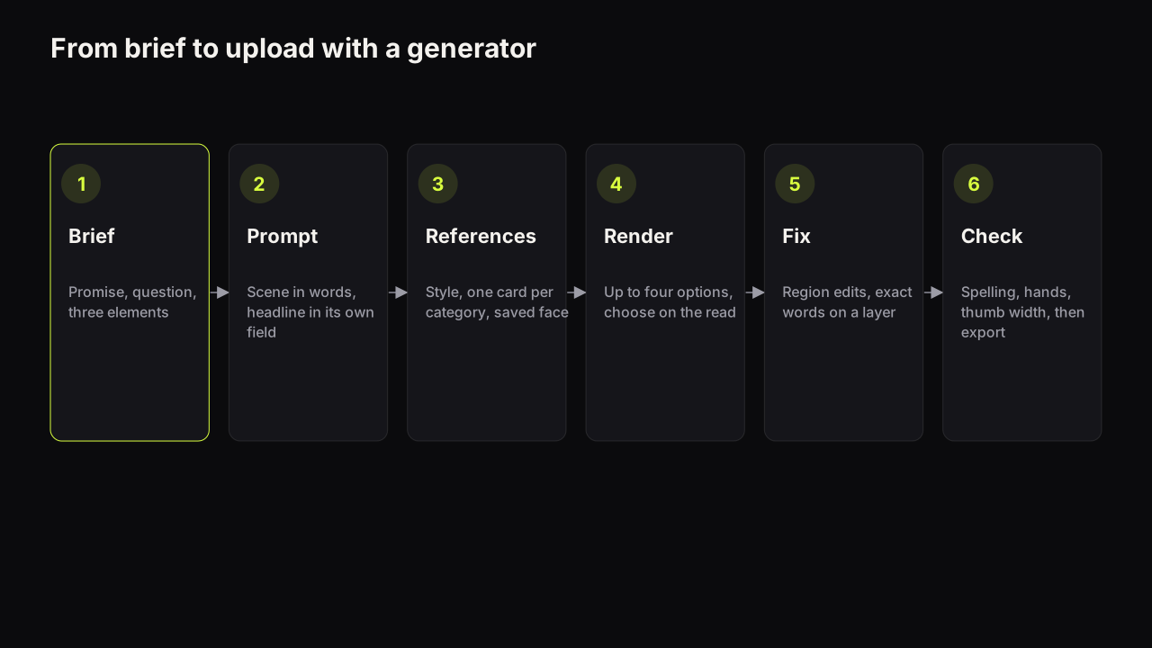
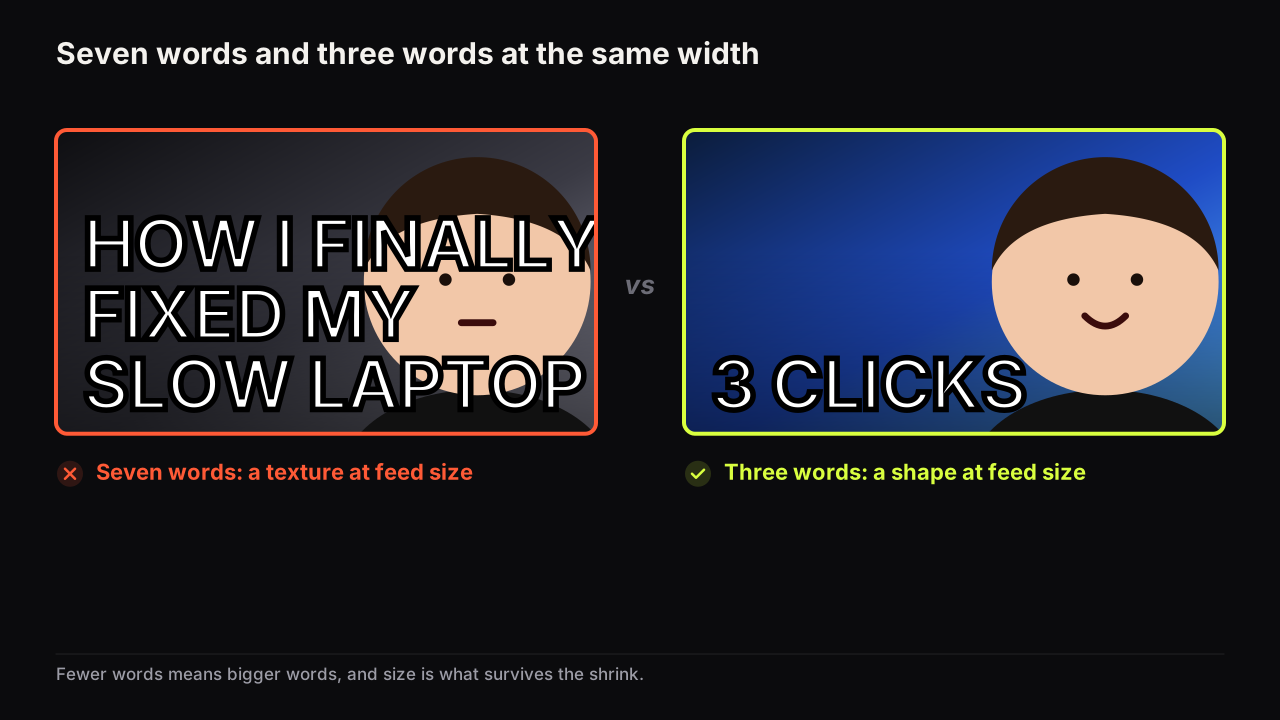
The headline is the seventh thing and it lives somewhere else. On the bench, the words go in the "Words on it" field (up to 80 characters) and the model renders them into the picture. Putting the same words in the prompt as well tends to produce the headline twice or a sign in the background that says it. Keep the field short: three big words is the working limit, and short common words in capitals are also the ones the model spells correctly. If a word must be exact, add it as a text layer in the editor afterwards; the generator guide explains when rendered text is fine and when a layer is safer.
We would keep the headline out of the prompt even when the model has spelt it correctly for weeks, even though a headline in the prompt sometimes sits more naturally in the scene. The day it renders the words twice is the day before an upload.
We recommend writing the prompt in plain sentences, in that order, at roughly forty to seventy words. Shorter prompts leave the model to its defaults. Longer prompts contradict themselves (two light sources, two moods, three colours), and the model resolves contradictions by averaging, which is where the generic look comes from.
One worked prompt per style
Each of the eight styles on the bench is a layout the feed already understands, and each wants a different kind of prompt. The prompt describes the scene; the style decides the composition; the headline field carries the words. The examples below are written for 16:9. Change the setting and the object to your niche and keep the structure.
Big Face
Big Face puts the face at half the height or more, on one side, with the words on the other. The prompt should describe almost nothing except the face, the light and the empty side.
Prompt: A man in his forties with short grey hair, eyebrows raised, eyes wide, looking straight at the camera, filling the right half of the frame from the shoulders up. Hard cool light from the upper left, deep shadow behind him. The left half is a plain dark navy wall with nothing on it. No text, no hands, no other people.
Words on it: HE KNEW
Why it works: the emotion is one thing (surprise), the light separates the face from the wall, and the reserved half keeps the headline off the face. The most common mistake with Big Face is describing a room; the room shrinks the face, and the face-size floor is the rule the style exists to satisfy.
Split Screen
Split Screen is two halves with a contrast between them: two options, two outcomes, two people. The prompt has to describe both halves and the seam.
Prompt: The frame is split down the middle by a thin white line. Left half: a tired man in a dim grey office cubicle under flat fluorescent light, slumped. Right half: the same man on a bright balcony at golden hour, relaxed, warm light from the right. Both halves are simple, with plain backgrounds and no clutter. No text, no logos.
Words on it: 9 TO 5 VS FREE
Why it works: the contrast is in the light (flat grey versus warm gold), not only in the content, so it reads at thumb size. Ask for "the same man" and use a saved face on both sides; a described man will be two different men.
Number Pop
Number Pop makes one number the largest thing on the cover. The prompt's job is to leave a large clean area for it and to give the number a reason.
Prompt: A close-up of a cluttered desk with a laptop, a calculator and a spread of receipts, shot from above at a slight angle, cool blue-white light from a desk lamp. The upper two thirds of the frame is a clean dark surface with nothing on it. Muted colours except one red pen. No text, no hands, no people.
Words on it: $40,000
Why it works: the scene is the stakes (receipts, calculator), and the empty upper area is where the number goes. A number-led cover does not need a face; it needs the number to be the only bright thing.
Before / After
Before / After is a change over time in one frame. The prompt should describe the two states with the same framing and different light or condition, so the difference is the subject.
Prompt: Two matching photographs side by side of the same small bedroom from the same doorway. Left: dim, cluttered, clothes on the floor, grey daylight. Right: the same room tidy and bright, bed made, warm afternoon light through the window. Identical camera position in both. A narrow gap between the two images. No text, no people.
Words on it: 1 WEEKEND
Why it works: same framing, different state, so the eye compares. The headline adds the one thing the picture cannot show, which is time. Keep the words about the cost of the change (time, money, effort), not a description of the change.
Neon Glitch
Neon Glitch is high-saturation, dark background, one or two neon accents, some digital distortion. It suits gaming, tech and commentary. The prompt should name the accents and keep the rest black.
Prompt: A young woman in a dark hoodie, lit only by a magenta neon strip on the left and a cyan monitor glow on the right, face turned slightly toward the camera with a sceptical half-frown. Black background with faint horizontal scan lines. The right third of the frame is empty black. No text, no keyboard, no other light sources.
Words on it: IT'S BROKEN
Why it works: two accents on black is a strong brightness contrast, and the frown carries doubt, which is the emotion reviews and commentary run on. Do not add a third colour; the style loses its edge when the whole frame glows.
Clean Edu
Clean Edu is calm, light, uncluttered. The face is composed, the background is flat, the object is a simple diagram or prop. It signals "this is easy", which is what tutorial viewers are choosing between.
Prompt: A woman in a plain white shirt, neutral friendly expression, slight smile, looking at the camera, positioned in the right third. Soft even daylight from the front. Flat pale cream background with no texture. On the left, a single simple object: a blue notebook and a pencil, small, centred in the empty area. No text, no glow, no drama.
Words on it: START HERE
Why it works: a light cover is the odd one out in a dark feed, and calm signals competence in education, an observed pattern the design principles guide discusses under expectation fit. Resist the urge to add a shocked face; it reads as the wrong genre.
Money Stack
Money Stack puts a stack of cash, coins or a rising chart in frame as the object, with a face reacting to it. The prompt should make the money the brightest thing and keep the face on one side.
Prompt: A man in a plain black T-shirt on the right third of the frame, looking down at a tall stack of banknotes on a desk in front of him with a doubtful, slightly worried expression. Warm spot light on the money, cooler dim light on the man. Dark green wall behind. The upper left of the frame is empty dark green. No text, no coins flying, no logos.
Words on it: NOT WORTH IT
Why it works: the light says "look at the money" and the expression says "there is a problem", which opens a gap. Finance audiences tend to respond to doubt more than to shock, so the face is worried, not screaming.
Reaction
Reaction is a face responding to something in the frame: a screen, an object, an event. The prompt has to describe both the thing and the response, and keep them on opposite sides.
Prompt: A man in his twenties on the left, turned three-quarters toward a laptop screen on the right, mouth open and eyebrows up in disbelief. The laptop screen is a plain bright white rectangle with no readable content. Cool light from the screen on his face, dark room behind. The upper area of the frame is dark and empty. No text on the screen, no other people.
Words on it: HE SAID WHAT?
Why it works: the gaze points at the object and the object points at the words. Ask for a blank screen; a screen with content will be garbled text, which is the first thing viewers notice.
The mistakes that produce most bad renders
| Mistake | What you get | Instead |
|---|---|---|
| Describing the video ("a video about my move to Tokyo") | A montage, a collage, or a map | Describe one frame from one moment |
| Headline inside the prompt | The words twice, or as a sign in the scene | Words only in the headline field |
| Asking for "a YouTube thumbnail" | The model's generic idea of one: centred glow, warm-cool split | Describe the scene; let the style set the layout |
| Two light sources or two moods | A flat, averaged image | One source, one direction, one emotion |
| No space reserved for words | Text lands on the face or the object | Name the empty area and what is in it (nothing) |
| A described face for a series | A different person every render | A saved face, same one every time |
| Screens, signs, small text in the scene | Garbled letters | Blank screens, no signs, or crop them out |
| Adjective stacks ("epic, cinematic, ultra-detailed, 8k") | More glow, more particles, more sameness | Nouns and light directions |
Take a prompt we would throw out: "Epic cinematic YouTube thumbnail of me moving to Tokyo, shocked face, neon city at night, text says I MOVED TO TOKYO, ultra detailed 8k." It breaks five rows of that table at once, and the render will be a glowing skyline collage with a stranger's face and the words somewhere twice, once misspelt. Rewritten: "A woman in her late twenties, eyes wide, one hand over her mouth, on the right half of the frame, standing in a narrow Tokyo side street at night. One red paper lantern lights her face from the left; the rest is dark. The left half is a plain dark wall. No text, no signs, no other people." Words on it: I MOVED. Same idea, one frame, and the city's name goes in the title.
The prompts that render best in our own use are the ones that read like a photographer's shot list: subject, position, light, background, what is not in frame. The ones that render worst read like a title. If your prompt would make sense as a video title, it is describing the wrong thing.
Prompting for a promise the video keeps
A prompt produces a picture; the picture makes a promise. The moment you prompt for should be the moment in the video the viewer is clicking to see, shown just before its outcome. "A man opening a package, face lit by whatever is inside, the contents out of frame" is a promise. "A man holding the finished product and smiling" answers the question on the cover and gives the viewer a reason not to click. The reasoning behind that, and the reason the video then has to deliver, is the information gap and the way YouTube decides its own thumbnail tests by watch time share rather than clicks.
Prompting for a moment that is not in the video at all is the other failure, and it is a policy failure as well as a trust failure. YouTube's rules on misleading packaging apply to the picture however it was made.
Iterating without starting over
The first render is rarely the last, and the mistake is to rewrite the whole prompt after each one. Change one part.
- If the emotion is wrong, change only the emotion words, or change the saved face's expression in Face Lab and keep the prompt.
- If the words land on the face, move the reserved space: "the left third is empty" becomes "the upper half is empty".
- If the colour is wrong, rename the surface: "dark green wall" becomes "flat mustard-yellow wall".
- If the light is flat, add a direction: "from the upper left, hard, with shadow on the right".
- If one region is wrong (a hand, a prop, a corner), do not re-prompt; edit that region in the editor and keep the rest.
On the bench, Tweak makes step one to four literal: the result becomes the source for the next render, style and face stay locked because the source already carries them, and only the thing you changed changes. That is also how you make a fair second variant for a test, which is the point where a prompt stops being a creative act and becomes a controlled one.
Building prompts from what already works
The fastest way to a good prompt is to describe a layout that already earns clicks in your niche, in your own words, with your own face and object. Studying outlier covers in your category gives you the composition and the emotion; the prompt structure above turns that into a brief; the style choice sets the layout. Borrow the layout, never the cover: the words, the face and the object are yours. Explore on the bench works the same way, with a Remix action on every cover so the layout becomes a starting brief.
What to do next
Take the video you are packaging now and write the six parts in order: subject and emotion, setting, light, palette, space, exclusions. Put the headline in the field, not the prompt. Render four options in the style whose layout your niche uses least, choose on the read at thumb width, and keep the prompt with the result so the next one starts from a known good brief. If the rendered text is wrong, or the face is drifting, the generator guide's failure table has the fix for each.
Niche-specific patterns to prompt for are collected in the gaming thumbnail patterns piece, where Neon Glitch and Split Screen do most of the work.