On this page
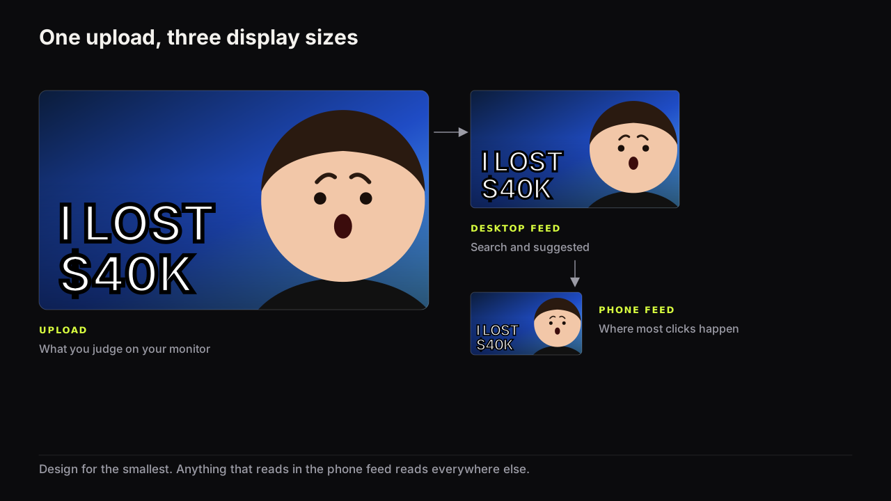
The file you upload is shown at many sizes you do not control: large on a TV across a room, mid-sized in a desktop grid, small in a phone's Home feed, and smaller still in the list of suggested videos beside one that is playing. Design for the smallest of those and the rest take care of themselves. Feed size is the size a cover appears at in a feed of other covers, and on a phone that is a fraction of the width you designed at, viewed at arm's length, for a moment.
We give no pixel dimensions for any of those surfaces. They vary by device, app version and screen density, and every figure circulating for them is unsourced. Relative size is what matters, and your own phone measures it in a minute.
One file, many sizes
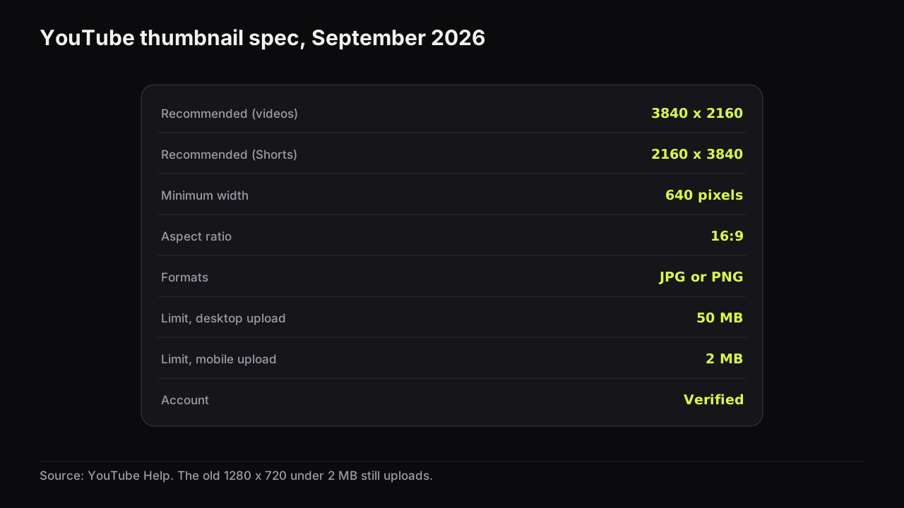
YouTube's own help page on custom thumbnails recommends a 3840 x 2160 upload for videos, as of September 2026. That is a large image. It is then displayed at whatever size each surface allots, which ranges from a sizeable part of a TV screen down to a small tile beside a playing video on a phone. The full spec, and what changed in the upload limits, is in the thumbnail size and specs guide; the point here is the gap between the file and the display.
A cover that is designed at upload size and never viewed smaller is designed for a surface almost nobody uses. The phone feed is the surface to design for, for two reasons. It is the smallest common display, so anything that reads there reads everywhere. And it is where the cover is judged in the least forgiving conditions: a dim screen, daylight, a thumb already moving.
On a phone the same cover appears at two quite different sizes in a single session: wide in the Home feed, where it can fill most of the screen width, and small in the suggested list under a playing video, where it is a tile beside a title. Creators who check only the Home feed are surprised by how much disappears in the suggested list, and the suggested list is where a lot of viewing decisions are made.
We would design every cover for the suggested-list tile rather than the Home feed, even though that means giving up detail the Home feed has room to show. A cover that reads as a tile reads as a card. The reverse is not true.
What breaks first when a cover shrinks
Elements do not degrade evenly as the image gets smaller. They fail in a predictable order, and knowing the order tells you what to fix.
- Thin strokes. Light or thin typefaces, thin outlines, hairline arrows. Their strokes fall below the size at which they can be drawn and they vanish or blur into the ground. Heavy type survives.
- Fine detail. Readable screenshots, small labels on products, patterned backgrounds. Detail becomes texture, and texture competes with the elements that matter.
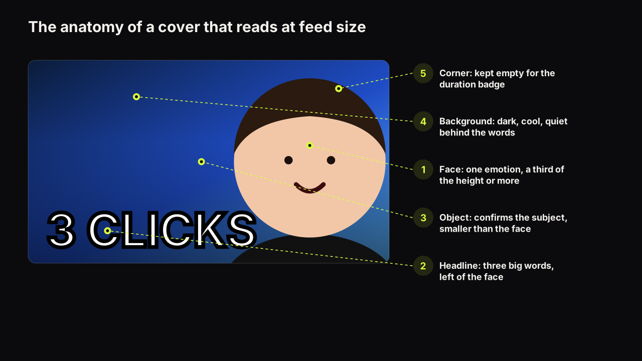
- Small text. The second tier of a two-tier headline goes first, then anything under about the size of the face's eyes. This is why we cap the headline at three big words; how many words a cover can carry is the reasoning.
- Small faces. The eyes and mouth are small features, and the expression lives in them. A face under about a third of the cover's height becomes an oval, which is where the face-size floor comes from.
- Low brightness contrast. Two areas that differ only in hue merge as they shrink, because small areas of colour blend with their neighbours. Brightness differences survive longer than hue differences, and that is the argument in colours and contrast that survive a phone screen.
- Anything near the edges. Corners and edges are where the interface puts its own elements, and where some surfaces round or crop the cover.
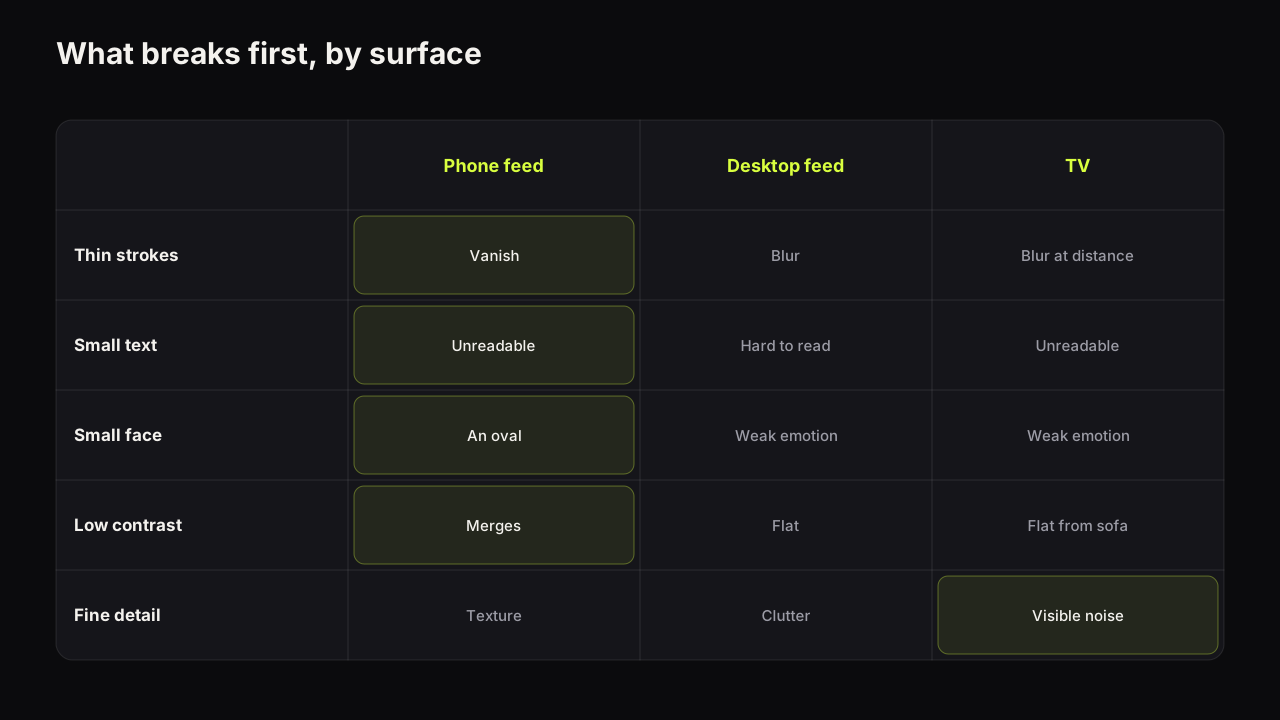
Big shapes, heavy type, a large face and a brightness gap survive all six. That is the design brief for the phone, and it is the same brief as the four design principles, reached from the other direction.
Take an illustrative cooking cover. Say the upload shows a whole plate of carbonara from above, a thin script headline reading "Weeknight carbonara in 15 minutes" across the top, a cream tablecloth, and a small channel logo in the bottom-right corner. At upload size it looks like a magazine page. At suggested-list size it is a beige rectangle: the script strokes have gone, the plate is a pale disc on a pale ground, and the logo sits under the duration badge. We would crop to a fork lifting the pasta so the strands fill half the height, set two heavy words, 15 MIN, in a dark corner, drop the logo, and put the plate on dark slate rather than cream so the food is the bright thing. At thumb width the viewer now gets "quick pasta" before reading anything.
The phone check
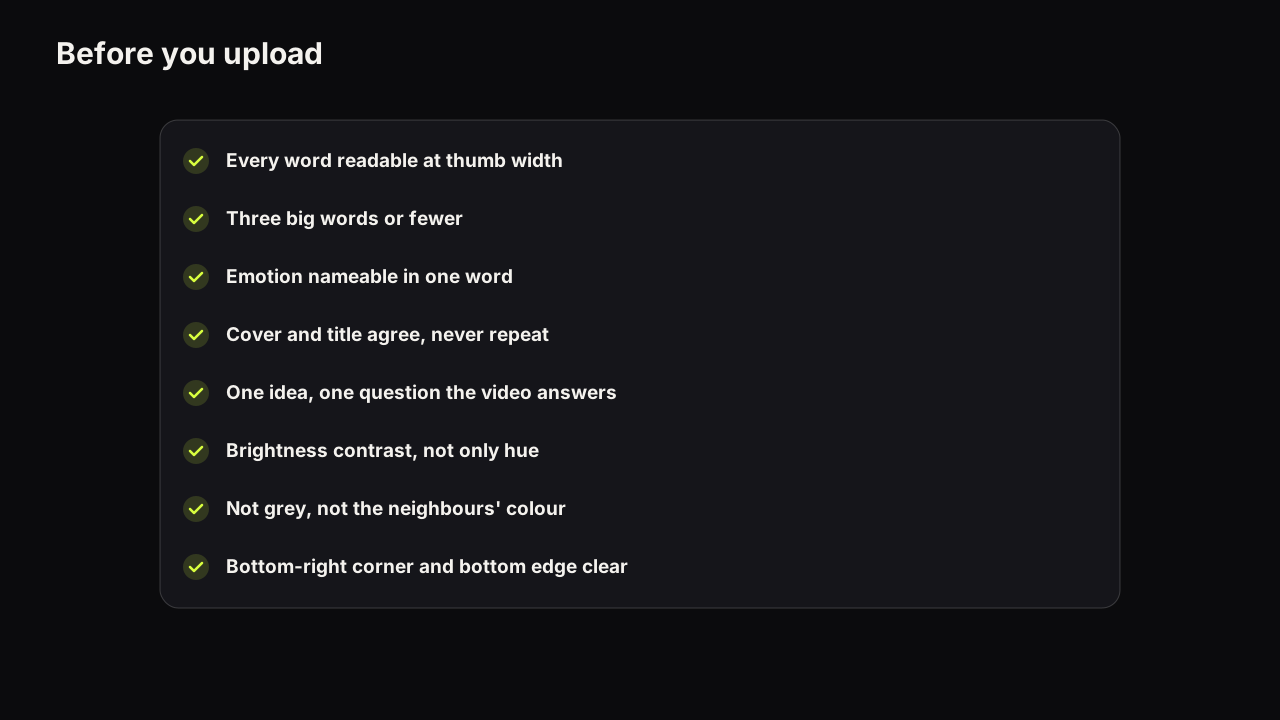
The phone check is the habit that turns the list above into a routine. Do it before upload, every time, and do it before the promise and spec checks on the pre-upload checklist, because a cover that fails here fails regardless of anything else.
- Shrink it. View the cover at the width of your thumb, either in a mock feed or by sending it to your phone and looking at it in a grid rather than full screen. Never judge it full size.
- Read every word. Can you recognise each big word as a shape? If one has become texture, cut a word or set the rest larger.
- Name the emotion. Can you say what the face feels in one word? If not, the face is too small or too calm.
- Find the object. Can you tell what the thing is? If it has become a blob, enlarge it or drop it.
- Check the separation. Turn the screen brightness down. Does the face still separate from the ground and the words from the ground?
- Put it in a row. Beside six recent covers from your niche, is it the one your eye goes to? If not, the dominant colour is the usual fix.
Our free thumbnail tester does the mock-feed part of this with no account: it drops a cover into a mock search result and a phone feed so you can see it at the proportions viewers see, beside other covers. It is a preview, not a score; the judgement in steps two to six is yours.
The squint test and the arm's-length test
Two shortcuts approximate the phone check when you cannot do the full one. Squinting blurs the cover the way shrinking does: if you still see two or three distinct shapes (a face, a word block, an object) the hierarchy holds; if you see one shape, it does not. Holding the phone at arm's length rather than reading distance approximates the feed's viewing distance and catches the small text and the thin strokes. Neither replaces looking at the cover in a real feed at real size, but both catch the common failures in a second.
TV: the ten-foot view
The TV screen asks for the same design for the opposite reason. On a TV the cover is displayed large, but it is viewed from across a room, with the same words and face that had to survive being small now having to survive being far away. Distance and size do the same thing to the eye: a thin stroke at three metres is as unreadable as a thin stroke at thumb width.
Connected TV is not a minor surface. Deadline reported that in early 2025 connected TV became the largest US YouTube watch surface. A cover that is checked only on a phone is still probably fine on a TV, because the failure modes overlap, but two things differ.
- Detail is punished twice. On a TV the cover is large enough that fine detail is drawn, and far enough away that it cannot be resolved. It becomes visible noise rather than invisible noise.
- Low contrast is punished harder. Living-room light, a wall behind the viewer, a screen calibrated for films. A cover with a small brightness gap looks flat from the sofa even when it looked acceptable on a monitor.
Design for the phone feed, then look at the finished cover from across the room on any screen you have. If it holds up at thumb width and at three metres, it holds up everywhere in between.
The corners and the edges
The interface draws its own elements over the cover, and the places it draws them are predictable enough to plan around.
The duration badge sits over the bottom-right corner of the cover on the surfaces we check. A watched-progress bar can run along the bottom edge on videos the viewer has started. Some surfaces round the corners of the cover, and some crop a sliver from the edges when fitting it to a tile. None of these is documented as a fixed measurement, and we do not give one.
The practical rule is to keep the bottom-right corner empty, keep the headline off the bottom edge, and keep nothing that carries the promise within a margin of any edge. A face bleeding off the top of the cover is fine, because the crop takes hair, not eyes. A headline sitting on the bottom edge is not, because the crop takes the letters.
Phone-first design decisions
Every one of these rules exists somewhere else in the design cluster. This is the version you can pin above the desk.
| Element | Phone-safe rule | Why |
|---|---|---|
| Headline | Three big words, heavy type, one accent | Small text and thin strokes fail first |
| Face | A third of the height or more, on one side, lit to separate | The expression lives in small features |
| Object | One, large enough to name at thumb width | A small object is a blob |
| Ground | Dark or light, not mid-grey; cool under a warm face | Brightness contrast is what the phone keeps |
| Detail | Blur it, darken it or crop it | Detail becomes texture and competes |
| Edges | Bottom-right empty; nothing important near any edge | The interface draws there |
| Palette | One dominant colour, different from the niche's row | Feed contrast is decided by colour |
Common questions
Does YouTube show a different thumbnail on mobile?
No. The same file is shown everywhere; what changes is the size it is displayed at and what sits around it. A cover that reads on the phone feed reads on every other surface, which is why we recommend designing for the phone and checking there first.
What size should I upload if most viewers are on phones?
Upload the largest file YouTube recommends, which as of September 2026 is 3840 x 2160 for videos, and let the display do the shrinking. A smaller upload does not make the cover read better on a phone; it only gives the larger surfaces less to work with.
How do I see my thumbnail at phone size before uploading?
Use a preview that places the cover inside a mock feed at the proportions a phone uses, then look at it at arm's length. Our free thumbnail tester does that with no account. Failing that, send the image to your phone and view it in a grid rather than full screen.
What to do next
Run the phone check on your last upload, not your next one, because the last one is already in the feed and the failures are real. Fix the first thing on the list that breaks, which is usually the words or the face, and check again. Then make the phone check the first step of your pre-upload routine. The design decisions it tests are laid out in the full thumbnail guide, and the checklist it belongs to is the pre-upload one linked above.