On this page
- What an AI thumbnail generator actually does
- What generators do well
- Where generators fail, and why each failure happens
- The failure and fix table
- A workflow that catches each failure
- How to avoid the AI look
- What YouTube requires of an AI-made cover
- What it costs, honestly
- Pre-upload checks for an AI cover
- If it were our channel
- Common questions
- What to do next
The worst AI thumbnail in your feed is not the one with six fingers. That one rarely ships; somebody saw the hand. The one that ships is the cover that looked fine in the options grid, with a centred face, a warm-cool glow and slightly too much saturation, and turned out to be the third cover in the row that looked exactly like that.
An AI thumbnail generator turns a written description, and optionally a reference image or a saved face, into a finished cover image. It is good at scenes you could not shoot, lighting you could not afford, and several options in about a minute. It is unreliable at spelling, hands, small details, and keeping the same face across videos, and it has a default look that makes covers from different channels resemble each other. Each of those failures has a cause you can predict and a fix you can apply before upload, and the fixes are most of what follows.
What an AI thumbnail generator actually does
A thumbnail generator is an image model wrapped in a workflow. You give it a brief; it produces one or more images that match the brief statistically; you edit, check and export the one that works. The wrapping is where generators differ from each other. The model underneath behaves in broadly the same way across tools.
The brief has three possible ingredients. A prompt describes the scene in words. A reference shows the model something to work from: an uploaded image, a saved face, or a style card. A headline is the text you want on the cover. On Thumbnail Bench the headline is its own field ("Words on it", up to 80 characters) rather than part of the prompt, and the model renders those words into the picture as part of the image.
The model has learned, from a large set of captioned pictures, what images that match a description tend to look like. When it renders, it starts from noise and works towards an image that fits your words and your references. That is why it is so good at scenes and lighting: those are patterns it has seen millions of times. It is also why it fails in the specific ways below. The model has no font file, no spell checker and no skeleton. It has expectations, and it draws what it expects.
This is a plain-language description, not a technical one. The details differ between models and change often. Nothing in this guide depends on the internals; it depends on the observable behaviour, which has been stable for long enough to plan around.
The output is a set of options, not a cover. Treating the render as a finished thumbnail is the mistake behind most of the bad AI covers in any feed. Treating it as a scene plate that still has to pass the checks in the full thumbnail guide is what produces the good ones.
What generators do well
Generators are strongest where a camera is weakest: places you cannot get to, props you do not own, light you cannot rig. A creator with a phone and a bedroom can render a trading floor, a burning kitchen, a mountain pass, or a studio with a rim light, and can put a saved face into it with matching lighting and angle.
In practice the biggest gain is not any single picture. It is having four different compositions to choose from before you commit, at a cost of one credit each, instead of one composition you spent an evening on. Creators who use generators well spend their time choosing and fixing, not drawing.
The other strength is iteration. Once you have a render that is close, you can change one thing and keep the rest. On the bench that is Tweak: the result becomes the source for the next render, so the expression changes and the scene, palette and headline stay. That matters later, because a fair thumbnail test needs two covers that differ in one lever, which is the discipline in the workflow that takes a cover from idea to upload. Ratio is a smaller convenience of the same kind: the bench composes a render for 16:9, 9:16 or 1:1 rather than cropping one image three ways, so the face and the words land where each format needs them.
Where generators fail, and why each failure happens
Four failures account for nearly every unusable AI cover.
Rendered text misspells
The model treats letters as shapes. It has learned what "LOST" looks like in a thousand fonts, so short common words in capitals usually come out right. Longer words, unusual words, names, and anything with a doubled letter or a number-letter mix fail more often, because the model is guessing at a sequence of shapes rather than spelling. A rendered word can also drift: a letter thickens, a serif appears, two letters merge.
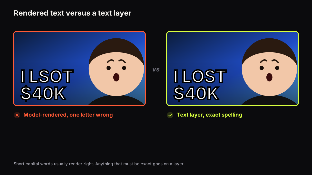
The fix has two parts. Keep the model-rendered headline to a few short words, which is also the right number for readability, as the argument for three big words sets out. Then, where spelling must be exact (a name, a product, a price), put the words on a real text layer instead. Thumbnail Bench does both: the bench renders the headline into the image with the model, and the editor adds free text layers with real fonts (Anton, Bebas Neue, Archivo Black and others) on top, with outline and shadow controls, so the spelling is whatever you typed.
A worked case, invented for illustration. A food channel wants "AVOCADO TOAST £14" on the cover. Three problems: a nine-letter word, a currency symbol, and a number, all in one headline. We would split it. "£14" is the promise, so it goes in the headline field alone where the model can make it huge and light it as part of the scene; a short figure is about as safe as rendered text gets, and it is worth checking the "4" has not become a "9". "AVOCADO TOAST" is a label, not a promise, so it either comes off the cover entirely (the dish is right there) or goes on a text layer in Bebas Neue, small, in the corner. The cover lost nothing it needed and gained a headline that reads at thumb width.
Hands and small details go wrong
Hands have many joints, they overlap, and in most training pictures they are small, partly hidden or blurred. The model's expectation of a hand is vague, so it draws six fingers, a thumb on the wrong side, or a hand that merges with a prop. The same is true of anything small and structured: keyboards, watch faces, text on a screen in the background, a logo.
Design around the weakness. Ask for the face and shoulders and keep hands out of frame, or hold the object so the hand is mostly behind it. When a render is right apart from one region, edit that region rather than rolling the whole image again. The bench's editor has a "Selected area" AI edit: draw a box, and only what is inside it changes.
Sometimes the rule has to bend. Picture a pottery channel: the hands are the promise, and a cover with no hands is a cover with no video in it. Here we would keep the hands and pay for it in checks. Render four options rather than one, expect to discard two on the fingers alone, region-edit the best of the rest, and zoom in on every knuckle before export. It costs more credits and more minutes than a face-and-shoulders crop. It is the right call, because the alternative is a cover that hides the one thing the audience came for.
Faces drift between renders
A prompt that says "a man in his thirties with a beard" will produce a different man every time, because the description fits millions of faces. Even a reference photo pasted into a prompt gets reinterpreted. Across a series of videos, the viewer sees a slightly different person on each cover, which quietly breaks the recognition a channel depends on.
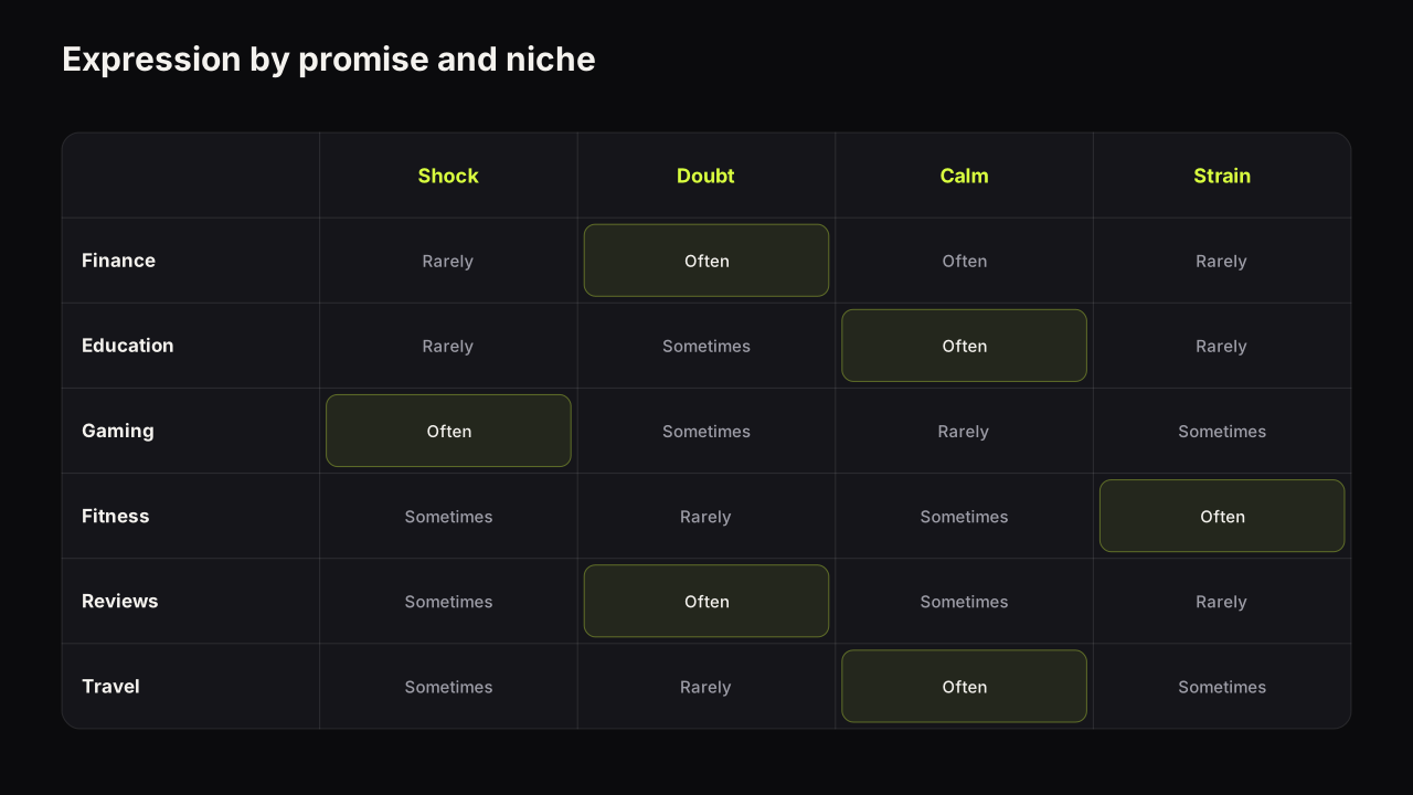
The fix is a saved face rather than a described one. Face Lab on Thumbnail Bench takes one selfie (head and shoulders, facing the camera), cuts it out automatically, and produces eight expressions from it: Shocked, Surprised, Happy, Excited, Angry, Curious, Scream and Sad, one credit each. Any saved face can then be placed into any render, and the model paints it into the scene's lighting and angle. Only use the face of someone who agreed to be on your thumbnails, which is the rule in the acceptable use policy and the subject of the policy section below. Which expression to use is a separate question; the guide to facial expressions on covers covers matching the emotion to the promise.
The generic look makes covers interchangeable
Left to itself, a model produces its own idea of "a YouTube thumbnail": a centred subject, a warm-cool colour split, a glow behind the head, a dramatic sky, slightly too much saturation. Every channel that accepts the default gets the same cover. In a feed of twelve, three of them look like siblings, and none of them reads as the odd one out.
We treat sameness as the most expensive AI failure, and we would spend more time on it than on spelling and hands combined, even though those are the failures a viewer would actually point at. The reason is that nothing about sameness looks broken. The words are right, the hands are hidden, the cover ships, and it underperforms for reasons that never show up in a single-video review. Only the feed reveals it, and by then the render is live.
Breaking it needs a section of its own, below. The short version: bring something the model would not choose, usually a niche-specific colour, a real object from the video, and your own face.
The failure and fix table
| Failure | What you see | Why it happens | Fix |
|---|---|---|---|
| Misspelt text | A letter wrong, merged or thickened | Letters are drawn as expected shapes, not spelt | Short capital words in the headline field; text layers for exact spelling; check every letter |
| Bad hands | Extra fingers, merged grip | Hands are small and hidden in most training pictures | Keep hands out of frame or behind the object; region edit the hand |
| Wrong small details | Garbled screen text, odd logos, warped props | Structured detail is guessed, not drawn | Simplify the scene; edit the region; crop the detail out |
| Face drift | A different person on each cover | A described face fits millions of people | A saved face from one selfie; same face across the series |
| Generic look | Centred glow, warm-cool split, oversaturation | The model's default idea of a thumbnail | Niche colour, one real object, your face, references; check in a mock feed |
| Answered promise | The cover shows the ending | The prompt described the video, not the question | Prompt for the moment before the outcome; leave the gap for the video |
A workflow that catches each failure
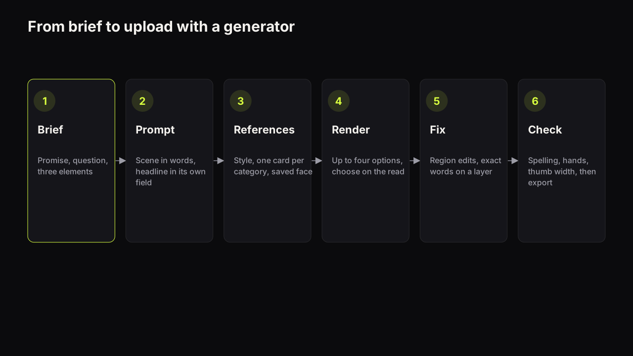
The pipeline in the hero figure is the sequence we recommend. Each step exists because it catches one of the failures above before it reaches the feed.
- Write the brief before the prompt. Decide what the video promises, what the cover should make the viewer ask, and what three elements carry it (a face, a headline, an object). The prompt describes the scene; the brief decides what the scene is for.
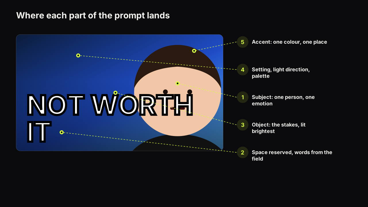
- Write a scene prompt and a separate headline. Describe the subject, the emotion, the setting, the light and the palette. Leave space in the description for the words ("empty dark space on the left"). Keep the headline to a few short words in the headline field. The prompt guide has one worked prompt per style.
- Add references, including a saved face. Pick a style, add at most one reference card per category, and choose the saved face and expression. A face reference beats a face description every time.
- Render several options and choose on the read, not the render. Four options cost four credits. Pick the one where the emotion is clearest and the empty space for words is cleanest, not the prettiest one. Failed renders never cost a credit, so a bad batch is a free lesson.
- Fix regions instead of rolling again. A hand, a garbled prop, a corner: draw a box and change only that. Rolling the whole image throws away everything that was right.
- Set exact text as a layer if spelling matters. Names, prices, product names, anything the audience will read closely. Let the model-rendered headline do the big loud words and let the layer do the precise ones.
- Check at feed size, then export for YouTube's limits. Shrink the cover to thumb width, next to real neighbours from your niche, and ask whether every word reads, whether you can name the emotion, and whether it is a different colour from the row. The free thumbnail tester drops it into a mock search page and phone feed. Then export at 1280 x 720 under 2 MB (Export HD on the bench), which clears the current upload spec on any device.
We would never ship a render straight from the options grid, even on a day when the first option looks perfect and the upload is due in ten minutes. Three checks matter most for AI covers: the spelling check (every letter, zoomed in), the hand check (every finger, or no hands), and the feed check at phone size. Together they take a minute. The minute is cheap next to a viewer noticing a merged letter and deciding the channel does not look closely at its own work.
Where spelling allows, we would let the model render the headline rather than default to a text layer, even though the layer is safer and free. A model-rendered word sits in the scene's light, catches the same shadows as the face and reads as one picture. A layer sits on top, and at thumb width the difference is small but real. So: model for the two or three big words, a layer for anything that must be exact, and a spelling check either way.
My own workflow changed because I've been building a product around this exact problem. The traditional loop is: land on a concept, find or generate assets, compose, adjust the text, check contrast, try alternative layouts, then go back because the idea still isn't clear enough. What I want from AI in that loop is help with the thinking before the picture: what the video is really about, what the click is, where the focal point should sit, and then several strong directions quickly rather than one image. A generator that skips the thinking just produces the fourth step faster.
How to avoid the AI look
A generator's default aesthetic is the average of everything it has seen. Your cover has to be a specific thing, in a specific niche, next to specific neighbours. That means overriding the defaults on purpose, and the override is the same move that the design principles guide recommends for any cover: one dominant colour, one accent, three elements, a clear eye path.
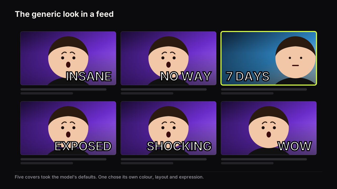
Four moves break the sameness.
Choose the colour from the niche, not the model. Look at the covers that already work in your category and pick a dominant colour the row does not use. Studying what already works in your niche is a research task, not a design task, and it takes an hour once. Put the colour in the prompt ("a flat mustard yellow wall behind the subject") and in the style choice; do not leave it to the model.
Put one real object from the video in the scene. The model's defaults are abstract: glows, skies, particles. A real object (the actual product, the actual dish, the actual console) is specific, and specificity is one of the levers of a click. Describe it precisely.
Use your own face, saved once. A generic model-drawn person is the fastest way to look like everyone else. Your face is the one asset nobody else in your niche has.
Use a layout the niche does not use. If everyone in your category uses a centred subject with a glow, use Split Screen or Number Pop. Layout is a pattern interruption when the layout is uncommon in the row.
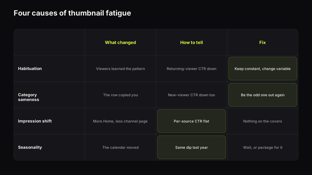
Channels that run the same AI style for months tend to see the effect described in the article on when a style stops working: the cover is not worse, but the niche has caught up and the audience has habituated. The refresh that works keeps the recognisable constant (a colour, a face position) and changes the variable (the layout, the expression, the object).
What YouTube requires of an AI-made cover
YouTube's rules are about the content of the thumbnail, not about the tool that made it.
YouTube's thumbnails policy says that thumbnails which violate the Community Guidelines are removed and can earn a strike, and that sexually explicit thumbnails can lead to termination. Packaging that promises content the video does not contain, whether in the title, the thumbnail or the description, is covered by the spam, deceptive practices and scams policy.
For AI covers the practical consequence is this: the ease of rendering a dramatic scene does not change the requirement that the scene represents the video. A rendered explosion on a video with no explosion is misleading packaging, whatever produced it. Prompt for the real moment, dramatised, not for a moment that never happens.
Faces are a second rule and it is stricter. A generator can put anyone in a scene, which is exactly why the bench's acceptable use policy limits saved faces to people who agreed to be on your thumbnails: you, a co-host, a client with permission. No public figures without consent, no minors. A cover with a famous face on a video they are not in is misleading packaging by YouTube's definition as well.
YouTube has rules about disclosing altered or synthetic content in some situations. They are outside the verified sources this guide relies on, so they are not summarised here. Check YouTube's current help pages when a cover depicts a real event or person in a way that did not happen.
What it costs, honestly
The right comparison is not "AI versus designer" as a contest. Each way of making covers trades time, control, consistency and money differently, and most channels use more than one.
| Way of making covers | Time per cover | Control | Consistency across a series | Cost model |
|---|---|---|---|---|
| Generator (the bench) | About a minute per render, plus fixes | High on scene and options, medium on fine detail | High with a saved face and a fixed style | One credit per image; Free gives 4 credits plus 4 more after the first render; Creator is $15 a month for 70 credits |
| Design tool with photos | Tens of minutes to hours | Total, pixel by pixel | Depends on the person | Software subscription plus your time |
| Designer or editor | Hours to days including the round trip | Total, delegated | High once briefed, if the same person stays | Per cover or retainer; you still write the brief |
We would run a hybrid on most channels, even though it means paying for a generator and a designer in the same month. Generate the scene and the options, fix regions and text in the editor, and keep a designer for the covers where a specific illustration or a complex composite is the whole idea. The generator is the fastest way to a first draft of a promise. The judgement about which promise to make does not get cheaper, and a designer who understands the channel is the best place we know to buy it.
Two cost details matter more than the headline price. Failed renders do not cost a credit, and text layers, references and versions on the bench are free, so the expensive part is the render count. The arithmetic for one illustrative channel: two uploads a week on the Creator plan's 70 credits. Four options per video is 4 credits; one region edit is 2; a second expression on the chosen face, if needed, is 2 more. Call it 8 per video, 16 a week, a little under 70 a month, with the rollover covering the week a video needs a second round. If the same channel finds itself at sixteen renders per video, the problem is not the plan. The brief was not finished before the first render.
Pre-upload checks for an AI cover
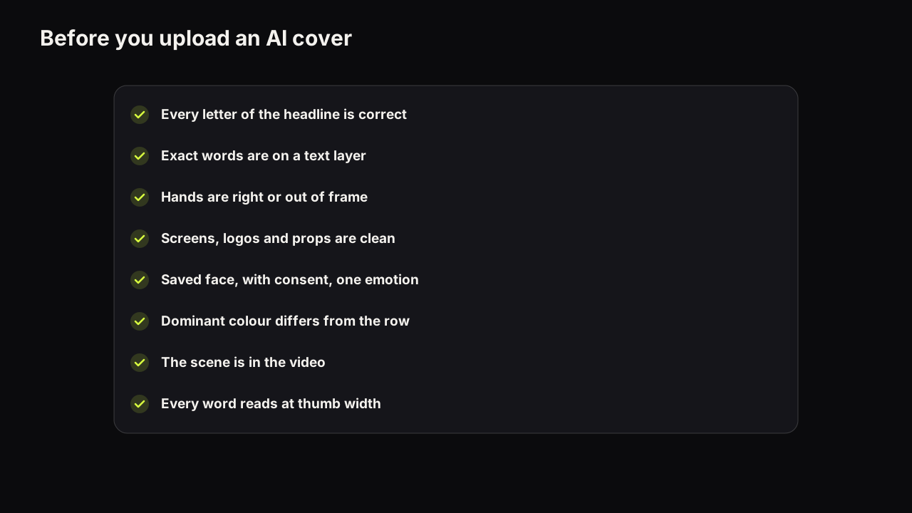
- Every letter of the rendered headline is correct, checked zoomed in, not at preview size.
- Exact words (names, prices, products) are on a text layer, not left to the model.
- Every visible hand has five fingers and holds what it is holding, or hands are out of frame.
- Screens, logos and small props in the scene are either clean or cropped out.
- The face is a saved face of someone who agreed to be on the cover, at least a third of the height, one nameable emotion.
- The dominant colour differs from the neighbours in your niche's row.
- The scene shows something the video actually contains, dramatised but not invented.
- At thumb width, every word reads and the emotion can be named.
The face-size line is not specific to AI; the face-size floor applies to any cover, and generators tend to draw faces too small because the prompt described a whole scene. Ask for "face and shoulders filling the right half" rather than "a person in a kitchen". The thumb-width line is the one most creators skip, and why the phone decides most clicks explains what breaks first.
If it were our channel
Suppose we ran a small personal-finance channel, one upload a week, and moved cover production onto a generator tomorrow. The first thing we would do is not render anything. We would spend an hour on the row: what colour the finance covers around ours already are, how big the faces run, whether the numbers glow. Then one selfie into Face Lab, and the eight expressions saved, because every render after that depends on the face being ours and constant.
For each video we would write the brief first (promise, question, three elements), then a scene prompt with the palette chosen against the row, and a headline of one figure. Four options, chosen for the cleanest empty space rather than the prettiest light. Region-edit the one thing wrong. The exact sum or the product name, if the video has one, on a layer.
The trade-off we would accept is a slower first month. Eight credits a video is more than we would need once the prompts settle, and the hour on the row is an hour not spent editing. We would take it, because the failure we are most afraid of is the quiet one: six weeks of correct, well-lit covers that look like the rest of the finance feed, and no way to see it from inside the options grid. So we would keep a folder of our last six covers beside six from the row and look at the twelve together, at thumb width, before every upload. That check costs nothing and it is the one the generator cannot do for us.
Common questions
Do AI thumbnails work on YouTube?
They work when the result passes the same tests as any other cover: readable words at feed size, one clear emotion, one idea, a promise the video keeps. The generator changes how the picture is produced, not what the feed rewards. The failure to manage is sameness, because a generic render blends into a row of other generic renders.
Are AI-generated thumbnails allowed on YouTube?
YouTube's thumbnails policy is about content, not tools. A cover has to follow the Community Guidelines, and packaging that promises something the video does not contain falls under the spam, deceptive practices and scams policy. An AI-made cover is judged by the same rules as a photographed one.
Why does the text on AI thumbnails come out misspelt?
The model draws letters as shapes it has learned to expect. It has no font file and no spell checker. Short, common words in capitals survive best. When the spelling has to be exact, keep the rendered headline short and check every letter, or add the words as a real text layer.
Can an AI generator put my own face in a thumbnail?
Some can, from a saved reference. On Thumbnail Bench, Face Lab takes one selfie, cuts it out, and produces eight expressions you can place into any render. Only use faces of people who agreed to be on your thumbnails.
What to do next
Write the brief for your next video first: the promise, the question the cover should raise, the three elements. Then use the prompt guide's six-part structure and write the scene prompt and the headline as two separate things. Render four options, fix one region if needed, put exact words on a layer, and run the eight checks above with the pre-upload checklist beside them. Ship the cover that reads best at thumb width, and keep the runner-up: it is your first candidate if the video needs a new cover later.
The text failure is common enough to get its own piece: why generators misspell and the workflow that fixes it.
Each part of the bench has a craft piece: what the reference cards do to a render, choosing among the eight expressions, region edits instead of re-rolls, shooting a selfie Face Lab can use, iterating with Tweak, and for the wider question, how to make thumbnails without Photoshop at all.