On this page
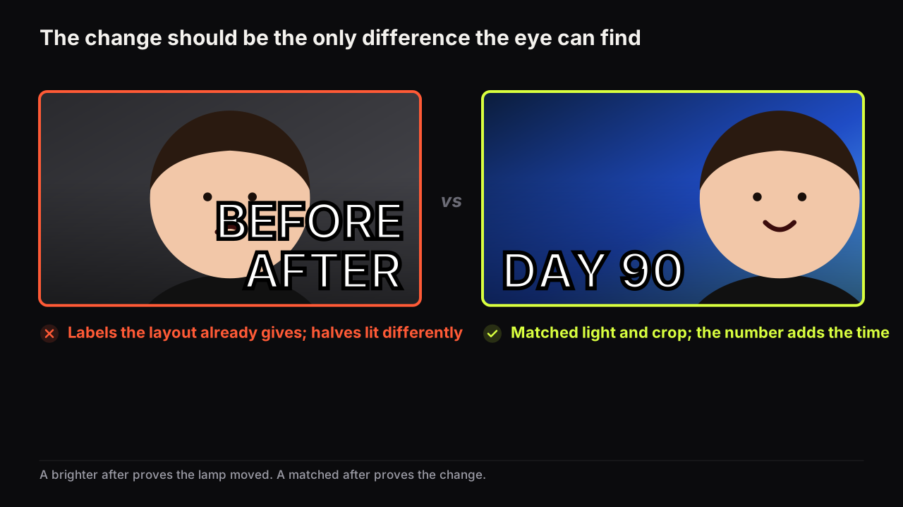
A before and after thumbnail works when the two halves match in everything except the change: same light, same angle, same distance, same crop, same colour treatment, so that the only difference the eye can find is the one the video delivers. That is the whole craft of the transformation frame, and it is the part most covers get wrong, usually by accident. Brighten the after, shoot the before under a ceiling bulb, stand a step closer for one of them, and the viewer reads lighting and lens as the change. The cover looks like a transformation and proves nothing.
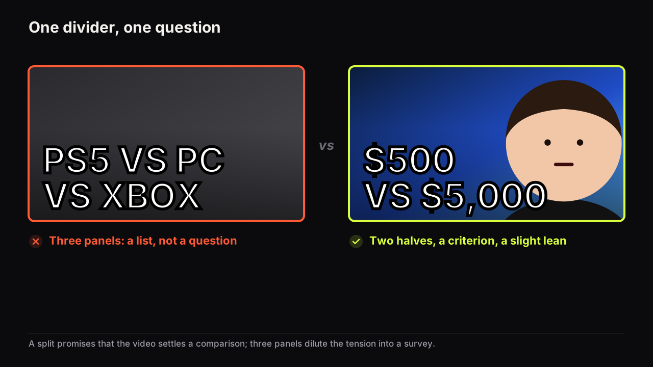
The general split layout, with a versus or a contradiction on either side of the divider rather than time, is its own piece: split-screen and versus thumbnails. The hierarchy and contrast rules every cover obeys are in the design principles guide; its layout table already notes that this frame breaks when the halves are lit differently, and this article is that one cell expanded.
What the transformation frame promises
A before and after cover promises two things at once: that a change happened, and that the video shows how. The after is the proof; the gap between the halves is the question. The viewer does not ask "did it change?" because the cover has answered that. They ask "how?", and sometimes "how long?", and the video owns the answer.
That is why the frame is strongest when the change is large, visible at thumb width, and of a kind the viewer wants for themselves: a garage cleared, a body changed, a garden rebuilt, a website redesigned, a painting restored, a chair reupholstered. It is weakest when the change is subtle (a colour grade, a small weight change, a tidy of a room that was already tidy), because at feed size a subtle change is no change, and the cover promises nothing.
In the rows we look at, the transformation covers that get read are the ones where the difference between the halves survives squinting. If you have to look twice to find the change on your monitor, it does not exist on a phone.
The matched-pair rule
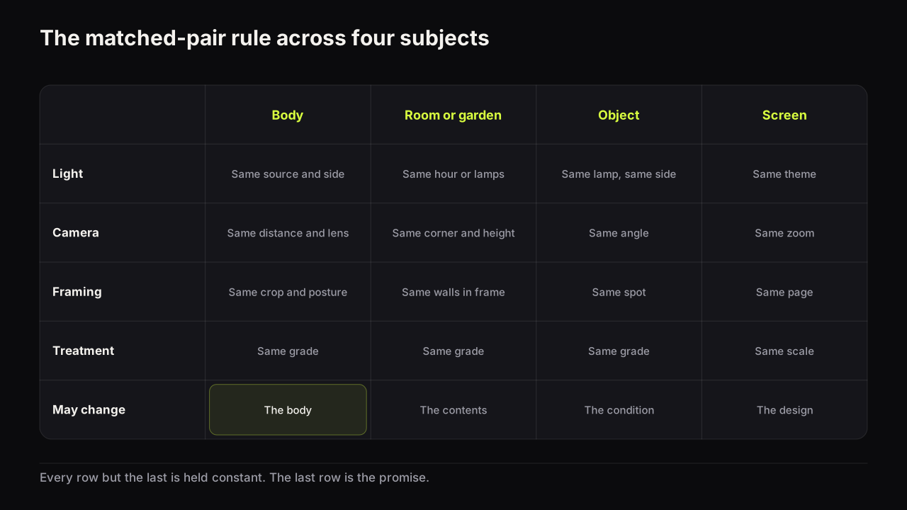
The two halves should be identical in every respect but the one that changed. Each mismatch is a second difference, and the eye cannot tell a second difference from the first. The table lists what to hold constant, and what is allowed to move, for the four subjects the frame is used on most.
| Hold the same | Body | Room or garden | Object | Screen or design |
|---|---|---|---|---|
| Light | Same source, side and colour | Same hour or same lamps | Same lamp, same side | Same theme, light or dark |
| Camera | Same distance, height and lens | Same corner, same height | Same angle and distance | Same zoom, same viewport |
| Framing | Same crop, same posture | Same walls in frame | Same spot on the surface | Same page, same scroll |
| Treatment | Same grade, same skin tone | Same grade | Same grade | Same scale |
| What may change | The body | The contents | The condition | The design |
Two mismatches deserve their own warning, because they are the ones people make on purpose without noticing.
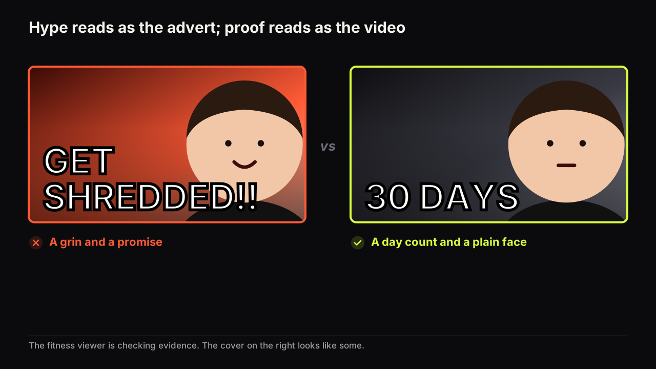
Posture and expression. A slouched, unlit, neutral before beside a flexed, lit, grinning after is the fitness cliché. The change in posture is real and the change in light is real, and both are fakes in the sense that matters: they would be there whether or not the body changed. Hold the posture and let the body differ. If a face is in frame, hold the expression too, or let the after carry pride and keep the before neutral rather than sad. Pride is a reaction to the change; sadness is a prop.
Colour grade. A cool, desaturated before and a warm, saturated after is the renovation cliché, and it is done in the edit rather than the shoot. It is the same fake. Grade both halves the same way and, if the after still needs to arrive first, give it the accent colour on its label rather than a different grade.
Shoot the before and the after as one setup: mark the tripod position on the floor with tape, note the lamp positions and the camera settings, and photograph the before with the after in mind. A before shot without a plan for the after is the reason most pairs mismatch.
Take a garden cover. Left half: a phone snap of the overgrown lawn at noon, grey sky, taken from the back door. Right half: the new lawn at golden hour from a drone, saturated, with a smiling face pasted over the divider, BEFORE and AFTER in white and an orange arrow between them. The viewer infers that the light and the drone did most of the work, and they are half right. The matched version shoots both halves from the back door at the same height and the same overcast hour, grades them the same, drops the face and the labels, says 3 WEEKENDS, and gives the after a little more width with a slight diagonal. The only thing that differs is the lawn.
We would shoot both halves under flat overcast light even though the after looks less impressive that way than it would at sunset. A duller after that is believed beats a golden one that is discounted, and the golden one is discounted in the first frame of the video, when the viewer sees the real light.
The divider, the direction and the labels
Before on the left, after on the right. In left-to-right languages the eye reads the frame as time, and the right half is where it stops, which is where the proof belongs. Reversing the order is sometimes done for a reason (the after as the hook, the before as the reveal), and it works only if the labels make the order unmistakable, which spends words.
The divider is a cut, not an ornament. A plain vertical line, slightly softened, does the job. A diagonal that gives the after the larger share of the frame adds energy and tilts the eye towards the proof, and it is the one variation we recommend. Torn-paper edges, lightning bolts and thick coloured bars are a fourth element with nothing to say. An arrow across the divider is the most common ornament and it says what the layout already says; when an arrow earns its place and when it is a patch covers the rule.
Skip the words BEFORE and AFTER. The layout says it. Those two words are spent on nothing when the same space could carry the one thing the picture cannot show: the time it took, the cost, the count. DAY 90. $40. 6 HOURS. That is the case made in how many words a cover can carry, and the transformation frame is where it applies most cleanly. If the halves are so similar that the viewer cannot tell which is which without labels, the problem is the change, not the labels.
One face, or none. The frame can include the same face in both halves (fitness, hair, style) or no face at all (rooms, objects, screens). Two different people is a comparison, not a transformation, and belongs in the split-screen piece. Where the face appears, the fitness playbook covers the doubt-versus-pride choice, and the after-half expression should be a reaction to the change rather than a performance for the camera.
When to show only the after
The before and after frame spends half the cover on a state the viewer may not need to see. Four cases favour a single-state cover.
- The before is obvious to the audience. Everyone knows what a cluttered garage or an overgrown lawn looks like. The after alone, large, with the time or cost as the headline, promises the same change and gives the proof twice the size. The title can carry the before ("My garage was unusable").
- The before belongs to someone else. A client's home, a friend's body, a family member's room. Showing the unflattering state on a public cover is a permission question and often a kindness question. Show the after and describe the before in the title.
- The after is the surprise. When the finished thing is unexpected (a shed that became a studio, a wreck that became a showroom car), the after alone opens the question "what was this?" and the before becomes the reveal inside the video.
- The change is a number, not a look. Debt paid, weight lifted, subscribers, speed. There is nothing to photograph; the cover is a figure and a direction word, and the two-state version is two figures with a gap between them.
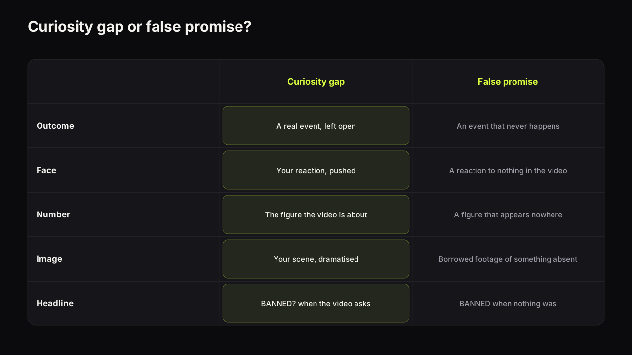
The mirror case is the before with the after withheld: the messy room, the wrecked car, the day-one body, and a headline that promises the result without showing it. That is a curiosity cover rather than a proof cover, and it is one of the gap types that turn a setup into a click. It suits series and journeys, where the after does not yet exist.
Where the honesty line sits
Most transformation covers sit on the craft side of the line, and the mismatches above cost belief rather than policy. Two things cross it.
YouTube's thumbnails policy points to the spam, deceptive practices and scams policy for titles, thumbnails and descriptions that promise content the video does not contain. We do not describe enforcement beyond what those pages say.
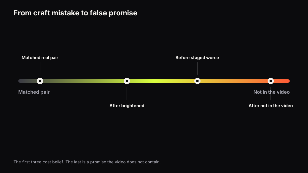
An after that is not in the video is the first crossing: a result borrowed from elsewhere, a render of a body or a room that was never achieved, a stock photo standing in for the finish. The second is a before staged to be worse than it was: a room messed up for the shoot, a body posed to look heavier than the video shows. The first is a promise the video does not contain, in the policy's own words. The second is, in our view, the transformation equivalent of an invented number: it may never be enforced, and it still makes the cover a lie the viewer notices at the first frame of the video.
We think the honest transformation cover is also the one that holds a viewer, because the video opens on the same before the cover showed and the viewer's trust is confirmed rather than spent. A cover that wins the click by exaggeration loses the viewer in the first minute, and YouTube's help page on testing titles and thumbnails says its testing tool decides by watch time share rather than clicks, a mechanism that punishes exactly this. The full map of where taste ends and policy begins is in the thumbnail mistakes that can get a cover removed.
Lighting the two halves so the change is real
The matched-pair rule is mostly a lighting rule, because light is the mismatch the eye reads fastest. Three habits make the halves match.
- Same source, same side, same colour. A window for the before and a lamp for the after differ in direction and temperature, and the after will look warmer and better lit regardless of the subject. Use the same lamp, or shoot both at the same hour on the same side of the same window.
- Same exposure. Lock the phone's exposure or note the camera settings. Auto exposure brightens a tidy room and darkens a cluttered one on its own, which manufactures the cliché without anyone deciding to.
- Separate both halves from their own ground. Each half needs its subject to separate from what is behind it, and both grounds should sit at similar brightness so that neither half wins by default. Lighting a face so it separates covers the setup for a person; for a room, the same key-and-rim logic applies to the one object that carries the change.
Building the frame on the bench
The Before / After style on the bench sets the divided frame and renders the headline into it, which suits covers where the change is an idea rather than a photograph: a habit, a workflow, a budget, a desk shown as a type of desk rather than as your desk. For a real transformation the honesty rule decides the workflow: the two states are your photographs, composed in whatever editor you use, and a render is not a substitute for either of them. Do not render the after. A generated after is a transformation that did not happen. For the exact digits of a day count or a cost, the editor's text layers add them on top in a heavy font, free.
The matched-pair check
Run it on the finished cover at thumb width.
- Is the change visible when you squint?
- Same light source, side and colour in both halves?
- Same camera distance, height and crop?
- Same posture and, if a face is in frame, a matched or reaction expression rather than a sad-then-happy pair?
- Same colour grade, with the accent on the after's label rather than on the after's grade?
- Before on the left, after on the right, unless the labels make a reversal unmistakable?
- Are the words BEFORE and AFTER gone, replaced by the time, the cost or the count?
- Is the after in the video, and is the before the real starting state?
Common questions
Should the before go on the left of the thumbnail?
In left-to-right languages, yes. The eye reads the frame as time and stops on the right half, which is where the proof belongs. Reversing the order works only when the labels make it unmistakable, and that spends words the cover could use on the time or the cost.
Do I need to write BEFORE and AFTER on the thumbnail?
No. The divided layout already says it, so the two words carry nothing. Spend the space on what the picture cannot show, such as the day count, the cost or the hours. If the viewer cannot tell which half is which without labels, the change is too small for the frame.
Is exaggerating a before and after against YouTube's rules?
YouTube's thumbnails policy points to its deceptive practices policy for packaging that promises content the video does not contain, so an after that is not in the video is the clear case. A before staged to look worse than it was is, in our view, the same kind of lie even where it is never enforced, and viewers notice it in the first frame.
What to do next
Before the next transformation shoot, tape the tripod position, write down the lamp and the camera settings, and take the before with the after already planned. When the pair exists, put the two halves side by side at thumb width and squint: if the change is the first thing you see, the frame is working, and the headline is the number the picture cannot show. If the change is not the first thing you see, the after alone with a day count is the better cover. The versus and contradiction versions of the divided frame, where the two halves are rivals rather than two moments in time, are in the split-screen piece linked above.