On this page
- The body is the object, and sometimes the face too
- Day counts: the number that names the effort
- An honest before and after
- Doubt or pride: the two honest expressions
- Workout, nutrition and journey: three formats, three heroes
- The row is bright and skin-heavy, so the interruption is quiet
- Building fitness covers on the bench
- The fitness cover check
- Common questions
- What to do next
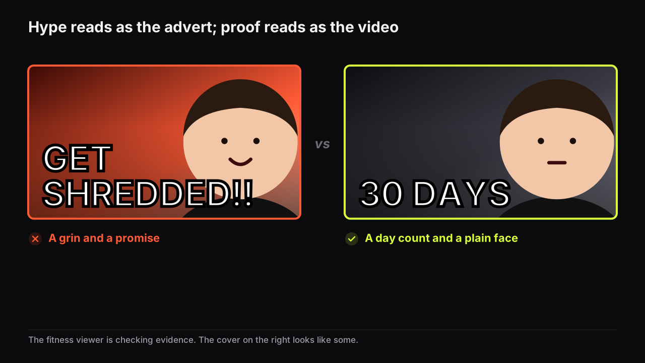
Fitness thumbnails work when they show proof rather than hype: the body, the plate or the scale as the object, a day count that names the effort, a before and after lit the same on both halves, and a face carrying doubt or pride rather than a sales grin. The fitness viewer's question is "did it work, and would it work on me?", and every element on the cover is evidence for or against the answer. That is what separates fitness from the rows around it; the general rules of hierarchy and the shrink to feed size hold here as they do in every niche's row.
Hype is the failure mode because the row is full of it. Programmes, supplements and coaching are sold in the same feed the videos appear in, and the viewer has learnt what an advert looks like: a lit, flexed, grinning body and a promise in capitals. A cover that borrows that grammar gets filed with the adverts. A cover that looks like a plain record of something that happened gets filed with the videos.
In the fitness rows we look at, the winning covers are less polished than their neighbours, not more. Ordinary light, a flat wall, a phone-quality still, a number, a face that looks unsure or quietly pleased. The polished cover with the studio lighting and the wide smile is common, and it is the one the eye learns to skip, because it looks like the thing the viewer did not come for.
The body is the object, and sometimes the face too
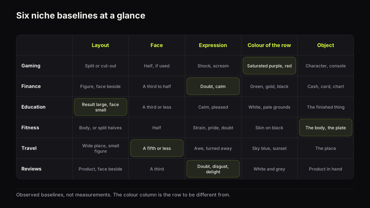
Fitness is the one niche where the object and the face belong to the same person, and the mistake that follows is trying to show both. A full-length figure that includes the face has a face too small to read and a body too small to judge. Pick one crop, and let the crop follow what the video is about.
- The face crop. Head and shoulders at half the height, for opinion, advice and "I tried it" videos where the person's judgement is the promise.
- The torso crop. Shoulders to hips, face out of frame or cut at the chin, for transformations and physique videos where the change is the promise. This is the crop the niche is built on.
- The full-figure crop. The whole body in a movement or a lift, for form guides, mobility and strength videos where the shape of the movement is the promise. The face is incidental and can be turned away.
Whichever crop you choose, the part shown should fill half the height and be lit from the side, because side light gives shape and front light flattens it. A body lit flat from the front reads as a silhouette at thumb width, and the difference the video is about disappears into it.
On transformation covers we would go further and drop the face altogether, even though most thumbnail advice says to add one and even though a known face is what a returning subscriber recognises in the row. On a torso crop the face takes height the body needs, and the viewer is judging the body, not the person. Channels that do not show a body at all have substitutes that work: hands on the bar, the plate, the scale, the shoes at the start line; the faceless cover guide covers the substitutes and the extra contrast they need.
Day counts: the number that names the effort
The day count is fitness's native number and the one pattern the rest of YouTube has borrowed from this niche. It works because it prices the promise: "30 DAYS" tells the viewer what the result cost, and cost is what makes a result believable. How big a figure should be, where it sits and why a precise figure often beats a round one are the number-led cover's subject; what is specific to fitness is what the count signals.
Different counts promise different videos. "DAY 1" says a journey is starting and asks the viewer to follow. "DAY 30" or "30 DAYS" says a result is in the video. "75 DAYS" or "1 YEAR" says the challenge is complete and the video is the reckoning. A count on its own is the strongest gap the fitness niche has when it sits beside the before and not the after: the viewer knows how long, sees where it started, and has to click for where it ended.
Two rules keep the count honest. The number is the actual span, not the programme's name. And the count pairs with the state it produced, or with the doubt it started from, never with a claim about the viewer. "30 DAYS" beside a body is a record; "30 DAYS TO ABS" beside a body is an advert.
Imagine the cover for a first-ever-pull-up video. A torso from behind, shoulders to hips, hands on the bar, lit from a window on the left so the back has shape. "90 DAYS" in white block letters top-left, and under it, smaller and in yellow, "TO ABS". Everything above that second line is a record: the viewer infers that someone spent three months on one movement and the video shows how it went. The second line turns the same picture into a programme advert, and it also lies a little, because the video is about a pull-up. Cut "TO ABS", keep "90 DAYS", and let the hands on the bar say what the ninety days were for.
An honest before and after
The before and after is the fitness niche's home layout, and the mechanics of the split (the divider, which half gets the accent, when to show only the after) are in the before and after guide. What is specific to fitness is that the change is a claim about a body, and a body can be made to look changed without changing. The honesty rules are photographic.
- Same light. Same room, same lamp, same time of day. Different light is the most common way a fitness before and after lies, and viewers know it.
- Same distance and lens. The camera in the same place. A closer after looks bigger.
- Same pose and tension. Relaxed against relaxed, or flexed against flexed. A slumped before beside a flexed after is a posture comparison.
- Same clothing category. Not a jumper before and shorts after.
- No pump, tan or oil presented as change. They are the tools of the physique stage, and on a cover they read as the trick they are.
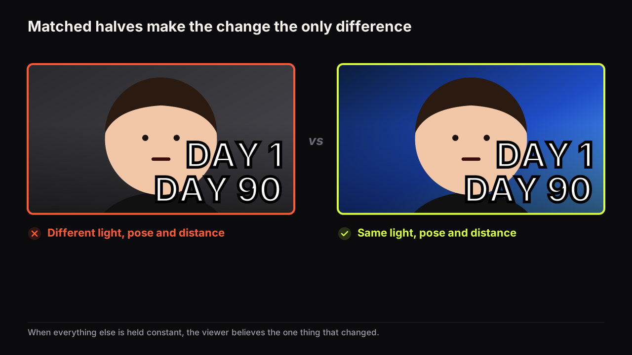
YouTube's thumbnails policy covers thumbnails directly, and misleading packaging, meaning titles, thumbnails and descriptions that promise content the video does not contain, is covered by the spam, deceptive practices and scams policy. A transformation the video does not show, or one manufactured by lighting and pose, sits on the wrong side of that line.
The general version of where the line falls, and the mistakes that cross it, is in the packaging mistakes that can get a cover removed. One fitness-specific point: when the body is a client's rather than your own, the honesty rules still apply and a consent rule joins them. A client's before is theirs, and using a client's face or image on your covers needs their agreement in writing before it needs a layout.
Doubt or pride: the two honest expressions
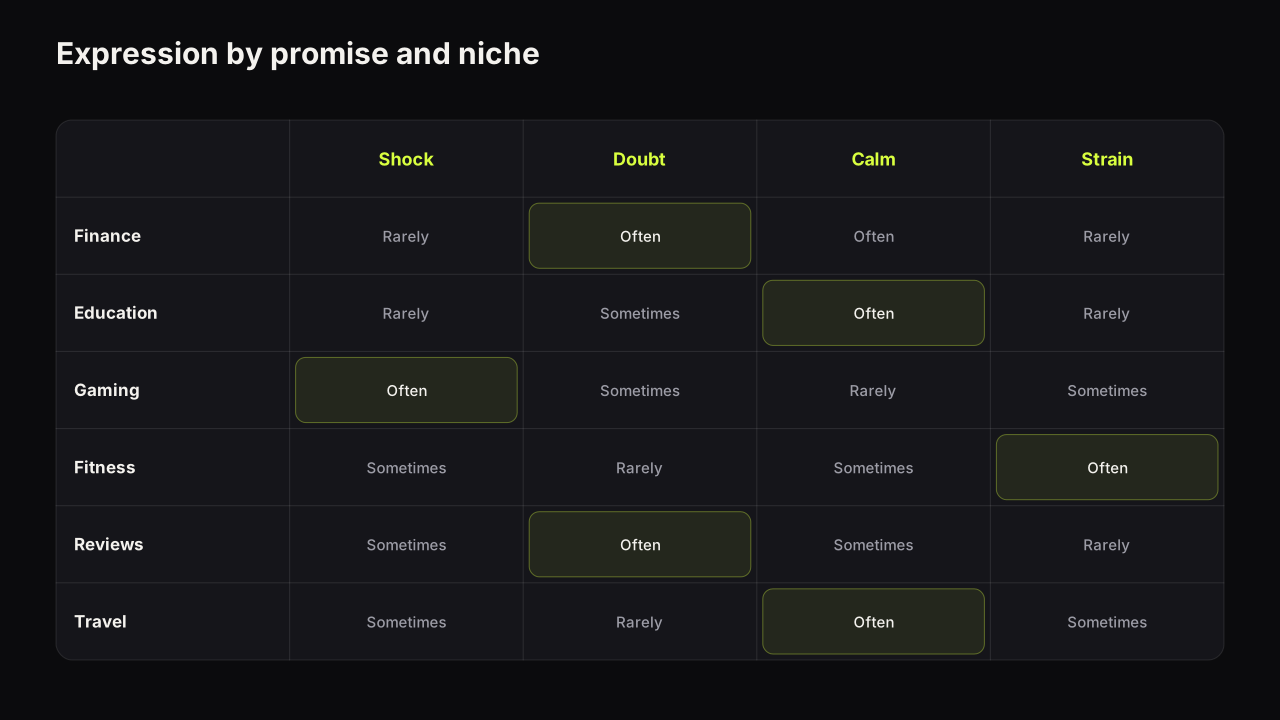
A fitness face has two settings that read as true and one that reads as a pitch. Doubt is for the attempt: "I tried it", "does this work", "day one". Pride is for the result: the finished transformation, the lift that went up, the run that got done. The pitch is the wide grin with the teeth, and it belongs to the adverts in the row. Strain is a third setting for the moment itself, the face under the bar, and it fits form and strength videos where the video is about effort rather than outcome.
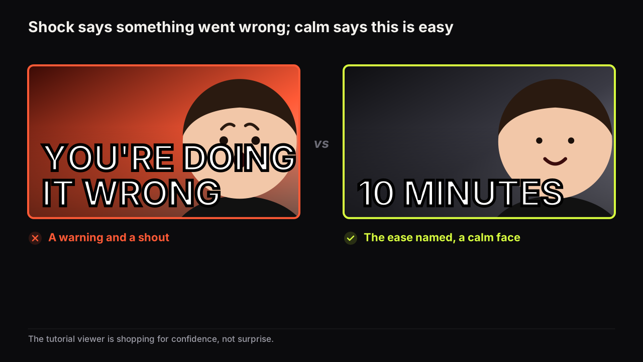
Matching the expression to the promise is the general skill. The fitness-specific version is a table.
| The video promises | Face | Where it looks |
|---|---|---|
| An attempt or a test | Doubt: raised eyebrow, closed mouth | At the plate, the scale, the programme |
| A finished transformation | Pride: small smile, chin level | At the viewer |
| The effort itself | Strain | At the bar, eyes down |
| A warning or a myth | Flat, or a wince | At the thing being warned about |
| A sale | The grin | At the viewer, and this is the one to avoid |
Choose doubt when the video begins with a question and pride when it ends with a result. Never pair pride with "DAY 1" or doubt with "1 YEAR"; the mismatch reads as staged. And if the face is not carrying doubt or pride, ask whether it is carrying anything, because a torso crop with no face and a day count often says more.
Workout, nutrition and journey: three formats, three heroes
Fitness channels make three kinds of video, and each wants a different thing to be largest on the cover. Putting the journey's body on a workout cover, or the workout's movement on a nutrition cover, is the most common mismatch we see in the niche.
| Format | Hero | Number | Words | Face |
|---|---|---|---|---|
| Workout and form | The movement, or hands on the equipment | Minutes or rounds | The constraint: "NO GYM", "10 MIN", "ONE DUMBBELL" | Small or none; strain if shown |
| Nutrition and diet | The plate, or body beside plate | Days or a count of meals | The rule: "ONE MEAL", "NO SUGAR", "$3 A DAY" | Doubt, a third of the height |
| Journey and transformation | The body, or two halves | The day count | Nothing more; the count is the words | Pride or doubt, a third, or none in a torso crop |
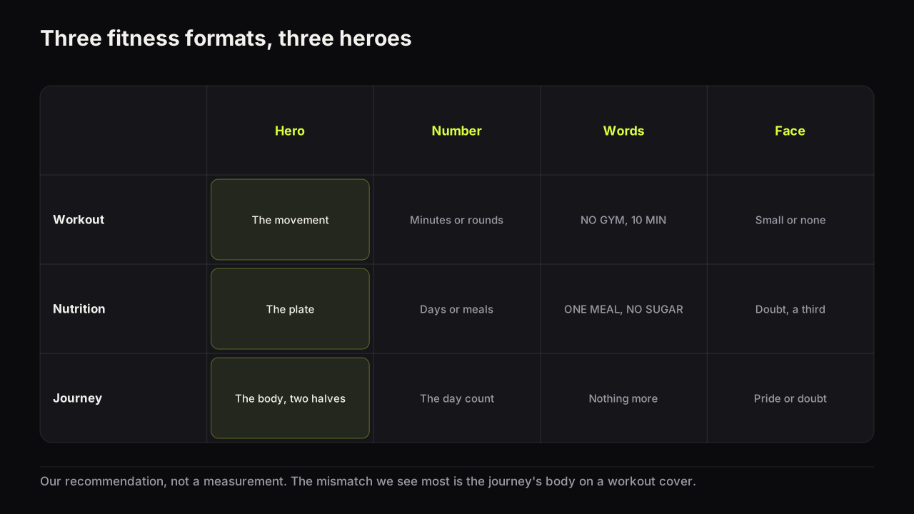
The nutrition row borrows from food and the journey row from finance. A nutrition cover with a dish close and cropped reads the way a food cover does, and a day count with a doubtful face reads the way a money figure with a doubtful face does; both borrowings keep the fitness row's honesty grammar and drop the other niche's expression. The versus (this diet against that one, home against gym) is a fourth format, and the split-screen and versus layout covers what goes on each side.
The row is bright and skin-heavy, so the interruption is quiet
Fitness rows are among the most uniform on YouTube: skin tones on black or on one hot colour, heavy outlined type, and the same two crops repeated. That makes the departure easy to find.
In the fitness rows we look at, the cover the eye stops on is often the clothed one, the one on a plain pale ground, or the one with a small figure in an ordinary room. The row's saturation is so consistent that restraint is the odd one out. The reasoning is the same one behind being a different colour from your neighbours in colour and contrast that survive a phone screen; in fitness the neighbours are unusually predictable.
The risk in a quiet cover is that the body stops reading as a body at thumb width, so the crop has to get tighter as the treatment gets calmer. A torso at half the height on a pale ground in soft side light is quiet and still legible. A whole person in a grey room is just a grey room.
Building fitness covers on the bench
The Before / After style is the fitness layout: two halves, a divider, the headline rendered into the image. Number Pop carries the day count on a single-image cover, and Split Screen sets up the versus between two programmes or two diets. In the reference library, which is free and uses no credits, Studio Portrait gives a plain lit face for the doubt or pride crop and Dark Studio keeps the ground quiet. For a day count that must be exact to the digit, the editor's text layers add it in a heavy font on top of any render, free. The honesty rules do not change on the bench: a rendered body is not your before or your after, and the two halves of a real transformation have to be your own photographs.
The fitness cover check
Run it at thumb width, beside three covers from the fitness row.
- One crop: face, torso or full figure. Not a whole person with a face too small to read.
- Is the part shown at half the height and lit from the side?
- Is the day count the real span, paired with a state rather than a claim about the viewer?
- Before and after: same light, distance, pose, tension and clothing category?
- Does the face carry doubt or pride, and does it match the count?
- Would this cover work as the advert for a programme? If yes, quieten it.
- Is the body yours, or shown with the owner's written agreement?
- Does the format match the hero: movement, plate or body?
Common questions
Should a fitness thumbnail show the body?
Usually yes, cropped to the part the video is about, at half the height, in plain side light. The body is the fitness niche's object, and a cover that shows the whole person from a distance shows neither a readable face nor a judgeable body. Nutrition videos swap the body for the plate; form guides swap it for the movement.
Is a before and after allowed on YouTube?
Yes, when the change is real and the two halves show it honestly. Misleading packaging, meaning a thumbnail that promises something the video does not contain, falls under YouTube's spam, deceptive practices and scams policy. Shoot both halves in the same light, from the same distance, in the same pose, and the after will look true because it is.
Do I need my face on a fitness thumbnail?
Not always. Transformation and challenge covers benefit from a face at a third of the height carrying doubt or pride, because the face is the person vouching for the result. Workout and form covers often do better with the movement or hands on the bar and no face at all.
What to do next
Decide which of the three formats your next video is, and let that choose the hero: movement, plate or body. Then write the one number the video can honestly carry and the feeling the viewer should read on the face, doubt or pride. If it is a transformation, shoot the after in the same place and light as the before, and read the before and after guide linked above for the layout.