On this page
A split-screen thumbnail works because a divider turns two pictures into one question, and a versus thumbnail is the version where the question is "which?". The divider promises that the video settles a comparison; what you put on each side decides whether the question forms at all, and how symmetrical the two halves are decides whether the cover has an opinion. Most versus covers fail on one of two counts: the halves are not parallel, so the viewer compares the photography instead of the things, or the badge in the middle has grown louder than either side.
What a divider promises
A vertical line between two images tells the viewer that the two are related and that the relation is the subject of the video. Without the line they are a collage; with it they are a claim that these two things are in tension and the video resolves it. That is a contradiction gap in the sense that the curiosity-gap guide describes: two things that cannot both be best, or both be true, or both be the same, and an outcome that is withheld.
The promise has a cost. A split cover on a video that never actually compares the two, or compares them and refuses to decide, is a question the video does not answer, and the viewer who clicked for the answer leaves early.
Use a split only when the video contains a comparison that resolves. If the video is about one thing, give that thing the cover. If it compares two things and reaches a verdict, split it. If it compares two things and ends with "it depends", the honest cover shows the criterion the answer depends on, not a versus that promises a winner.
The layout's place among the others, and the four principles that all of them apply, are in the design principles pillar; the split-screen row of its layout table says the halves must not tie, and this piece is the detail behind that row.
The three kinds of split
Every split is one of three, and they ask different questions, want different things on each side, and fail in different ways.
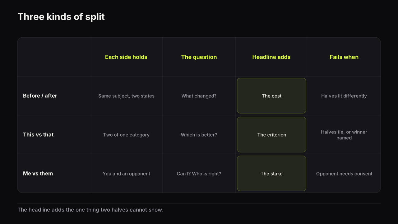
| Kind | Each side holds | The question | The headline adds | Fails when |
|---|---|---|---|---|
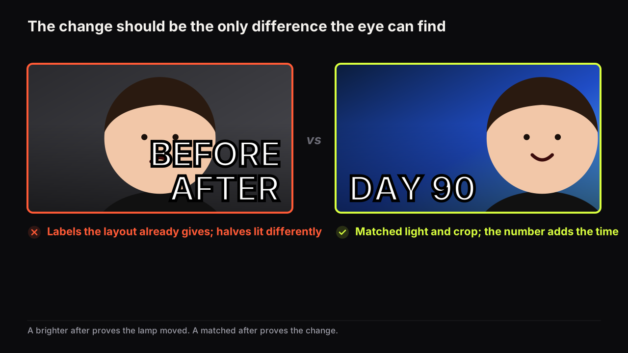
| Before and after | The same subject in two states | What changed, and how? | The cost of the change: days, money, effort | The halves are lit or framed differently, so the change reads as lighting |
| This versus that | Two things of the same category | Which is better? | The criterion: price, speed, taste | The halves tie, or the cover names the winner |
| Me versus them | You against an opponent, a claim, a record | Can I? Who is right? | The stake | The opponent is a person you have no right to show |
Before and after is the split with the most trust riding on it, because the viewer is judging whether the change is real from two small pictures. The honesty line, and how to light the two halves the same so the difference is the difference, are the subject of the guide to honest before-and-after covers; here the point is that the divider on a before-and-after is a timeline, not a contest, and the headline should say how far along the timeline the video travels.
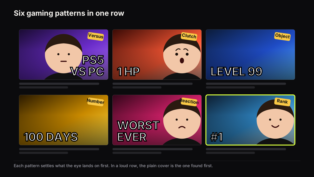
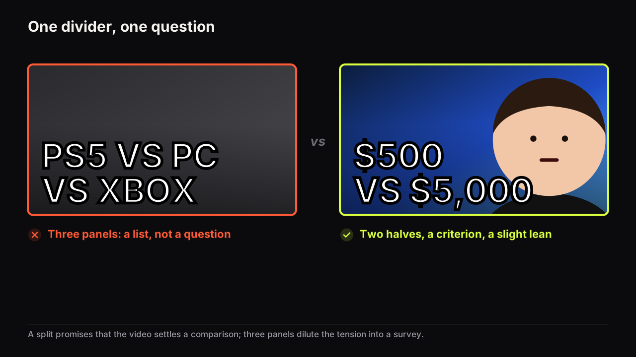
This versus that is the classic versus, and gaming owns the most developed version of it. The gaming patterns guide already explains why halves of equal brightness read as a tie and how to give one half a lean, so that is one sentence here. What it adds beyond gaming is the criterion: a versus with no criterion is "which is better at nothing in particular", and the headline's job is to supply the axis the video judges on. "$500 VS $5,000" is a criterion; "WHICH ONE?" is not. Tech reviews run on this version, and the review cover, where the object is the hero covers the object-led variant.
Me versus them is the split where one half is you. The opponent can be a person, a record, a price, a claim, a game boss. When the opponent is a person, the half that shows them raises the consent and likeness question that the commentary cover guide sets out in full, and the alternatives it gives (the artefact, the silhouette) work on a split exactly as they do anywhere else. When the opponent is a thing, your face carries the stake and the thing carries the scale.
Symmetry, lean and the centre badge
Two halves of equal size, equal brightness and equal treatment ask a neutral question: which? Give one half more brightness, the accent colour, or the face's gaze, and the cover leans; it now asks the viewer to disagree with an opinion it has not quite stated. Both are legitimate. They are different promises.
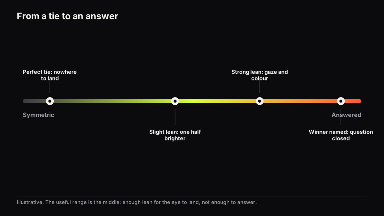
We prefer a slight lean on almost every versus cover, because a perfect tie gives the eye nowhere to land first and the cover reads as two thumbnails glued together. The lean should hint, not announce. Keep the halves the same size and change one thing: the brightness of one half, the colour of one label, or where the face is looking. A cover that shows the winner has answered its own question, and the reasoning about why an answered cover loses the click is in the curiosity-gap guide above.
The centre badge (the VS, the arrow, the "OR") names the relation, and it sits at the exact point where the eye crosses from one half to the other. That makes it the most expensive real estate on the cover. Use it when the two halves could be misread as one scene; keep it to two letters in one colour; and never let it grow into a third element with its own outline, glow and shadow. The divider itself can do the badge's job: a hard vertical edge, a narrow gap of background colour between the halves, or an angled cut. We would drop the badge on most versus covers, even though the row is full of them and viewers have learnt to read a VS as a genre marker; a gap of ground colour says the same thing and gives the eye nothing to trip over on its way across. When devices of this kind help and when they are patching an unclear layout is the subject of arrows, circles and badges.
A diagonal divider gives each half a wide end and a narrow end, and in the covers we look at the diagonal works when the important part of each half sits in its wide end: a face's head in the wide top-left, the object in the wide bottom-right. When both halves put their subject in the middle, the diagonal cuts through both and the cover reads as a mistake.
What goes on each side
The rule is parallelism. Each half holds the same kind of thing, at the same crop and the same scale, so that the only difference the viewer sees is the difference the video is about. Two phones, both face-on, both the same height. Two faces, both cropped at the shoulders. Two plates, both from above. A face on one side and an object on the other reads as a person and a thing, unless the video is me-versus-them and the thing is the opponent.
Imagine a budget-against-flagship earbuds cover built without that rule. Left: the £40 pair on white, shot from above. Right: the £250 pair in a hand, three-quarter view, dark ground, a soft glow behind it. A fat orange VS with an outline and a drop shadow sits in the middle, and CHEAP VS EXPENSIVE runs along the bottom. The viewer infers that the expensive pair wins, because everything about the right half is more flattering, and the badge is the loudest thing on the cover. The parallel version puts both pairs at the same angle on the same ground at the same size, gives the cheap pair the one rim of light as the lean, replaces the badge with a thin gap of ground colour, and says £40 VS £250. Now the only difference on the cover is the difference the video is about.
Put the thing the viewer already knows on the left and the new thing, the challenger, the after, on the right. In left-to-right languages the eye enters left and exits right, so the left half is the premise and the right half is the question. One headline for the whole cover, across the divider or along the bottom, rather than one per side; two headlines of three words each is six words, and the word budget does not double because the picture split.
Faces follow the kind of split. On a before-and-after, the same face on both sides or none. On this-versus-that, no face, or a small referee face at the bottom centre over the divider, doing the judging. On me-versus-them, your face fills one half and the opponent fills the other, and each half is narrow enough that the face has to be cropped hard to clear the size floor. Podcast and debate channels use the me-versus-them split with two people, and the podcast cover guide covers the two-face case, including when one face should shrink.
Brightness is the last thing to set per half. Each half needs its own brightness contrast between subject and ground, and the two halves together need one to be slightly brighter than the other for the lean; the pairs that survive a phone screen are in colour and contrast that hold up at feed size.
When three panels fail
Three things to compare is common. Three panels on a cover almost never works, for reasons that compound.
The first is geometry. A 16:9 cover cut into three vertical panels gives each one a narrow portrait strip, and a face or an object in a strip that shape is either cropped to nothing or shrunk under the size floor. The second is the question. "Which of three?" is a list, not a question; the divider's promise depends on tension between two things, and three things dilute it into a survey. The third is the eye path. With two halves the eye goes left, right, badge, done. With three it goes left, middle, right and has no end point, so it leaves.
Two halves, or one hero and a strip. If the video compares three things and one wins, show the winner large and the other two small along one edge; the cover then promises a verdict and the small strip promises the field. If the video is a sequence rather than a contest (three stages, three attempts), show the last stage large and the earlier ones small. If none of the three is the hero, the video is a list, and a list wants a number-led cover, not a split.
Ratio changes the geometry again. A vertical split in 16:9 becomes a top-and-bottom split in 9:16, with the known thing on top and the challenger below, and the halves in that ratio are wide enough for a face again; composing one cover for 16:9, 9:16 and 1:1 covers how the halves move.
Split Screen on the bench
Split Screen is one of the eight styles on the bench, with the two halves and the divide already set so the decision left is what goes on each side; the eight styles are side by side on Explore. The free reference library adds the parts this article describes: VS Badge as a hook card for the two-letter centre badge, and Split Contrast and Poor vs Rich as backgrounds that give the two halves different grounds without a hard line. One reference per category goes into a render, so a versus cover takes at most one badge and one background from the library.
The split cover check
- Does the video contain a comparison that resolves?
- Which of the three kinds is this, and does the headline add what that kind needs: the cost, the criterion or the stake?
- Do the two halves hold the same kind of thing at the same crop and scale?
- Is the known thing on the left and the challenger on the right?
- Is there one headline for the cover, not one per side?
- Does one half lean by brightness, colour or gaze, without naming the winner?
- Is the centre badge two letters or absent?
- If there were three things, is it now two halves or one hero and a strip?
Common questions
Does a versus thumbnail need a VS badge?
No. The badge names the relation, but the divider already implies it, and the badge sits at the point where the eye crosses from one half to the other. Use it when the two sides could be read as one scene rather than two, keep it to two letters, and let the divider do the work otherwise.
Which side should the winner go on?
Neither, on the cover. Naming the winner closes the question the video exists to answer. Put the thing the viewer already knows on the left and the challenger on the right, and let a slight lean in brightness or gaze hint at your view without stating it.
Can I split the thumbnail into three?
Rarely. Three panels on a 16:9 cover are three narrow strips, faces in them fall under the size floor, and which of three is a list rather than a question. Show the winner large with the other two small, or reduce the video's comparison to the two that matter.
What to do next
Take the next video that compares two things and name the kind of split before you open anything: before and after, this versus that, or me versus them. Write the headline as the cost, the criterion or the stake, in three words. Build the halves in parallel, put the known thing on the left, and set the lean last. If the split is a before and after, the honesty rules for the two halves are the next read.