On this page
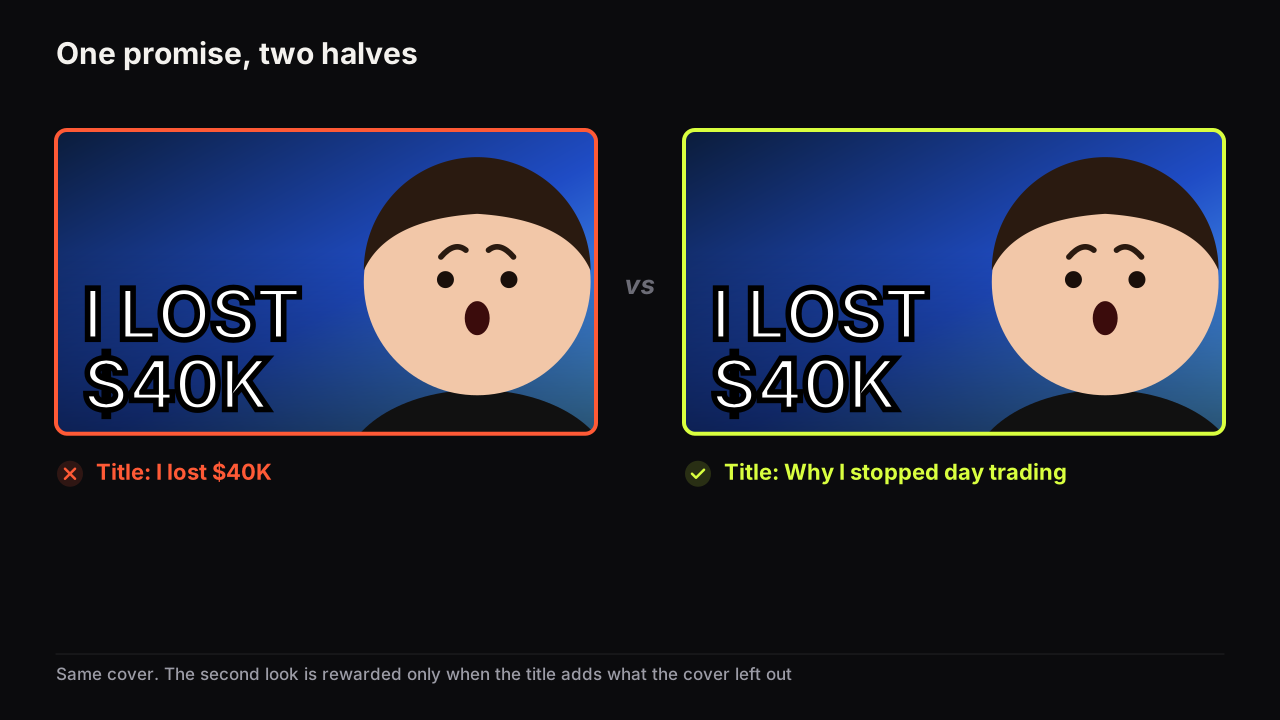
Same video, two covers. On the first, a man stands beside a ten-year-old hatchback, grinning, under the words I SOLD MY CAR. On the second, same man, same car, and the headline reads SOLD FOR $1. The first cover has told you everything. The second has told you everything except the one thing you now want to know, and that difference is the whole technique.
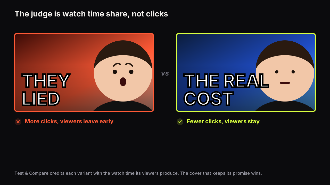
A curiosity gap works on a thumbnail when the cover gives the viewer enough to know exactly what they are missing, and the video supplies it early. Withhold everything and there is no gap, because the viewer has nothing specific to miss. Open a gap the video never closes and you get the click, lose the viewer, and on YouTube lose the test as well, since the tool that judges covers judges them by how long people stay.
What the information gap is
The information gap is the distance between what someone knows about a subject and what they want to know. George Loewenstein's 1994 review of the psychology of curiosity in Psychological Bulletin (vol. 116, pp. 75 to 98) describes curiosity as the feeling that gap produces: a mild deprivation that persists until the missing piece arrives. We cite the paper as the origin of the idea. It is not a study of thumbnails and we attach no numbers to it.
Two consequences of the account do more work for a cover than the account itself.
A gap needs a reference point. You cannot miss what you do not know exists, so curiosity is strongest when the viewer already holds most of the picture and can see the shape of the hole. MY STORY over a neutral face fails for exactly this reason: no picture, so no hole.
And the feeling is relieved by the answer, not by the click. If the answer is not in the video, or arrives at minute eleven of twelve, the viewer leaves with the gap still open and a slightly lower opinion of the channel that promised to close it. That opinion compounds across uploads.
The covers that open the strongest gaps are the most specific ones, not the most mysterious. A blurred object under YOU WON'T BELIEVE THIS is mystery with no reference point. A sharp photo of a car under SOLD FOR $1 is a gap: the viewer knows roughly what a car is worth and can see precisely which piece is missing, which is the why.
Three ways a cover opens a gap
Every working curiosity cover we have looked at does one of three things: shows a setup and withholds the outcome, puts two things in one frame that should not both be true, or names a detail so precise that it demands a story.
| Gap type | The cover shows | The cover withholds | The question the viewer forms |
|---|---|---|---|
| Missing outcome | The setup, the attempt, the day count | The result | "What happened?" |
| Contradiction | Two facts that cannot both hold | The explanation | "How is that possible?" |
| Unusual specific | One precise detail | Its context | "Why that, exactly?" |
Missing outcome
The beginning shown, the end hidden. DAY 30 over a face that has been through something. I TRIED IT with the product held up and no verdict. A before with no after. The gap is strong because the viewer already has the whole shape of the story except its last frame. The risk is that the video takes twenty minutes to reach that frame, which we come back to below.
Contradiction
Two things together that the viewer's model of the world says cannot coexist. $0 BUDGET over a luxury interior. A tiny kitchen and 150 COVERS A NIGHT. A pro's face and I WAS WRONG. Contradiction is efficient because the viewer's own knowledge forms the question; the cover only has to present the two facts clearly. It fails when the contradiction resolves too easily ("it was rented"), because the viewer guesses and scrolls on.
Unusual specific
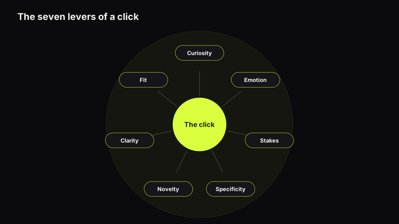
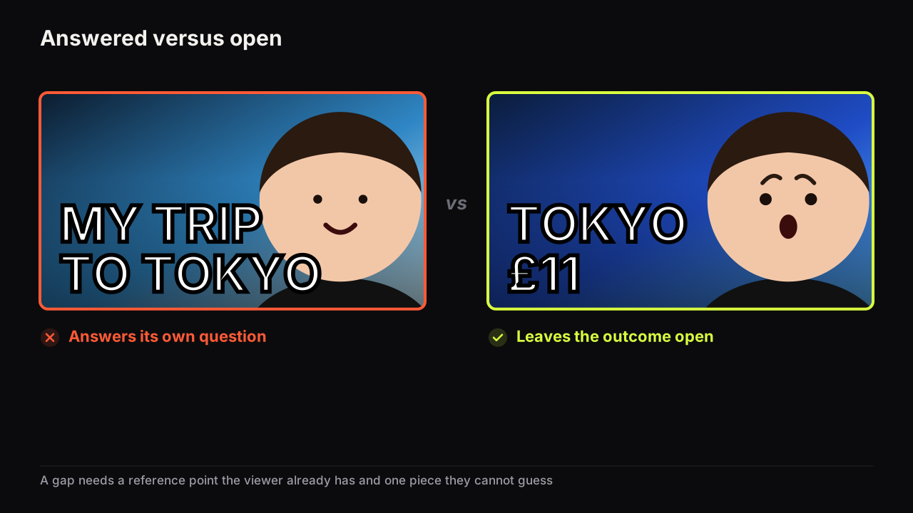
One detail too precise to be random. 3:14 AM. £11 IN TOKYO. DAY 47. A specific implies a story and the viewer wants the story. This type pairs naturally with the specificity and stakes levers in the pillar on why people click, and the seven levers behind it; a specific that also names a consequence is a gap with weight behind it.
I don't have a clean A/B result of my own to quote, but I've made both versions many times. The weaker one explains everything: it shows the result, labels the result, and then the title explains the result again. The stronger one shows enough for the viewer to understand why they should care and leaves one important piece unresolved. Curiosity isn't about confusing people. It's about making the missing piece feel worth having.
How strong is the gap? A scale
Gap strength is not a number you can measure, but you can place a cover on a scale, and doing that is the most useful review you can do before upload.
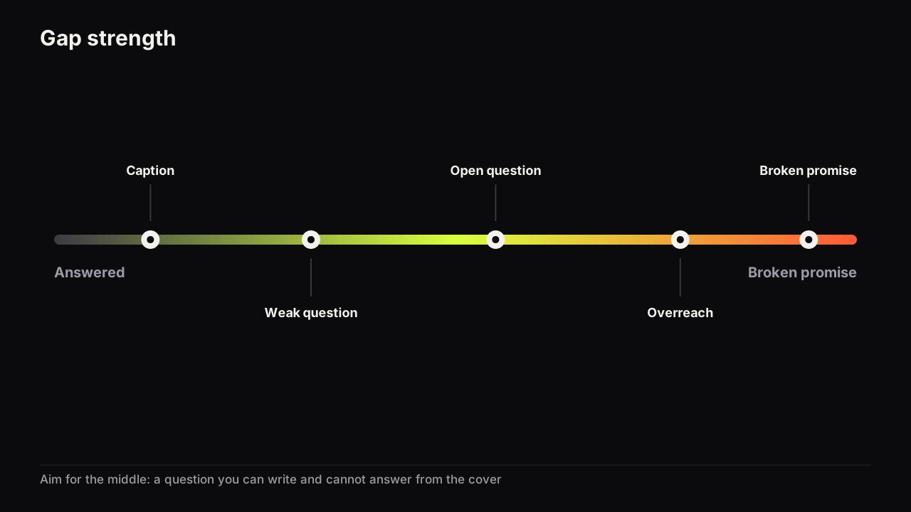
- Answered. Cover and title together tell the whole story. MY TRIP TO TOKYO, a smile, a bowl of ramen. Nothing to miss, no reason to click.
- Caption. The cover describes the subject without raising a question. CAR LOAN TIPS. Fine for search-led content, weak for browse.
- Weak question. A question forms but the viewer can guess the answer in one word. IS IT WORTH IT? on a product everyone knows is fine.
- Open question. The viewer knows exactly what is missing and cannot guess it. SOLD FOR $1 on a clear photo of a car. This is where you want to be.
- Overreach. The gap is real but the video answers a smaller question than the cover implies. The viewer feels short-changed even though nothing was false.
- Broken promise. The cover implies an outcome the video does not contain. This is the clickbait end, and on YouTube it falls under policy.
Aim for the open-question position even where a plain caption would pull steadier search traffic, because browse impressions are where a cover has to create the reason to click, and a caption creates none. The cost is a few lost search clicks from viewers who wanted confirmation rather than a question; we accept that on any video we expect to live in Home and Suggested. Check the position two ways. Write the question the cover raises in the viewer's words; if you cannot, you are at caption or below. Then try to answer it in one word from the cover alone; if you can, you are at weak question.
When the caption is the right answer
The scale is not a ladder to climb on every video. Picture a tutorial channel uploading "How to fix a dripping tap" and trying the three gap types anyway. Missing outcome: the tap, no result. Contradiction: FIXED IN 4 MINUTES, £0. Unusual specific: THE 40p PART. Only the specific produces a real question, and it is a decent cover.
But the viewer arriving from search already has the question. They typed it. What they want is confirmation that this video answers it, and a clear photo of the tap, a wrench and the word DRIPPING does that better than any gap. We would ship the caption and keep THE 40p PART for a browse-facing cut of the same video. How traffic sources change what a cover is for is the longer version.
Why the video has to close the gap
On YouTube the gap is a loan: the cover borrows attention against a promise, and the video repays it or defaults. Two documented facts make the default expensive.
YouTube's help page on A/B testing titles and thumbnails says that Test & Compare in YouTube Studio decides the result by watch time share, not clicks, and that a test can take a few days or up to two weeks. Source: YouTube's A/B testing help page. YouTube's thumbnails policy places misleading titles, thumbnails and descriptions that promise content the video does not contain under its spam, deceptive practices and scams policy. Source: YouTube's thumbnails policy.
The first fact means a cover that opens a gap the video does not close will earn clicks and lose the test, because the viewers it attracts leave early and their short watch time counts against the variant. The explainer on why YouTube's testing tool can pick the cover with fewer clicks works through the arithmetic. The second fact means the broken-promise end of the scale is a policy question before it is a taste question.
Close the gap the cover opened within the first minute, then open the next one. We would show the sold car in the first thirty seconds even though it gives away the ending, because a viewer who has had the promise kept stays for the how, and a viewer still waiting at minute six is checking the progress bar. The cost is that the video cannot save its reveal for the end. We think that shape belongs in the middle of a video, as the second or third gap, never on the cover.
The reveal at minute nine
An illustrative workshop channel builds a desk from a single sheet of plywood. The natural edit saves the finished desk for minute nine of eleven, and the cover shows the sheet under ONE SHEET, ONE DESK. Open question, honest, and mistimed: viewers who clicked to see whether it can be done sit through nine minutes of cutting before they find out, and some of them do not.
The fix is not a different cover. It is a cold open: the finished desk at second ten, then the sheet, then the build. The cover's gap closes almost at once and a new one (how did the joints work with no offcuts?) carries the rest. That is an edit note rather than a cover note, and it is the strongest argument for deciding the cover before you film. The pillar on treating title and thumbnail as one promise covers planning the payoff moment alongside the cover.
Keep the title out of the gap
The title is the most common way a good gap gets closed by accident. The cover says SOLD FOR $1, the title says "I sold my car for $1 because the engine was gone", and the question is answered before anyone clicks. Cover and title should agree without repeating. The short answer to whether the words on the thumbnail should repeat the title sets out three ways to split the job.
Word count matters too. A gap needs its reference point to be readable at feed size, which usually means keeping the headline to three big words and letting the image carry the rest. SOLD FOR $1 is three words and a clear photo. I SOLD MY OLD CAR FOR ONLY $1 is a sentence, and nobody reads a sentence in a row.
A literal question on the cover (WHY?, WHAT HAPPENED?, IS IT WORTH IT?) is the weakest form of gap, and we would drop it even though it is the easiest headline to write. A question the viewer forms for themselves pulls harder than one handed to them, and a question mark spends a word on punctuation the picture should have made unnecessary. The exception is a question whose answer is itself a specific nobody could guess, and even then we would rather show the specific.
Curiosity gaps by niche
The three gap types are universal. Which one a niche responds to is not. These are patterns we see, not measured results.
Finance and business audiences respond to a specific number with the cause withheld ($4,100 SAVED, DOWN $6K) and to contradiction with a calm face rather than a shocked one. Education and tutorial audiences respond to a missing outcome framed as a result they want (IN 10 MINUTES, the finished thing shown), and are put off by mystery. Gaming responds to contradiction and to versus setups where the outcome is withheld. Fitness responds to day counts and before-without-after. Travel responds to unusual specifics, especially prices and times. Reviews respond to a withheld verdict: the product shown large, the face showing doubt, no answer on the cover.
Several of the eight styles on the bench are built around one gap type: Number Pop puts a single large figure on the cover with the cause left to the video, Before / After frames a transformation, and Split Screen sets up a contradiction or a versus. Picking the style by the gap you want to open is quicker than describing the layout from scratch; the styles page shows one example of each.
If it were our channel
Suppose we ran a small channel about restoring old hand tools, and the next upload was a rusted plane bought for a pound at a car boot sale and brought back to working order.
We would write the question before the headline: "how did that thing become that thing?" That points at contradiction, because the outcome of a restoration video is assumed. So the cover shows the rusted plane, large, on the right, with £1 in the accent colour, and the title carries the other half: "The £1 plane that outcuts my £200 one". Neither says how. Can we write the viewer's question? Yes: "how can a £1 wreck outcut a £200 tool?" Can we answer it in one word from the cover? No. Open question.
Then the edit. The first thirty seconds show the finished plane taking a clean shaving, then cut to the rust. The cover's gap closes and the video's real gap, the process, takes over.
No question mark, no shocked face, because a restoration audience seems to click on calm competence rather than alarm. That is a pattern we observe, not a measured fact, and if the channel had the impressions we would put a calm-face version and a no-face version through Test & Compare and let watch time share settle it.
Common questions
Is a curiosity gap manipulative?
Not when the video closes it. Opening a question and answering it is what every good teacher, journalist and storyteller does. The gap becomes manipulation at the overreach and broken-promise end of the scale, where the cover implies an answer the video does not contain. The scale exists so you can tell where you are.
Should every thumbnail have a curiosity gap?
No. Search-led content, where the viewer already has the question and is checking that your video answers it, often works better at the caption position: the cover confirms relevance instead of raising a new question. Browse-led content (Home, Suggested) is where the gap earns its keep, because the viewer arrived without a question and the cover has to supply one.
What if the answer to the gap is not interesting?
Then the gap is the wrong lever for this video. A gap borrows attention against the answer; if the answer disappoints, the loan defaults. Pull stakes or specificity instead, or reconsider whether the video's idea is strong enough to package at all.
What to do next
Take your next cover and write the question it raises in the viewer's words. Place it on the scale. If it sits at caption or weak question, try each of the three gap types in turn (withhold the outcome, add a contradiction, sharpen one specific) and see which produces a question you cannot answer from the cover. Then find the moment in the video that answers it and check it lands within the first minute.
For the compressed version of the whole psychology argument, the short answer to what makes a thumbnail clickable fits on one screen.