On this page
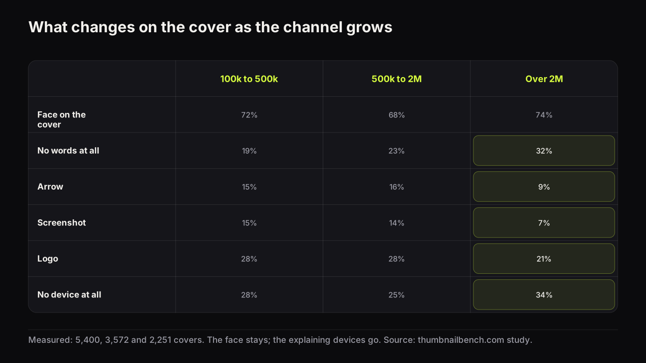
Split the 1,043 channels in our thumbnail study into three bands, 100,000 to 500,000 subscribers, 500,000 to 2 million, and over 2 million, and one feature stays put while the rest move in the same direction. The face is on 72, 68 and 74 percent of covers across the bands. Text, arrows, screenshots, logos and split screens all fall as the channel gets bigger. A third of covers on the biggest channels carry no device of any kind.
That is the pattern. The rest of this page is the table, the reasons we think it happens, and what it means if your channel is in the first band.
The table
| Feature | 100k to 500k | 500k to 2M | 2M+ |
|---|---|---|---|
| Face on the cover | 72% | 68% | 74% |
| Big face (over a third of the height) | 25% | 21% | 21% |
| Eye contact | 52% | 46% | 47% |
| Any text | 81% | 77% | 68% |
| No words at all | 19% | 23% | 32% |
| Seven or more words (of covers with text) | 31% | 25% | 21% |
| A number on the cover | 28% | 24% | 24% |
| Arrow | 15% | 16% | 9% |
| Circle or highlight | 4% | 5% | 4% |
| Screenshot or app screen | 15% | 14% | 7% |
| Logo | 28% | 28% | 21% |
| Split screen | 14% | 15% | 10% |
| Object held up | 23% | 30% | 26% |
| No device at all | 28% | 25% | 34% |
| Clutter score 4 or 5 (of 5) | 48% | 48% | 44% |
Three things to notice. First, the middle band is not a halfway point on every row; on held objects and split screens it is the busiest of the three. The clean-up happens mostly between 2 million and everything below it. Second, the face rows barely move. Third, the biggest drops are the explanatory devices: arrows, screenshots, logos and text itself.
The face stays because it is the brand
Across all three bands, seven in ten covers show a face and about half of those faces look at the camera. A big channel does not drop the face when it no longer needs to introduce itself; the face is the thing the audience is looking for in the feed. The face size guide covers how big it should be; the study says big channels run it slightly smaller (21 percent big faces against 25) but no less often.
The devices go because the audience supplies the context
Our reading is that arrows, screenshots, labels and split screens are the scaffolding a channel uses while the feed is still learning what it is. An arrow says "look here"; a screenshot says "this is real"; a label says "this is the topic". A viewer who has watched a channel forty times does not need any of those. They recognise the face, they know the format, and the cover can spend its space on the one image that carries the video's idea. The devices were never the style. They were the explanation, and the explanation becomes unnecessary.
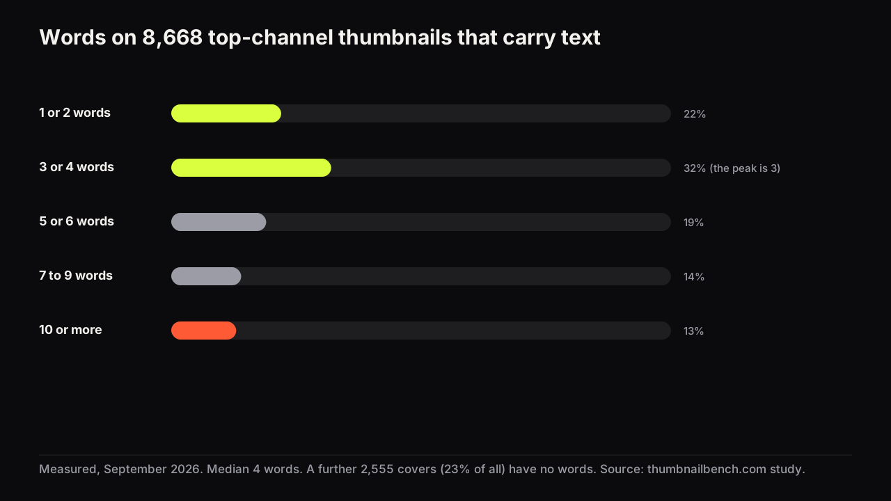
The text numbers support that. Big channels do not write shorter headlines; the median for covers with text is four words in every band, as the word-count study shows. They put text on fewer covers, 68 percent against 81, and the long captions fall from 31 to 21 percent of text covers. The picture is doing more of the work.
What it does not show
This is a comparison of channels at different sizes at one moment, not a history of any channel growing. It cannot say that dropping arrows made anyone bigger. The likelier direction is the other way: channels that grew earned an audience that no longer needs the arrows. Copying the quiet cover before you have the audience removes the explanation while you still need it.
It also does not measure clicks. Click-through rate is private to each channel. The study's best-cover comparison found that within a channel, no device separates the best-viewed cover from the rest, which is consistent with the devices being about legibility of the promise rather than a lift on their own.
If your channel is in the first band
- Keep the devices while they are doing a job. An arrow that points at the thing the title promises is earning its place. An arrow on every cover is a habit.
- Use the arrows, circles and badges guide to check each one: what would the viewer miss without it?
- Watch the screenshot rate. 15 percent of small-band covers carry one; 7 percent of big-band covers do. A screenshot proves a claim, and the biggest channels rarely need to prove anything on the cover.
- Do not go text-free to look established. Go text-free on the covers where the picture already says it, which is what the top niches do (see the word-count study).
- Look at the channels one band above yours with the competitor research method, and count their devices rather than guessing.
- Test the quiet version, not just the loud one. The small-channel testing guide covers how to run a comparison with the impressions you have.
The biggest channels are not doing less because less works. They are doing less because they can. The job for a smaller channel is to make each device earn its place until the audience makes it unnecessary.