On this page
- The shocked face is the exception, not the rule
- Seven in ten covers have a face, but the niche decides
- Four words is normal, and a quarter of covers have none
- One in three covers repeats the video title
- Bigger channels use fewer tricks
- Niche by niche
- What the best cover on each channel has in common: almost nothing
- Method
- What to do with this
The advice is everywhere. Put your face on it, make the face shocked, use three words in capitals, add a red arrow. We wanted to know how much of that the channels that already win actually do. So we pulled the most recent uploads of 1,043 YouTube channels with at least 100,000 subscribers, across 11 niches, and tagged every long-form thumbnail on 21 design features: faces, expressions, words, devices, colour and background. That is 11,223 covers.
The short version: faces are near universal, shocked faces are not, four words is normal, a quarter of covers have no words at all, and the biggest channels use fewer tricks than the channels below them. The rest of this page is the numbers, the differences by niche and by channel size, what we found when we compared each channel's best-viewed cover to its others, and the full method so you can judge how far to trust it.
The shocked face is the exception, not the rule
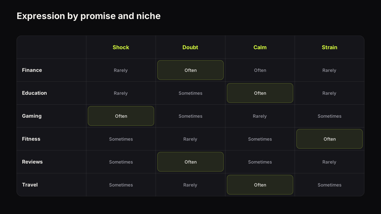
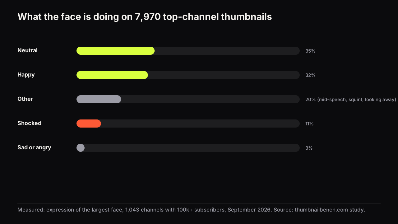
Among the 7,970 covers that show a face, the largest face is neutral on 35 percent and happy on 32 percent. It is shocked or surprised on 11 percent. Sad and angry together are 3 percent. The remaining 20 percent are expressions that did not fit those five, mostly mid-speech, squinting or looking away.
The exception is Gaming, where a quarter of faces are shocked. Fitness sits at the other end at 3 percent. Finance and Commentary, the two niches most associated with the open-mouth reaction, are at 12 and 16 percent.
The face is there, in other words, but it is doing something calmer than the guides describe. That fits what we see when we look at covers one at a time: a shocked face works when the video contains a shock, and most videos do not. The expressions guide covers when each one earns its place.
Seven in ten covers have a face, but the niche decides
71 percent of the 11,223 covers show at least one face. 46 percent show one person, 25 percent show two or more. The niche spread is wide.
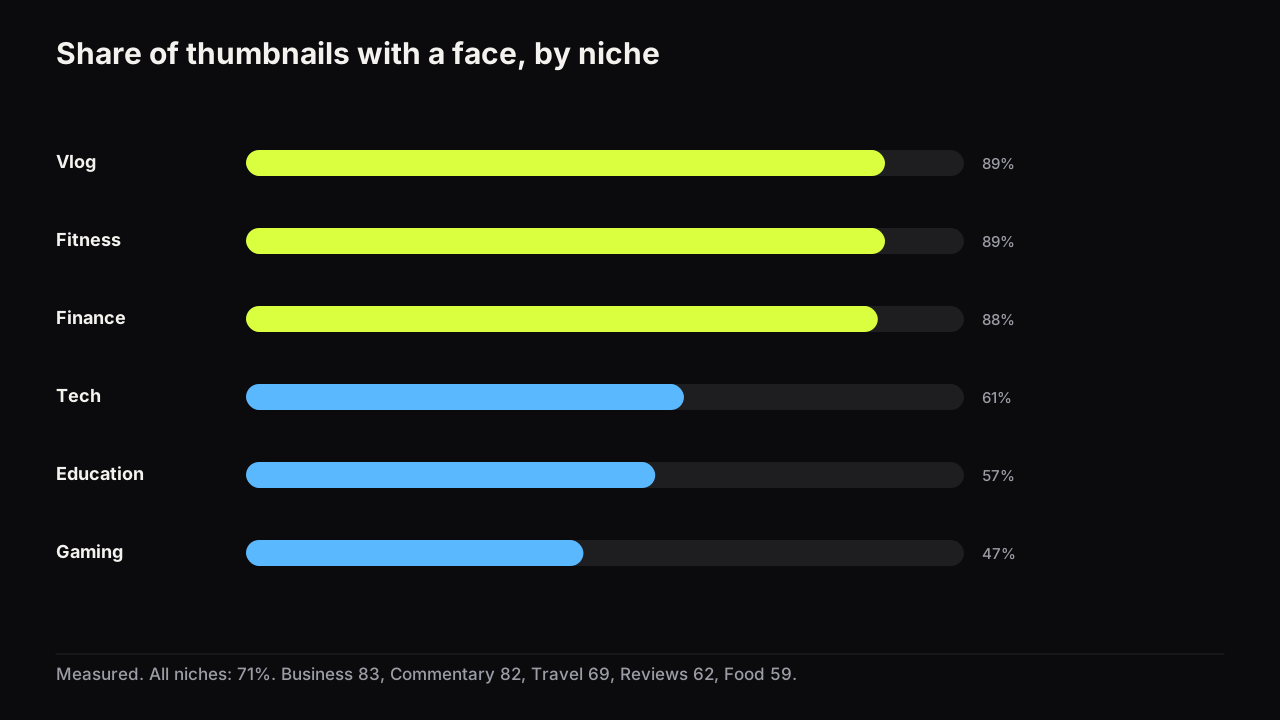
Vlog, Fitness and Finance are near nine in ten. Gaming is under half, because the game is the subject. Education and Food are under six in ten, for the same reason: the diagram or the dish carries the promise. If you run a faceless channel, the faceless thumbnails guide covers how those niches fill the space, and the competitor research method shows how to count your own niche the way we did here.
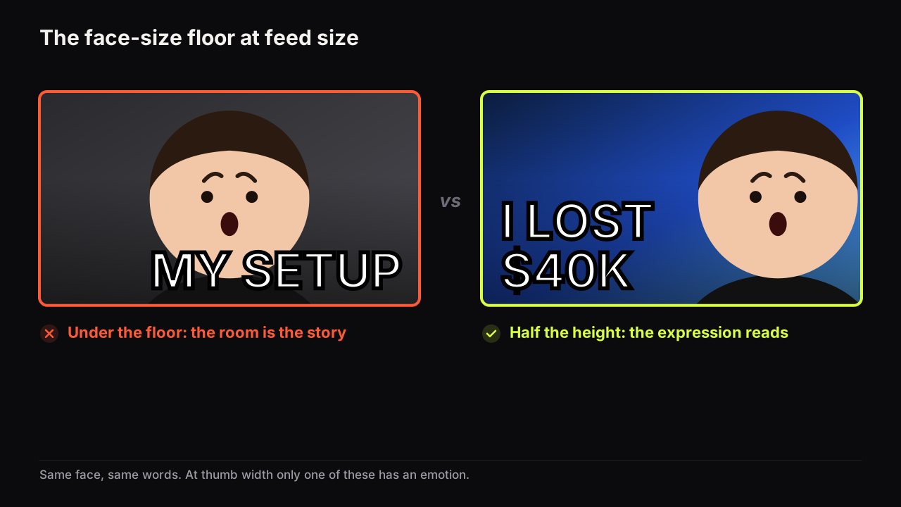
Among the covers that do have a face, 33 percent make it big (more than a third of the image height), 36 percent medium and 31 percent small. Eye contact with the camera is 49 percent overall and reaches 74 percent in Finance and 63 percent in Vlog. The face size guide has the layout rules; the study says the big face is common but not dominant.
Four words is normal, and a quarter of covers have none
77 percent of covers carry designed text. Among those, the median is 4 words. 22 percent have one or two words, 32 percent have three or four, 19 percent have five or six, and 27 percent have seven or more. So the "three words maximum" rule is followed by four in ten of the covers that have text at all. The word-count study goes through the whole distribution.
23 percent of covers have no words. That is not a rounding error from faceless niches: Food is text-free on 51 percent of covers, Gaming on 33 percent, Travel on 31 percent. Finance is the opposite at 6 percent.
Where there is text, it is white on 68 percent of covers, black on 11 percent, yellow on 9 percent and red on 3 percent. 62 percent of covers with text set it in all capitals, and 73 percent give it an outline, a shadow or a box. 56 percent of covers have a warm accent (red, orange or yellow) covering at least 15 percent of the frame; in Food it is 82 percent.
One in three covers repeats the video title
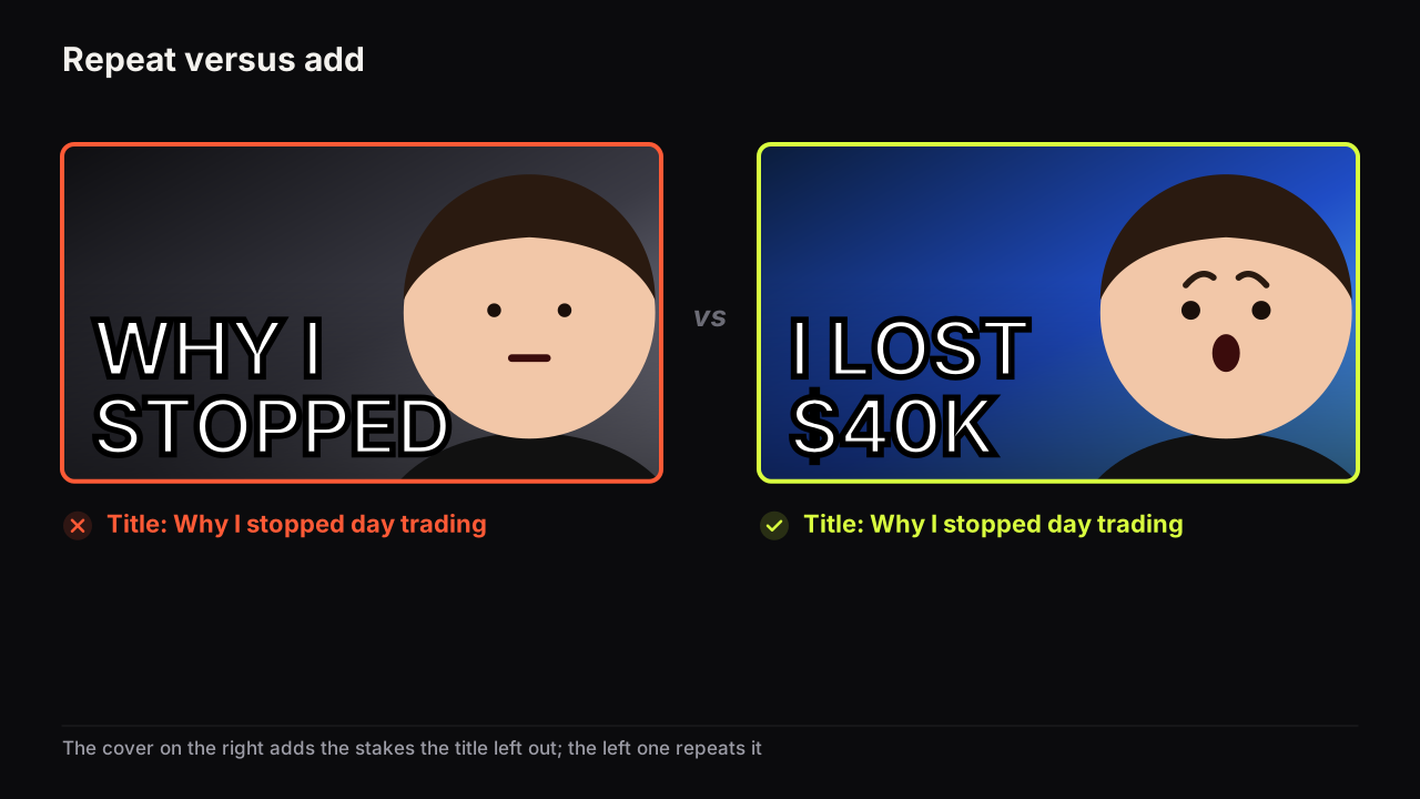
For every cover with text, we checked how many of its words also appear in the video's title. On 36 percent of covers, half or more of the cover words are title words. Fitness is the worst at 52 percent; Tech and Education are at 41. Food, at 23 percent, is the best.
The pattern behind the number is easy to see when you scroll a niche. A Fitness channel titles the video "30 Day Transformation" and writes 30 DAY TRANSFORMATION on the cover. The two pieces of packaging say the same thing, so the viewer reads one idea twice instead of two ideas once.
This is the one design feature in the study that also showed up, weakly, in the best-cover comparison below. The repeat-the-title guide explains how to make the cover and the title carry different halves of the promise.
Bigger channels use fewer tricks
We split the channels into three bands: 100,000 to 500,000 subscribers (5,400 covers), 500,000 to 2 million (3,572) and above 2 million (2,251). The face rate barely moves across the bands, 72, 68 and 74 percent. Almost everything else drops as the channel grows.
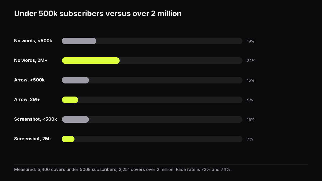
Channels above 2 million go text-free on 32 percent of covers, against 19 percent for the smallest band. They use arrows on 9 percent of covers against 15, and screenshots on 7 percent against 15. Among covers that do have text, the share in capitals is about 62 percent in every band, so the difference is not the style of the words but how often there are any. The share that repeats the title drops a little, 39 to 35. The big-channel article has the full band-by-band table.
Our reading is that the devices are scaffolding. A channel that is still teaching the feed who it is leans on arrows, labels and screenshots to make the promise explicit. A channel with an established face and a known format can leave more of the frame to the picture, because the audience already supplies the context. That does not mean a small channel should strip its covers to match; it means the devices are a stage, not a style.
Niche by niche
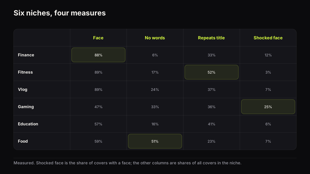
The table below is the six niches with the clearest identities. The full table for all eleven is in the data file.
| Niche | Covers | Face | Eye contact | No words | Median words | Repeats title | Number on cover | Arrow |
|---|---|---|---|---|---|---|---|---|
| Fitness | 853 | 89% | 44% | 17% | 4 | 52% | 40% | 13% |
| Tech | 1,126 | 61% | 46% | 18% | 4 | 41% | 31% | 19% |
| Finance | 1,095 | 88% | 74% | 6% | 4 | 33% | 39% | 25% |
| Food | 923 | 59% | 38% | 51% | 4 | 23% | 9% | 7% |
| Gaming | 1,098 | 47% | 29% | 33% | 3 | 36% | 20% | 12% |
| Travel | 1,160 | 69% | 48% | 31% | 4 | 39% | 12% | 7% |
| Vlog | 905 | 89% | 63% | 24% | 5 | 37% | 20% | 11% |
| Commentary | 1,116 | 82% | 52% | 17% | 4 | 32% | 19% | 11% |
| Business | 936 | 83% | 61% | 14% | 5 | 29% | 39% | 21% |
| Reviews | 1,003 | 62% | 43% | 25% | 4 | 35% | 29% | 10% |
| Education | 1,008 | 57% | 41% | 16% | 6 | 41% | 33% | 19% |
Two rows stand out. Finance is the most formulaic niche in the study: a face on 88 percent of covers, eye contact on 74 percent, text on 94 percent, a number on 39 percent, and the highest arrow rate. Food is the least: half the covers have no words, one in ten has a number, and 82 percent lean on warm colour, because the food is the picture.
What the best cover on each channel has in common: almost nothing
For 609 channels with at least eight long-form covers older than a week, we took the cover with the most views per day and compared it with the channel's other covers on every feature. If a design trick reliably produced a channel's best video, it would show up here as a gap.
It does not. A face is on 72 percent of the winners and 70 percent of the rest. Big faces, warm colour, capitals, numbers, arrows, split screens: every gap is within two or three points and most are within the noise. The two that clear the noise are small. Winners repeat the title slightly less often (33 against 35 percent) and have a face slightly more often (72 against 70).
Views per day is a rough proxy. It reflects the topic, the title, the upload timing and what the recommendation system did with the video, as well as the cover. Click-through rate is the measure that isolates the cover, and it is private to each channel. This comparison can show whether a feature is over-represented on winners; it cannot show that a feature caused the win.
The face article goes through this comparison feature by feature. We think this is the most useful finding on the page. The features that guides present as rules are, on the evidence of the channels that already win, mostly a matter of niche convention and channel maturity. The cover that outperforms is the one whose idea is right for that video, and no feature tag captures the idea. That is why the bench's Review gives you words about the promise and the reading order rather than a score.
Method
Sample. We searched YouTube's channel results for plain queries in each of 11 niches (for example "personal finance", "investing", "budgeting" for Finance), kept channels with 100,000 or more subscribers, and read each channel's public upload feed on 15 September 2026. Channels were kept if they had at least 10 uploads, an upload in the previous 90 days, and titles mostly in Latin script. A language model then screened out TV networks, media companies, music labels, children's channels, clip compilations, non-English channels and channels outside the niche; when unsure it kept the channel. The remaining channels were shuffled with a fixed seed and capped at 100 per niche, giving 1,100. 57 channels contributed only Shorts and drop out of the cover counts, leaving 1,043.
Covers. The feed gives the 15 most recent uploads. Shorts were removed by three checks: YouTube serves a vertical oardefault image only for Shorts, dark side bars in the image, and #shorts in the title. 16,499 feed items became 11,223 long-form covers.
Tags. Each cover was tagged by Claude Opus 5 from a 640-pixel copy, four covers per request, with a fixed schema of 21 fields: face count and size, expression, eye contact, text present, the words, word count, all caps, outline, text colour, split screen, before-and-after, number, arrow, circle, held object, screenshot, logo, background type and a 1 to 5 clutter score. Colour measures (dominant hue, warm share, brightness) were computed in code from the image. Title overlap was computed from the tagged words and the feed title.
Checks. On a 10-cover pilot, the four-per-request tags agreed with one-per-request tags on 206 of 210 fields; the misses were two face-size steps and two text colours, so text colour is the field we trust least. A "looks AI-generated" tag was collected but is not reported, because a hand check found it under-counted. A Sonnet 5 run agreed on 88 percent of fields and was rejected.
Best-cover comparison. Views per day was computed only for videos at least 7 days old. Channels with fewer than 8 such covers were dropped, leaving 609. The 95 percent intervals are a bootstrap over channels (2,000 resamples).
What is not here. No click-through rates, because they are private. No individual channels named, no covers republished. The counts describe what top channels do; they do not show what causes a click.
What to do with this
- Put a face on the cover if your niche does, and make it the expression the video earns. Neutral and happy outnumber shocked three to one at the top.
- Count your words. Four is the median. If you are above six, you are in the top quarter, and the words compete with the picture.
- Read the title and the cover together. If half the words match, one of them is wasted. Give the title the topic and the cover the tension.
- Treat arrows, circles and screenshots as tools for a specific job, not a style. The biggest channels use half as many.
- Judge the idea, not the checklist. The best cover on a channel looks like its other covers on every feature we could count.
The full aggregate tables are in the study data (CSV). If you use the numbers, link this page as the source and keep the caveats with them.