On this page
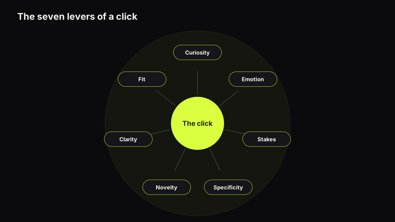
Nobody decides to click your thumbnail. They decide not to click the eleven around it. People click a YouTube thumbnail when it wins a glance against the covers around it, raises a question the title does not answer, and looks like a promise the video can keep. That is the whole model. Every technique creators trade (the shocked face, the big number, the red arrow, the split screen) pulls one of seven levers inside it, and most of the arguments about which technique "works" are arguments about which lever a particular audience responds to. What follows is the decision from the viewer's side: what the eye does before any reading happens, what the read is looking for, why a cover that would be excellent on its own can lose in a row of twelve, and what a cover can and cannot do about it.
The click is a comparison, not a verdict
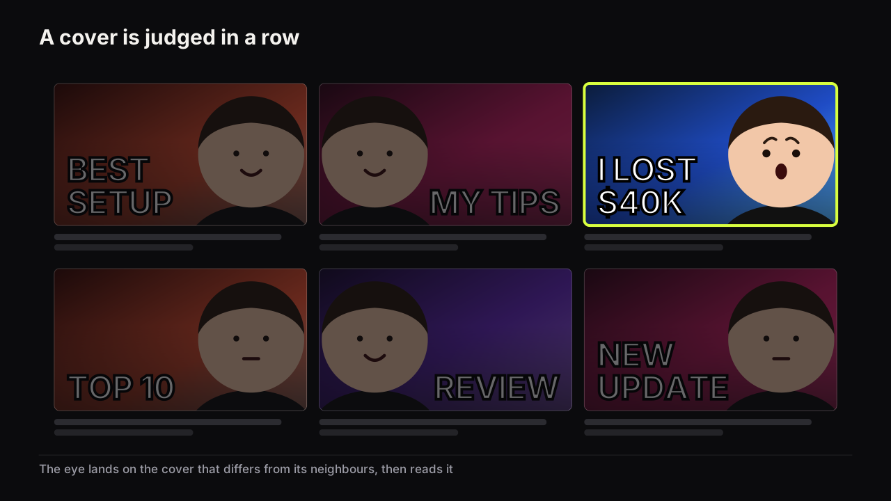
A cover appears in the Home feed, in Suggested videos or in a search result next to six to twelve others, most of them from the same niche, on a phone, for a moment. The viewer is not asking "is this good?" They are asking "which one?", and often "any of these?". Your cover competes with its neighbours, and the neighbours change with every impression.
That framing changes what an impression is.
YouTube's help page on impressions and click-through rate says an impression is counted when a thumbnail is shown for more than one second with at least half of it visible, and that half of all channels and videos have an impressions click-through rate that can range between 2% and 10%. It also says a video shown widely, for example on the Home page, will naturally have a lower rate. Source: YouTube's impressions and click-through rate FAQ.
So the denominator of your click-through rate is full of glances. Most impressions are covers a viewer scrolled past on the way to something else. Impressions click-through rate is the share of those glances that became a click, which is why a rate of a few percent is normal rather than a failure, and why the same page warns that a wider audience lowers the number. The guide to what impressions click-through rate actually measures covers the traffic-source effect in detail. For psychology the point is simpler. You are not trying to convince a viewer. You are trying to be the one cover in the row their eye stops on, and then give the stopped eye a reason.
Two things follow. The levers that matter most are relative: brighter, simpler or a different colour than the neighbours beats bright, simple or colourful in the abstract. And the same cover performs differently on different surfaces, because the neighbours differ. A cover that stands out on your channel page may vanish in a Home feed surrounded by the niche's loudest covers.
How the decision happens: two passes and a check
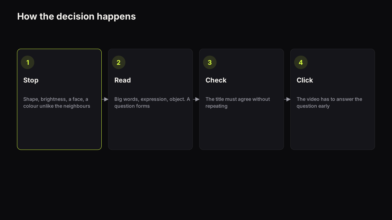
We describe the decision as three moves in a fixed order, and we do not attach times to them. You will read elsewhere that viewers decide in a fraction of a second, or that a cover has twelve seconds to work. We have not found a primary source for either number. The order is something you can design for. The clock is not.
Pass one: before anything is read
The eye reacts to shape, brightness contrast, a face, and a colour that differs from the neighbours. Nothing has been read. A cover that loses pass one is never evaluated, however clever its words. This is why the phone check comes first in every method we teach: shrink the cover to thumb width, put it in a row, and ask whether it separates from the others as a shape.
Brightness contrast survives a dim phone screen where hue contrast does not. Red text on a green background is a hue difference and a brightness match; at low screen brightness the two collapse into one grey. A pale word on a dark ground stays a pale word. This is our reasoning from how covers look on real phones, not a measured result.
The free thumbnail tester drops a cover into a mock search result and a phone feed so you can run pass one before uploading. It is a preview, not a score.
Pass two: the read
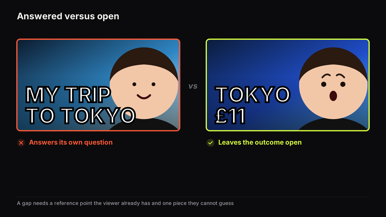
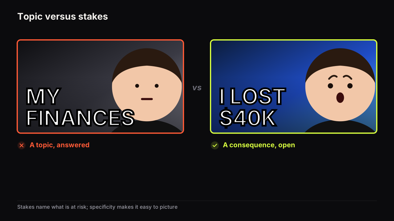
If the eye stops, the viewer takes in the big words, the expression, and the object, roughly in that order, and a question forms. "What happened?" "Is that true?" "How?" "Why does he look like that?" The question is the click. A cover that answers its own question gives the viewer everything they came for and no reason to watch. "MY TRIP TO TOKYO" with a smiling face and a ramen bowl is answered: he went to Tokyo, he enjoyed it. "TOKYO" with a shocked face and a restaurant bill is open: what did Tokyo cost him?
The check against the title
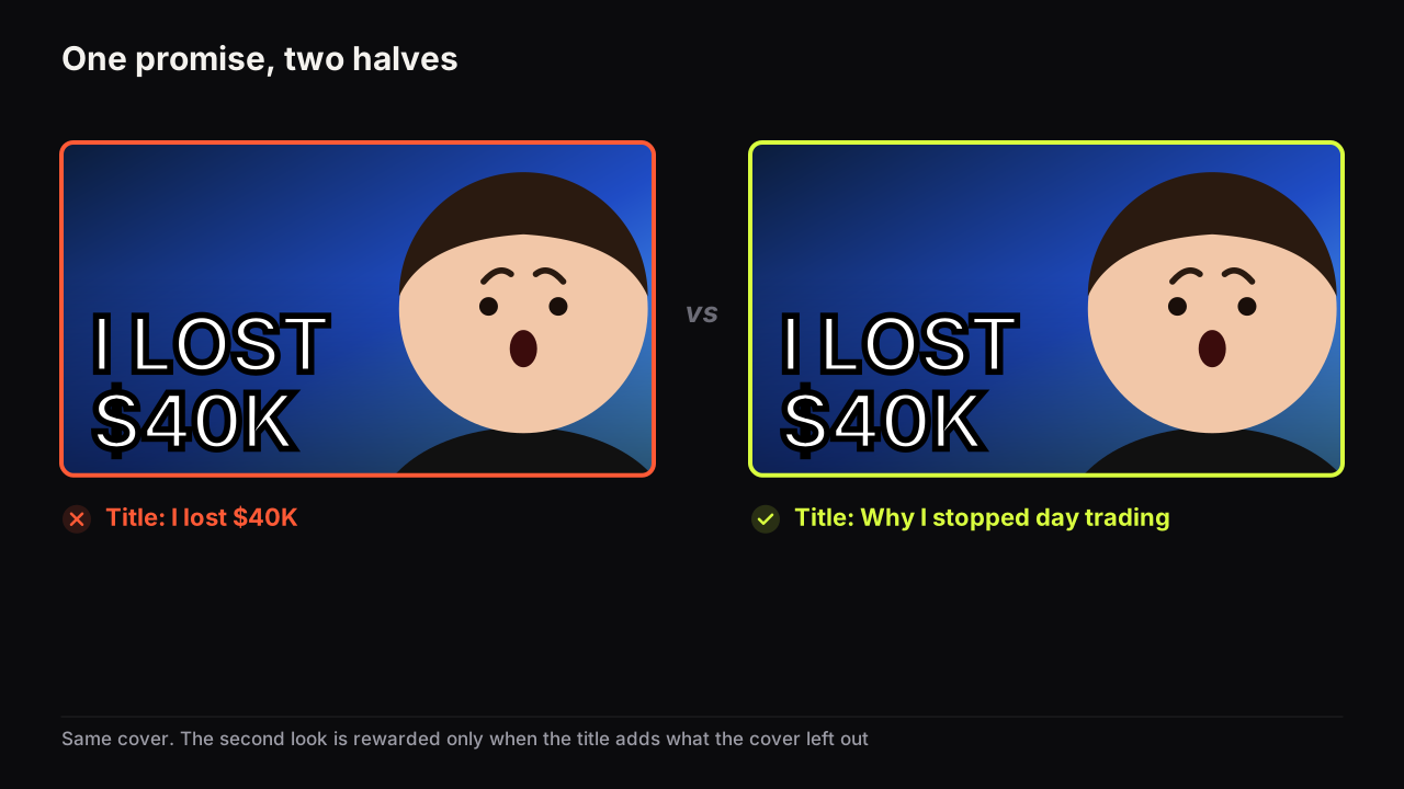
Before clicking, the viewer glances at the title, then back at the cover. The two must agree without repeating. If the cover says "I LOST $40K" and the title says "I lost $40K", the second look teaches nothing. If the title says "Why I stopped day trading", the two together tell a story and the second look is rewarded. The short piece on whether thumbnail text should repeat the title works through the three ways a cover can add to a title instead.
YouTube's thumbnail and title tips page notes that viewers may only see part of the title, and advises limiting ALL CAPS and emoji in titles. Source: YouTube's thumbnail and title tips.
That partial-title fact matters for the check. On surfaces where the title is cut off, the cover's headline carries more of the promise than you planned. Put the part of the promise that cannot be lost on the cover, and front-load the title so the words that survive truncation are the ones that matter.
I can't point to one of my own videos and say with confidence that it got clicks because of an element I never planned, so I won't pretend to. What I have seen over and over while working on Thumbnail Bench is one unintended element becoming the focal point: a bright object, an unusually strong expression, one high-contrast area that pulls the eye before the thing you meant people to notice. It is why I think reviewing a thumbnail has to start with "what do I notice first?" rather than "does this look good?"
The seven levers of a click
A lever is a property of the cover that raises the probability of a click. Levers are not additive and you cannot pull all seven at once; a cover that tries reads as noise. What follows is each lever, why it works, the thumbnail pattern that expresses it, and the way it fails.
1. Curiosity: the information gap
Curiosity is the response to a gap between what a viewer knows and what they want to know. The idea comes from George Loewenstein's 1994 review of the psychology of curiosity in Psychological Bulletin, which describes curiosity as a reaction to an information gap that feels like a deprivation until it is closed. We cite the paper as the origin of the idea, not as a source of percentages.
The implication most creators miss is that a gap needs knowledge on both sides. You cannot miss what you do not know exists. A vague cover ("MY STORY", a neutral face) opens no gap because the viewer has nothing specific to be missing. A cover that shows the setup and withholds the outcome ("DAY 30" and a face that has been through something) opens one, because the viewer now knows exactly which piece is absent.
Cover patterns: a setup with the result withheld, a contradiction (two things that should not both be true in one frame), or a specific so unusual it demands a story. The full method for opening a question the video has to answer covers all three with a strength scale. The failure mode is a gap the video cannot close, which we come back to below.
There is also a case where the gap is the wrong lever, and it is common enough to spell out. Take a video on how to sharpen a chisel. The viewer arriving from search typed exactly that. They do not want a mystery; they want to see that this video shows the thing, quickly. A cover that withholds ("YOU'RE DOING THIS WRONG", a raised eyebrow) opens a gap for a Home feed viewer and annoys the search viewer, who now has to work out whether the video even contains the method. For that video we would let the cover answer its own question: the chisel, the stone, a hand mid-stroke, the headline "30 SECONDS". Clarity and specificity do the work; the only curiosity left is "that fast?", and that is enough. Open a gap when the viewer is browsing. Close it when they are searching.
2. Emotion: a face carrying one nameable feeling
Faces get looked at. That is a fact about human perception rather than about YouTube, and we will not put a number on it. What matters for a cover is that the face, once looked at, is read for what it is doing. An expression tells the viewer how to feel about the object before they have read a word: shock says "something surprising happened", doubt says "this might not be worth it", calm says "this is manageable". Emotion is information, not decoration.
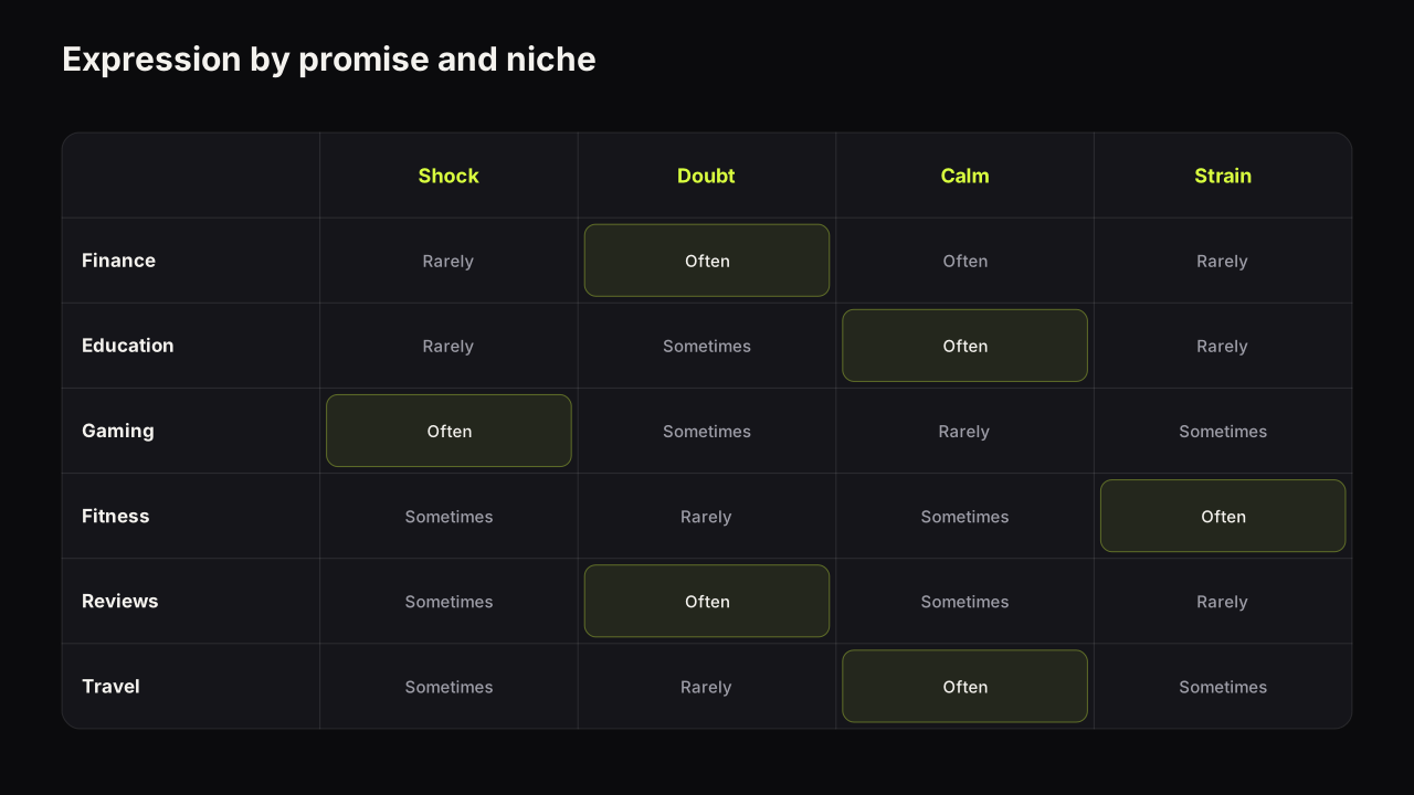
The pattern is a face filling a good share of the frame, one clear emotion, eyes on the viewer or on the object. It fails when the expression does not match the promise (a shocked face on a calm tutorial) or has no visible cause (shock at nothing). The guide to which facial expression fits which promise has a matrix by niche and covers why the shocked face wears out.
We would default to doubt or curiosity on the face and reserve shock for the videos where something surprising actually happens, even though that lowers the ceiling on the occasional upload where a shocked face would have won the row. Shock is the most copied expression in most niches, so it separates least; and a channel that leads with shock every time has nowhere to go when it has real news. Doubt keeps shock in reserve. Whenever we used it, the cover would show the cause of the shock in frame, because shock at nothing is the fastest way to teach an audience that your face means nothing.
On the bench, Face Lab turns one selfie into eight expressions (Shocked, Surprised, Happy, Excited, Angry, Curious, Scream and Sad) that can be placed into any render, which makes expression the easiest single variable to change between two covers. It works only with faces of people who agreed to be on your thumbnails: you, a co-host, a client with permission.
3. Stakes: something is at risk
Stakes convert a topic into a consequence. "My finances" is a topic; "$40K" is a consequence. Money, time, risk, reputation, a number that means something: each gives the viewer a reason to care that does not depend on caring about you. A consequence is easier to feel than a subject is to be interested in.
The pattern is a number large enough to read at thumb size, or the thing at risk shown in frame: the crashed car, the empty shelf, the timer. The failure mode is stakes with no owner. A number floating on a background with no face or object to attach it to reads as a price tag.
4. Specificity: easy to picture, hard to dismiss
"7 days", "Tokyo", "PS5 vs PC". A specific is easier to picture than a category and harder to wave away, because the viewer's mind has already built the image before the decision is made. Specificity also feeds curiosity: a gap can only form around something definite.
The pattern is one concrete noun or number on the cover instead of a category word. "BUDGET PC" is a category; "$300 PC" is a specific. The failure mode is a specific that means nothing to the audience, such as a model number only insiders recognise, or a place name with no context.
5. Novelty: being the odd one out
Pattern interruption is the cover being visibly different from the row it sits in: a different dominant colour, a layout the niche does not use, a light cover in a dark feed. It is the purest relative lever, because it depends entirely on the neighbours. A lime cover is novel in a row of reds and invisible in a row of limes.
The pattern is to look at the row you will actually appear in, which is the job of research into the covers that already work in your niche, and choose a dominant colour and layout that differ from the majority. The guide to colour and contrast choices that survive a phone screen covers which pairs hold up. The failure modes are two: novelty that breaks expectation fit (lever 7), and novelty that wears out, because the audience habituates and the niche copies. The piece on what to do when a style stops working separates the causes.
An illustrative decision. A home-cooking channel looks at its Suggested row and finds nine covers out of ten are warm: orange food, wooden boards, a smiling cook, yellow text. The novelty lever says go cool. The fit lever says a cold blue cover with a stern face reads as a tech channel and the audience skims past it as "not food". The way through is to spend novelty on one variable and hold the rest to convention. Keep the plate, the hand and the warm light on the food, because those are what say "cooking" to this audience; change only the ground behind them to a deep cool green. The cover is now the one cool rectangle in a warm row and still unmistakably dinner. If the row turns green in six months, the same logic points somewhere else.
6. Clarity: one idea, readable at thumb size
Clarity is a lever because most competitors lack it. In a row of busy covers, the one with a single idea and three elements reads first, and the viewer forms a question sooner. YouTube's own advice runs the same way: the tips page cited above says to use a font that is easy to read and not to make the design too complex.
The pattern is three elements at most (a face, a headline, an object), a background that supports rather than competes, and every word legible at feed size. The failure mode is trying to say two things. The design principles behind hierarchy, contrast and simplicity show how to build a cover that reads in one pass and what breaks first when it shrinks to phone size.
7. Expectation fit: it looks like something this audience clicks
The viewer's last unspoken question is "is this for me?" Fit answers it. A cover that looks like the videos this audience already watches passes; one that looks like a different niche fails even if it is more striking. Novelty works inside the audience's expectations. Too far outside and it reads as irrelevant.
The pattern is to keep the conventions the audience uses to recognise its own content (the object, the framing, the level of polish) and spend the novelty on colour or layout. The failure mode is a cover that would win in another niche. A gaming-style neon split screen on a personal finance channel does not read as fresh; it reads as a mistake.
Levers pull against each other
Choosing levers is choosing which ones to leave alone. The tensions that matter most:
| Lever | Pairs well with | Conflicts with | The trade-off |
|---|---|---|---|
| Curiosity | Specificity, stakes | Clarity | Withholding too much leaves nothing to be curious about |
| Emotion | Stakes, curiosity | Fit (in calm niches) | A big expression can read as fake where the audience expects calm |
| Novelty | Clarity | Fit | Different enough to be seen, similar enough to be trusted |
| Specificity | Curiosity, stakes | Fit (jargon) | A detail the audience does not recognise is noise |
| Clarity | Everything | Curiosity, when it tips into answering | One idea, but not the whole idea |
Pick two levers per cover and hold the rest at neutral. Decide which two before you open any tool, write them on the brief, and judge the candidates against them. We would do this even on a video where a third lever is sitting right there, because the third lever costs an element, and the element it costs is usually the one making the first two legible. A cover that pulls curiosity and stakes with a calm face and a plain background beats one that tries to pull all seven, and it is also the one you can test, because you know what it was betting on.
Which two depends on the video and the niche. A surprising outcome wants curiosity and emotion. A verdict wants stakes and clarity. A lesson wants clarity and fit, with specificity in the headline. The pillar on title and thumbnail as one promise shows how to make that choice before filming, when it is cheapest.
The click the cover cannot keep
Every lever above raises the probability of a click. None of them keeps it. The viewer who clicks arrives with the question the cover raised, and the first minute of the video either answers it or does not.
YouTube's help page on A/B testing titles and thumbnails says the result of a Test & Compare in YouTube Studio is decided by watch time share, not by clicks. Source: YouTube's A/B testing help page. Separately, YouTube's thumbnails policy says misleading titles, thumbnails and descriptions that promise content the video does not contain fall under the spam, deceptive practices and scams policy. Source: YouTube's thumbnails policy.
Put those two facts next to the seven levers and the strategy writes itself. A cover that opens a gap the video does not close will get clicks and lose the test, because those viewers leave early and their watch time counts against it. The explainer on why the tool can pick the thumbnail with fewer clicks works a numerical example. A cover that overstates the stakes borders on policy. Curiosity is a loan; the video repays it in retention or pays for it in the test.
Our view is that this makes psychology and honesty the same discipline on YouTube, which is not true in every medium. We would turn down the strongest cover we could make for a video if the video answered its question late or not at all, and accept the smaller first day that comes with a plainer promise, because the plainer cover is the one that survives a watch-time test and does not teach the audience to distrust the next one. Creators who treat the cover as marketing and the video as product end up with covers that win the glance and lose the audience.
Auditing a cover with the seven levers
Run this on every candidate before upload. It takes a minute.
- Name the two levers this cover pulls. If you name four, cut until two remain.
- Write the question a viewer forms after the read, in their words. If you cannot write one, the cover is answered or vague.
- Read the title. Does it answer that question? If yes, rewrite one of them.
- Cover the words with a thumb. Does the picture still raise the question? If not, the image is a backdrop and the words are doing all the work.
- Shrink to thumb width and put it in a row from your niche. Is it the one your eye lands on? If it matches its neighbours' colour, change the dominant colour.
- Name the emotion on the face in one word. If you need a phrase, the expression is not clear enough.
- Find the moment in the video that answers the question. If it is past the first minute, move it or change the cover.
- Would this cover look at home on a channel in a different niche? If yes, fit is off.
A second example. A personal finance creator has a video about paying off a car loan early. Draft one: a smiling face, "CAR LOAN TIPS", a stock image of keys. Levers pulled: none clearly; the question is "what tips?", which is weak; the title "5 tips to pay off your car loan faster" answers it. Draft two: a doubtful face looking at a car, "$4,100 SAVED", the car small and the number large. Levers: stakes and specificity, with doubt as the emotion because the audience for finance content trusts doubt more than shock. Question: "how did that save $4,100, and could it work for me?" Title: "I paid off my car loan 2 years early. Here is the maths." The title says what, the cover says why it matters, and the second look is rewarded. The figure is invented for the example; what matters is that it is a specific with an owner.
Common questions
Do faces always get more clicks?
No. A face pulls the eye, which is useful, but the click depends on what the face is doing and whether that matches the promise. In object-led niches such as reviews, and on faceless channels, a large object with strong colour contrast does the same job. The guide to how big the face needs to be covers when a face is the wrong choice. We have no sourced figure for how much a face adds and we do not use one.
Is a curiosity gap the same as clickbait?
No. A curiosity gap is a question the cover raises and the video answers. Clickbait is a question the video does not answer, or a promise it does not keep. Because Test & Compare decides by watch time share, a cover that opens a gap the video cannot close tends to lose the test even when it earns more clicks.
Does colour psychology work on thumbnails, such as red for urgency?
We have not seen a source that supports fixed colour meanings for thumbnails and we do not claim any. What we observe is that colour works relatively: the cover whose dominant colour differs from its neighbours gets looked at first. Brightness contrast between the elements matters more than which hue you pick.
Why can a cover with more clicks lose a Test & Compare?
Because the tool decides by watch time share. A cover that earns clicks with a promise the video does not keep loses those viewers early, and their short watch time counts against it. The cover that earns fewer but better-matched clicks can win.
If it were our channel
Say we ran a small woodworking channel and the next upload was a desk built from one sheet of plywood for about sixty pounds. This is how we would use the seven levers on it, as a plan rather than a result.
First the row. Ten minutes in Suggested under similar builds shows neighbours that are mostly finished-piece glamour shots: warm wood, a satisfied maker, "DIY DESK" in yellow. The lever the row is starving for is stakes. Nobody is putting a cost on the cover.
Then the two levers. Stakes and specificity: "£60 DESK" as the headline, the plywood sheet standing on end as the object because a sheet is more surprising than a desk, and our face at half height with mild doubt, as if we are not sure it will hold. Curiosity gets left at neutral on purpose. The audience for build videos wants to see the build, and the question "will that sheet really become that desk?" forms on its own from the object and the number. Emotion is held to doubt rather than pushed to shock, for the reasons above.
Then the title check. "I built a desk from ONE sheet of plywood" says what; the cover says why it matters. Neither repeats the other, and the word "one" survives truncation because it is in the first five words.
Then the audit. Cover the words: sheet plus doubtful face still asks a question. Shrink it into the row: the only cover with a cool grey workshop ground and a big number. Fit: a hand on the sheet and sawdust on the floor keep it reading as a build channel. Where does the video answer the question? The desk has to stand up, loaded, inside the first minute, or a watch-time test would punish the cover. If the edit could not deliver that, we would change the video before we changed the cover.
What to do next
Take your last three covers and run the audit above on each. Most creators find the same lever missing every time, which is the one to work on first. Then go deeper on the information gap and the expression, using the two supporting guides linked in the lever sections above. If the covers are failing pass one rather than pass two, the problem is craft rather than psychology, and the complete guide to how thumbnails earn the click is the place to start.
If you want the compressed version of this argument to send to an editor, the short answer to what makes a thumbnail clickable is a five-minute read.
Four of the levers have their own deeper pieces: eye direction and gaze, specificity, stakes and pattern interruption.