On this page
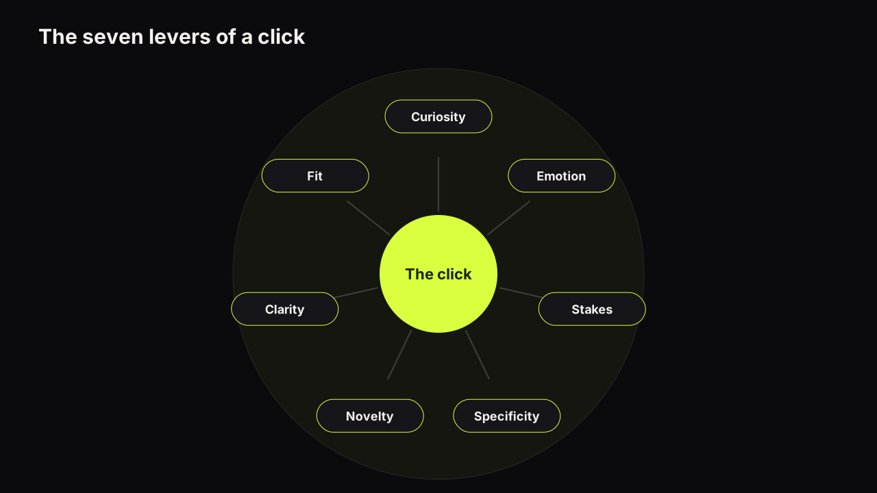
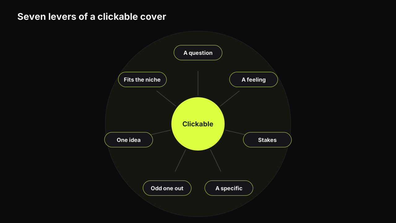
A YouTube thumbnail is clickable when it is seen before it is read, raises one question the title does not answer, and looks like a promise the video can keep. Those three conditions map onto how the decision happens: a glance that reacts to shape, brightness and a face before any reading; a read that looks for a question worth answering; and a check against the title. Seven levers move the odds at each stage. This is the compressed version; the psychology of why people click is the full account.
The decision happens in two passes, then a check
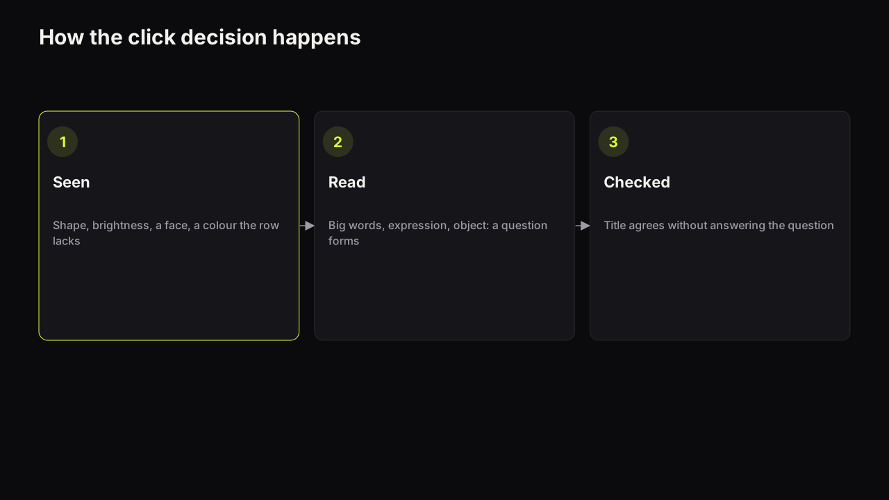
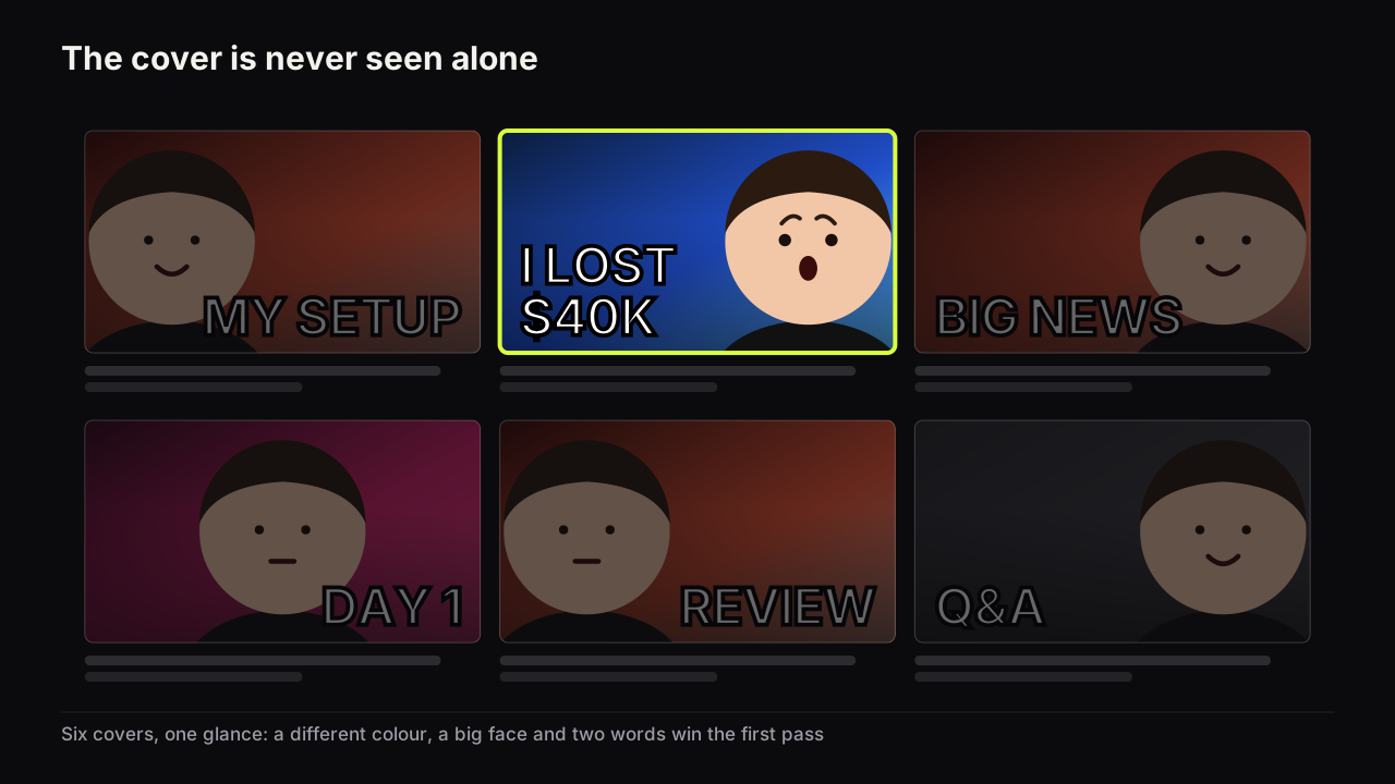
Pass one is before reading. The eye reacts to a big shape, a bright-against-dark edge, a face, and a colour that differs from the neighbours. A cover that loses here, because it is grey like the feed or the same colour as the row, is never evaluated at all. Most of what breaks at this stage breaks at phone size, which is why the phone check comes before any other judgement.
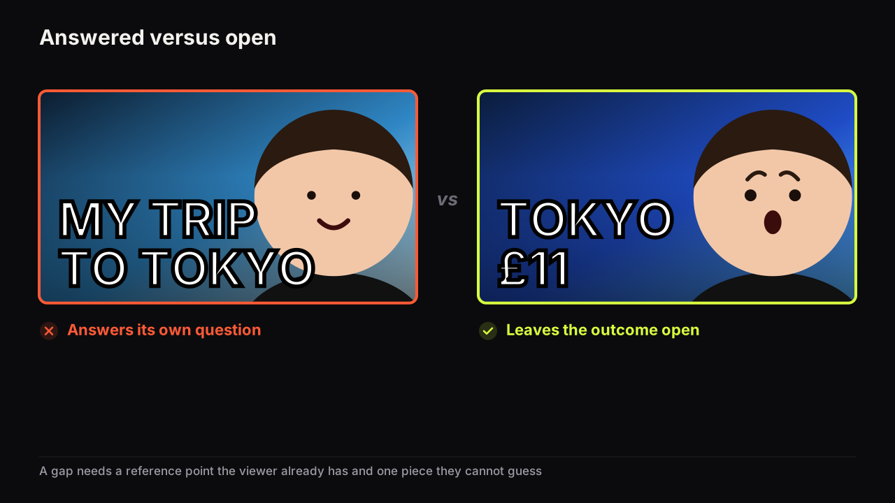
Pass two is the read. The viewer takes in the big words, the expression, the object, and a question forms: what happened, or how. If the cover answers its own question, there is nothing to click for.
The check. Cover and title are read together. They must agree without repeating; if the title already answers the cover's question, the reason to click is gone. That division of labour is what packaging means: the title says what the video is, the cover says why it matters.
We attach no timings to these passes. The order is what matters.
The seven levers, one example each
| Lever | What it does | On the cover |
|---|---|---|
| A question | Opens a gap between what the viewer knows and wants to know | "WHAT HAPPENED" over a wrecked kitchen |
| A feeling | A face carrying one nameable emotion that matches the promise | Doubt on a finance cover, not shock |
| Stakes | Something that costs or matters, shown specifically | "$40K", not "my finances" |
| A specific | A detail that is easy to picture and hard to dismiss | "7 DAYS", "TOKYO", "PS5 vs PC" |
| The odd one out | A dominant colour or layout the row is not using | A light cover in a dark niche |
| One idea | Three elements at most, readable at thumb size | Face, three words, one object |
| Fits the niche | Looks like something this audience already clicks | Novelty inside the audience's expectations |
The first lever is the engine. Curiosity, in the account George Loewenstein gave in his 1994 review in Psychological Bulletin, is the response to an information gap, a distance between what someone knows and what they want to know. A cover opens one with a missing outcome, a contradiction or an unusual specific, and the video must close it; how to open a question without clickbait is the whole craft in one article.
The second is emotion, and it is information rather than decoration. The expression tells the viewer what kind of video this is before they read a word, which is why the wrong emotion (shock on a tutorial) can lose a click that the right one (calm, competent) would have earned. Which expression carries which promise is the detail.
Levers three and four, stakes and specificity, do the same job from different sides: they make the question concrete. "I lost money" is a category; "I LOST $40K" is an event, and events get clicked.
Levers five and six are about the row. Being the odd one out gets the cover seen; one idea gets it understood in the moment it has.
The seventh lever is the brake on the fifth. Novelty works inside the audience's expectations; a cover that looks like nothing this audience has ever clicked reads as irrelevant. We would still take the odd-one-out colour over the niche's usual palette on every cover except the search-led ones, even though it costs a little of the "this is one of those" recognition that lever seven protects.
What makes a thumbnail un-clickable
Three failures account for most covers that earn fewer clicks than their video deserves. The cover answers its own question, so the read ends in a shrug. The cover cannot be read at feed size, so it never reaches the read. Or the cover is invisible in its row, the same colour and layout as its neighbours, so pass one never happens. Each has a fix in the full guide to how covers earn the click.
Take an illustrative tech cover: a phone flat on a white desk, the creator smiling beside it, "MY HONEST REVIEW" in white, a blue-grey ground. It fails all three. There is no question (honest about what?), the desk is the same white as the rest of the row, and the words are the title again. Keep the phone, put "£1,199" beside it at the size of the phone, change the smile to doubt, and set it on an orange ground. The question is now "is it worth that", the face hints the answer may be no, and the orange gets it seen in a row of white desks.
We recommend testing a cover against the levers rather than against taste. Before upload, name the question it opens, name the emotion in one word, point to the specific, and place it in a screenshot of your niche's row. If any of those four fails, the cover is not ready, however good it looks at full size.
Decide the question and the emotion first, then render the options: on the bench you type the scene, add the headline and pick a style, and get up to four versions to hold against the row.
What to do next
Take the cover for your next upload and score it against the seven levers, one word each. Where it scores nothing, change one thing: open the question, push the expression, add the number, change the dominant colour. Then read the full model, with a thumbnail pattern for each lever and the honest limits of all of them, in the pillar on the psychology of the click linked at the top of this page, and put the two-minute phone check from the pre-upload checklist between every cover and the upload button.