On this page
- Brightness contrast beats hue contrast
- The three kinds of contrast a cover needs
- One dominant colour and one accent
- Pairs that work and pairs that fail
- Faces and skin in the palette
- Avoid the app's own greys and whites
- What we do not claim about colour
- Three tests before upload
- Colour on the bench
- If it were our channel
- What to do next
Turn your phone's brightness down to a quarter, walk to a window, and open your own channel page. Some of the covers you approved on a monitor last month will have gone. Not the whole cover, just the words, or just the face, dissolved into a ground that was a different hue but the same brightness. That is the test most palettes fail, and it is the one the viewer runs on every cover without knowing it.
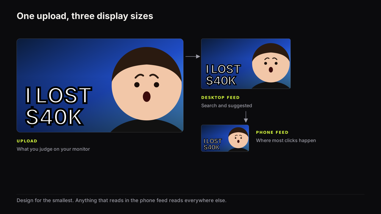
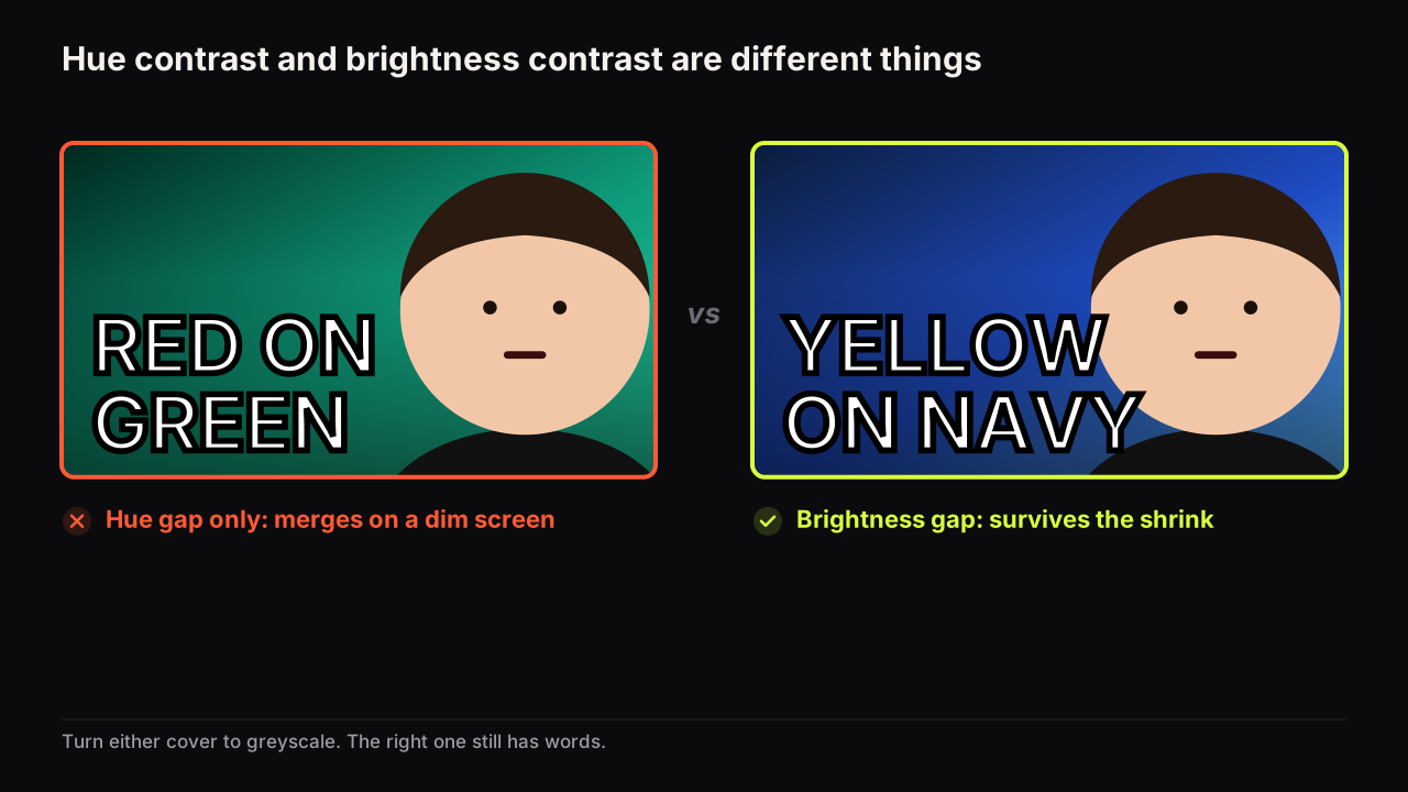
The best colours for a YouTube thumbnail are the ones that stay apart on a dim phone screen: one dominant colour, one accent, far apart in brightness, and different from the covers around yours in the feed. Hue is the least reliable part of that formula. A red word on a green ground has plenty of hue contrast and almost no brightness contrast, and on a phone at low brightness the two merge.
Brightness contrast beats hue contrast
Choose your two main colours for the gap in brightness between them, not the gap in hue. Dark ground and light words, or light ground and dark words. We would take a dull pair with a big brightness gap over a vivid pair without one every time, even though the dull pair looks flatter on the monitor where you approve it, because the monitor is not where the cover is judged. Hue is the second decision and it is optional.
The reason is how vision degrades. Brightness differences (how light or dark something is) survive conditions that hue differences (what colour it is) do not: a screen turned down, sunlight on the glass, the cover sitting at the edge of vision while the eye is on the next one, a viewer whose colour vision is not typical, and above all the shrink to feed size, where small areas of colour blend with their neighbours. Under all of those, a light word on a dark ground still reads as a light shape on a dark shape. A red word on a green ground of the same brightness reads as one shape.
Turn any cover to greyscale and you can see which kind it is running on. Words and face still separate from the ground: brightness is doing the work and the cover will survive. They vanish: hue was doing all of it, and hue is the first thing the phone takes away. What a contrast ratio is and how to measure one turns the squint into a number, for the cases where you want one.
The three kinds of contrast a cover needs
Contrast is separation, and a cover needs it in three places at once.
Brightness contrast inside the cover. Every element against what is behind it: headline against ground, face against ground, object against ground. This is the one above, and the one most covers get wrong.
Temperature contrast inside the cover. Warm colours (reds, oranges, yellows, skin) against cool ones (blues, greens, dark neutrals). A face is warm, so a cool ground separates it for free. A warm face on a warm ground needs a rim light or an outline to keep its edge, because face and ground share a temperature and often a brightness. This is one reason the dark, cool background behind a lit face is so common in successful feeds.
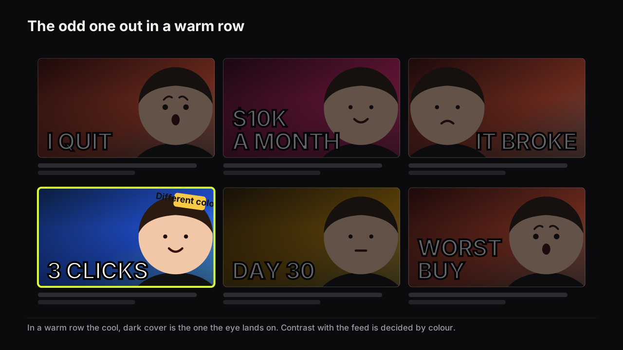
Contrast with the feed. The cover is never seen alone. It sits beside six to twelve others, most from the same niche, and the eye stops on the one that differs. If every neighbour is red, a red cover is one of the row. If yours is the only cool cover in a warm row, or the only light cover in a dark row, the eye lands on it before reading anything. This is the pattern-interruption lever, and colour decides it more than anything else on the cover.
The third kind cannot be judged on your own screen. You have to know what your niche's row looks like, and studying the covers that already work in your niche is where that knowledge comes from. Not to copy the niche's colours. To pick a dominant colour the niche is not using.
When the safe pair is the wrong pair
An illustrative case. A tech reviewer settles on deep navy with yellow words, which passes every brightness test and suits warm skin. Then the row screenshot comes back: five of the eight covers beside theirs in Suggested are navy, and three of those use yellow type. The pair is still correct inside the cover and wrong in the feed.
We would keep the brightness gap and flip the ground: a cream or off-white cover with near-black words and the reviewer's face lit from the side, which makes it the only light cover in a dark row. The cost is real. A light cover gives up the free separation a cool dark ground gives a warm face, so the face needs a shadow edge or a cut-out outline to hold its shape, and there is a bit more work per cover. We would pay it, because a perfect navy cover that is the sixth navy cover has already lost the glance it was designed to win.
One dominant colour and one accent
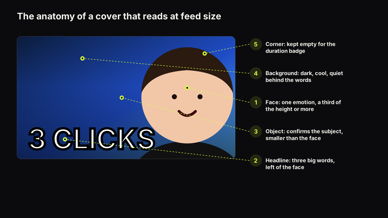
A cover needs one dominant colour (the ground, most of the area), one accent (a word, a number, an outline), and the natural colours of the face and the object. That is the whole palette.
The dominant colour sets the temperature and the brightness of the ground, so it decides whether the face separates. The accent is used once, on the one thing you want the eye to reach second: the number in a headline, the word that carries the stakes, the outline on the object. Used once it is a pointer. Used four times it is a pattern, and the eye has nowhere to land.
The covers that fail the accent rule usually fail by generosity: a yellow headline, a red arrow, a blue outline and an orange badge, each of which would have worked alone. Four accents is zero accents. Choose the one element that most deserves the eye and give the colour to that.
Pairs that work and pairs that fail
Every pair in the first table has a large brightness gap and a temperature gap. Every pair in the second lacks one or both.
| Pair that works | Why it holds up | Suits |
|---|---|---|
| Deep navy ground, yellow words | Large brightness gap, cool ground under warm words and warm skin | Tech, finance, education, most face-led covers |
| Near-black ground, lime accent | Maximum brightness gap; lime is rare in feeds | Commentary, gaming, anything in a red-heavy niche |
| Warm orange ground, white words | White stays readable on it at any size; energy without the alarm of red | Food, fitness, vlogs |
| Cream or white ground, one dark ink | The only light cover in a dark row is the odd one out | Education, craft, calm explainers |
| Teal ground, warm skin, white words | Cool ground separates the face without a rim light | Reviews, travel, tutorials with a presenter |
| Pair that fails | Why | What it becomes on a phone |
|---|---|---|
| Red words on a green ground | Hue contrast only; same brightness | One dark shape |
| Red face, red ground, red words | Same temperature, same brightness, nothing separates | A warm smear with a face-shaped area |
| Dark grey ground, white words | Merges with the app's own dark interface | A cover with no edges, floating in the feed |
| Yellow words on a white ground | Both light; the words vanish first | A white rectangle |
| Four accents on one cover | The eye has no order of arrival | Noise |
The pairs that work are not the only pairs that work. The rule generalises: pick the ground, then pick a word colour as far from it in brightness as you can get, then check that the face's warmth is not matched by the ground.
On a new channel in most niches we would not use red as the dominant colour, even though it is what the templates default to and what half the guides recommend. The row is already red. Red on a cover has become the colour of "a thumbnail" rather than the colour of anything in particular, and a new channel needs the first glance more than it needs to look like it belongs. The exception is a niche whose row has drifted cool, where red is back to being the odd one out; the screenshot decides, not the guide.
Faces and skin in the palette
Skin is warm and mid-bright, which means the face is a fixed element of the palette you do not get to choose. Plan around it.
On a cool, dark ground the face is the warmest and often the brightest thing on the cover, so it arrives first, which is usually what you want; the size floor for faces covers how big it needs to be once it is separated. On a warm ground the face needs help: a rim light along one side, a cut-out with an outline, or a darkened zone behind the head, and lighting a face so it separates goes through the options. On a light ground the face is darker than its surroundings, which works, but the words then need to be dark too, and a saturated red accent next to a face can read as part of the face at feed size.
Avoid the app's own greys and whites
YouTube's interface has a dark theme and a light theme, and a cover that matches either one loses its edges. A dark grey or near-black cover with nothing bright on it sits in the dark theme with no boundary between cover and page. A white cover with pale words does the same in the light theme. The combination that disappears in both is a mid-grey ground, a small face and thin white text.
When near-black is fine
The grey rule has a clean exception, and it is worth knowing where the line is. Picture a minimalist tech channel whose whole identity is a near-black ground and white type, which the table above lists as a failing pair. On a cover where the product is a large, bright object (a white earbud case at half the height, lit so it glows against the black) the cover draws its own boundary. The bright object is the edge, and the black ground reads as deliberate rather than absent.
The same channel's cover for a software topic, with no bright object, would fall straight into the app's dark theme with nothing to mark where it starts. We would keep the near-black identity and make one rule of it: no cover ships without a large bright element, and on the software videos that element is the headline, set enormous and pale rather than small and white. That is the check on the pre-upload checklist that is easiest to miss on a monitor, where the cover sits alone on a neutral canvas and always looks like it has edges.
What we do not claim about colour
We do not claim that red makes people click, that blue builds trust, or that yellow means happiness. Those statements circulate without sources we can trace, and the effects they describe, if they exist, are small next to the one we can see: a cover that is not separated from its ground or its neighbours is not read at all. We would rather choose a colour that carries the "wrong" association and separates than the "right" one that does not, and we accept that this occasionally means a finance cover in lime. Any association a colour carries is a tie-breaker between two options that both pass the contrast tests.
The one colour effect we will stand behind is the one you can see in any feed: the colour the neighbours are not using is the colour that gets looked at. If your covers have stopped standing out after months of the same palette, that is one of the four things creators call thumbnail fatigue, and the fix is a new dominant colour rather than a new style.
Because Thumbnail Bench is a product rather than a personality-driven channel, I think about colour a little differently. I care more about contrast against the actual competitive row than about forcing every cover into one rigid palette. Brand recognition matters, but YouTube puts your thumbnail next to everyone else's, and if the brand colour disappears into that row I'd rather bend the palette than lose the click. The better question isn't "did we use our brand colour?" It's "where does my eye go when this cover is surrounded by ten competitors?"
Three tests before upload
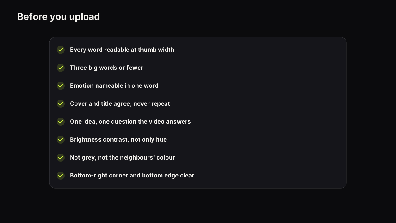
- Turn your screen brightness to about a quarter. Can you still tell the words from the ground and the face from the ground?
- Convert the cover to greyscale, or squint hard. Do you see two or three distinct shapes, or one?
- Put the cover in a row of six recent covers from your niche. Is it the one your eye goes to? If it is the same colour as its neighbours, change the dominant colour.
The third test is the one the free thumbnail tester exists for: it drops your cover into a mock search result and a phone feed so you can see it beside the competition at the size viewers see it. The reasons that size matters so much, and the rest of the phone check, are in why phone readability decides most clicks.
Colour on the bench
The contrast rules are built into the eight styles on the bench, so a Big Face or Number Pop render arrives with a dark, cool ground and a bright headline rather than a palette you have to fix. The reference library adds backgrounds that exist for separation, such as Dark Studio and Split Contrast, and text effects (Gold, Ice, Fire, Chrome and others) that put a bright edge around the letters, which is where the brightness gap between word and ground is decided. To change the dominant colour and nothing else, Tweak uses the finished render as the source for the next one, so face, words and layout stay put while the ground changes; that is also the cleanest way to make a colour variant for a test.
If it were our channel
Say we were starting a commentary channel, our face on every cover, and the Suggested row for our first three topics came back from the screenshot as six red-and-yellow covers, one white, one black.
We would rule out red and yellow first, for the reason above. The white cover already owns "light in a dark row", so we would not be the second. That leaves the cool, saturated darks: navy, teal, a deep green. We would pick teal, because it is the furthest in temperature from skin, which means our face separates with no rim light and the covers get faster to make, and because a lime accent on teal gives the headline a large brightness gap without another warm colour competing with the face.
Then two checks before committing. Greyscale: face, word and ground as three distinct tones, or we adjust the ground darker. Quarter brightness at a window: the lime still reads as a light shape. If both pass, teal and lime become the constant, and the expression and layout become the things that change from upload to upload.
And we would date the row screenshot, because the row moves. If in six months it came back half teal, we would change the ground before anything else, and count that as the palette having done its job.
What to do next
Take your last cover, turn it to greyscale, and look at what disappears. Then open your niche's feed on a phone and count how many covers share your dominant colour. Those two checks decide most of what this article recommends. For the rest of the cover, the hierarchy, the layout and the element budget that colour serves, read the design principles guide; the broader rules of the format are in the full thumbnail guide.