On this page
There is a faceless cover we see every week. A wide shot of a kitchen or a desk, a mid-sized object near the middle, a caption along the bottom, and on the right an empty area exactly where a person would have stood. Nobody deleted the face. It was never there. But the layout was designed for one, and without it the cover has no first thing to look at.
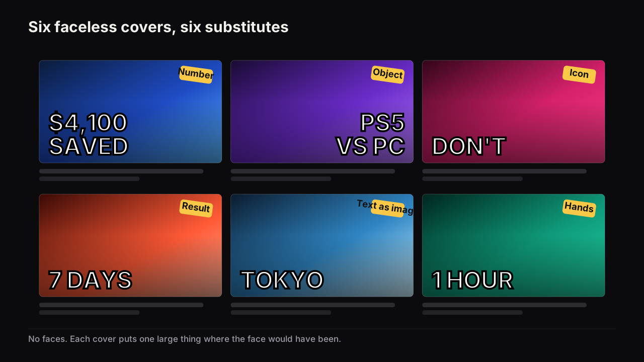
A faceless thumbnail replaces the face with something that does the face's two jobs: pulling the eye before anything is read, and telling the viewer how to feel about the thing. Six substitutes do that reliably: hands, the object as hero, a result or number, iconography, a silhouette or avatar, and text as the image. The cost is worth stating plainly. Without a face the cover loses its fastest signal, so everything else has to work harder, which comes down to a stronger brightness contrast and fewer elements than a face-led cover can get away with.
A faceless channel is one whose creator does not appear on camera or on the cover: automation channels, documentary and story channels, screen-recorded tutorials, compilation channels, and plenty of creators who simply prefer it. This is the faceless companion to the design principles that apply to every cover; the principles hold, but the weight each one carries shifts.
What a face does, and what you give up
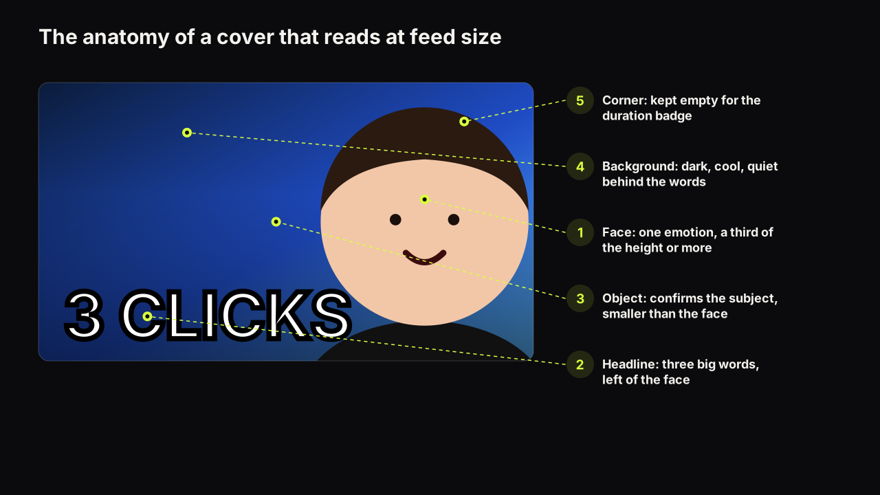
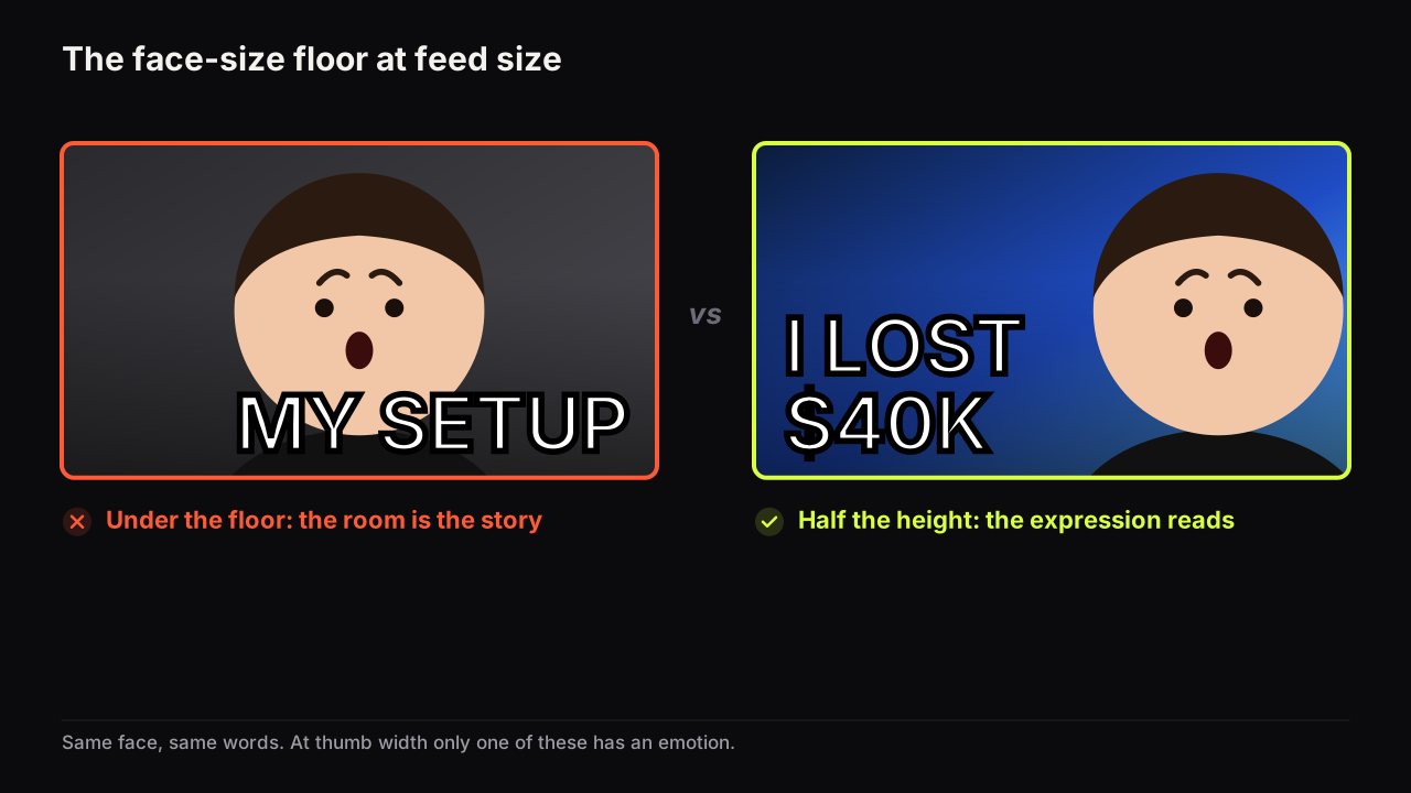
Faces pull the eye. In any picture, viewers tend to find the face before anything else, which is why a face at half the cover's height is the most reliable way to win the first pass, the glance before anything is read. That is job one. Job two is emotion: one nameable expression tells the viewer how to feel about the thing before the words have been read.
Remove the face and both jobs are open. The mistake is to pretend they went away. They moved to the object, the words and the colour, and those elements have to be designed to carry them.
In the channels we look at, faceless covers lose the first glance in one specific way: they are built like face covers with the face deleted. A wide shot, a mid-sized object somewhere in the middle, a caption along the bottom, and a gap where the person would have been. The covers that hold the first glance put one large substitute exactly where the face would have gone and give it the size, the side and the separation a face would have had.
I've shipped covers without a face, and I don't think a face should be mandatory. If the story is about an object, an interface, a transformation, a result, a graph or a before-and-after, that can be the hero. One thing I want Thumbnail Bench never to do is bolt a giant creator face onto a cover because a playbook says faces perform better. The focal point should be whatever carries the strongest reason to click.
The six substitutes
Each substitute does the face's two jobs in a different proportion. Pick the one that fits the promise, then give it the face's size: a third of the height at least, half is better.
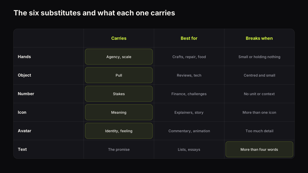
| Substitute | What it carries | Best for | Breaks when |
|---|---|---|---|
| Hands | Agency, scale, a person doing this | Crafts, cooking, repair, unboxing | Hands are small, or hold nothing legible |
| Object as hero | Pull, the subject itself | Reviews, tech, food, products | Centred and small, or three objects |
| Result or number | Stakes, the outcome | Finance, challenges, productivity | The number has no unit or context |
| Iconography | Meaning in one shape | Explainers, commentary, documentary | More than one icon, or the icon is generic |
| Silhouette or avatar | Identity, and emotion if it has a face | Story, commentary, animation | Drawn with detail that vanishes at feed size |
| Text as the image | The promise, directly | Lists, essays, opinion | More than four words, or thin type |
Hands
Hands doing the thing: holding the tool, pointing at the part, cutting, typing, turning a screw. A hand tells the viewer that someone is doing this, which is most of what a face would have said on a tutorial or a craft cover, and it gives the object a scale. Crop close, so the hand and the object fill the height together, and light the hand so it separates from the ground. Skin is warm, so a cool background does the work. A hand on a wooden bench under warm light disappears.
The object as hero
The object takes the face's slot: large, cut out or lit to separate, on one side, at half the height. A single object, never three. A reviews channel that puts the product at face size with a verdict word beside it is doing what a face-led review channel does, with the product carrying the pull and the word carrying the verdict. The object needs what a face would get: an edge that survives the shrink, a plain ground, and a size where its shape is recognisable at thumb width.
A result or number
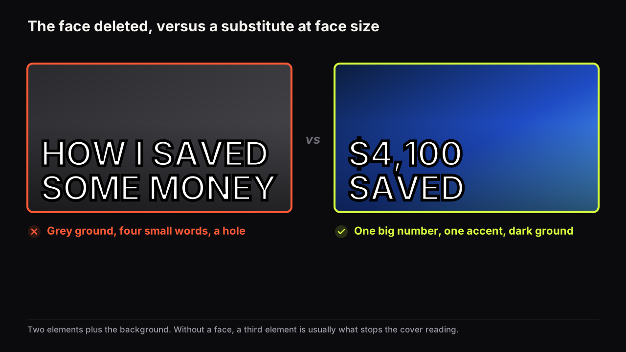
The outcome shown or stated: the finished cake, the clean engine bay, the repaired screen, or one large figure with a unit. A number is the strongest faceless substitute for stakes, because a specific figure is easy to picture and hard to dismiss. It has to carry its own context on the cover or in the title: 7 DAYS, $4,100 SAVED, 1 HOUR. A bare 37 is decoration. The number is one of your elements, so it counts against the budget covered in how many words a cover can carry, and the number-led layout has its own rules about size and unit.
Iconography
One symbol at large size: a warning triangle, a padlock, a map pin, a chart arrow. Icons read across a room because they are shapes before they are pictures, and a single icon can carry a feeling (warning, secrecy, loss) without a face. The rule is one; two icons are a diagram. An icon also cannot carry a specific. If the video is about one particular thing, show the thing rather than the symbol for its category.
A silhouette or avatar
A consistent character: a drawn avatar, a mascot, a hooded figure. The avatar's value is identity across uploads; the viewer learns to find it in the row, which is the recognition a face would have provided. If the avatar has a face it can carry emotion too, but only if it is drawn boldly enough for the expression to survive at feed size: big eyes, a clear mouth, one colour. One boundary applies. An avatar is your character, not a way of putting someone else's face on your cover without their consent.
Between a realistic generated face and a drawn character, we would pick the drawn character every time, even though it takes a dozen uploads to become recognisable and a realistic face pulls the eye from the first one. A realistic face that belongs to nobody is a promise the channel cannot keep: the viewer assumes a person, and the moment they learn there is none the channel's credibility takes the hit. A character is honest about being a character, and recognition compounds while credibility does not come back.
Text as the image
The headline becomes the picture. Three words or fewer, set heavy, one word in the accent colour, on a plain dark or plain light ground. This is the layout for lists, essays, opinion and commentary where there is no single object to show. It fails when the words multiply because there is room for them; a text-only cover with six words is a paragraph, and nobody reads a paragraph in a feed.
Choosing a substitute: a spreadsheet tutorial
An illustrative case. A screen-recorded channel teaches spreadsheet formulas, and the next video is about a lookup function that replaces a slow manual process. Hands are out; there is no camera. The full screenshot is the default and the worst option, because at thumb width a spreadsheet is a grey grid. The object as hero would mean one cell, cropped so the formula bar fills a third of the height, which reads but carries no feeling. The result would mean the outcome in numbers: 4 HOURS to 4 SECONDS, stakes and a contradiction at once.
We would build the result cover: 4 HRS crossed through on the left in a muted tone, 4 SEC large on the right in the accent colour, a plain dark ground. Two elements plus the background. A cropped fragment of the grid is tempting as a third, and we would leave it out, because the number is already doing the pull and the crop would only dilute it.
Contrast and simplicity have to rise
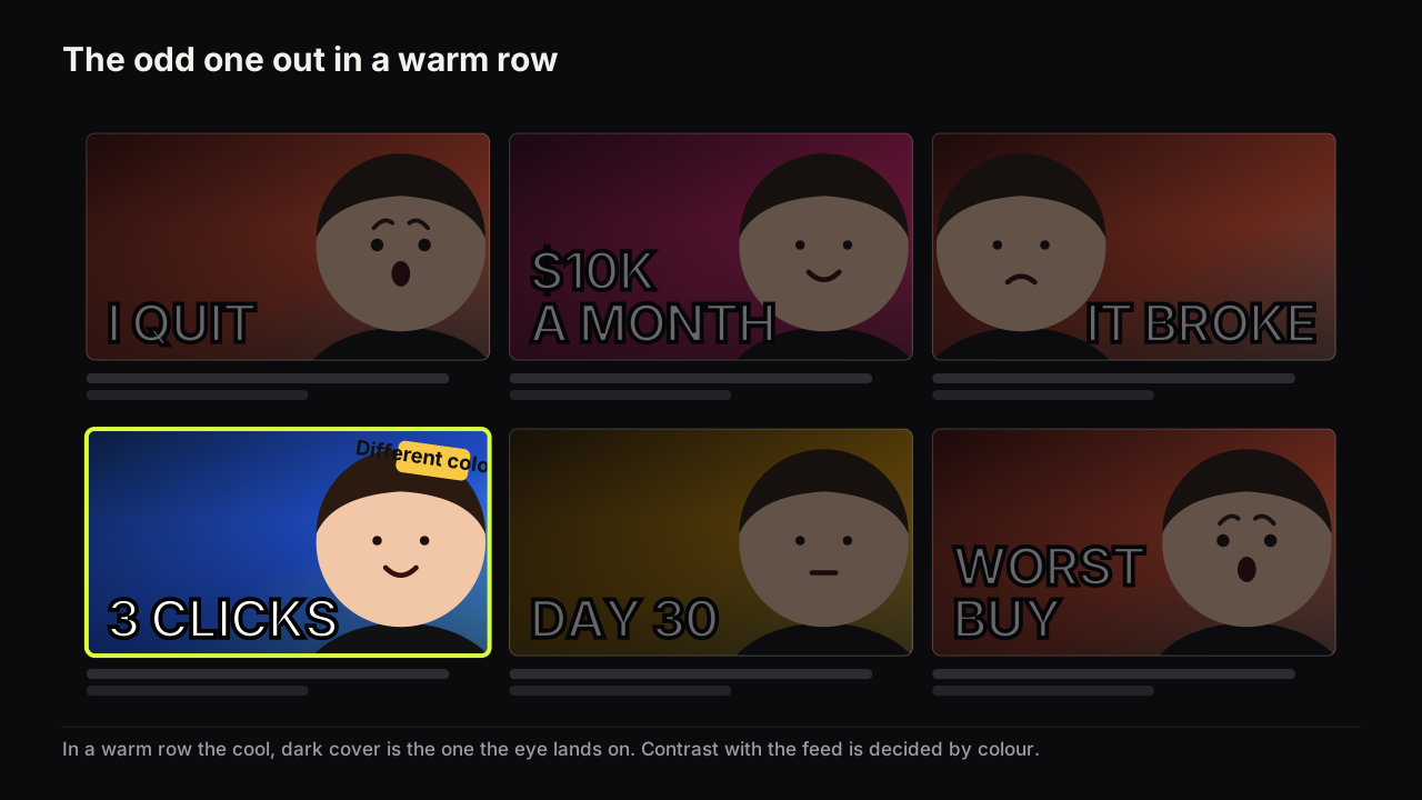
A face brings its own separation: warm skin against almost any cool ground, and a shape the eye already knows. A faceless cover has to build that separation on purpose. The rule from colour and contrast that survive a phone screen applies with more force here: brightness contrast beats hue contrast, one dominant colour and one accent, and a dominant colour that differs from the row. A mid-grey ground, which a face can sometimes survive, kills a faceless cover, because the substitute has nothing to stand out against and the cover merges with the app's own interface. Backgrounds that do their job covers the grounds that separate and the ones that swallow.
Budget a faceless cover at two elements plus the background, not three: the substitute and the headline, or the substitute alone. We would hold to this even when the third element is the actual subject of the video, because a face-led cover can carry a face, a headline and an object only because the face organises the other two, and without it the third element is usually the thing that stops the cover reading. The cost is that a faceless cover says less than a face-led one, and the title has to pick up the slack.
The reason is hierarchy. On a face-led cover the eye lands on the face and the order of the rest follows. On a faceless cover there is no automatic first landing, so size and brightness have to create one: the substitute is the biggest and brightest thing, the headline is second, and nothing else competes.
When no big thing is the right answer
Every rule above says: one large substitute, high contrast. There is a kind of channel where we would break it. Picture an ambient channel, rain on a window for three hours, a study room at night. The promise is calm, and the row it sits in is full of loud covers with large glowing text. A cover built to the rules (one huge raindrop, a bright word) would be correct and would look like everything around it.
The odd one out here is the quiet cover: a wide, softly lit room, a single small word or none, the whole frame reading as mood. It wins the first glance by being the only calm thing in a loud row, which is pattern interruption doing the substitute's job. We would still keep a brightness gap between the room and the feed's dark ground, because a calm cover that also disappears is a missing cover. The row decides which rule matters most, and for a mood channel the feed-contrast rule outranks the big-thing rule.
Faceless covers by niche
The six substitutes are not equally at home everywhere. These are patterns from the feeds we look at, not measured results.
Finance and business faceless channels lean on the number: one large figure, a stack or a chart shape as the object, dark ground, one warm accent. Education and tutorial channels lean on the result and on hands: the finished thing, or a hand on the tool, with a small headline naming the outcome. Gaming faceless channels use the character or the console as the object and versus layouts, with high saturation as the treatment. Documentary, true-crime and story channels lean on iconography and the silhouette: one symbol or one hooded figure, a single word, a dark ground. Tech and review channels put the product at face size with a verdict word. Compilation and ambient channels lean on text as the image, with a place or a mood in the ground.
To find out which applies to yours, look at the row you will sit in. Studying the faceless covers that already win in your niche tells you which substitute the audience already reads, and which colour the row is so you can be a different one.
The mistakes we see most on faceless covers
- The deleted face. A layout designed for a person, with a hole where the person was. Move the substitute into the hole and enlarge it.
- Stock imagery with nothing to say. A generic city, laptop or handshake fills the space and carries no promise. If the object is not the specific thing in the video, it is background.
- The full screenshot. The whole window, every menu, tiny type. Crop to the one control that matters and enlarge it until it reads at thumb width.
- Words filling the room. Without a face there is space for a sentence, and a sentence is what ends up there. Three words; the rest belongs in the title.
- The same grey as the app. A faceless cover on a mid-grey ground is the app's own chrome with a caption on it.
The phone check catches all five. Judging the cover at feed size is the only way to know whether the substitute is doing the face's job.
Building a faceless cover on the bench
Two of the eight styles on the bench are built around a substitute rather than a face. Number Pop puts one large figure on the cover with the cause left to the video, and Split Screen sets up a versus or a contradiction between two halves. Both work with no face at all: describe the scene, type the headline, and the model renders the words into the image. For text as the image, the editor's real text layers add exact words in heavy fonts on top of any render, free, which matters when the words are the whole cover and a misspelling would be the whole cover too.
The reference library covers the other substitutes. Hook cards such as Shadow Figure, Warning Tape and VS Badge add a silhouette, an icon or a pointer as a reference to the render; Background cards such as Dark Studio and Split Contrast set the ground the substitute has to separate from. The reference library is free and uses no credits, one card per category per render.
The faceless cover check
Run it at thumb width, beside your last few covers, not on its own at full size.
- Name the substitute. Is there exactly one large thing where a face would have been?
- Does it fill at least a third of the height, on one side?
- Does it separate from the ground by brightness, not just by colour?
- Count the elements. Two plus the background, or fewer?
- Is the headline three words or fewer, heavy, with one accent?
- Can you name the feeling the cover gives without a face on it? If not, the words or the colour need to carry it.
- Is the dominant colour different from the row your niche sits in?
If it were our channel
Suppose we ran a faceless history channel, ten-minute explainers on how ordinary objects came to exist, and the next three videos were the paperclip, the shipping container and the barcode.
We would not pick one substitute for the channel. We would pick one per video and hold the ground constant. The paperclip gets the object as hero: a single clip, enormous, lit from one side on a near-black ground, with the patent year in the accent colour as the only word, because a date is the specific that makes a boring object strange. The shipping container gets the number, because its story is a cost story: the old price of moving a tonne crossed through beside the new one, whatever the research turns up, with the container a small silhouette in the corner rather than a third element. The barcode gets text as the image, since a photo of a barcode is a grey stripe: the word SCANNED set enormous with the stripes running through the letters.
Three substitutes, one ground, one typeface, one accent. The constant makes the channel findable in a row; the variety inside it keeps the covers from becoming wallpaper. Before any went live we would put each beside the six covers YouTube shows next to our last upload, on a phone, and ask only whether ours is the one the eye goes to. If the row turned out to be near-black already, the ground would change to cream before anything else did.
Common questions
Do faceless YouTube thumbnails get fewer clicks?
We have no sourced figure for what a face adds or what its absence costs, and we do not use one. What we observe is that faceless covers lose the first glance when they are built like face covers with the face removed, and hold it when one large substitute takes the face's place with stronger contrast around it.
Can I use a generated or stock face instead of my own?
A drawn avatar or a consistent character is a better long-term choice, because it becomes an identity the audience recognises. A real person's face needs that person's consent, and a realistic invented face creates a trust problem the moment the audience learns it is nobody.
Should a faceless thumbnail have words on it?
Usually yes, because the words now carry part of the emotion a face would have carried. Keep them to three big words or fewer, set heavy, with one accent colour, and make sure they add something the object or number does not already show.
What to do next
Open your last five covers and name the substitute on each one. Any cover where the largest thing is under a third of the height, or where there is no single largest thing, gets rebuilt around one substitute at face size on a plain dark or light ground. Then read the colour rules linked above, because on a faceless channel the ground does half the work a face used to do.