On this page
- The promise is "this is easy and I can do it"
- Clarity over drama: what the eye should meet
- The result or the object as hero
- The face in a tutorial: calm, smaller, pointing at the thing
- Words that name the outcome
- Search-led intent: why the cover may repeat the title
- Consistency for a series
- Educational covers by type
- Building tutorial covers on the bench
- The tutorial cover check
- Common questions
- What to do next
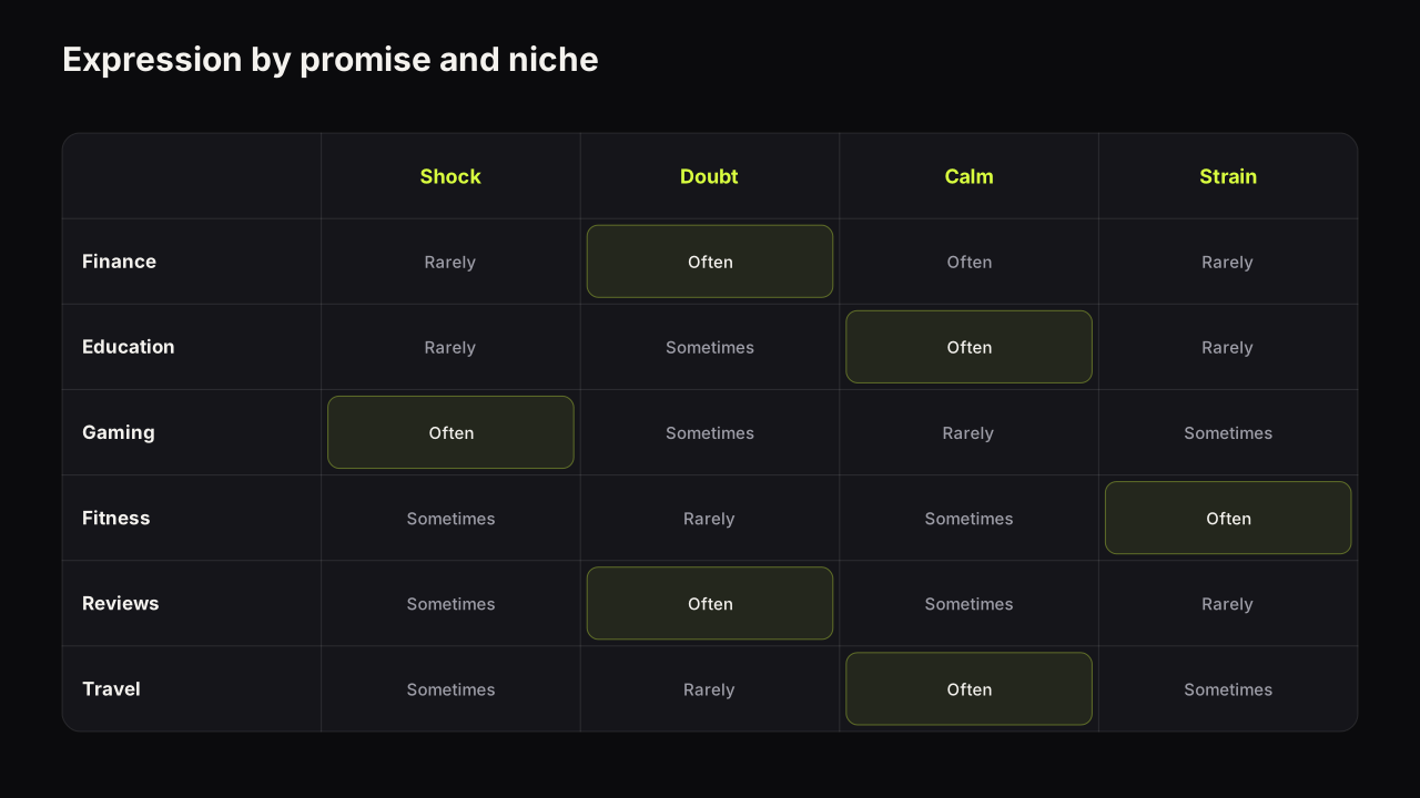
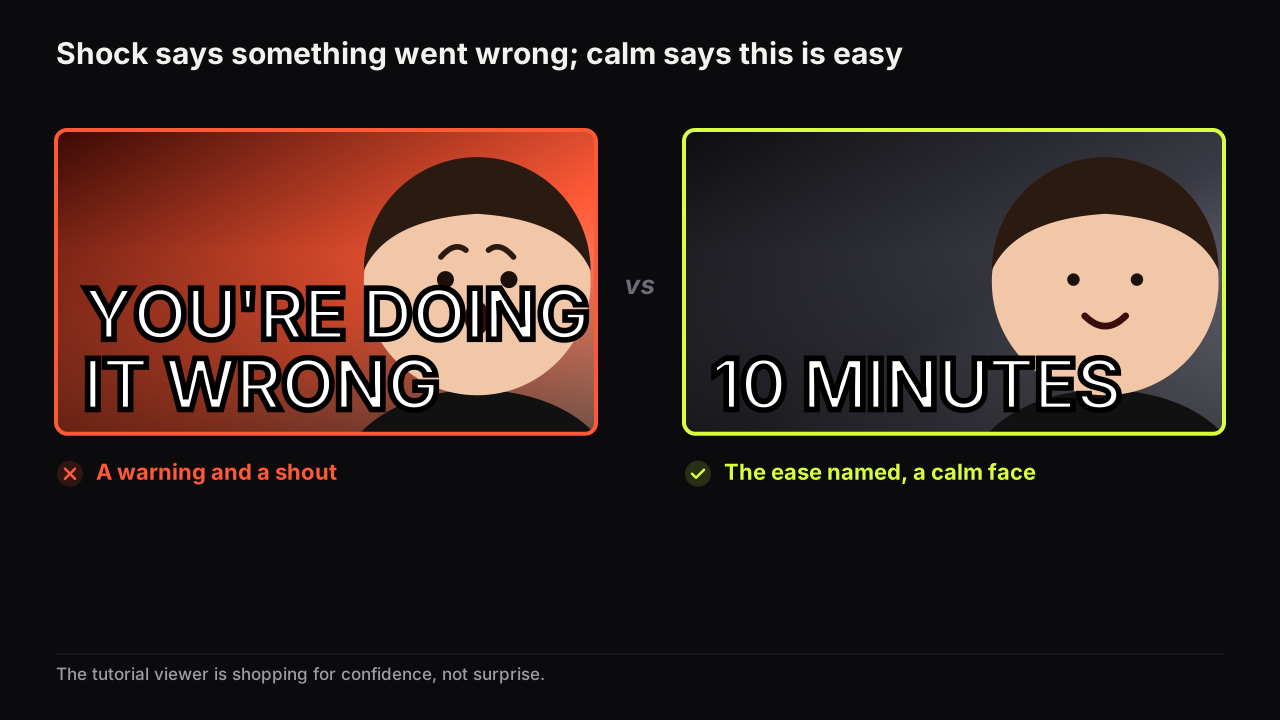
A tutorial thumbnail has one promise to make: this is easy, and you can do it. Calm beats shock because shock says the opposite. A shocked face means something went wrong or something surprising happened, and a viewer who searched for how to do a thing is not shopping for a surprise; they are shopping for confidence. The covers that win in education, in the rows we look at, show the result or the object large, name the outcome in a few words, keep the face calm and often small, and repeat the title more than other niches can afford to, because the viewer arrived by search and wants confirmation more than intrigue.
That last point makes education the exception to several rules the rest of this library teaches. The face is not always first. The words may echo the title. The cover's job is less to open a question than to answer one: yes, this is the video that shows you how. The general principles still hold, and the design principles guide is where hierarchy, contrast, simplicity and readability are set out; here is how they apply when the promise is competence rather than drama.
The promise is "this is easy and I can do it"
The tutorial's promise is about the viewer, not the creator. The viewer wants to know three things at a glance: is this the thing I am trying to do, will I be able to follow it, and how long will it take. A cover that answers all three has done its job before the words are read.
Simplicity is the signal. A clean cover with one result and two words says the method is clean. A cluttered cover with four arrows and a paragraph says the method is cluttered, whatever the video is like. That is why the shocked face, the red circle and the six-word warning that work elsewhere tend to fail here: they raise the stakes, and a tutorial viewer wants the stakes low.
In the education and tutorial rows we look at, the shocked face underperforms in tone. It sits beside calm covers and reads as a warning or a rant, and the viewer looking for a method scrolls past it to the cover that looks like a method. The covers that hold attention are plain, bright, and built around the finished thing, with a face that looks pleased or focused rather than alarmed. We do not attach numbers to this; it is a pattern, not a measurement.
Clarity over drama: what the eye should meet
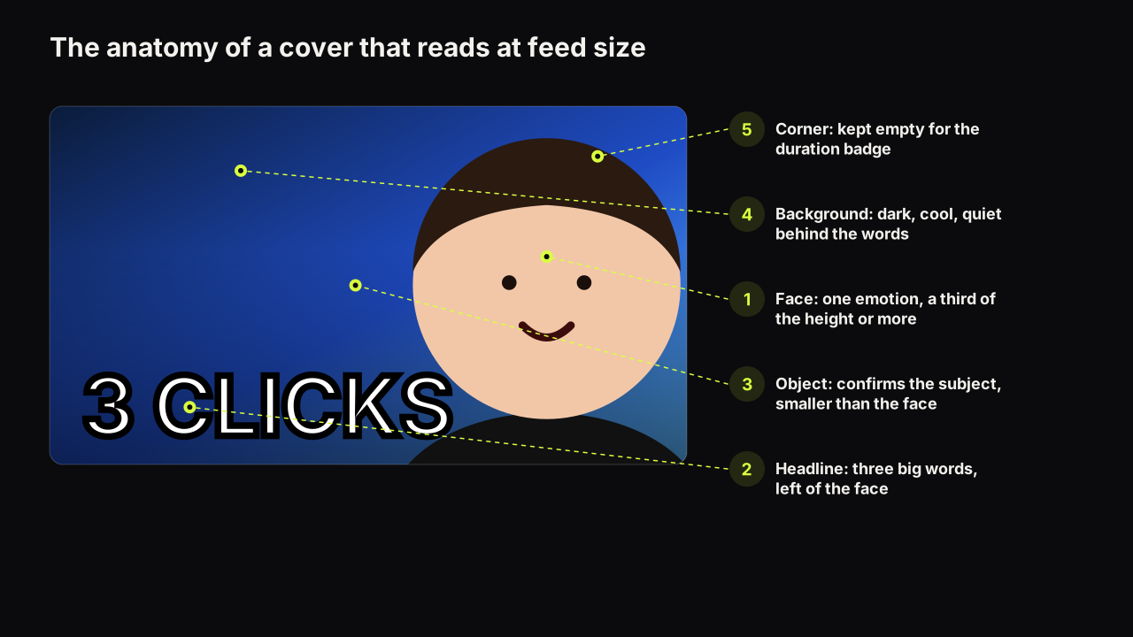
On most covers we recommend the eye meet the face first, then the headline, then the object. On a tutorial cover the order usually inverts: the result or the object first, the outcome words second, and the face last, if there is one. The reason is that the result is the promise. The viewer is looking for the finished cake, the working spreadsheet, the fixed tap, the finished chord, and the cover that shows it at a size where it is recognisable at thumb width answers "is this the thing" without a word.
The hierarchy tools are the same: size, brightness, position, isolation. The result is the largest and brightest element, on one side. The words sit beside it on a quiet zone. The face, if used, is smaller and looks at the result, so the gaze closes the path on the thing the viewer wants.
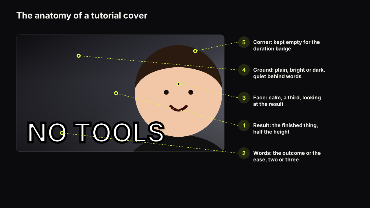
Build a tutorial cover in this order: the result at half the height, the outcome in two or three words, then decide whether a face adds anything. If the face would only add "a person made this", leave it out or keep it small. If it adds "and it was easy", keep it, calm, at about a third of the height, looking at the result.
The result or the object as hero
The hero is the finished thing, the tool, or the one control that matters. Three forms cover most tutorials.
- The finished result. The cake, the built shelf, the finished garment. Shot clean, lit to separate, cropped to fill half the height. The strongest hero, because it is the promise made visible.
- The object or tool. When the result is invisible (a habit, a concept, a fixed error), the tool stands in: the instrument, the app icon, the part being replaced. One object, large, on a plain ground.
- The one control. Software tutorials fail most often here, with a full-window screenshot on the cover. At feed size a full window is grey texture. Crop to the single menu, button or panel the tutorial is about and enlarge it until it is the cover.
The size floor for the hero is the same as the size floor for a face: a third of the height at least, half is better. A result at a fifth of the height is a blob beside some words, and the words then have to do the whole job.
Take a tutorial on turning off Windows startup apps and imagine the first draft: a full screenshot of Task Manager, the creator's shocked face at half the height on the right, a red arrow, and YOUR PC IS SLOW BECAUSE OF THIS in red across the top of the grey window. At feed size the window is grey texture, the arrow points at nothing readable, and the face says something has gone wrong, so the viewer infers a warning video rather than a fix. The rebuild: crop to the Startup tab alone and enlarge it until the toggle switches fill the left half; set 1 SETTING in white with a dark outline on the right; and if the face stays, make it calm, a third of the height, in the lower corner, looking at the toggle. Nothing in the video changed. The cover now promises the thing the searcher typed.
The face in a tutorial: calm, smaller, pointing at the thing
A face on a tutorial cover is a recognition device and a confidence signal, not the hero. It says "the same person as last time" and "this went fine". The expressions that fit are calm, focused, pleased and mildly curious; the ones that do not are shock, anger and scream. Matching the expression to the promise is the general skill, and in education the promise is competence, which has a narrow, quiet range of faces.
Size and position follow from the role: a third of the height, on one side, eyes on the result rather than the camera, so the viewer's eye is led to the thing. A face at half the height looking at the camera makes the creator the subject, which is right for commentary and wrong for a how-to. Faceless tutorial channels lose little here; hands on the tool do the face's job well. We would leave the face off most software tutorial covers altogether, even though that costs some recognition across a series, because the one control the viewer is hunting for needs the width, and a face squeezed to a fifth of the height to make room for it adds nothing a viewer can read.
Words that name the outcome
The words on a tutorial cover name what the viewer will be able to do, or the constraint that makes it easy: "IN 10 MINUTES", "NO CODE", "ONE PAN", "FIRST TRY". They should not describe the picture, and they should not be the whole title. Two or three big words, or one big word and two small, is the budget, and how many words a cover can carry explains why the ceiling is lower than it looks on a monitor.
Two things are specific to education.
Spelling has to be exact. A misspelt word on a teaching channel costs trust in a way it does not on a vlog. If the words are rendered into the image by a generator, read every letter at full size before uploading; if the words must be exact, put them on a text layer. The workflow for that, and why models get letters wrong, is in the guide to AI thumbnail text.
The number is the ease. A time, a step count, a "from scratch" or a "no tools" is the constraint that makes the viewer believe they can do it. It has to be true of the video, and it should be the only number on the cover.
Search-led intent: why the cover may repeat the title
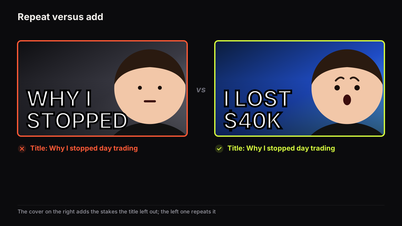
Most of this library argues that the cover should not repeat the title, because the second look should be rewarded with new information. Tutorials are the exception, and the reason is where the viewer comes from.
A viewer who typed "how to fix a dripping tap" into search is scanning results for confirmation. A cover that shows the tap and reads "FIX IT" beside a title that says "How to fix a dripping tap" is repeating itself, and that repetition is reassurance: yes, this one. The rules for when repeating the title is fine come down to intent, and search intent is the clearest case.
Repeat the subject; do not repeat everything. Let the cover show the thing and name the ease ("10 MINUTES", "NO TOOLS"), and let the title name the task and the audience ("How to fix a dripping tap, no plumber"). The subject appears in both; the ease is on the cover; the task is in the title. That way the search viewer gets confirmation and the Home or Suggested viewer, who did not search, still gets something new from the second look.
The same video is also shown to people who did not search for it, in the Home feed and beside other videos, and for them the cover has to open a small question as well as confirm the subject. The missing-outcome gap works: show the result, withhold the method. Opening a question the video has to answer is a lighter touch in education than elsewhere, but it is not absent. Title and cover remain one promise, and packaging the video before you film it is the habit that keeps a tutorial's promise honest.
Consistency for a series
Educational channels are built on series: a course, a set of lessons, a run of how-tos on one tool. A series cover has to be recognisably part of the set and distinguishable from the other episodes. The way through is to fix the constant and vary the variable.
The constant is the layout, the dominant colour, the type style, the face's place if there is one, and a corner mark or a series label. Keep it identical across the series, so a viewer who found lesson three recognises lesson four in the row. The variable is the result shown, the outcome words, and the lesson number. Change those every time.
Two failure modes. A series with no constant looks like unrelated channels, and the viewer who liked one cannot find the next. A series where everything is constant, including the result and the words, is one cover repeated, and the audience's eye slides over it after a few episodes; that sameness is one of the four things creators call thumbnail fatigue, and the fix is to vary the result and the words, not the layout.
We think the lesson number belongs on the cover for a course and not for a loose series. In a course the number is a promise of order and the viewer uses it to find their place; in a series of independent how-tos it is a claim that the videos must be watched in sequence, which costs clicks from people who only want the one.
Educational covers by type
The grid below is our recommendation for five common educational formats. It is a starting point, not a measurement, and the row you sit in may argue otherwise.
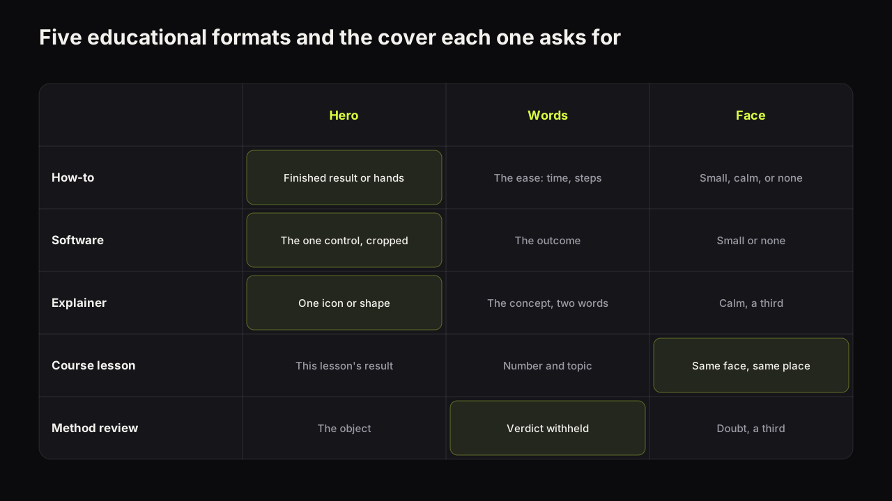
| Format | Hero | Words | Face |
|---|---|---|---|
| How-to (physical) | The finished result, or hands on the tool | The ease: time, steps, "no tools" | Small, calm, or none |
| Software tutorial | The one control, cropped and enlarged | The outcome: "NO CODE", "IN 5 STEPS" | Small or none |
| Concept explainer | A single icon or diagram shape | The concept in one or two words | Calm, a third, looking at the icon |
| Course lesson | The result of this lesson, fixed layout | Lesson number and topic | Same face, same place, every lesson |
| Method review | The method's object with a verdict | "WORTH IT?" or the verdict withheld | Doubt, a third, looking at the object |
Building tutorial covers on the bench
One of the eight styles on the bench is built for this niche. Clean Edu sets a plain ground, a clear result and calm type, with the headline rendered into the image. In the reference library, which is free and uses no credits, the Studio Portrait subject look gives a calm, lit face, and the Dark Studio and Light Burst backgrounds keep a quiet zone behind the words. For the exact spelling a teaching channel needs, the editor's text layers add the outcome words in a heavy font on top of any render, free.
The tutorial cover check
Run it at thumb width, beside a few covers from the search results for your topic.
- Can you tell what the viewer will be able to do, without reading?
- Is the result or the object the largest element, at a third of the height or more?
- Do the words name the outcome or the ease, in three words or fewer, spelt correctly?
- If there is a face, is it calm and looking at the result? Is it smaller than the result?
- Is any number on the cover true of the video, and the only number on it?
- Does the cover confirm the subject for a search viewer and add one thing for a Home viewer?
- Does it match the series constant and change the series variable?
- Is the ground plain behind both the result and the words?
Common questions
Should a tutorial thumbnail have a face?
It can, and it helps recognition across a series, but it is rarely the largest element. A calm or pleased face at about a third of the height, on one side, looking at the result, works; a shocked face at half the height says something went wrong, which is the opposite of the promise.
Should I put the step count or the time on the thumbnail?
If the number is honest and is the reason to click, yes. "10 MINUTES" or "3 STEPS" names the ease the viewer is looking for. It has to be true of the video, and it should be the only number on the cover.
Can an educational thumbnail use a curiosity gap?
Yes, the missing-outcome kind: show the finished result and withhold the method. Education audiences are put off by mystery framed as mystery, but they respond to a result they want with the "how" left to the video.
What to do next
Take your most recent tutorial cover and ask what the viewer will be able to do after watching. If the cover does not show that result at a third of the height or more, rebuild it: result first, outcome words second, face last and calm. Then decide the constant and the variable for the series it belongs to, so the next cover is recognisable and different at the same time.
For how the education pattern sits against the other niches, see thumbnail patterns by niche.