On this page
- A niche is a question the viewer arrives with
- Ten niches, one table
- The ten playbooks, two sentences each
- Which patterns travel between niches and which do not
- How to find your niche's baseline pattern
- Where to break the baseline: the one-step rule
- When your channel sits in more than one row
- Building niche covers on the bench
- The niche check
- If it were our channel
- Common questions
- What to do next
Take the best gaming cover you have ever seen, saturated purple, a screaming face at half the height, a "VS" badge, and drop it into the search results for "how to poach an egg". It is now the worst cover on the page. Nothing about it got worse. The row changed, and the row decides what a cover means.
Thumbnail ideas by niche are not ten different rulebooks; they are ten different rows, and each row has a baseline pattern its audience already knows how to read. The cover that wins in a niche usually keeps that baseline in most respects and departs from it in one, because a viewer has to recognise the kind of video before they will notice what makes this one different. Below: the baseline for ten niches in one table, why the lever that carries one row misfires in the next, and a method for writing down your own row's baseline and choosing the one field to break. Each niche also has its own playbook in this library, summarised in two sentences and linked.
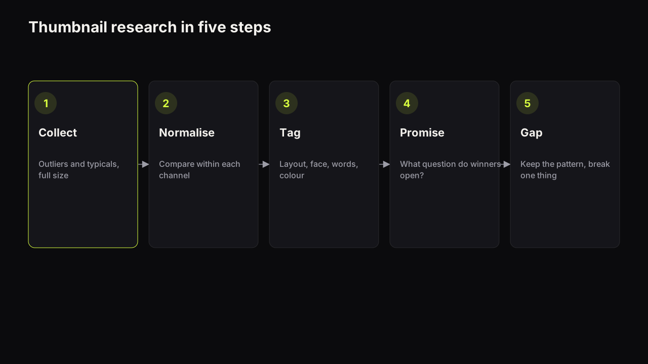
Two things this guide does not repeat. The universal design rules (hierarchy, contrast, three elements, the shrink to feed size) are in the design principles guide, and they hold in every row. The argument that research in your own niche beats general rules, and the five-step method for doing that research, are in the competitor research guide; here we take that argument as read and describe what the research tends to find.
A niche is a question the viewer arrives with
A niche row is the set of covers a viewer sees together when they are looking for one kind of video: the search results for a recipe, the Home feed after three gaming videos, the Suggested column beside a phone review. The row is defined by the viewer's session and the video's topic, not by your channel. Every cover in it is competing to answer the same question, and the question is what makes niches differ from each other.
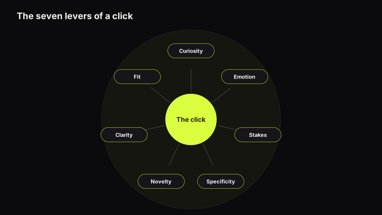
A finance viewer is asking "how much, and is that true?". A tutorial viewer is asking "can I do this?". A travel viewer is asking "where is that, and what is it like to be there?". The question decides which lever leads. The seven levers that make people click are the same in every row; what changes is their ranking, and the lever that leads in one row is often the one that misfires in the next.
| Niche | The viewer's question | The lever that leads | The lever that misfires |
|---|---|---|---|
| Gaming | What happened, and who won? | Novelty and stakes | Clarity is the one most covers drop |
| Finance | How much, and is it true? | Stakes and specificity | Emotion pushed to shock reads as a pitch |
| Education | Can I do this? | Clarity and expectation fit | Curiosity framed as mystery |
| Fitness | Did it work, and would it work on me? | Stakes (time and effort) and specificity | Emotion used as hype instead of proof |
| Travel and vlog | Where is that, and what is it like? | Novelty and specificity | Emotion, when the face crowds out the place |
| Tech and reviews | Should I buy it? | Curiosity (the withheld verdict) | Expectation fit, when every cover is the press shot |
| Food | Do I want that, and what is the catch? | Appetite, which does the work emotion does elsewhere | Clarity lost to a busy table |
| Commentary and news | What did they do, and what do you make of it? | Stakes and emotion | Specificity, when the quote is vague |
| Music | Is this the song, the artist, the version? | Expectation fit and clarity | Curiosity, which the listener did not come for |
| Reaction | How did you take it? | Emotion | Clarity, when the original crowds the reactor |
The table is a pattern from the rows we look at, not a measurement. The test for "the lever that leads" is which absence makes a cover fail first in that row: a finance cover with no figure, a tutorial cover with no visible result, a review cover with no verdict on the face. The test for "misfires" is the lever that, pushed hard, makes the cover read as belonging to a different row.
Ten niches, one table
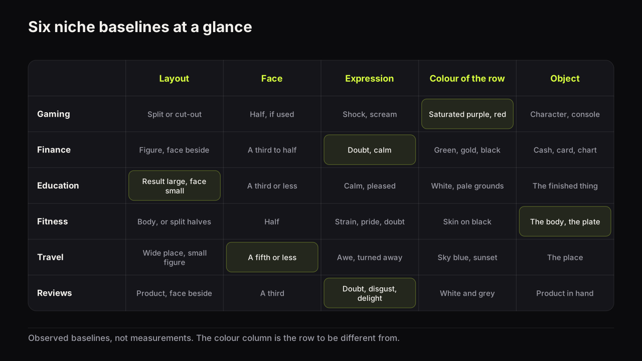
The baseline for each row, in the five fields we track: layout, face and expression, the dominant colour the row already uses, the object, and the failure that costs the first pass. The colour column describes the row you will sit in, which is the colour to be different from, not the colour to use.
| Niche | Baseline layout | Face and expression | Colour the row already is | Object | Fails when |
|---|---|---|---|---|---|
| Gaming | Split, or a cut-out subject on a saturated ground | Half the height when used; shock and scream accepted | Saturated purple, red, electric blue | Character, console, the clutch frame | HUD clutter; four elements |
| Finance | One large figure with the face beside it | A third to half; doubt or calm | Green, gold, black | Cash, a card, a chart shape | Glow on the figure; a number the video never shows |
| Education | Result large, words beside it, face small | A third or less; calm, pleased | White and pale grounds with one brand colour | The finished thing, or the one control | Shock; a full-window screenshot |
| Fitness | Body as object; a day count; a split before and after | Half the height; strain, pride, doubt | Skin tones on black or on one bright colour | The body, the plate, the scale | Halves lit differently; a body that is not the creator's |
| Travel and vlog | Wide place, small figure, one word | A fifth or smaller; awe, or turned away | Sky blue, sea green, sunset orange | The place, the vehicle, the meal | A postcard with no promise; the face crowding the place |
| Tech and reviews | Product at half the height, face beside it as verdict | A third; doubt, disgust, delight | White and grey, plus the brand's colour | The product in hand, at an angle | The manufacturer's press shot; the verdict spelt out |
| Food | The dish close and cropped, one accent word | Optional; delight, or a challenge face | Warm food on dark or cool grounds | The dish, the cross-section, the drip | The whole table; brown on brown |
| Commentary and news | A split of you and the subject, or a quote card | A third to half; concern, doubt, anger | Red, black, white | The subject's frame, a headline card | A face used without consent; a quote nobody said |
| Music | The artist or the artwork, minimal words | Artist recognisable; performance face or none | Follows the release artwork | The artist, the instrument, the cover art | The cover looks like a lyric video or a fan upload |
| Reaction | Reactor face plus an inset of the moment | Half the height; the reaction itself | Bright ground behind the reactor | The inset, cropped to the moment | The original's cover reproduced; the reactor smaller than the inset |
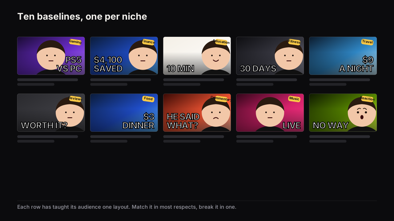
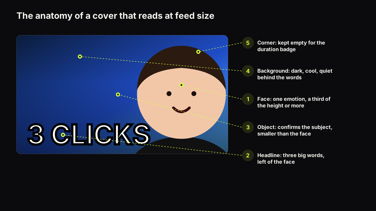
Every row in the table is observed, not measured, and every example in the figures is a mock with generic words. Rows drift, sub-niches disagree with their parents, and the row you sit in this month is the only one that counts. Treat the table as the starting hypothesis for your own baseline card, below, not as the answer.
The ten playbooks, two sentences each
Each niche has a full article. The summaries are deliberately short.
Gaming
The gaming row is the loudest on YouTube, and the gaming playbook annotates the six patterns it converges on (versus, clutch moment, subject as object, saturation, reaction face, number) with when each fits and how each breaks. Its central lesson is that in a row already at full volume the cover found first is the different one, not the loudest one.
Finance and business
The finance playbook argues that one number carries the promise and the face carries doubt or calm rather than shock, because the viewer is deciding whether to believe a claim about money. It covers five patterns, trust signals that are mostly restraint, and where the policy line sits for a figure on a cover.
Education and tutorials
The tutorial playbook explains why calm beats shock when the promise is "this is easy and you can do it", and why education is the one niche where the cover may echo the title's subject, because the viewer arrived from search and wants confirmation. The result is the hero, the words name the outcome or the ease, and the face is small and looks at the thing.
Fitness and transformation
The fitness playbook treats the body as both face and object and asks the cover for proof rather than hype: a day count, a before and after lit the same on both halves, and a face choosing between doubt and pride. It separates workout, nutrition and journey formats, each of which wants a different hero.
Travel and vlog
The travel and vlog playbook is the one place this library tells you to make the face smaller, because scale is the promise and a small figure against a big place is how scale is shown. It covers the place as the object, weather and light as the mood, the "I went to" framing and how a series stays recognisable when every episode is somewhere new.
Tech and reviews
The review playbook puts the product at the size a face would take and makes the face the verdict, with doubt, disgust and delight as the working range. It covers the versus and "worth it?" framings and the launch-week problem of every cover in the row carrying the same manufacturer press shot.
Food
The food playbook puts appetite first: the dish close and cropped, lit so it still reads as food at thumb width, and then one twist in a word or two, a price, a time, a place or a versus. The face is optional and the busy table is the usual failure.
Commentary and news
The commentary playbook covers the split of you and your subject, the quote as the headline, and the speed a news cycle demands from production. Its longest section is about other people's faces: the consent and likeness rules, and the policy line on framing that misleads.
Music and artist channels
The music playbook is the one niche with a documented case, the catalogue refresh reported in the Vevo story, and it states the caveats before drawing anything from it. It separates cover art from video thumbnail, lyric video from performance and visualiser, and treats artist recognisability as the constant.
Reaction videos
The reaction playbook is built on two elements, the reactor's face and the moment being reacted to, and on the choice between an inset and a split. It is firm on rights: crop or describe the moment, never reproduce the original creator's cover wholesale.
Which patterns travel between niches and which do not
The patterns in the table are not sealed inside their rows. Some travel well, because the promise they encode is a question every audience asks. Some fail on arrival, because they carry an expression or a face size the new audience reads differently.
The day count is the most portable pattern we see. It began as fitness grammar ("DAY 30") and now carries business ("DAY 90"), survival challenges in gaming ("100 DAYS") and language learning, because "how long did it take?" is a question in every row. The versus travels from gaming into tech, food and finance with nothing lost, because "which one?" is universal. The withheld verdict travels from reviews into food and finance. The patterns that travel badly are the ones bound to an expression or a face size: the shocked face that gaming and reaction rows accept reads as a pitch in finance and as a warning in education, and the small figure that travel needs reads as a weak cover in commentary, where the face is the point.
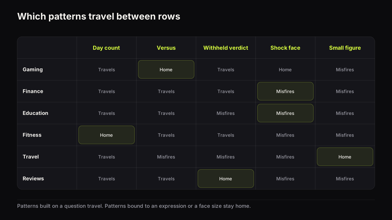
Borrowing across rows is the cheapest source of novelty we know. A pattern that is the baseline in the next row over is new in yours, and the viewer can still read it, because they have met it elsewhere. The rule that keeps the borrowing safe: bring the layout, keep your own row's expression and colour. A day count on a food cover works; a day count with a fitness strain face on a food cover reads as the wrong video. If you want a repeatable way to produce candidates from a promise rather than from a gallery, the ideas method turns one sentence into four sketches, and the borrowed pattern is a good fourth.
How to find your niche's baseline pattern
A baseline pattern is the combination of layout, face, expression, colour and headline type that most winning covers in a row share. It is what the audience has learnt to read as "one of the videos I watch", and it is the thing your cover has to match in most respects before any departure from it counts as a signal rather than as noise.
The collecting is not the subject here. Which videos to collect (outliers, not favourites), how to normalise for channel size and how to count rather than scroll are the competitor research guide's method, and a swipe file organised by pattern is where the entries live. What follows is what to extract from the entries once you have them: a baseline card with five fields.
- Layout. Where the largest element sits and where the words go. Write the position, not the style: "subject right, words left", "split with a centre badge", "wide scene, figure bottom left".
- Face. Present or absent, and roughly what fraction of the height it takes when present.
- Expression. The two or three feelings that recur across the winning covers. Name them; "energetic" is not a feeling.
- Colour. The dominant family and the usual accent. This is the field you will most often depart from, so record it carefully.
- Headline. What kind of words appear: a number, a verdict, a place, a quote, a constraint, or none.
For each field, write the mode, the most common answer, not an average. A row where half the covers have no face and half have a face at half the height does not have a "medium face" baseline; it has two baselines, which nearly always means two sub-niches sharing one search term. Pick the one your video belongs to and fill the card for that half only.
An illustrative case of that split. Search a bread query and the winning covers divide cleanly: one half is a cropped crumb shot, no face, warm on dark, a single word; the other half is the baker at half the height, a challenge or a "first time" framing, a bright ground. Two rows sharing a search box. A first-attempt video belongs with the second group and should take that card; a technique video belongs with the first. Fill the wrong card and every departure you choose afterwards is measured against a row you are not in. We would decide which half by the promise, not by which half we prefer to look at.
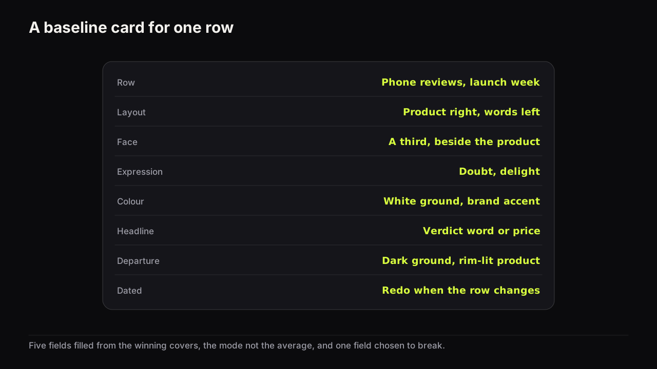
We would fill the card from at least a couple of dozen winning covers, dated, and rewrite it whenever the row visibly changes, even though it means the card is never quite finished and the first few uploads after a change are made against a draft. Five covers give you an impression; a couple of dozen give you a mode. Keep the card beside the brief for every new video in that row, so the departure you choose is a decision against a written baseline rather than a feeling about what you saw last week.
A card also tells you when the baseline itself is the problem. When every winning cover in a row shares all five fields, the row has converged, and what creators call category sameness is doing its work on all of them at once; thumbnail fatigue names that as one of four different things and gives it a different fix from the others. In a converged row, the departure is worth more than usual, and the safest departure is still a single field.
My own row is YouTube growth, creator tools, AI and content strategy. It is full of large faces, exaggerated expressions, analytics screenshots, arrows, graphs, familiar bits of the YouTube interface, big numbers and very short text. When everyone follows the same best practices, the row starts to look the same, and at that point following the pattern can make you invisible. That tension between fitting the niche and breaking the pattern is most of what interests me about thumbnails.
Where to break the baseline: the one-step rule
Keep four of the five fields at baseline and change one. The four you keep buy expectation fit: the viewer recognises the kind of video in the first pass. The one you change is the pattern interruption: the reason the eye stops on yours rather than the neighbour's. We would hold to one field even when two departures each look strong on their own, because the cost of two is not additive. Two changed fields and the cover starts to read as a video from another row, and a viewer in the mood for one kind of video scrolls past what looks like another.
The fields are not equally expensive to change. In order from cheapest to most expensive:
- Colour. A different dominant family from the row: a cool cover in a warm row, a plain ground in a saturated one. It changes the first pass without changing the read.
- Brightness. A light cover in a dark row or a dark one in a light row. Often stronger than a hue change, because brightness survives a dim phone screen and hue does not.
- Face. A face where the row has none, or none where the row is all faces. Changes what the eye lands on first.
- Layout. The words where the row puts the face, a wide scene where the row is close-cropped. Costs recognition; use it when the first three have been used up.
- Concept. A promise the row has not made: a different question answered by the same kind of video. The most expensive and the most durable, because the row cannot catch up by changing a colour.
The lever behind this list, being the odd one out without being the irrelevant one, is pattern interruption, and that article covers the auditing of a row in depth, including the cases where the niche norm itself is the interruption.
We think most channels should change the colour field first and keep changing it as the row catches up, then move to face or layout only when colour has stopped separating them. The trade-off is that colour is also the first departure the row copies, so a colour-led channel is back at the card more often than a layout-led one. We would take that, because changing the layout first is the common mistake: it costs recognition, it is the hardest field to get right, and it usually gives back less than a colour change would have.
Colour-first has a limit, and the gaming row is where you meet it. Picture a row where every cover is already a different saturated hue: purple beside red beside electric blue beside acid green. There is no colour family left to be different in, and a cool cover in that row is just one more colour. Here we would skip straight to brightness or to face: a plain near-white ground with one dark subject, or a calm face at a third of the height in a row of screams. That is a departure the row cannot absorb by turning a dial. The list above is an order of preference, not a sequence you must walk through in full.
One caveat before you adopt any baseline. Some rows have converged on a broken promise: transformations that were lighting tricks, a shocked face the video never earns, a figure the video never reaches. A baseline is not a licence. The line between a gap and a false promise is drawn per video, not per niche, and the packaging mistakes that can get a cover removed sets out where YouTube's policies put it. When the row's baseline is over that line, match the layout and colour and keep the promise honest; you will be the odd one out for the right reason.
If we had to choose, we would rather be recognised as the right kind of video and lose the first pass than win the first pass and be read as the wrong row. A cover that stops the eye and then reads as "not what I was looking for" has spent the viewer's attention and earned nothing, and the viewer remembers the bait. A cover that reads as the right row and is merely overlooked has lost one impression and kept the audience's trust. Expectation fit is the lever we would protect when the two collide, and the one-step rule is how we protect it.
When your channel sits in more than one row
Most channels are not one niche. A cooking channel that also vlogs, a tech reviewer who explains concepts, a fitness coach who talks about money: each video lands in the row its topic and the viewer's session put it in, and the baseline card for one row does not apply to the other.
The way through is to separate what belongs to the channel from what belongs to the row. The channel's constant is the face, its position, a type treatment, a corner mark: the things a returning viewer recognises before reading. The row's baseline is the layout, the expression range, the colour to be different from and the kind of headline. Keep the constant across every upload; take the baseline from whichever row the video is entering. A tutorial from a vlogger keeps the vlogger's face and type but shrinks the face, shows the result and names the ease, because that is what the tutorial row reads. The general version of that rule, what stays fixed and what must change so a channel stays recognisable without tiring, is in consistency versus sameness.
Take the fitness coach making a money video, as an invented case. Their fitness card says: body as object, face at half the height, strain or pride, skin on black, a day count. The finance row's card says: one large figure, face at a third with doubt or calm, green and gold and black, cash or a chart shape, a number. The constant that travels is the coach's face, their corner mark and their type. Everything else takes the finance card: the face shrinks to a third and switches from pride to doubt, the figure becomes the largest element, the day count becomes a sum. The departure, one field, would be colour, because the coach's fitness palette (say, skin on black with a single hot accent) is already a different family from the finance row's green and gold. The channel stays recognisable to its subscribers and reads as a finance video to everyone else, which is the whole trick.
Channels without a face in a face-led row have a version of the same problem, and the substitutes (hands, the object, a result, iconography) are covered in the faceless cover guide. The choice of substitute follows the row: hands for food and fitness, the object for reviews, iconography for explainers.
Building niche covers on the bench
The bench does not know your niche, but it has two things arranged by it. Explore is a gallery of covers made on the bench, filterable by niche (Fitness, Tech, Finance, Food, Gaming, Travel, Vlog, Commentary, Business, Reviews, Education), and each cover carries a Remix action that renders the layout again with your headline, style and face. It is a shelf of baselines and departures, not performance data; the gallery shows no numbers, and choosing from it is a design decision, not a measurement.
The eight styles map onto the rows in the table. Split Screen serves gaming, tech and commentary; Number Pop and Money Stack serve finance and any row that borrows the day count; Before / After serves fitness; Clean Edu serves education and recipe covers; Reaction and Big Face serve reaction and commentary; Neon Glitch serves gaming and the louder end of tech. The eight styles side by side show one example of each with the hierarchy already set. Remix borrows a layout, never a cover; the face in the result is a saved face of someone who agreed to be on your thumbnails.
The niche check
Run this before the design review and before the phone check, with the baseline card for the row beside you.
- Name the row this video enters. Not the channel's niche: this video's.
- Name the viewer's question in that row, and the lever that answers it. Is that lever the largest thing on the cover?
- Check the five fields against the card. How many match the baseline?
- Name the one field you are breaking, and why it will separate you from the row rather than from the audience.
- If a pattern is borrowed from another row, has it kept your row's expression and colour?
- Is the promise honest by this video's standard, whatever the row does?
- Does the channel's constant (face, position, type) survive the row's baseline?
- Judge it at thumb width beside four covers from the row, not alone. That is where the departure either shows or does not.
If it were our channel
Suppose we ran a tech channel that reviews on Mondays and explains a concept on Thursdays: the same face, two rows. We would write two cards, not one. The review card would probably come back as product at half the height in hand, face at a third as the verdict, white and grey grounds, the brand's colour as the accent. The explainer card, from the education row, as result large, face small and calm, a pale ground with one brand colour, a headline naming the outcome.
The constant across both: our face on the right, our type, a small corner mark. Nothing else is allowed to carry over. A Thursday explainer does not get Monday's verdict face, however good that face has been for us, because the education row reads disgust as a warning and calm as competence.
For the departure, we would take a different field in each row. In the review row we would go dark, because the row runs white and grey, and a near-black ground with the product lit puts the first pass on our side without touching the read. In the education row, dark is a poor departure (pale grounds are how that row says "easy"), so we would keep the pale ground and break the face field instead: no face at all, the result filling the frame, our type doing the recognising. The cost is that Thursday covers lose the face our subscribers know. We would pay it, because the explainer's audience is mostly search, mostly new to us, and a stranger's calm face buys less in that row than a result they can see. Then the check at thumb width, each cover beside four from its own row, never beside each other.
Common questions
Do thumbnail rules change by niche?
The rules do not change; the ranking does. Hierarchy, contrast, three elements and the phone check hold everywhere. What changes is which lever leads, how big the face is, which expressions the audience trusts and what colour the row already is, and those are the things a niche baseline records.
How do I know which niche row my video is in?
Search the query a viewer would type to find your video and look at the covers around the top results, then look at the Suggested column beside a similar video. The row is set by the viewer's session and the video's topic, not by your channel, so a channel that covers two topics sits in two rows.
Should I copy the most popular thumbnail style in my niche?
Adopt the baseline in most respects and depart from it in one. Copying the whole look makes you correct and invisible; departing in several fields makes the video read as another niche's. The one field you change is the pattern interruption, and colour or brightness is the cheapest field to start with.
What to do next
Pick the row your next video enters and write its baseline card from the winning covers you can find today: layout, face, expression, colour, headline. Then choose the one field to break, starting with colour unless the row has already gone quiet, and brief the cover against the card. The playbook for your niche, linked above, has the patterns and the check for that row; the competitor research guide has the collecting method the card depends on.