On this page
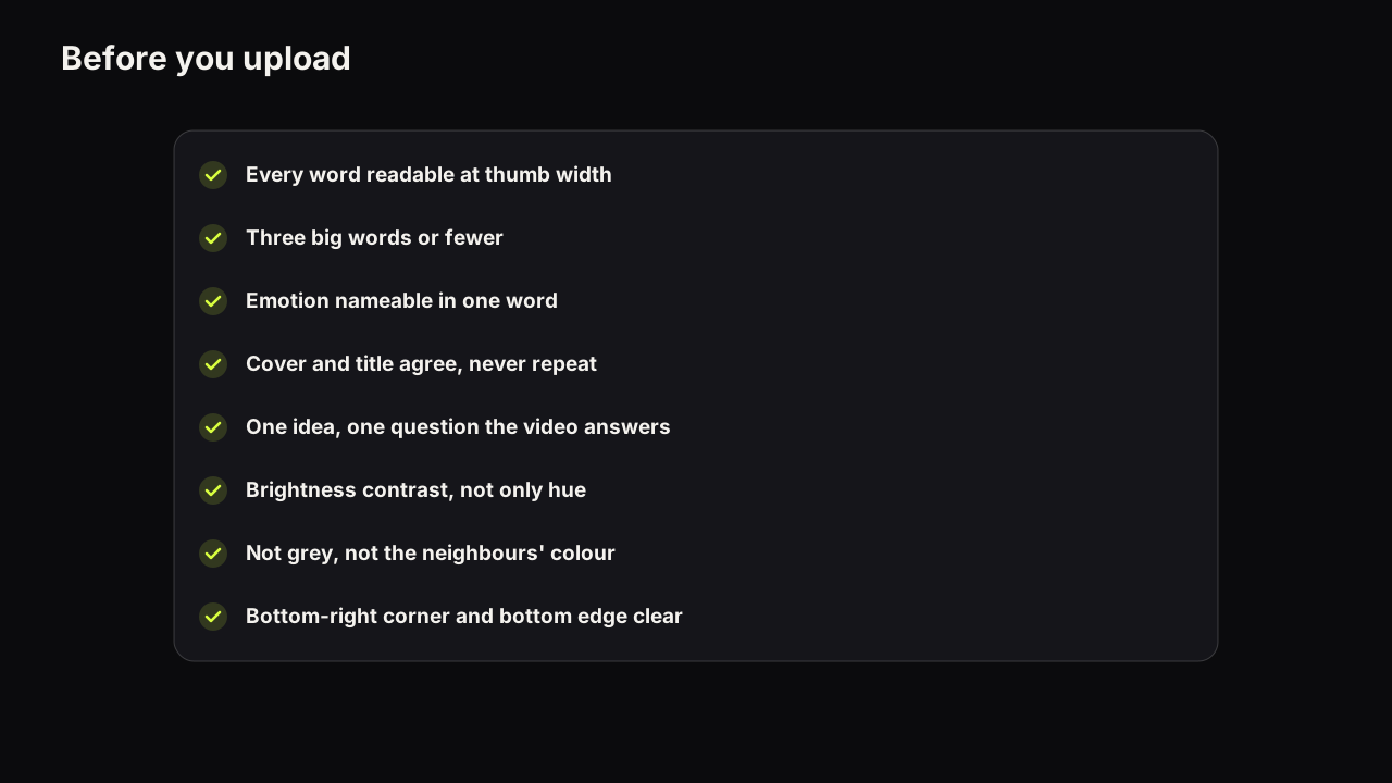
The cover looked finished at midnight on a 27-inch monitor. On the phone the next morning the price was hiding under the duration badge and the second word had turned to mud. Both were catchable in under a minute. Before a thumbnail goes live it should pass twelve checks in four groups: Read (can it be read at feed size), Promise (does it make one promise that the title completes and the video keeps), Feed (does it separate from its neighbours) and Spec (will the file upload and survive the interface). Each check below has the reason it exists, a test that takes under a minute, and the fix. Run the list on a phone, not on the monitor you designed on, because the monitor is the one screen your viewers never use.
- Every word is readable at thumb width
- The headline is three big words or fewer
- The emotion on the face can be named in one word
- Cover and title agree without repeating each other
- The cover opens a question the video answers early
- One idea, not two
- Brightness contrast, not only hue contrast
- Not YouTube grey, and not the colour every neighbour uses
- The eye path closes: words, face, stop
- 16:9, at least 640 pixels wide, JPG or PNG
- Under the file limit for the device you upload from
- Bottom-right corner and bottom edge clear
The order is deliberate. A cover that fails the Read checks cannot pass the others, because nothing that cannot be read can make a promise or win a feed. Fix from the top down.
Read: can it be read at feed size?
1. Every word is readable at thumb width
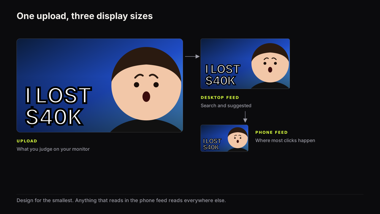
Why. A cover is seen at a fraction of its upload size on a phone, and letters that were crisp at full size become a texture. A word that cannot be read is worse than absent, because it still takes up space.
Test. Shrink the cover to the width of your thumb on the phone screen, or drop it into the free thumbnail tester, which places it in a mock search result and a phone feed. Read each word aloud. Any hesitation is a fail.
Fix. Make the remaining words bigger rather than the failing word smaller. If there is no room, cut a word. The full argument about what breaks first at feed size is in why phone readability decides most clicks.
2. The headline is three big words or fewer
Why. Three words can be set large enough that each is a shape the eye recognises before reading it. Seven cannot. The title beneath the cover already says what the video is, so the cover only needs the words the picture cannot show.
Test. Count the words at the big size. Ignore a small second line if there is one.
Fix. Cut to the word that carries the stakes: the number, the place, the verdict. If the idea needs five words, set two of them small. The reasoning, and when zero words is right, is in how many words a cover can carry.
3. The emotion on the face can be named in one word
Why. The expression is the information a face carries. Shock, doubt, delight, disgust and calm each set up a different promise. Half a smile at thumb size reads as nothing, and a face that reads as nothing is a third of the frame doing no work.
Test. At thumb width, say the emotion out loud in one word. If you need a sentence, or two people would name it differently, the face is too small or the expression too mild.
Fix. Crop tighter until the head fills at least a third of the height, or reshoot with the expression pushed further than feels natural. How big the face needs to be covers the size floor and the cases where a face is the wrong choice altogether.
Promise: is it one promise the video keeps?
4. Cover and title agree without repeating each other
Why. The viewer reads the cover, then the title, then looks back. If both say the same words, the second look teaches nothing and the reason to click evaporates. If they split the job, the title saying what the video is and the cover saying why it matters, the second look is rewarded.
Test. Put cover and title side by side. Underline any word that appears in both. One shared word is usually fine; a shared phrase is a fail.
Fix. Change the cover, not the title, because the title also has to work in search. Replace the repeated phrase with the detail, the stakes or the contradiction the title lacks. The three relationships that work, and the one case where repetition is fine, are in whether thumbnail text should repeat the title.
5. The cover opens a question the video answers early
Why. A click is a viewer accepting a promise; the watch is the promise being kept. A cover that answers its own question gives no reason to click, and a cover that asks a question the video never answers is a loan repaid in retention. It is also a policy risk: YouTube's spam, deceptive practices and scams policy covers thumbnails that promise content the video does not contain.
Test. Write down the question a stranger would form from the cover and title. Then find the timestamp where the video answers it. No timestamp, false promise. A timestamp near the end, late promise.
Fix. Move the answer earlier in the edit, or change the cover to ask the question the video does answer. The mechanics of an honest question are in opening a question the video has to answer.
6. One idea, not two
Why. Two promises halve each other, because the viewer cannot form one question. A cover that says "I QUIT" and "$40K" and "TOKYO" is three videos.
Test. Say the cover out loud in one breath. If the sentence needs an "and", there are two ideas.
Fix. Keep the stronger hook on the cover and move the other into the title, or save it for the next video. Deciding this before filming rather than at upload is the subject of title and thumbnail as one promise.
The mistake I've made more than once is trying to fix a weak concept with better design. You can improve the lighting, the typography, the contrast, the composition, the expression and the image quality, and if the underlying idea isn't interesting you're polishing the wrong problem. I've caught myself deep in execution when I should have gone back to the concept. It is probably the biggest lesson behind Thumbnail Bench.
Feed: does it separate from its neighbours?
7. Brightness contrast, not only hue contrast
Why. Two colours that differ only in hue collapse into one on a dim phone screen. Red text on a green ground is a hue contrast and a brightness match, and it disappears outdoors. A light word on a dark ground survives anything.
Test. Turn the phone's brightness down to about a quarter. Can you still tell the text from the background, and the face from the background? Then squint: two or three big shapes, or a soup?
Fix. Darken the background or lighten the subject; leave the hue alone. Pairs that survive and pairs that fail are listed in colours and contrast that survive a phone screen.
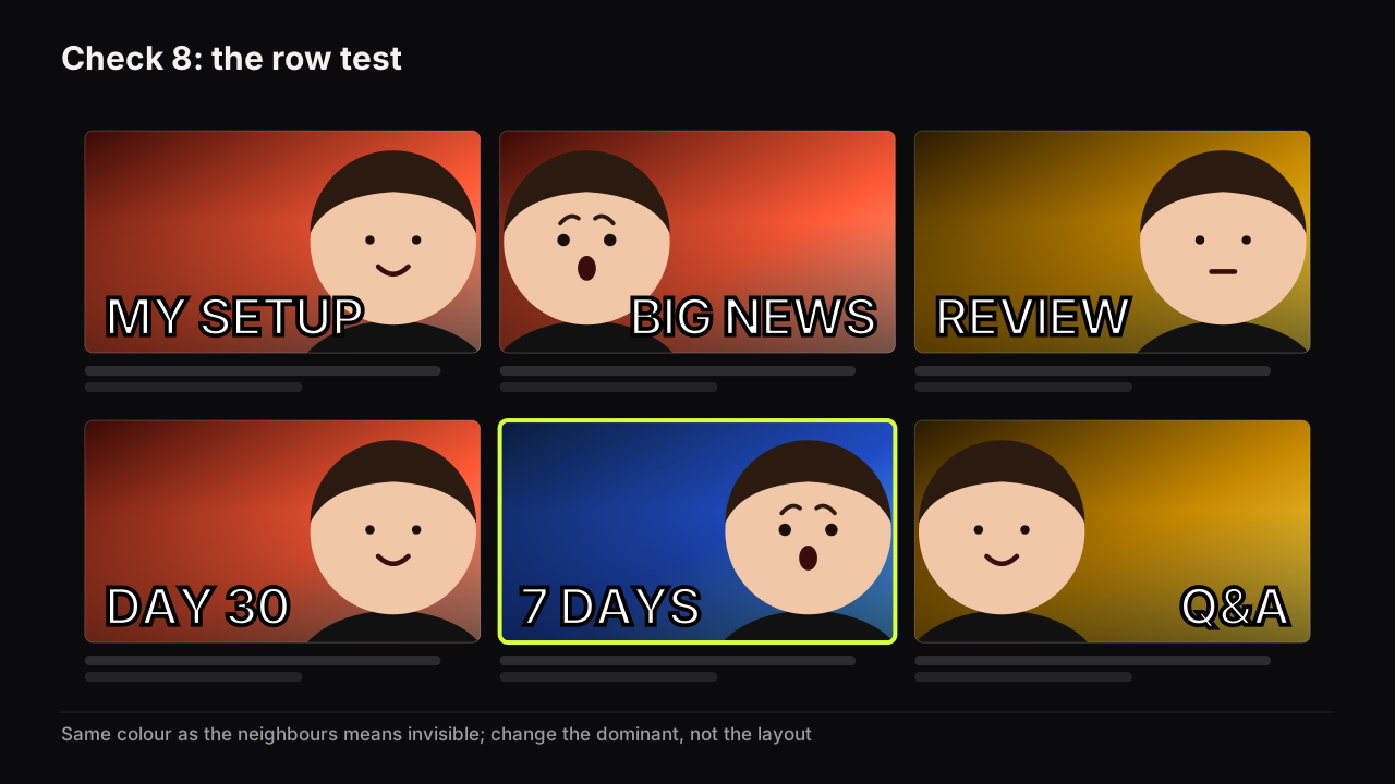
8. Not YouTube grey, and not the colour every neighbour uses
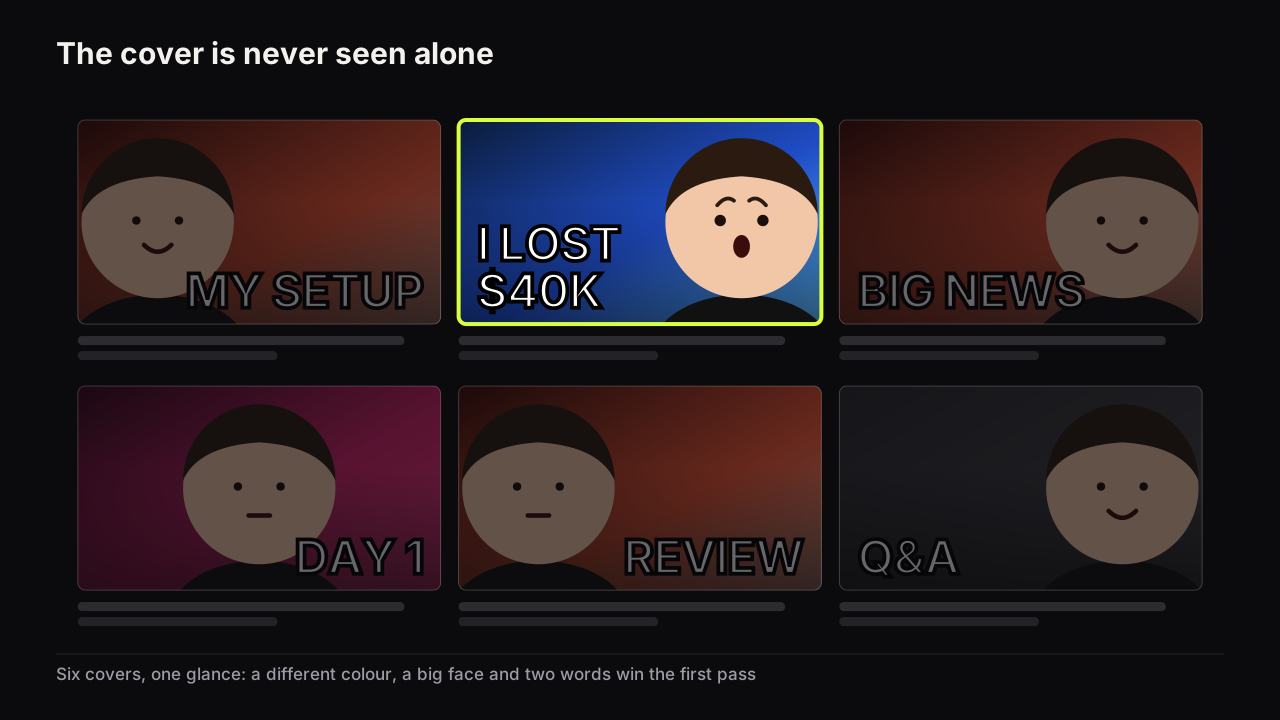
Why. The feed background is a dark grey, so a dark grey cover has no edge and merges into the page. A cover the same dominant colour as its six neighbours is invisible for a different reason: nothing makes it the odd one out.
Test. Open your niche on YouTube and screenshot a row of six covers. Place yours among them. Is it the one your eye goes to first?
Fix. Change the dominant colour, not the layout. If the niche is red, be blue. If the niche is dark, try a light ground.
There is a case where we would ship a cover that fails this check. If a video is made for existing subscribers, and most of its impressions will come from the channel page and subscriptions rather than Home, being recognisably yours matters more than being the odd one out. YouTube's impressions FAQ notes that videos whose impressions come mostly from the channel page may have a higher CTR, because the viewer has already chosen the channel. For an episode in a running series we would keep the series colour and accept losing the row; channel page and playlist covers covers that layout.
9. The eye path closes: words, face, stop
Why. The eye should visit the elements in one sweep and then stop. In a left-to-right language that usually means words on the left, face on the right, object between or in hand. A centred face leaves two thin gutters that fit no headline, and an eye that has to search moves on before it finishes.
Test. Cover the thumbnail with your hand, then uncover it and notice where your eye goes first, second and third. If the third stop is not the face or the object, the path is open.
Fix. Move the face to one side and the words to the other. If the face can look at the words or the object, its gaze closes the path. Add an arrow or circle only if the path is still unclear after that; on a strong layout they take space from the face. The layouts that make this reliable are in the design principles pillar.
An invented cover, run through the first nine checks, shows how they interact. A cooking video: face right, TOKYO ON $3 left, a bowl of ramen between, warm orange ground. Checks 1 to 3 pass at thumb width. Check 4: the title is "What $3 buys you in Tokyo", which shares two words with the cover, so the cover becomes $3 DINNER and the title keeps the city. Check 5 passes if the meal is on screen in the first two minutes. Check 8 fails, because the food feed is wall-to-wall warm orange and this cover is the same colour as the row. The fix is the ground, not the layout: a deep teal behind the warm bowl and the warm skin separates the cover from the row and improves check 7 at the same time. One colour change, two checks.
Spec: will it upload and survive the interface?
10. 16:9, at least 640 pixels wide, JPG or PNG
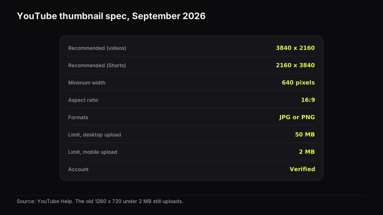
Why. These decide whether the file is accepted. YouTube's custom thumbnail requirements recommend 3840 x 2160 for videos at 16:9, JPG or PNG, with a minimum width of 640 pixels and a verified account. The older 1280 x 720 still uploads because it clears the minimum.
Test. Read the file's dimensions and format from its properties. Anything other than 16:9 will be letterboxed or cropped in the frame.
Fix. Re-export from a 16:9 canvas. Do not stretch a 4:3 image to fit.
11. Under the file limit for the device you upload from
Why. The limit depends on the device: 50 MB from desktop, 2 MB from mobile, per the same help page. A 3840 x 2160 PNG is nearly always over 2 MB, and the mobile upload fails without a useful explanation.
Test. Check the file size before choosing how to upload.
Fix. Over 2 MB means desktop upload, or a 1280 x 720 export for the phone. The whole spec, what changed in late 2025, and an export recipe are in the size and spec reference.
12. Bottom-right corner and bottom edge clear
Why. In feeds and search results the video duration badge sits over the bottom-right corner of the cover, and on partly watched videos a red progress bar runs along the bottom edge. A number or a word placed there is covered for many viewers.
Test. Look at the cover at feed size and imagine a short dark label in the bottom-right corner and a thin bar along the bottom. Does anything that must be read sit under either?
Fix. Move the words up or left. Most strong layouts keep the words left and the face's eyes in the upper half, which clears both areas without trying.
The duration badge and progress bar are interface behaviour we observe in the YouTube apps as of September 2026, not documented sizes, which is why this check describes areas rather than pixel counts.
Running the checklist in two minutes
The list looks long, but nine of the twelve checks happen on one phone screenshot. Send the exported cover to your phone, open it, shrink it to thumb width, and run checks 1, 2, 3, 7 and 9 in a row. Screenshot a row of your niche's covers for check 8. Read the title next to the cover for 4, 5 and 6. Checks 10, 11 and 12 are the file properties and one look at the bottom edge.
For checks 3, 5 and 6 we would hand the phone to someone who has not seen the video, even though it adds a person and five minutes to every upload, because the maker already knows the answer and cannot form the question a stranger would. You can run the Read and Spec checks alone forever. The Promise checks are the ones where you are the worst available judge.
We recommend running the list on the two candidate covers you would bet on, not on one, even though it doubles the cover work for that upload, because a cover that passes every check is eligible to be tested, not certain to win, and the audience decides that. Keeping the second candidate ready means the test can start the day the video goes live, which is how the checklist fits into a repeatable thumbnail workflow.
If it were our channel
Suppose it is Thursday evening and a twenty-minute laptop-repair video goes up on Friday morning. Two candidates come out of the editor: our face with 3 CLICKS, and the laptop large with NOT YOUR FAULT. Both go to the phone. At thumb width the words on both read, but the laptop is a grey slab on a grey ground, so the second one fails check 7; we lighten the ground rather than the laptop, because the laptop is the object and its colour is the truth. Check 4: the title is "Why your laptop is slow (and the 3-click fix)", which repeats the first cover. This time we would cut the fix from the title rather than change the cover, breaking our own rule, because the title reads better in search without the parenthesis anyway and the cover word is the stronger of the two. A screenshot of six covers from the niche shows four of them blue, so neither of ours can be blue. Check 12: the 3 sits high left, clear of the corner. Both pass. 3 CLICKS goes up first, because it is the one we could live with as a default, and NOT YOUR FAULT waits for the test.
What to do next
Run the twelve checks on the cover for your next upload, on a phone, and fix from the top down. If it fails more than one Read check, the problem is usually the same one: the face is too small and the words are too many, and cropping tighter fixes both at once. For the reasoning behind every check, and the process that produces covers that pass on the first try, read the full guide to how covers earn the click.