On this page
- Browse features: the Home feed and the cold viewer
- Suggested videos: the viewer in a mood set by another video
- Search: the viewer with a question already typed
- Channel page: the viewer who already chose you
- Notifications, playlists and the surfaces that are not counted
- Which sources reward thumbnail work most
- How to read a shift in the mix
- Packaging for the source that pays
- What to do next
Each YouTube traffic source delivers a viewer in a different state, and the state decides how much of the click the thumbnail can win. On the Home feed the cover does almost all of the work; in search the query and the title do most of it; on the channel page the viewer has already chosen you and the cover's job is to be distinguishable from your own other covers. YouTube documents two of these directions and no more, so most of this piece is observed pattern, labelled as such.
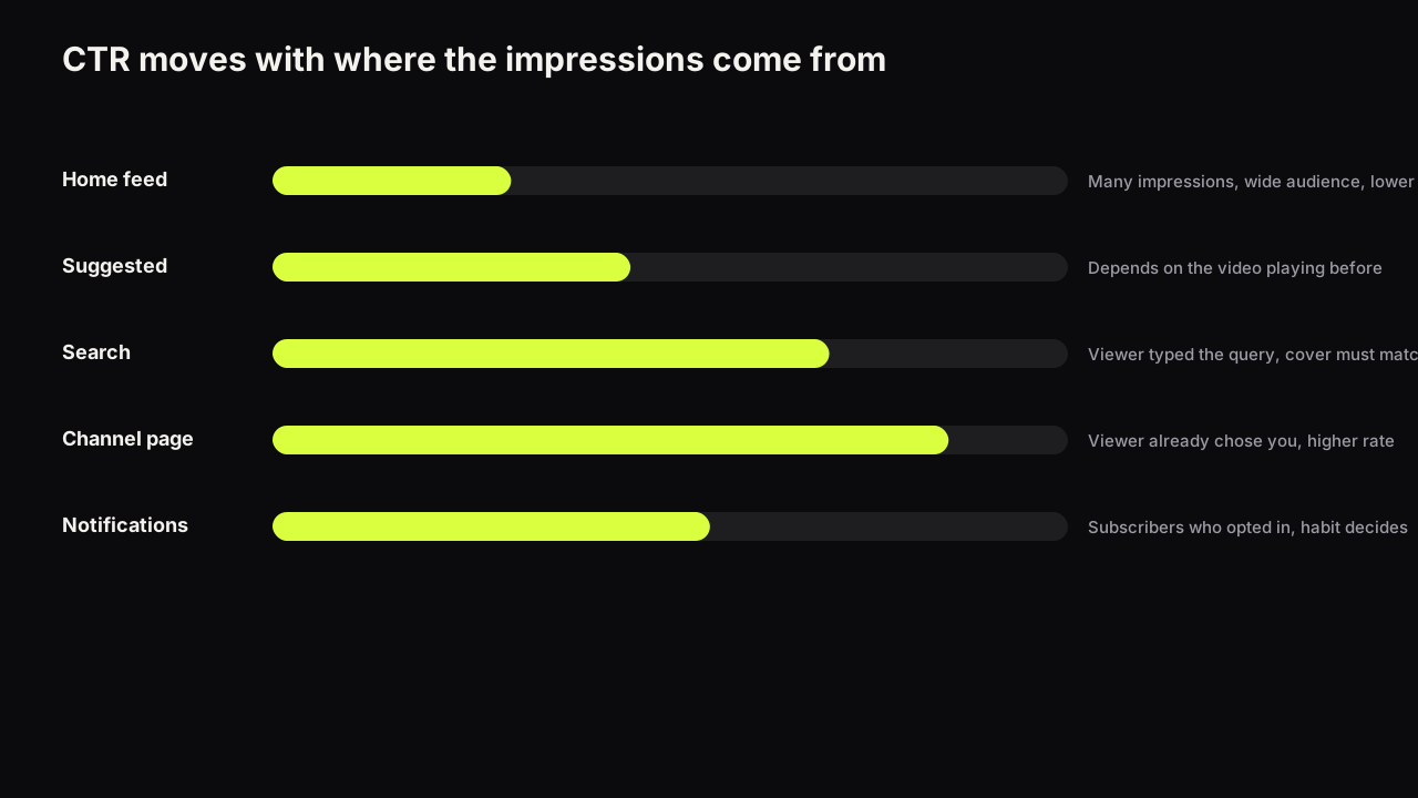
YouTube's impressions and click-through rate FAQ says a video that gets a lot of impressions, for example on the Home page, will naturally have a lower click-through rate, and that videos whose impressions come mostly from the channel page may have a higher rate, because the viewer has already chosen to look at the channel. The same page notes that some impressions, on external sites, end screens and some embeds, are not counted at all.
Those two directions, Home lower and channel page higher, are the only documented ones. Everything below about search, Suggested and notifications is what we and the creators we work with see consistently, and nobody has published numbers for it.
Browse features: the Home feed and the cold viewer
Browse features is the Analytics name for the Home feed and the other browsing surfaces. The viewer opened the app with no particular video in mind and is scrolling a feed of covers, most of which have nothing to do with one another. There is no query and no video playing to set a mood. The decision is the pure first pass: shape, brightness, a face, a colour that differs from the neighbours, and then a headline if the cover earned the read.
What the cover can do here is everything the first pass rewards, and this is the surface where being the odd one out in the row has most leverage, because the row is wide and the viewer is comparing. What it cannot do is convert a viewer the video was not made for. Home impressions go to broad circles, many with no history with you, and a well-made cover in front of the wrong audience earns few clicks and, worse, clicks that do not stay.
The title is second on Home. It is read after the cover has stopped the scroll, and on a phone it may be cut short. The cover has to carry the promise on its own here more than on any other surface, and the headline on the cover does the work a title does elsewhere.
Suggested videos: the viewer in a mood set by another video
The viewer is watching or has just finished a video, and yours appears beside or after it. Their state is set by that video: its topic, its pace, how they feel at the end of it. The question they are holding is "what next, in this mood", and your cover is answering it next to the video they chose on purpose.
The cover can do two things here. It can promise continuation (the same subject, taken further) or contrast (the answer, the other side, the mistake the first video made). Either way it is read in relation to the source video, so the same cover performs differently depending on what it appears beside. What it cannot do is fix being suggested next to unrelated videos. When a Suggested impression arrives from a video with nothing in common with yours, the rate is low and no redesign changes it; the signal is in the retention of the few who clicked, and a video that collects impressions and almost no views covers how to read that case.
In practice Suggested rewards a cover that opens a question the source video left open. A viewer finishing a "how I did it" video clicks a "what it cost" cover; a viewer finishing a review clicks a "versus" cover. The covers that underperform on Suggested are the ones that restate the source video's promise, because the viewer has just had that promise kept and does not need it again.
Search: the viewer with a question already typed
The viewer typed a query and is scanning results for the one that answers it. Their state is intent, and the first thing they read is the title, because the title is what they are matching against the words in their head. The cover is read second and asked a narrower question: does this look like the answer, and does it look better than the answers beside it.
The cover can confirm and differentiate. It confirms by showing the thing the query names (the product, the place, the finished result), and it differentiates by looking more competent or more specific than the neighbours. What it cannot do is rank, and it cannot rescue a title that does not match the query. A curiosity cover, which works on Home and Suggested, can read as evasive in search, where the viewer wants to see that you have the answer rather than that you are hiding it. The information gap is a lever for the browsing surfaces first.
The search viewer is also the one most likely to be comparing covers deliberately rather than at a glance, which makes clarity and specificity count more than brightness. A cover that names the exact model, version or number beats a cover that shouts.
Take one cover across two surfaces. A face mid-wince, a cracked phone held up to the lens, I DROPPED IT in yellow. On Home it does its job: the wince stops the scroll and the headline is the whole promise. In search, beside results for a repair-cost query, it sits next to covers that show a screen being replaced and a price, and the wince reads as a vlog rather than an answer. The search version of the same video is the phone face-on with the crack visible, a hand holding the replacement screen, £89 as the only words, and the title carrying the phrase the viewer typed.
Channel page: the viewer who already chose you
The FAQ cited above gives the reason this source runs higher: the viewer has already chosen to look at the channel. They arrived from a video they liked, a subscription, or a search for you by name, and they are looking for the next thing to watch from someone they have already decided to trust.
The competition here is your own covers, in a grid, side by side. The cover's job is not to win the glance against strangers' covers but to be distinguishable from yours: to say which video this is and why it differs from the one beside it. A channel whose covers all share the same face, ground and expression fails on this surface even though each cover is fine on its own, because the viewer cannot tell them apart. How thumbnails work on the channel page and in playlists goes into the grid context and the series-marker question.
What the cover cannot do on the channel page is create the trust; that was earned by the videos. And because the rate here runs higher for reasons that have nothing to do with the cover, a channel whose impressions are mostly channel page will see a comfortable CTR that says little about how the covers would fare on Home.
Notifications, playlists and the surfaces that are not counted
A notification is read as text first: the title arrives before any cover, and whatever preview travels with it is small. Whether a subscriber opens it depends on habit, on the title, and on the time of day more than on the thumbnail, so notification CTR is a measure of the channel's relationship with its subscribers rather than of the cover.
Playlists are closer to the channel page: the viewer has chosen a sequence, and the cover's job is recognition and order.
End screens, external sites and some embeds do not count as impressions at all, per the FAQ above, which means a video whose audience arrives from a newsletter, a forum or another video's end screen can have a healthy view count and a click-through rate that describes only a fraction of its life. The thumbnail still did work on those surfaces; the number does not record it.
Which sources reward thumbnail work most
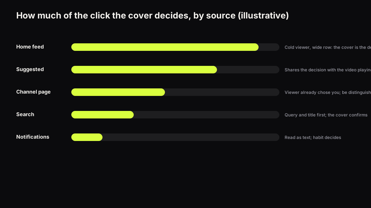
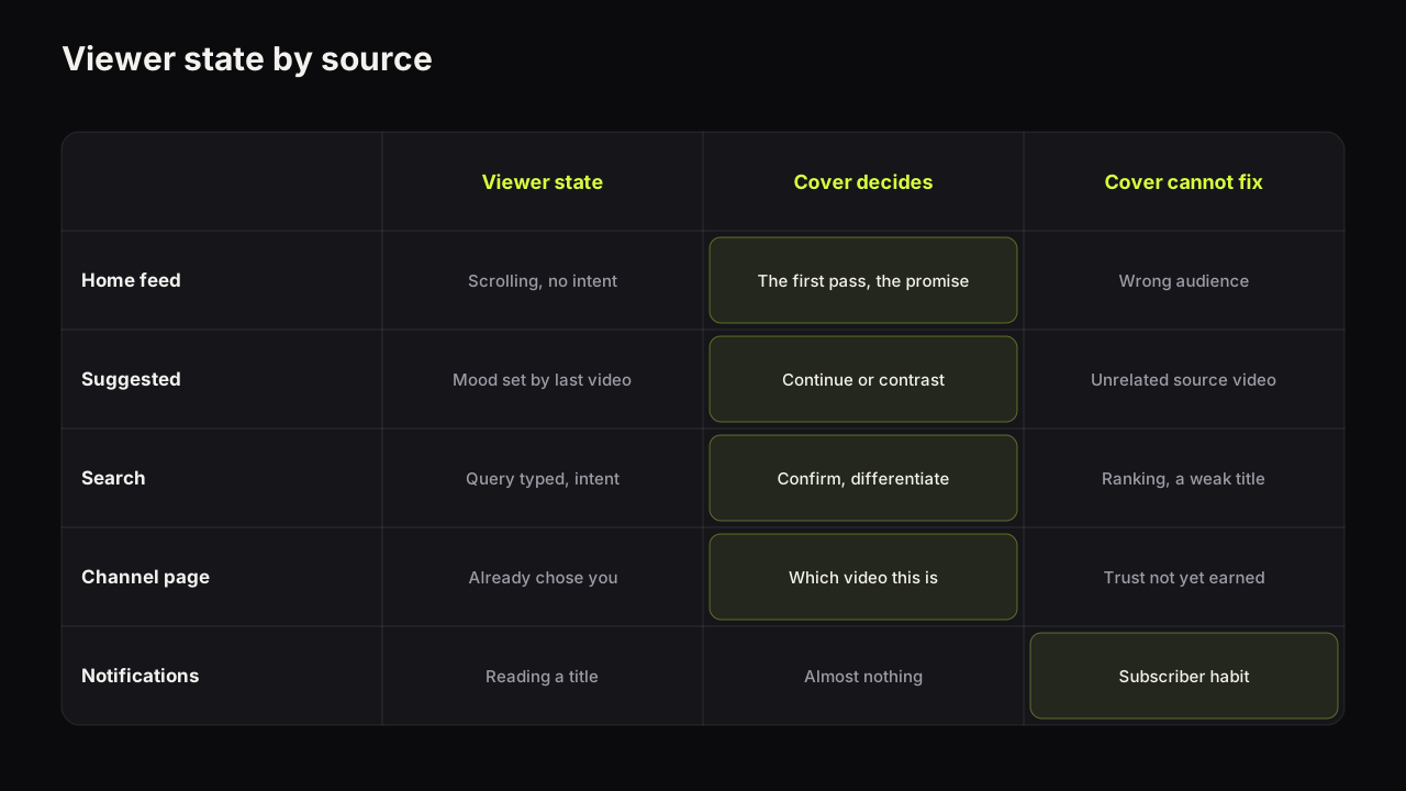
Ranked by how much of the click the cover decides, our view is: the Home feed first, Suggested second, the channel page third, search fourth, notifications last. On Home the cover is nearly the whole decision. On Suggested it shares the decision with the source video's context. On the channel page it shares it with the viewer's existing trust. In search it shares it with the query and the title, which come first. In notifications it barely appears. So a channel that lives on Home should spend its design effort on the first pass; a channel that lives on search should spend it on the title and use the cover to confirm.
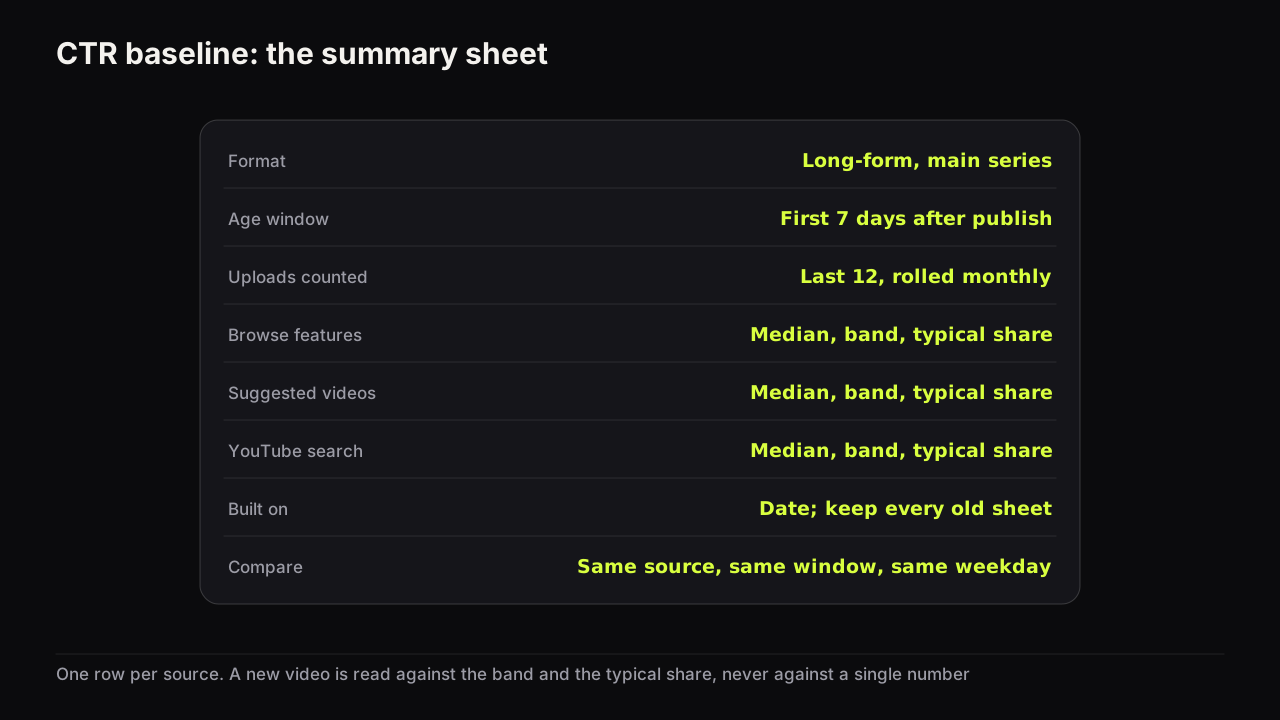
This ranking is also the reason the same cover produces different rates on different sources, and the reason the blended CTR on a video's overview cannot be compared across videos. A video whose impressions are mostly Home is being judged on the hardest surface; one whose impressions are mostly channel page is being judged on the easiest. The worksheet for building a per-source baseline exists so that each rate is read against the right comparison.
How to read a shift in the mix
A video's traffic mix is not fixed; it moves through a rough sequence as the video ages, and the sequence is worth knowing so a shift can be read as normal or not.
The pattern we see on most long-form uploads: the first impressions are notifications, the subscriptions feed and the channel page, all warm sources; Browse arrives within the first day or two if the early response is good; Suggested builds over the first weeks as the video attaches itself to other videos; and search, for videos that answer a durable question, becomes the largest source in the long tail. Not every video runs the full sequence, and the timings differ by channel, but the order is consistent.
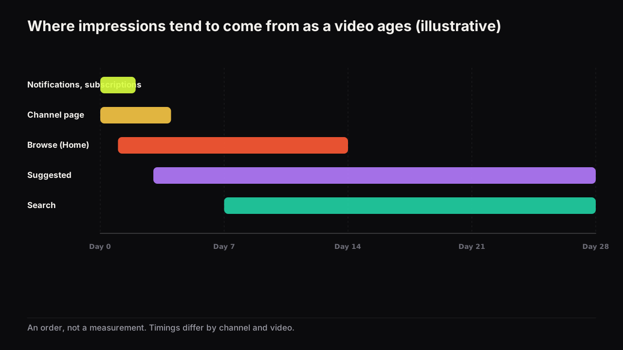
Three shifts are common, and each says something different:
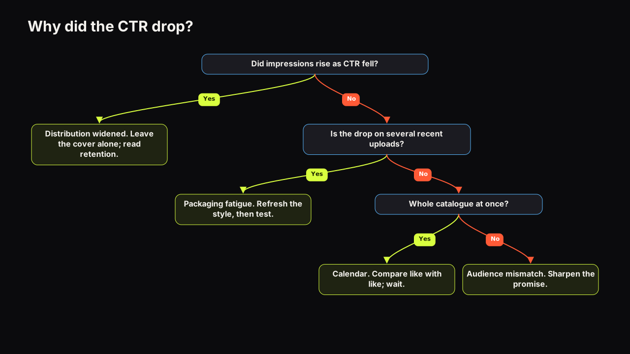
- Towards Browse, with impressions rising. The video is reaching beyond your audience. The rate falls because the surface is harder, not because the cover got worse; why a falling CTR is often good news covers what to check next.
- Towards search, months in. The video has become a reference for a query. Its cover is now being read by intent viewers, and a curiosity cover that served it well on Browse may now be the wrong cover for the surface that pays. This is one of the few cases where a swap on an old video has a clear reason.
- Towards the channel page, on a new upload. New subscribers are browsing the back catalogue after a breakout, and the recent covers are being read in your own grid. The question becomes whether they can be told apart.
The share column in the baseline worksheet is how a shift is measured rather than felt: a source whose share on the new video is far from its typical share is the shift, and the direction tells you which of the three you are looking at.
Packaging for the source that pays
Because the cover's job differs by surface, the practical decision is which surface to design for.
We recommend looking at where the last ten videos' impressions came from before designing the next cover, and building for the largest source rather than splitting the difference. Browse-heavy: design for the first pass, with the headline carrying the promise and the title free to be descriptive. Search-heavy: title matches the query, cover shows the thing and its specifics, curiosity kept low. Split between the two: build the cover for the browsing surfaces and let the title serve search, because the title is what search reads first and the cover is what Browse reads first. Title and thumbnail as one promise is the division of labour in full.
We would build for Browse on a channel split evenly between Browse and search, even though the search viewer then gets a cover that withholds more than they would like. The title can do the search job on its own. A cover cannot do the Browse job by halves, and a cover designed to satisfy both surfaces usually stops the scroll on neither.
When a video lives on two surfaces, the useful experiment is two covers built for the two states, the descriptive one and the question-opening one, tested rather than argued about. On the bench, Tweak uses a finished render as the source for the next one, so the two versions share everything except the headline and the expression, and the test measures the thing you changed.
What to do next
Open the reach reporting for your last ten uploads and write down the largest source for each. If one surface dominates, that is the viewer state to design the next cover for, and the section above for that surface is the brief. If the mix has moved since last year, read the shift against the three patterns before touching any cover. And for what the click-through rate on each surface can and cannot tell you in the first place, the CTR guide is the foundation this piece builds on.