On this page
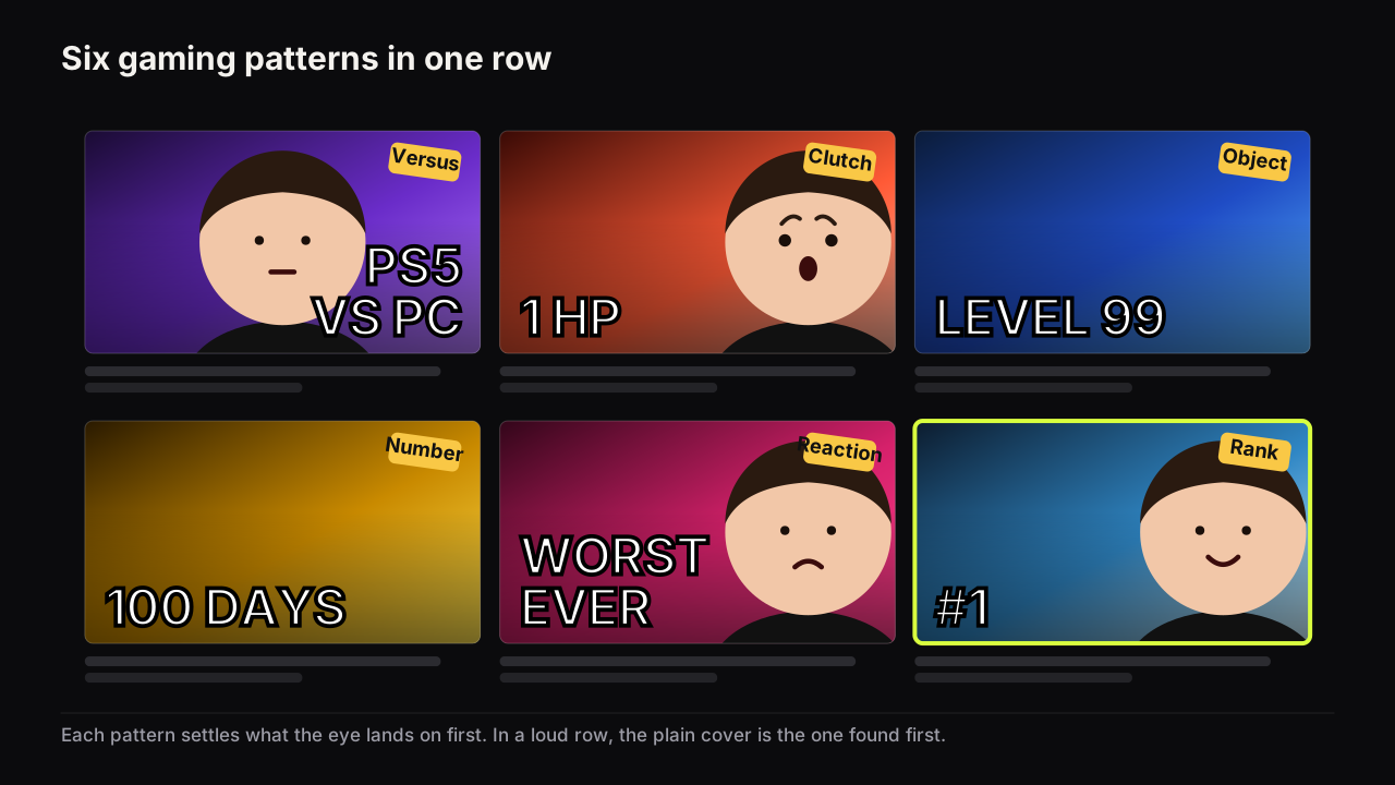
Gaming thumbnails converge on six patterns: the versus, the clutch moment, the character or console as the object, high saturation as a treatment, the reaction face, and the number or rank. Each fits a particular kind of video and each fails in a particular way, usually by clutter. None of this is measured; these are patterns from the feeds we look at, and every example below is a mock with generic words. Other niches borrow the patterns, so the patterns are not what sets gaming apart. The row is. The gaming feed is the loudest row on YouTube, and in a loud row the eye stops on the cover that is different rather than the cover that is loudest.
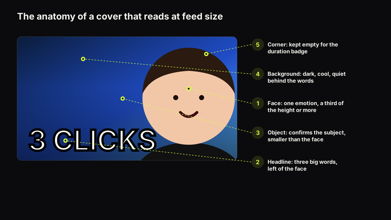
The rules that apply to every cover apply here: one idea, three elements at most, a face or an object at half the height, brightness contrast that survives a phone. The design principles do not change for gaming. What changes is which of them gaming covers tend to break, and the answer is nearly always simplicity.
Why gaming feeds look the way they do
Games are already designed to be looked at: saturated art, characters drawn to read at a distance, staged moments. A gaming cover starts with source material louder than a kitchen or a desk, and creators add to it: more glow, and more outlined words on top.
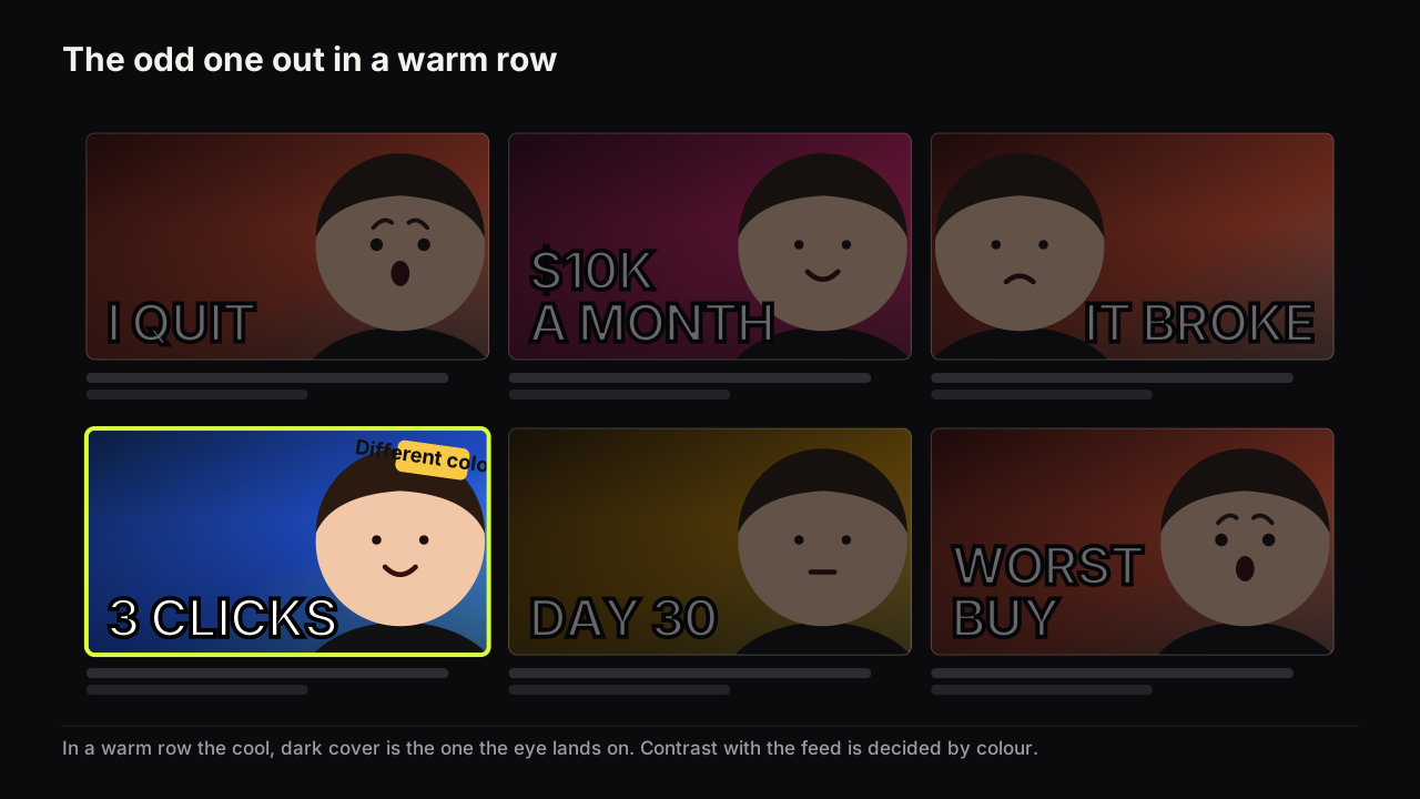
In the gaming rows we look at, most covers share a dominant treatment: high saturation, a bright rim of light around a cut-out subject, heavy outlined type, and either a split layout or a large face. The effect is that the row has no odd one out. A cover that follows the same treatment competes on volume with covers that are already at full volume; a cover that keeps the layout the audience expects but changes the brightness or the dominant colour is found first.
This is the feed-contrast argument from colour and contrast that survive a phone screen, and gaming is where it bites hardest. Being a different colour from the row is a design decision you can only make after you have looked at the row, which is the case for studying the gaming covers that already win in your niche before building your own.
The six patterns, annotated
Each pattern is a hierarchy decision: it settles what the eye lands on first and where it goes next. The table summarises; the notes under it say when each fits and how it breaks.
| Pattern | Eye lands on | Fits | Breaks when |
|---|---|---|---|
| Versus | Two halves, then the badge between | Comparisons, 1v1, old vs new, console vs PC | Halves are the same brightness; no favourite to look at |
| Clutch moment | The moment itself | Highlights, challenges, speedruns | The frame is a raw screenshot with HUD noise |
| Character or console as object | The subject, cut out and large | Reviews, lore, tier lists, news | The subject is small, or there are three of them |
| High saturation | The brightest thing | Action, arcade, chaos | Everything is saturated, so nothing is |
| Reaction face | The face, then the game | Reactions, commentary, first plays | The same shocked face on every upload |
| Number or rank | The figure | Challenges, rankings, records | The number has no unit or stake |
The versus
Two subjects, one per half, a VS badge or a dividing line between them. The eye reads left, right, badge, and the question forms on its own: which wins? It fits any video with two things in it: two games, two builds, two consoles, a player against a boss. It breaks when the halves are the same brightness, because then there is no favourite for the eye to settle on and the cover reads as a tie. Light one half more than the other, or give one half the accent colour, and the cover has a lean the video can confirm or overturn. The versus is a contradiction gap with the outcome withheld, and it fails as a gap if the cover names the winner.
The clutch moment
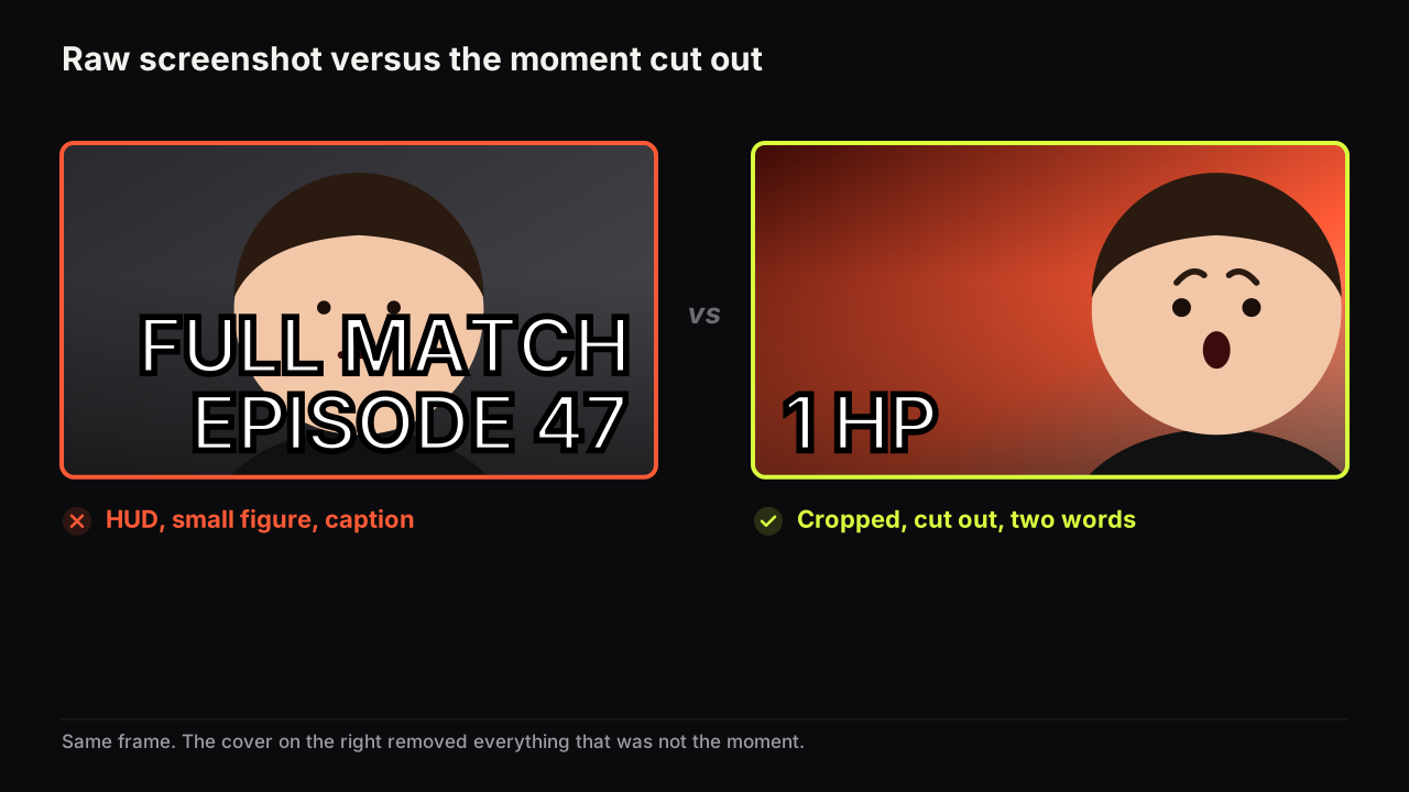
One frame at the peak: the last enemy, the health bar at a sliver, the jump before the landing. The moment is the object, and the headline names the stake in one or two words: "1 HP", "LAST SHOT". It fits highlight videos, challenge runs and anything where the video's promise is a single outcome. It breaks when the frame is used raw. A gameplay screenshot at feed size is a smear of HUD, minimap and chat with a small figure somewhere in it. Crop to the subject, cut it out, put it on a plain ground with a rim light, and enlarge it until the moment is the whole cover.
Take a hypothetical battle royale win. The draft is the whole final-circle frame: two figures the size of rice grains, minimap, kill feed, and "INSANE 1V4 CLUTCH WIN!!!" in yellow outlined type across the top. At thumb width the figures are gone and the words are a quarter of the cover. The rebuild crops to your character mid-slide, cut out on a near-black ground with one cyan rim, the health bar's last sliver enlarged as the only other object, and "1 HP" as the whole headline. The viewer infers survival by a thread, which is the video's promise, and the headline has gone from five words to a number and a unit.
The character or console as the object
The subject at face size: a character, a weapon, a console, a box, cut out and lit to separate from the ground, on one side, with the words on the other. This is the faceless layout gaming has always used, and it fits reviews, lore videos, tier lists and news, where the thing itself is the promise. It breaks when the subject is small or centred, or when three subjects share the cover and none of them arrives first. One subject, half the height, one side. Rights are a separate question: a subject from your own capture is the usual source, and the rules for using a game's art are the publisher's, so check them.
High saturation
Not a layout but a treatment: one dominant colour pushed hard, a glow or rim around the subject, speed lines or a burst in the ground. It fits action, arcade and chaos videos, where the cover's job is to feel like the game feels. It breaks when everything on the cover is saturated, because saturation is an accent, and an accent on everything is an accent on nothing. It also breaks as a feed strategy when the whole row is saturated; then the plain cover is the interruption.
The reaction face
The creator's face at half the height, one nameable emotion, the game shrunk to a backdrop or an inset. It fits reactions, first plays and commentary, where the promise is how the creator felt rather than what happened. The emotion has to be matched to the promise: shock for the surprise, disgust for the worst thing, doubt for the "is it any good", delight for the win. Which expression fits which promise is the same in gaming as anywhere else, with one gaming-specific warning: the shocked face on every upload is the most common way a gaming channel teaches its audience to stop looking. The face needs the size floor, a third of the height at least, and in a busy gaming row half is safer. We would drop the face from most gaming covers even though a face is the strongest single element a cover can carry, because in a row where every neighbour is a shocked face the character or the console is the odd one out, and the odd one out is what the eye finds.
The number or rank
A single figure with a stake: "100 DAYS", "0 DEATHS", "#1", "TOP 5", "LEVEL 99". Numbers carry stakes and specificity, and in gaming they carry the format too; a day count says survival challenge, a rank says leaderboard. It fits challenges, records, rankings and tier lists. It breaks when the figure has no unit or stake, and when the number is the fourth element on a cover that already has a face, a subject and a headline. The number is one of your words, and the word budget is three big ones.
Which pattern fits which video
Pick the pattern from the promise, not from what the row is doing this month. The grid below is our recommendation, not a measurement.
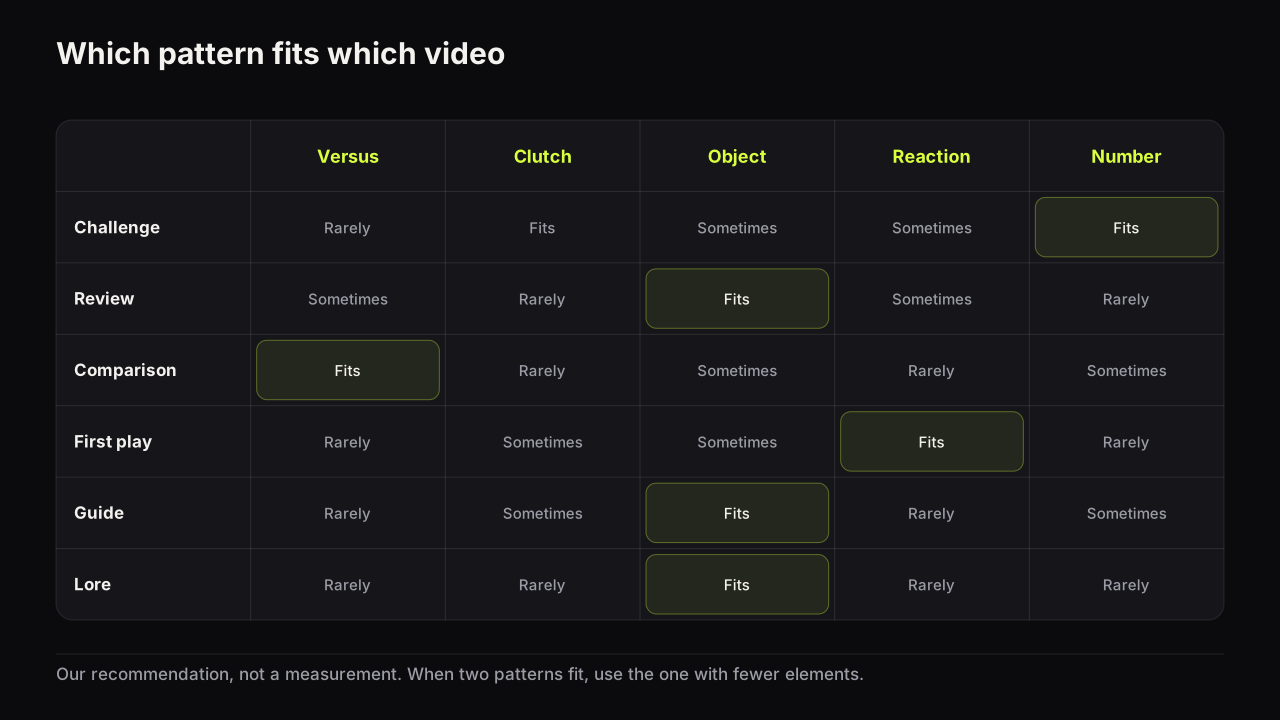
Challenge and record videos: number first, clutch moment second. Reviews and news: the subject as object. Comparisons: the versus. First plays and reactions: the face, with the game as backdrop. Guides and tutorials: the subject or the result, calm, with words that name the outcome. Lore and story: the subject or a single icon on a dark ground, no face. When a video fits two patterns, use the one that leaves the cover with fewer elements.
Gaming is not one niche
Gaming rows differ from each other as much as gaming differs from cooking, and a pattern that is the default in one sub-niche is the interruption in another.
Competitive shooter and battle royale rows are saturated, split and loud, with clutch moments and ranks; the odd one out is a plain dark cover with one lit subject. Story and role-playing rows are darker and more cinematic, with characters as objects and calm faces; the interruption is a bright, simple cover with one big word. Sandbox and building rows lean on the build as the object and on before-and-after halves. Retro rows put the console or cartridge as the object on a plain ground, and nostalgia does the emotional work a face would. Strategy and simulation rows lean on maps, numbers and outcomes rather than faces. Mobile game rows are the most saturated of all, and a restrained cover there is a different colour from every neighbour.
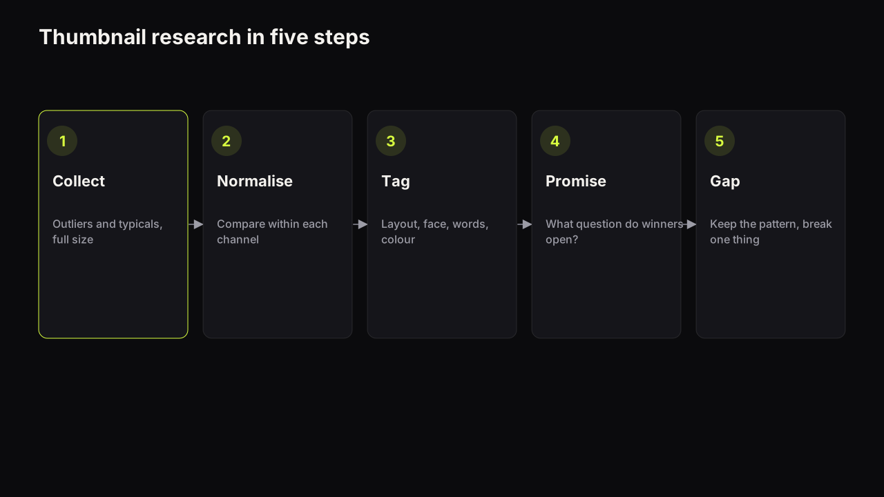
The consequence is that "gaming thumbnail ideas" is the wrong search; the right one is your sub-niche's row this month. Collect it, tag the patterns, and keep the covers that work in a swipe file organised by pattern rather than by channel, so the next cover is chosen from a shelf of layouts and not copied from one neighbour.
The mistakes that cost the first pass
Gaming covers fail in the first pass, before anything is read, more often than covers in quieter niches, because the row is loud and the source material is busy.
- Clutter. HUD, minimap, chat, score, subtitles, all left in. Crop until only the subject remains.
- The tiny HUD screenshot. A wide gameplay frame used whole, with the figure a fraction of the height. At feed size it is texture. Cut the subject out and enlarge it.
- Words over busy footage. Heavy type on a detailed ground has no quiet zone. Darken or blur the ground behind the headline, or put the words on a plain block.
- The same shocked face. The audience learns it in a few uploads and stops seeing it. Vary the expression, or drop the face for the videos that are about the thing rather than the reaction. When a style stops working across a channel, thumbnail fatigue names the four different things that could be happening.
- Matching the row. The same saturation, the same split, the same rim light as every neighbour. The cover is correct and invisible.
- Four elements. A face, a character, a number and a headline. The eye bounces and settles nowhere. Cut one.
All six are caught by the same habit: judge the cover at feed size, beside the row it will sit in, not alone on a monitor at full size.
Building gaming covers on the bench
Two of the eight styles on the bench are gaming's home layouts. Split Screen sets up the versus, with two halves and a divide, and Neon Glitch gives the saturated, rim-lit treatment with the headline rendered into the image. The reference library, which is free and uses no credits, adds the treatments gaming rows use: Speed Blur and Neon Outline as subject looks, Speed Lines and Epic Scene as backgrounds, Neon Glitch and Fire as text effects, and VS Badge as a hook card for the versus. One card per category per render.
For a shelf of layouts to start from, Explore filters the covers made on the bench by niche, and the Gaming filter shows the patterns above as finished covers, each with a Remix action that renders the layout again with your own headline, style and face. Remix is for the layout; the subject and the face are yours, and a face has to be a person who agreed to be there.
The gaming cover check
Run it at thumb width, beside four covers from your sub-niche's row.
- Name the pattern. Is it the one the promise asks for, or the one the row is doing?
- Count the elements. Three at most, and one of them arrives first because it is largest and brightest.
- Is the subject or the face at half the height, cut out or lit to separate?
- Is every trace of HUD, chat, minimap and subtitle gone?
- Does the headline sit on a quiet zone, not on detailed footage?
- Is there one accent colour, not five?
- Is the dominant colour or brightness different from the row?
- If there is a face, is its expression different from your last three uploads?
Common questions
Should a gaming thumbnail have a face?
Only when the video is about the reaction. Reviews, guides, lore and comparisons usually do better with the character, the console or the moment as the largest element. When a face is used it needs half the height and one clear emotion, and the game shrinks to a backdrop.
Can I use game screenshots and character art on my thumbnail?
Your own captures are the usual source, and a cropped, cut-out subject from your own footage is the standard treatment. Rights in game art vary by publisher and by use; check the game's rules for creators, because it is your responsibility.
How do I stand out when every gaming thumbnail is bright?
Be the odd one out in the row. When the row is saturated and busy, a plain dark cover with one lit subject is the pattern interruption; when the row is dark, a light one is. Match the audience's expectations in layout and break them in colour.
What to do next
Screenshot your sub-niche's row as it looks today, tag each cover with one of the six patterns, and note the row's dominant colour and brightness. Then build your next cover with the pattern the promise asks for and a colour the row does not have, and check it at thumb width beside the screenshot. The method behind that habit, and the difference between borrowing a layout and copying a cover, is in the competitor research guide linked above.
Gaming is one of ten niches compared side by side in thumbnail patterns by niche.