On this page
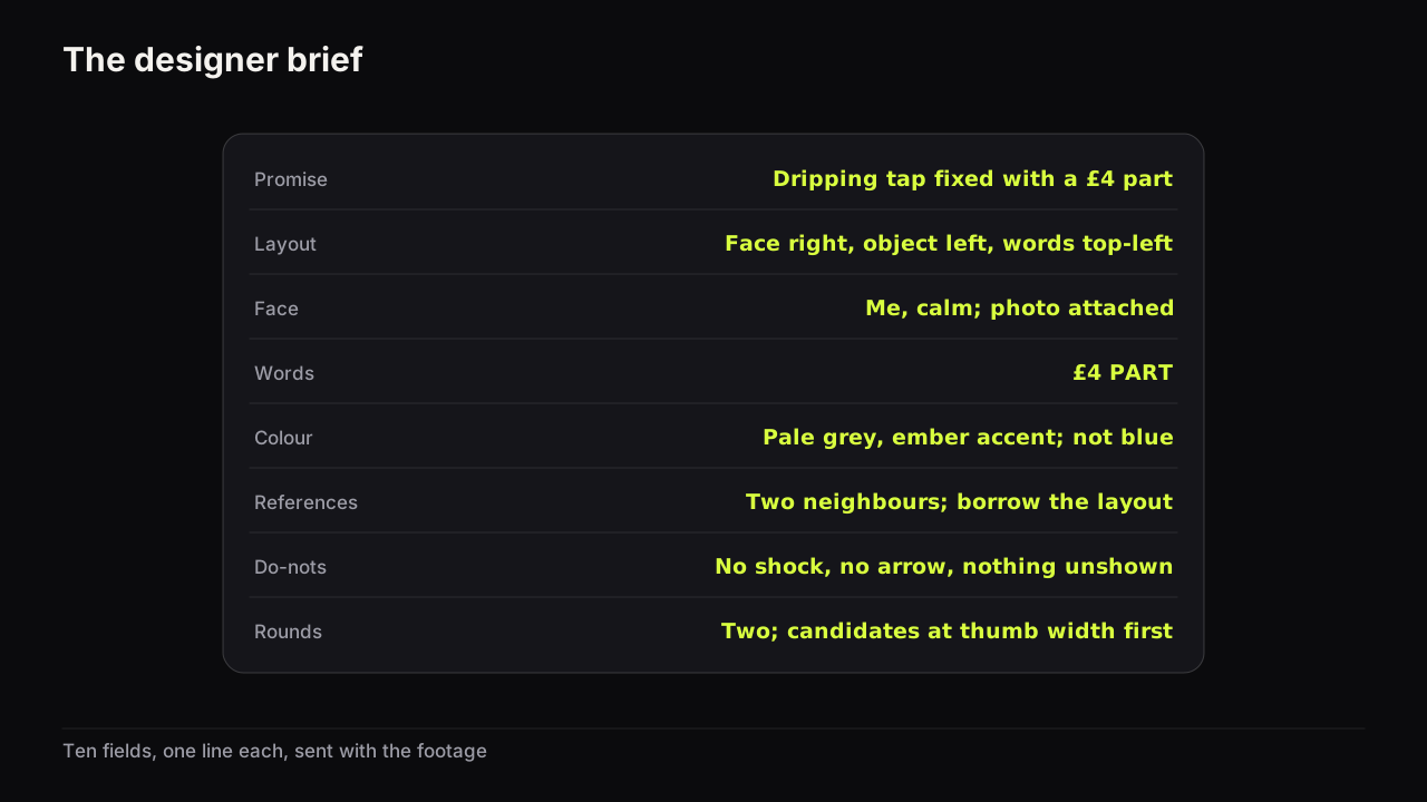
A thumbnail designer brief is a one-page document that tells the person making your cover what it must promise, how it should be laid out, whose face and which expression to use, the exact words, the colour, what to borrow from and what to avoid, what files to deliver, and how many rounds of feedback there will be. It is not the packaging brief. The packaging brief is written before filming and decides the promise and how the title and cover split it; the designer brief comes after, when the footage exists, and turns that promise into instructions a person can execute and a standard you can judge the result against. Most bad covers from good designers were made from the first document without the second.
The template
Copy the table, fill in one line per field, and send it with the assets it names. The running example is a home-repair video about fixing a dripping tap with one cheap part.
| Field | What to write | Example |
|---|---|---|
| Promise | One line, copied from the packaging brief | See a dripping tap fixed in ten minutes with a part that cost £4 |
| Audience and row | Who this is for, and three neighbouring covers they already click | People searching how to fix a tap; the row is blue, wet and shouty |
| Layout | Where each element sits, in positions not moods | Face right, a third of the height, looking at the object; object left, large; words top-left in two lines |
| Face and expression | Whose face (cleared), which single feeling, photo attached | Me; calm, slight smile; base photo attached |
| Words | The exact headline as it should appear, capitals as intended | £4 PART |
| Colour | Dominant, accent, and the row colour to avoid | Pale grey ground, ember accent on the part; not blue |
| References | Two or three covers with the thing to borrow marked | Two neighbours attached; borrow the object-left layout, not the images |
| Do-nots | Three at most, from what this channel has learned | No shocked face; no red arrow; nothing the video does not show |
| Deliverables | Ratios, formats, sizes, and what to show first | Two candidates at thumb width beside the row first; then 16:9 JPG, 1280 x 720 or larger, under 2 MB |
| Rounds and deadline | How many rounds, who approves, by when | Two rounds; I approve; candidates Tuesday, final Thursday |
Ten fields, one line each. Four of them (promise, words, face, colour) are copied straight from the packaging brief, which is the point: the two documents agree because one was made from the other. The other six exist only in this one.
Why this is a different document from the packaging brief
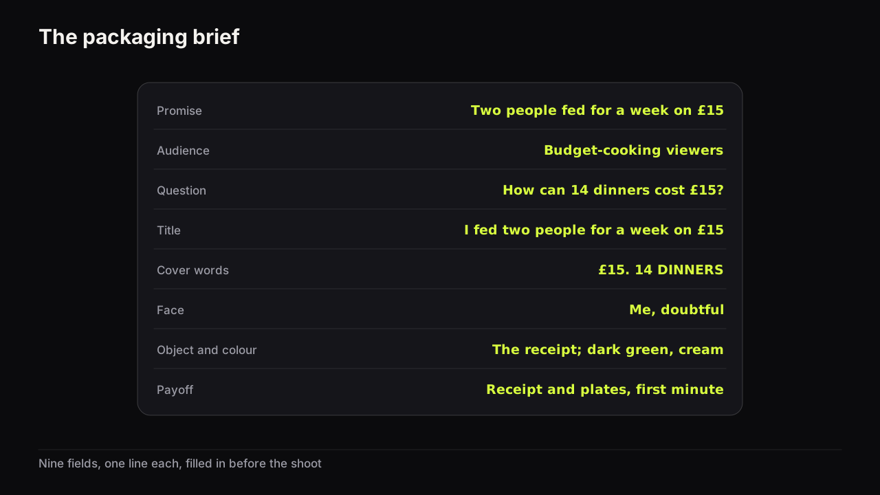
The packaging brief answers "what does this video promise, and how do the title and the cover share the work?" It is finished before the camera is on, and it has no idea what the footage looks like. The designer brief answers "how will this be made, by whom, from what, and how will I know it is right?" It cannot be finished until the footage exists, because the face photo, the object and the row are all things you only have afterwards.
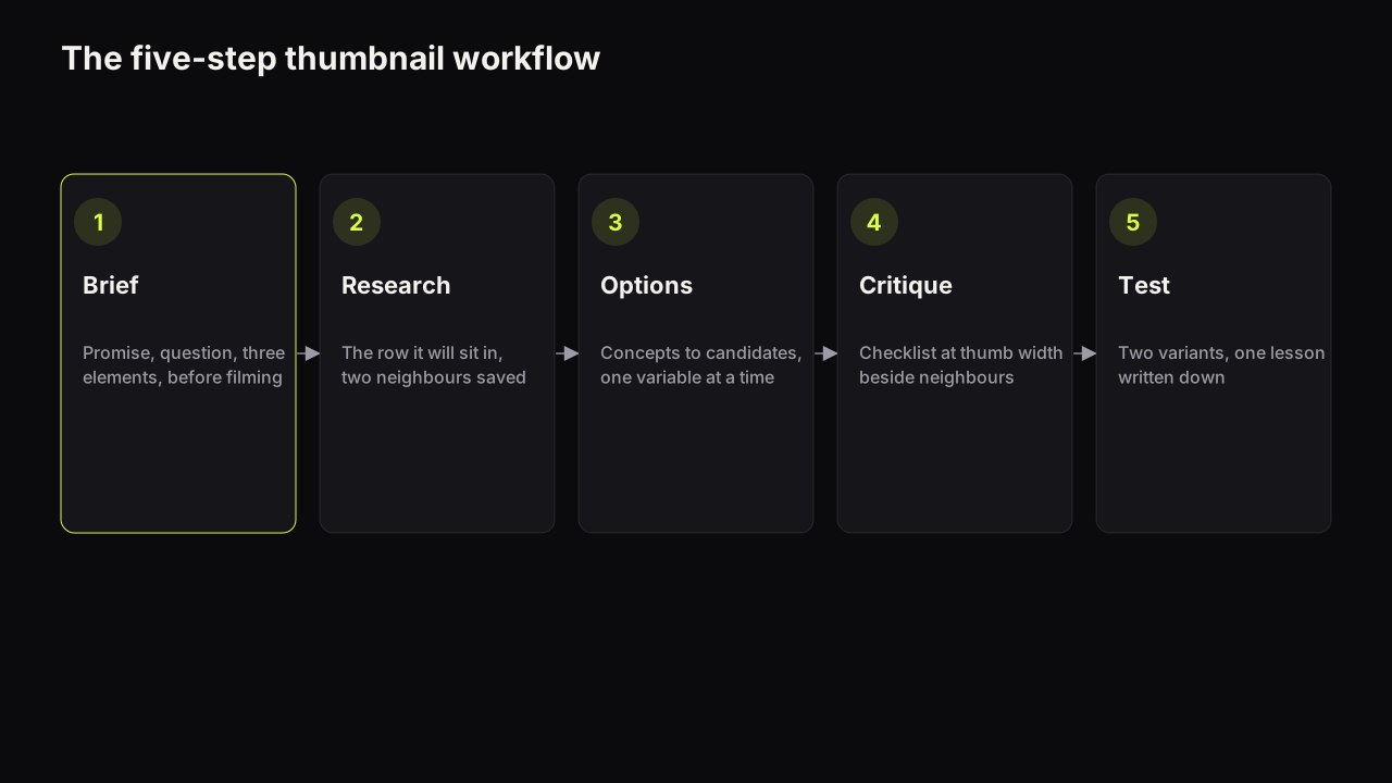
In the five-step workflow, the packaging brief is step one and the designer brief is the hand-over into step three, when someone other than you produces the options. Skipping it and sending the packaging brief alone is how a designer ends up choosing the layout, the references and the deliverables for you, and then being told they chose wrong.
Picture what comes back from the packaging brief alone on the tap video. The tap sits dead centre, a drop frozen mid-fall in a blue splash, the creator's face shocked in one corner, FIX IT YOURSELF! in yellow, a red arrow pointing at the tap. Every one of those choices is defensible and none of them was yours, and the viewer infers a shouty how-to in a row of shouty how-tos. From the ten-field brief the same designer sends the £4 part in a hand, left and large, a calm face on the right looking at it, £4 PART top-left on a pale grey ground. The viewer infers a cheap fix by someone who has done it. Same designer, same footage, one extra page.
Filling in the six fields that are new
Layout: positions, not moods
Write where things go. "Face right, a third of the height, looking at the object; object left; words top-left in two lines" can be executed and checked. "Bold and clean with the tap prominent" cannot. If you do not know where things should go, the references field is where you find out: pick the neighbour whose layout you want and describe its positions. The reason a face sits on one side and the words on the other, and why the gaze closes the path between them, is in the design principles that decide the eye path; the brief does not need to explain it, only to specify it.
References: what to borrow, marked
Attach two or three covers and mark on each one the single thing you want borrowed: the layout, the expression, the colour relationship. Never the image. A designer handed three references with nothing marked will average them; a designer handed three references with "this layout, that expression, neither colour" will build what you asked for. Studying the covers that already work in your niche is where the references come from, and the rule is the same one that applies everywhere in this library: borrow the layout, never the cover.
Do-nots: three, from evidence
The do-nots are the three things this channel has learned do not work for its audience, plus any policy line the topic raises. They come from your lessons log, not from taste: "no shocked face on tutorials" because it lost a test twice; "no red arrow" because the layout should not need one. One do-not belongs on every brief.
YouTube's thumbnails policy says that thumbnails, titles and descriptions which promise content the video does not contain fall under the spam, deceptive practices and scams policy. Source: YouTube's thumbnails policy.
So "nothing the video does not show" is the permanent third do-not, and because the video now exists, you can be specific: name the moment the cover depicts and its timestamp.
Deliverables: the order matters more than the specs
Ask for candidates at thumb width beside the row before anything at full size. A cover approved at full size on a white page fails on a phone more often than not, and the fix at that stage is a new round. The specs themselves are short.
YouTube's help page on custom thumbnails says thumbnails must be JPG or PNG, 16:9, at least 640 pixels wide, with 3840 x 2160 recommended, and that the file size limit is 2 MB when uploading from mobile and 50 MB from desktop.
If a clip from the video will become a Short, ask for a composed 9:16 cover rather than a crop; if the cover is for a Short in its own right, the Shorts thumbnail rules differ enough to name in the brief. Ask for the editable source file as well, so that a later change to the words does not need a new commission.
Faces and consent: cleared faces only
Name whose face may appear and attach the photo. The person must have agreed to be on your thumbnails: you, a co-host, a guest who said yes. No public figures without consent and no minors; that is the rule on the bench under its acceptable use policy, and it is the right rule for a human designer too. The workflow for a co-host's or a client's face covers the written habit and what to do when a collaboration ends.
Feedback rounds that converge
Rounds multiply when each one opens a new question. They converge when each one closes a specific question and the brief fixes how many there will be.
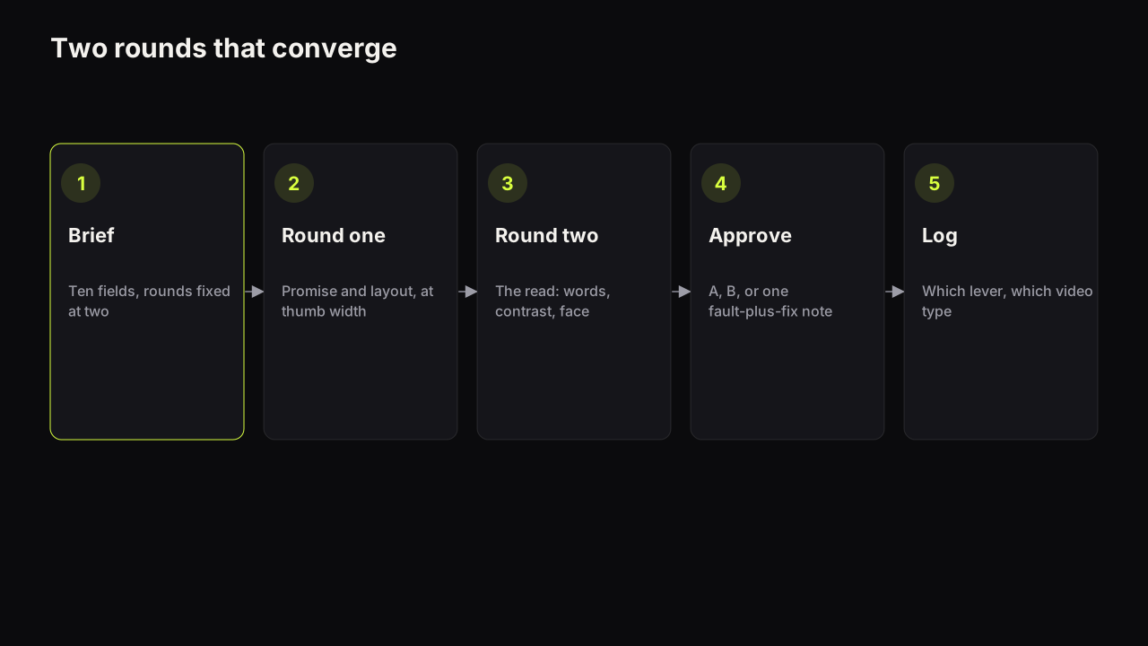
- Fix the number of rounds in the brief. Two is our recommendation, three at most. A designer who knows there are two rounds front-loads the thinking; a designer facing an open-ended sequence saves it for later. We would hold the cap at two and pay for a third round as a new brief, even though it feels petty on a long working relationship. An open round count is where an approver's indecision goes to hide, and it costs the designer more than it costs you.
- Round one is at thumb width and about promise and layout only. Does the cover open the question in the brief? Are the elements where the layout line put them? Colour and font notes are banned in this round, because they change when the layout changes.
- Round two is the read. Words legible at thumb width, face separated from the ground, the badge corner clear, the expression nameable in one word. This is where a stroke gets added or a ground darkened.
- No new ideas after round one. A new idea is a new brief. Say so in the brief, and hold yourself to it more strictly than the designer.
- Every note is a fault plus a fix in one sentence. The table below is the difference.
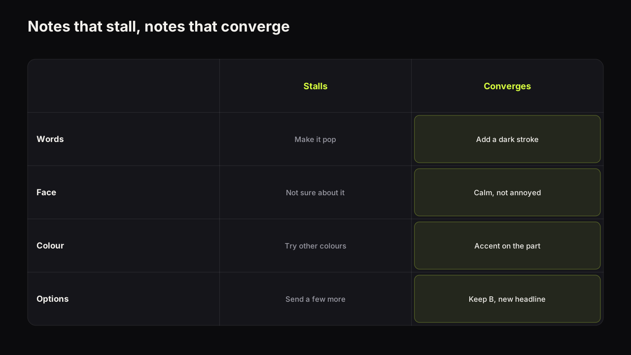
| About | A note that stalls | A note that converges |
|---|---|---|
| Words | "Can you make it pop more?" | "The words vanish on the pale ground at thumb width; add a dark stroke or darken the ground behind them" |
| Face | "Not sure about the face" | "The face reads as annoyed; I want calm: mouth closed, eyebrows level" |
| Colour | "Try some other colours" | "Keep the grey; move the ember accent from the words to the part so the object is the warm thing" |
| Options | "Send me a few more" | "Keep candidate B; change only the headline to £4 PART and send it beside the row" |
We recommend one approver, named in the brief, and a decision at the end of round two of one of three kinds: approve A, approve B, or one converging note. Where the video is eligible for a test, approve two candidates that differ in one lever rather than one cover for upload; the test is cheaper than the argument about which is better.
In practice the notes that stall are almost always about the approver, not the designer: they mean "I have not decided what I want". The cure is upstream. A brief with the layout, words and do-nots filled in leaves the approver little to be undecided about, and the rounds shrink on their own.
The same brief as a render prompt
When a model makes the cover instead of a person, the brief does not change; the fields go to different places. The mapping is close to one-to-one, which is why the brief is worth writing even when nobody else will read it.
| Brief field | Where it goes |
|---|---|
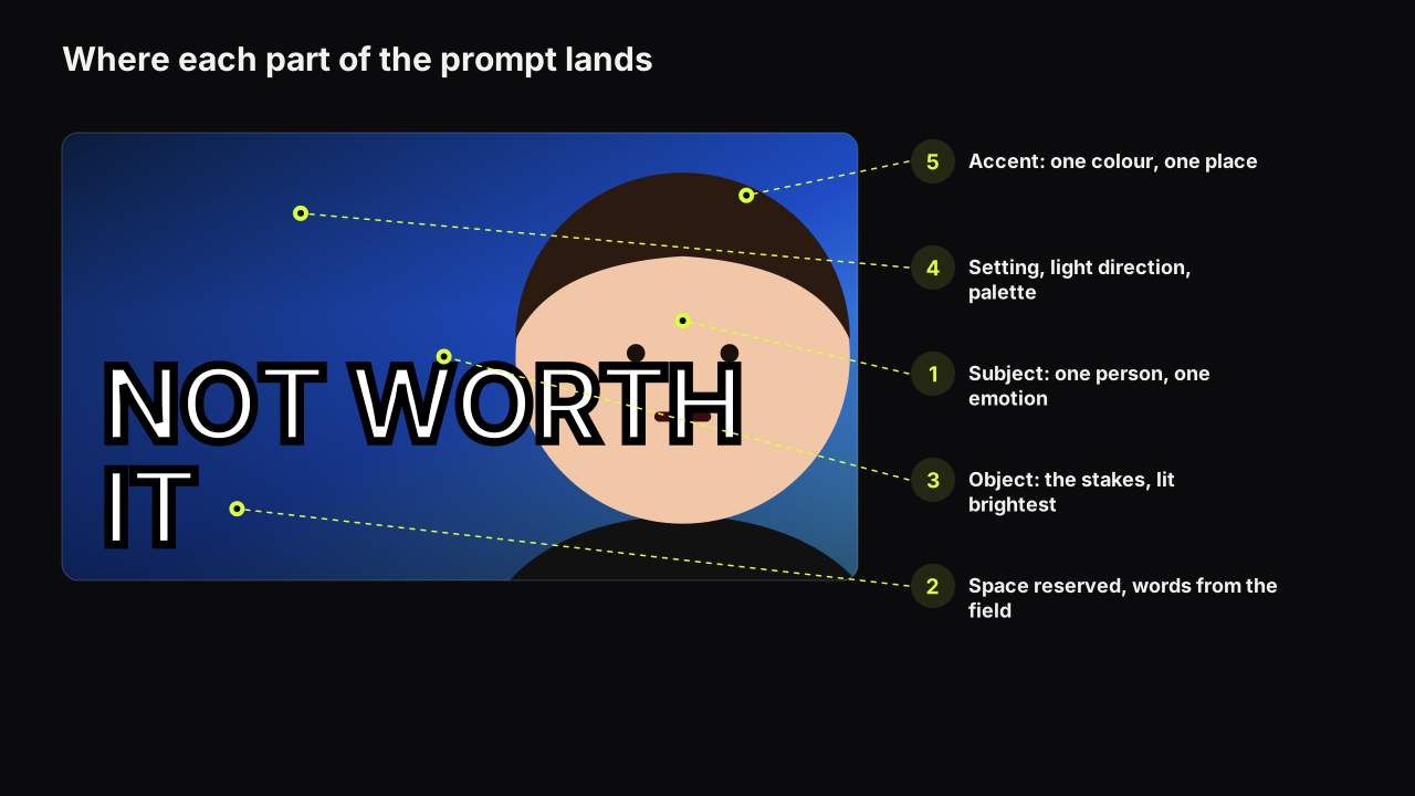
| Layout, object, colour | The scene description: positions, the object, the ground colour, the empty space for words |
| Words | The headline field, rendered into the picture; or a text layer when the spelling must be exact |
| Face and expression | The saved face and its expression |
| References | The style choice: the layout the row does not use |
| Do-nots | Your critique list when the options come back, not lines in the prompt |
| Deliverables | The ratio you compose for and the export size |
The prompt structure with one example per style is the fuller pattern for the first row. On the bench the scene goes in the prompt, the words go in the "Words on it" field (up to 80 characters, painted into the image, so keep them short and put a price or a name on a free text layer in the editor instead), the face is a saved Face Lab cut-out of a cleared person with one of eight expressions, and the layout is one of eight styles. The maker returns up to four options from that in about a minute, which is round one delivered without a designer's calendar in the way. The do-nots stay with you as the checklist you run on the four options at thumb width.
When the brief is for a refresh, not a new video
A brief for a replacement cover on a live video is shorter, because most fields are already decided by the cover that exists. Add three lines to the top: the current cover (attached), the per-source CTR figure that put the video on the list, and the one lever to change. Everything else is "as the current cover". Whether the video should be on the list at all is decided by the decision tree for changing a live thumbnail, and the answer is often that it should not; a refresh brief written before that check is a cover changed for no measurable reason.
One difference works in your favour. The video is finished and the payoff moment is known, so the promise line can point at a timestamp, and the "nothing the video does not show" do-not becomes trivially checkable.
What to do next
Copy the ten-row table into the document you already send with footage. Fill in layout as positions, mark the references, write three do-nots from your log, and put the rounds and the approver's name at the bottom. Ask for candidates at thumb width beside the row first. When the options come back, write every note as a fault plus a fix, and stop at round two.