On this page
- Concepts, candidates, variants, and the one you ship
- Step 1: write the packaging brief before you film
- Step 2: research the row, not the internet
- Step 3: generate options in stages
- Step 4: critique with the checklist, at feed size
- Step 5: test, ship, and record the lesson
- Time budgets by channel stage
- Working with an editor or an agency
- Keeping the lessons log alive
- What to do next
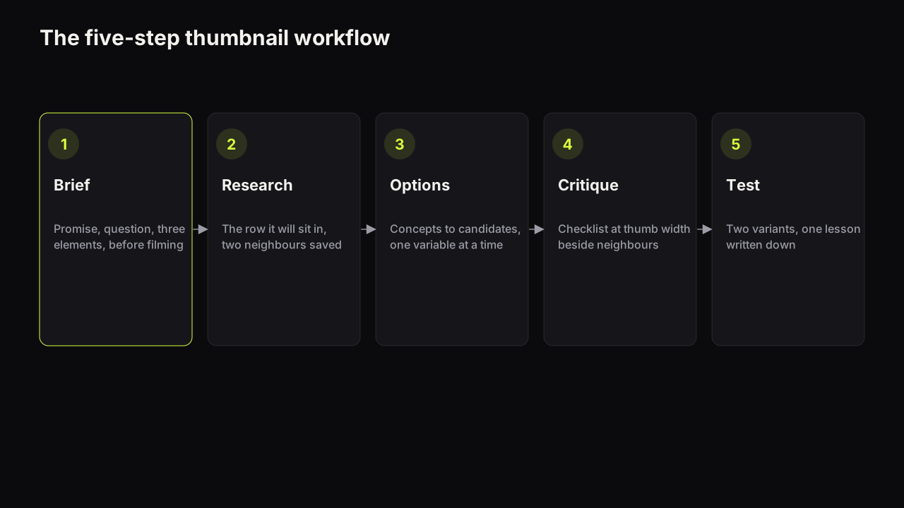
A repeatable thumbnail workflow has five steps: write the packaging brief, research the row the cover will sit in, generate options, critique them against a checklist, then test and record the lesson. The step most channels skip is the first, and the one they skip second is the last. Between them sits a funnel with four levels, and naming those levels (concepts, candidates, test variants, the one you ship) is what turns "make a thumbnail" into a process a channel, an editor or an agency can run every week.
Concepts, candidates, variants, and the one you ship
The four levels are different objects and they deserve different amounts of effort.
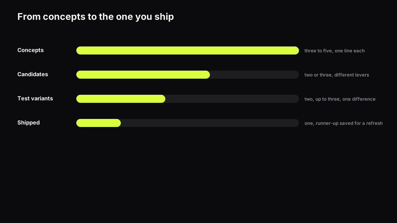
A concept is a promise and a layout in one line: "doubtful face beside the receipts, big number top-left, 'NOT WORTH IT'". It costs a minute and lives in the brief. Three to five per video is enough.
A candidate is a concept rendered well enough to judge at feed size. It has a real face, real words and real colour. Two or three per video, chosen because they pull different levers (one on stakes, one on curiosity, one on a face), not because they are the three prettiest.
A test variant is a candidate that survived the critique and differs from the others in one thing you want to learn about.
YouTube's help page on testing titles and thumbnails says a test can include up to three titles, thumbnails, or title and thumbnail combinations per video, and that the winner is decided by watch time share rather than by clicks.
So three is the ceiling for a native test, and two is often better because it resolves faster and the lesson is cleaner.
The one you ship is the variant the test picked, or, where a test is not available, the candidate that read best at thumb width. The runner-up is not waste; it is the first refresh candidate for the day this video's cover needs changing.
We recommend the ratio three to five concepts, two or three candidates, two test variants, one shipped, for a channel uploading weekly. Making twenty renders and choosing by feel is not more thorough; it is less, because nothing about the choice gets written down.
Take an illustrative review: a £900 espresso machine that disappointed. Concepts, one line each: a doubtful face beside the machine with "£900?"; a split of the machine against a £30 moka pot with "SAME COFFEE"; a close-up of a thin, watery shot pouring with "THIS IS £900". The third dies at concept stage because the pour will be a brown smear at thumb width. The first two become candidates, since one pulls doubt and the other a contradiction. After the critique the split reads better, so the two test variants are the split with the doubtful face and the split with no face at all. Whatever wins, the lesson is about the face, not the coffee.
Step 1: write the packaging brief before you film
Why. The cover and the title are one promise, and the promise is easier to design before the video exists than to extract from it afterwards. A video that cannot be packaged in a sentence is a weaker idea, and finding that out before filming is cheap.
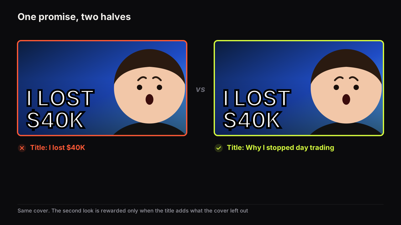
How. One page, five lines: the promise (what the viewer gets), the question the cover should make them ask, the stakes (a number, a risk, a time), the three elements (face and its emotion, headline of three words or fewer, object), and the one thing the video must show early to keep the promise. Title and thumbnail as one promise is the full method; the brief is its output.
Done when. Someone who has not seen the video can describe the cover from the brief, and the title and the headline do not repeat each other.
Step 2: research the row, not the internet
Why. A cover is never seen alone. It sits beside six to twelve neighbours from the same niche, and whether it is the odd one out is decided by them, not by design theory.
How. Search your topic and open the Suggested column on the video most like yours. Note the dominant colours in the row, the expressions, the layouts. Your concept list should contain at least one that uses a colour the row does not, and one that uses a layout the row does not. Pull two or three neighbours into your swipe file with the pattern tagged, so the research compounds; a swipe file that produces briefs is the structure. For the outliers, the videos that beat their channel's usual views, studying what already works in your niche is the longer method.
Done when. You can say which colour and which layout will make the cover the odd one out in its likely row, and you have borrowed a layout without borrowing a cover.
Step 3: generate options in stages
Why. The first render is a draft of a promise, not a cover. Judging it as finished is what produces the interchangeable covers in every feed; iterating one variable at a time is what produces a candidate.
How. Turn each concept into a scene prompt and a separate headline, using the prompt structure with one example per style. Render two to four options per concept. Choose the option with the clearest emotion and the cleanest space for words, then change one thing (expression, colour, object) rather than re-rolling everything. Where the whole scene is right and a hand or a corner is wrong, edit that region. Exact words (a name, a price) go on a text layer. The generator guide covers the failures to check for and the fix for each; if you shoot photos instead, the same staging applies, with the camera in place of the prompt.
On the bench, Tweak is the iteration step: a result becomes the source for the next render, so a second candidate that differs in only the expression or the headline takes one credit and keeps everything else.
Done when. You have two or three candidates that pull different levers, each with the same headline discipline and each readable at thumb width.
Step 4: critique with the checklist, at feed size
Why. A cover that is judged at full size on a monitor passes tests that the phone fails. Most clicks happen at thumb width, and why phone readability decides most clicks is the reason the critique happens small.
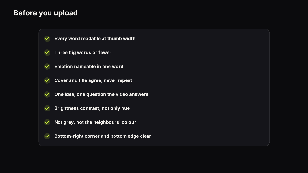
How. Shrink each candidate to thumb width beside real neighbours from step two. Run the pre-upload checklist: every word readable, one nameable emotion, three elements at most, title and headline that add to each other, a colour that separates from the row, nothing important in the corner the duration badge covers. Kill any candidate that fails a read check; there is no fixing a cover the viewer cannot read.
- Every word reads at thumb width, in a row of real neighbours.
- The emotion can be named in one word.
- Face, headline, object: nothing else competes.
- The headline adds what the title does not say.
- The dominant colour differs from the row.
- The promise is something the video shows early.
Done when. Two variants remain that differ in one thing, and you can say in a sentence what the test will teach you.
Step 5: test, ship, and record the lesson
Why. A test that ends in "B won" teaches nothing reusable. A test that ends in "doubt beat shock on a review video" changes the next ten covers.
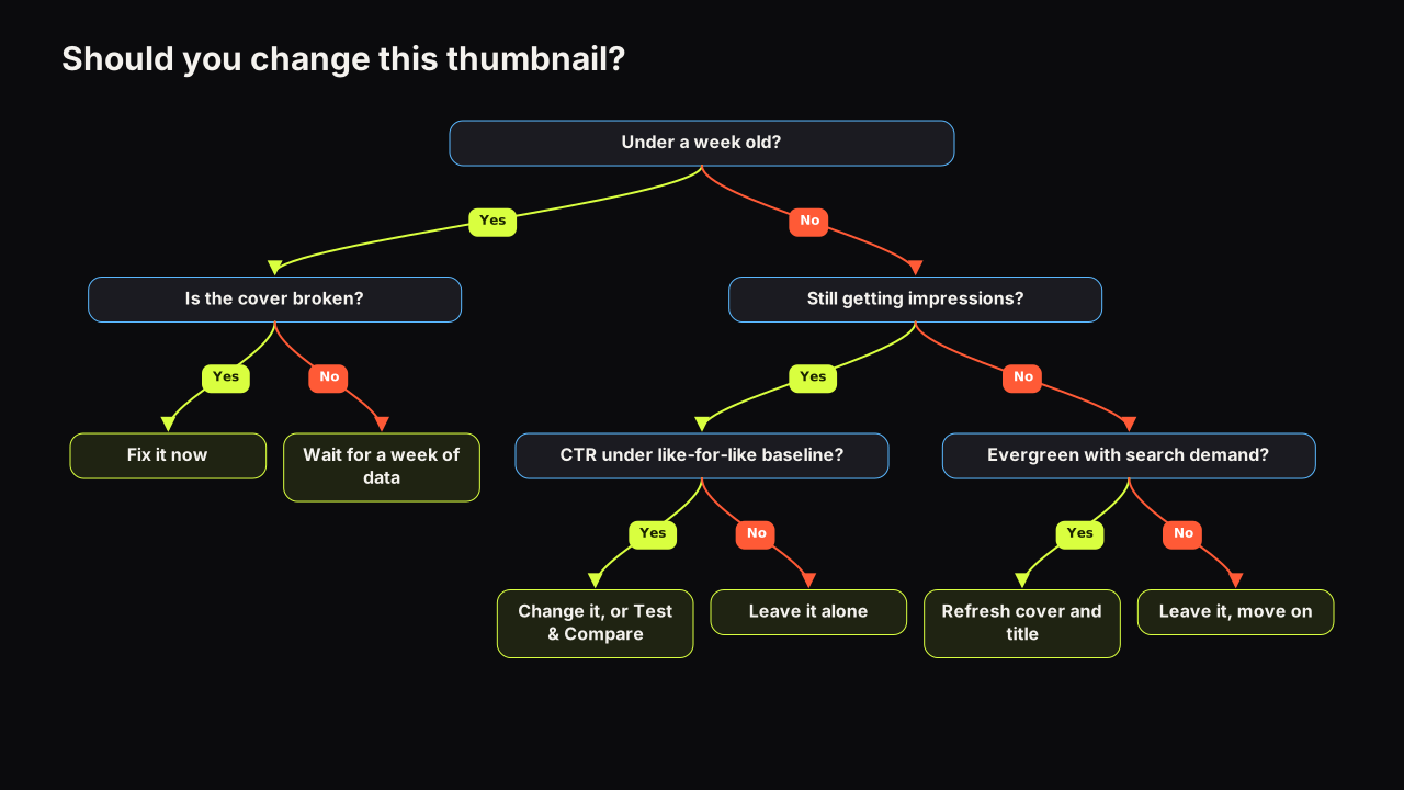
How. On an eligible video, run the two variants through Test & Compare and let it finish; the result states and how to read them are in the A/B testing guide. Because YouTube decides by watch time share, a variant with more clicks can lose if its viewers leave early, which is itself a lesson about the promise. Where the video cannot be tested, ship the candidate that read best and keep the other as the refresh candidate. Either way, write one line in the lessons log.
| Date | Video type | Variable tested | Variant A | Variant B | Result state | Lesson |
|---|---|---|---|---|---|---|
| 2026-09 | Review | Expression | Shock | Doubt | Winner: B | Doubt beats shock on reviews |
| 2026-09 | Tutorial | Headline | "FIX THIS" | "3 MINUTES" | Performed the same | Time claim did not add a lever |
| 2026-10 | Story | Layout | Big Face | Split Screen | Inconclusive | Retest with a bigger difference |
Done when. The log has a line, the runner-up is saved, and the lesson has changed something in the next brief. A lesson that repeats three times becomes a rule and stops being tested; how long a test needs covers what to do with inconclusive results and small channels.
Time budgets by channel stage
We recommend budgeting the workflow by stage rather than by ambition. A new channel uploading weekly can run all five steps in under an hour: a ten-minute brief, ten minutes in the row, twenty minutes of options, ten minutes of critique, and a line in the log. A growing channel with an editor should spend the extra time on steps one and five, because the brief and the log are where a second person adds the most. An established channel with a team should treat step two as a monthly research pass rather than a per-video task, and step five as a shared log the whole team reads.
The step to protect when time is short is the brief. Skipping research costs you one insight; skipping the critique risks one bad cover; skipping the brief makes every other step slower and the result harder to judge, because nobody agreed what the cover was for.
Working with an editor or an agency
The workflow changes shape when someone else makes the covers, and the change is almost entirely in steps one and four.
The brief becomes the contract. Send the five-line brief, two or three neighbours from the row with the pattern you want borrowed marked, your saved face and expression from Face Lab, and the headline exactly as it should read. A brief that says "make it pop" produces a cover you have to fix; a brief that says "doubtful face right, receipts left, 'NOT WORTH IT' top-left, dark green, calm not shocked" produces a candidate.
The critique becomes the approval round. Ask for candidates at thumb width beside the neighbours, not at full size on a white page, and run the same checklist. Approve two variants for the test, not one cover for upload. Agencies producing at volume gain the most from a shared lessons log, because the same lever tested on three clients' channels is a pattern, and the log is the only place it shows up.
Consent belongs in the brief too. Any face the editor renders or places has to be one that agreed to be on the channel's thumbnails: the creator, a co-host, a client with permission.
Keeping the lessons log alive
The log is the workflow's memory and it dies when it becomes a chore. Keep it to one line per test, in the shape of the table above, and read it at two moments: when writing a brief (which levers has this channel already settled?) and in the monthly pass over the back catalogue, when the same log tells you which old covers used a lever the audience has since stopped responding to. After a dozen entries the log is a house style that is measured rather than borrowed, and it is the fastest onboarding document you can hand a new editor. We would keep the log on a channel that cannot use Test & Compare at all, even though every line will then be a judgement made at thumb width rather than a result state. A written guess with a date can be checked in a year; a remembered one cannot.
What to do next
Write the five-line brief for the next video before anything else is made. Pull three neighbours from the row. Render two to four options per concept, tweak one variable to get a second candidate, critique both at thumb width, and set up the test. Add the line to the log the day the result arrives. After the first month, you will have four lines, a runner-up saved for every upload, and a workflow that a second person could run.