On this page
- What a thumbnail has to do in the feed
- The five parts of a cover
- The eye path: one sweep, then stop
- The three rules
- Cover and title make one promise
- The process from idea to upload
- Common mistakes and their fixes
- Niche patterns we see
- The spec in one paragraph
- Words used in this guide
- If it were our channel
- What to do next
You approved the cover on a monitor, at full size, with nothing next to it. Nobody will ever see it that way. They will see it at the width of a thumb, in a row with eleven others from your niche, while that thumb is already moving. A YouTube thumbnail earns a click by making one promise readable under exactly those conditions, and every best practice worth keeping is a consequence of them: one idea; a face or object big enough that its meaning survives shrinking; three words or fewer that add what the picture cannot show; brightness contrast that separates the cover from its neighbours; and a title that says what the video is while the cover says why it matters. The rules fit on an index card. Knowing why each one exists takes longer, and it is what lets you break one on purpose instead of by accident.
What a thumbnail has to do in the feed
A thumbnail (creators also say cover; this guide uses both) has three jobs, in order. Stop the scroll. Be understood, so a viewer knows what the video is and why it matters to them. Be believed, so the promise looks like one the video can keep. The title shares the second and third jobs, and title plus cover is what creators call the packaging.
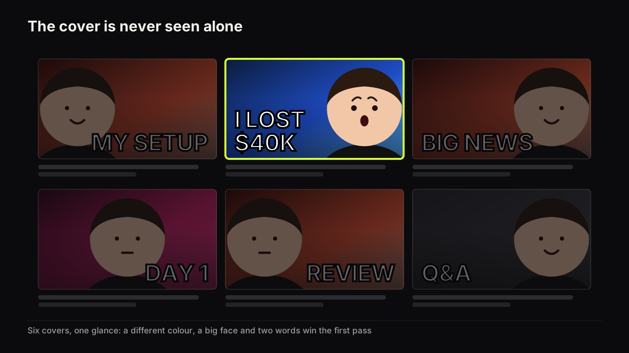
The cover is never seen alone. It sits next to six to twelve others on the Home feed or in Suggested videos, most from the same niche, for a moment, on a screen the size of a hand. Most thumbnail advice exists because of that context.
YouTube's thumbnail and title tips page says that 90% of the best-performing videos on YouTube have custom thumbnails. The same page advises a font that is easy to read, a design that is not too complex, the rule of thirds, and a 16:9 frame, and notes that viewers may only see part of a title.
The point about partial titles is easy to skim past. If a title can be cut off, its first words carry the promise, and the cover has to carry whatever the title cannot.
The decision happens in two passes
The click has an order, and the order tells you what to design first.
Pass one happens before anything is read. The eye reacts to shape, to brightness against the dark feed, to a face, and to a colour that differs from the neighbours. A cover that loses this pass is never evaluated at all.
Pass two is the read. The viewer takes in the big words, the expression, the object, then glances at the title. A question forms: what happened, is that true, how did they do that. If the cover answers its own question there is no reason to click. Then the check. Cover and title must agree without repeating, so the second look is rewarded with something new.
We do not attach times to these passes. Claims that viewers decide in some fraction of a second circulate widely and none of them trace to a source. Win the first pass with shape and contrast; win the second with a question worth answering.
One documented detail sharpens the first pass. YouTube's impressions and click-through rate FAQ counts an impression when a thumbnail is shown for more than one second with at least half of it visible. An impression is not a look. Some of the impressions in your click-through rate went to people who were reading a different title or scrolling past. Only shape, brightness and colour work on someone who has not looked yet.
I have approved covers that were perfectly readable on a large monitor and then nearly fell apart at real YouTube size on my phone. The headline technically fit, the image was sharp, everything felt balanced on the desktop. Reduced to a tile, the smaller text and the background details turned into visual noise. The problem was almost always too many secondary details, not the headline. It made me much more aggressive about checking a cover at small size before I call it finished.
The five parts of a cover
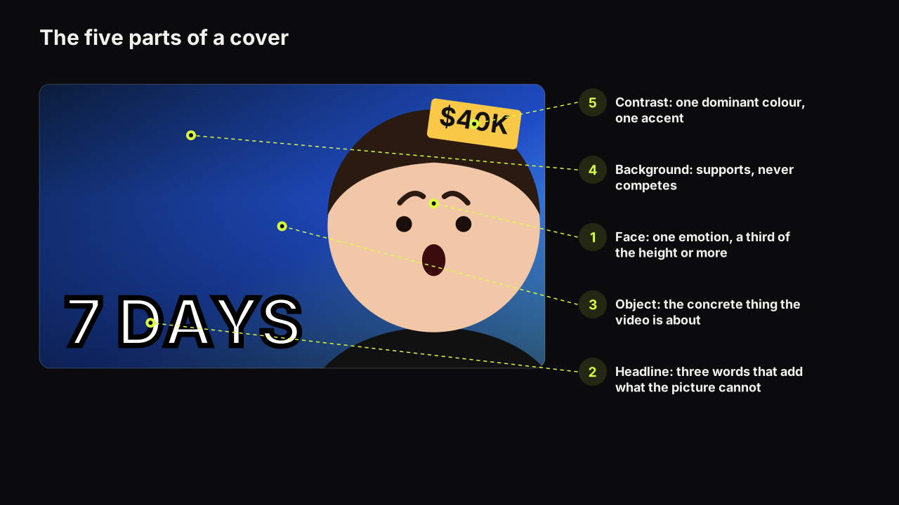
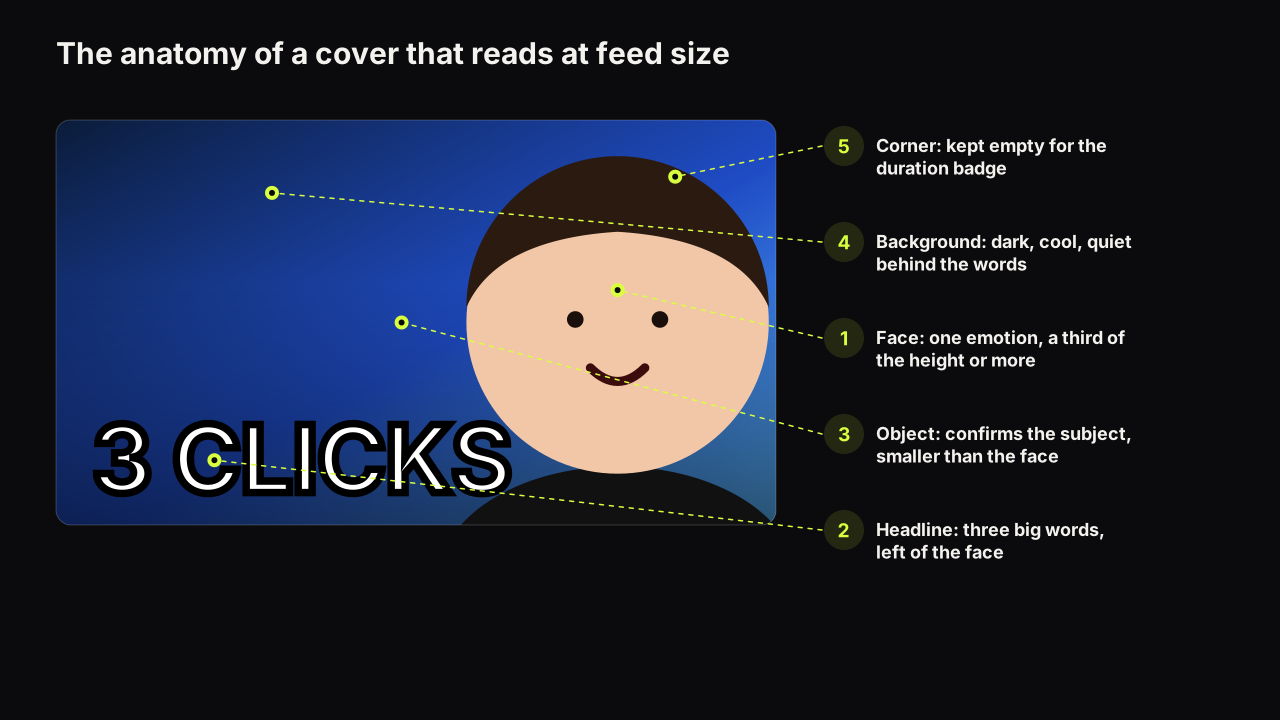
A cover has at most three elements: a face, a headline, and an object. Two more things are not elements but conditions: the background and the contrast between everything. Most weak covers fail because they have too many elements or the wrong conditions, not because the idea was bad.
The face
A face is the strongest single pull on a cover, and its expression is information rather than decoration. Shock says something surprising happened. Doubt says a claim is about to be tested. Calm says this is easy. A face with no nameable emotion tells the viewer nothing and takes a third of the frame to do it.
We recommend a face that fills at least a third of the cover's height, half if you can get it, placed on one side rather than the centre, lit to separate from the background, and looking at the viewer or at the object. We would take that crop even when it costs the setting: the desk, the kit, the room behind you. A viewer who cannot read the expression gets nothing from the room either, and the setting can live in the title or the first shot of the video. The most common failure we see is a face shot in a room with the whole room kept in frame. Crop until the room is gone.
The floor exists because the expression is the point, and at thumb size it only reads when the head is large. When a face is the wrong choice altogether is the subject of how big the face needs to be.
There is a case for breaking the floor, and it is worth knowing so you break it deliberately. Picture a travel channel with a video about a canyon walk. The emotion the cover wants is awe, and awe needs scale: a small figure against a wall of rock. Put the face at half the height and the canyon becomes a backdrop. Here we would drop the figure to a fifth of the height, keep it lit and on a third line so it still reads as a person, and let the canyon be the object. Nobody can read the expression; the scale carries the feeling instead. That trade only works when the place is the story. A canyon video about a twisted ankle wants the face back at half height, wincing.
The headline
The words on the cover are a headline, not a caption and not a summary. The title, directly under the cover, already says what the video is. The headline has one job: add what the picture cannot show. A face can show shock; it cannot show a dollar amount. A kitchen can show ramen; it cannot show a city.
Three big words or fewer. If the idea needs five, set two of them small, so the eye reads the big ones as the headline and the small ones only if it stays. Never put the same words on the cover and in the title. We hold to this even when the extra words feel necessary to be fair to the video, because the cover that feels slightly unfair is the one that gets read at feed size. The fairness belongs in the title, which has 100 characters to spend.
The reasoning is glance logic. At feed size a seven-word line is set so small that the letters turn into grey texture; three words can each be a shape the viewer recognises before reading it. When zero words is the right number, and how the two small words earn their place, is in how many words a cover can carry.
The object
The object is the thing the video is about: the console, the receipt, the plate, the before-and-after body, the map. It anchors the promise in something concrete. In faceless niches the object does the face's job and needs the same size and the same separation from the background. With a face present, the object usually sits between the face and the words, or in the face's hand, so the eye has a place to finish.
The background
The background supports; it is not a fourth element. Its job is to let the face, headline and object separate cleanly. A background that competes (a busy room, a second person, a wall of text on a screen) costs you the read. The best ones are a single field of colour, a blurred scene that sets the place, or a dark studio that lets the face glow.
Contrast
Contrast is what makes a cover the odd one out in a row of similar ones, and there are three kinds. Brightness contrast: a light subject on a dark ground or the reverse. Temperature contrast: a warm face on a cool backdrop. Niche contrast: if every cover in your niche is red, be blue.
Brightness contrast matters most, because it is the only kind that survives a dim phone screen outdoors. Two colours that differ only in hue collapse into one at low brightness. One dominant colour, one accent, and never YouTube's own dark grey as the dominant, because a grey cover has no edge against the feed. We would give up a palette we liked for one that separates. A cover that matches the brand guide and disappears in the row has done nothing for the brand.
Which pairs hold up, which fail, and the quarter-brightness test are in colours and contrast that survive a phone screen.
The eye path: one sweep, then stop
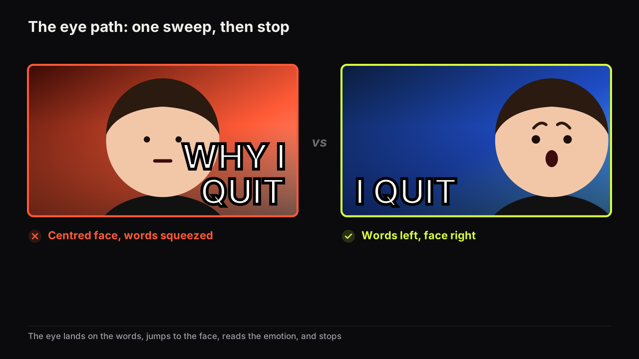
The three elements have to be arranged so the eye visits them in one sweep and then stops. If the eye has to search, the viewer has moved on before it finishes.
In a left-to-right language the reliable path is words on the left, face on the right, object between them or in the face's hand. The eye lands on the words, jumps to the face, reads the emotion, stops. If the face looks towards the words or the object, the gaze closes the path. A centred face breaks this because it leaves two thin gutters, neither wide enough for a headline.
Arrows and circles are a patch for a path that is unclear. They help a weak layout a little and hurt a strong one a little, because they take space from the face and add a fourth element. Fix the layout first. The layouts that make this reliable, and the hierarchy behind them, are in the design principles pillar.
We would rather ship a cover with no arrow and a slightly soft path than one with an arrow and a crisp one, because the arrow trains the audience to expect a pointer on every upload and the channel ends up unable to take it off. The exception is a cover where the object is small by necessity, a component on a circuit board or one line on a statement, and a circle is the only way to say "this bit". Even then we would try making the detail the whole object first.
The three rules
Everything above compresses into three rules a creator can apply before every upload.
One idea
A cover carries one promise. Two promises halve each other, because the viewer cannot form one question. If a video has two hooks, the stronger goes on the cover and the other goes in the title or waits for the next video. The fastest test is to say the cover out loud in one breath: "I lost forty thousand dollars." If it needs an "and", it is two ideas.
An illustrative case. A vlogger comes back from a week in Lisbon with two things worth telling: the trip cost less than a weekend at home, and they lost their passport on day two. A cover that tries both ("LISBON ON £300, LOST MY PASSPORT", a face split between grin and panic) gives the viewer nothing to hold. We would choose by asking which hook is rarer in the niche's row. Cheap-trip covers are everywhere in travel; a lost passport is not. So the cover gets the panic face, an empty passport wallet as the object and the single word "GONE", and the title carries the money: "Lisbon for a week on £300 (and one terrible morning)". The second hook is what the title adds when the viewer checks it.
Three words
Three big words or fewer, all caps, one accent colour on the word that carries the stakes. This is a rule about size as much as count: three words can be set big; seven cannot. The headline says why it matters; the title says what it is.
The phone check
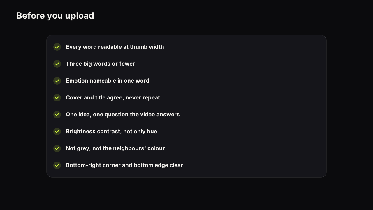
Judge nothing at full size. Shrink the cover to the width of your thumb, or drop it into the free thumbnail tester, which places it inside a mock search result and a phone feed. Then answer three questions: can you read every word, can you name the emotion on the face, and does the cover separate from its neighbours. If any answer is no, the fix is nearly always one of three: cut a word, make the face bigger, or raise the brightness contrast. Why phone readability decides so much, and what TV screens add to the problem, is in designing for feed size.
Cover and title make one promise
The cover does not work alone, and the most common packaging failure is not a bad cover but a cover and a title doing the same job. If the cover says "I LOST $40K" and the title says "I lost $40K day trading", the second look teaches the viewer nothing. If the title says "Why I stopped day trading after one night", the two together tell a story and the second look is rewarded.
The division of labour is simple. The title says what the video is, in words a search engine and a person can both parse. The cover says why it matters, in a picture and a headline that open a question. That question is the information gap George Loewenstein described in his 1994 review of curiosity in Psychological Bulletin: the distance between what someone knows and what they want to know. The seven levers behind a click, and how a cover pulls each one, are laid out in the psychology of why people click.
The video has to close the gap the cover opens. YouTube's spam, deceptive practices and scams policy covers misleading titles, thumbnails and descriptions that promise content the video does not contain, and its thumbnails policy says thumbnails that violate Community Guidelines are removed and can earn a strike.
There is a second, practical reason to keep the promise. When YouTube's own testing tool compares thumbnails, it decides by watch time share rather than clicks (more on this in the process section below). A cover that overpromises can win the clicks and lose the test. Deciding title and cover together, before the video is made, is the subject of packaging the video before you film it.
The process from idea to upload
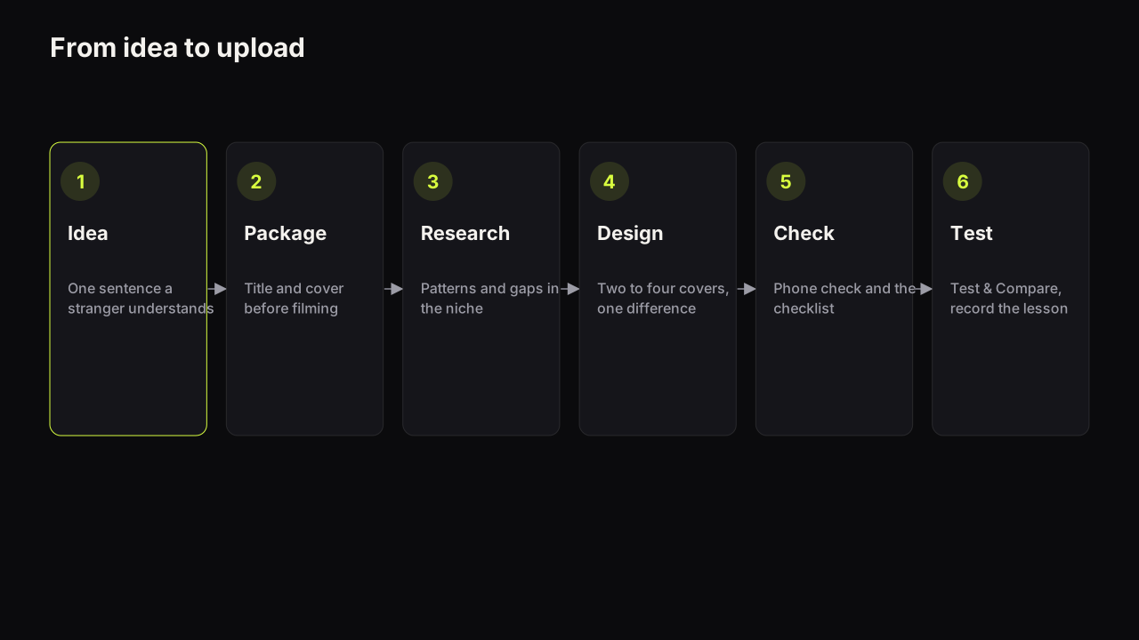
Good thumbnails come from a process, not from inspiration on upload day.
- Idea. Write the video idea as one sentence a stranger would understand.
- Package. Write the title and sketch the cover before filming. If the idea cannot be packaged in one picture and three words, it is a weaker idea, and it is cheaper to find that out now than after the edit.
- Research. Look at what the covers that already work in your niche have in common, and where they leave a gap. The method is studying the covers that already work in your niche without copying any of them.
- Design. Produce two to four candidate covers that differ in something that matters: the emotion, the headline, the layout, or the dominant colour. Whether you shoot, design or generate them, the rules above apply. If you use a generator, how AI thumbnail makers work and where they fail will save you the common mistakes, starting with text spelling.
- Check. Run the phone check and the pre-upload checklist on the two you would bet on.
- Test and measure. Upload with the stronger candidate, test the second, and record the lesson.
Step two is the one creators skip, and the one we would defend hardest. A video that cannot be packaged is a video problem that has not been noticed yet. We would rather drop an idea at the sketch stage than film it without a cover, even though that means occasionally binning something we were excited about.
On the bench, step four is one render: describe the scene, type the headline into the "Words on it" field, pick one of the eight styles, and the maker returns up to four options at 2K in about a minute. The headline is painted into the image by the model, so if spelling must be exact, add a text layer in the editor on top. Face Lab turns one selfie of a person who has agreed to be on your covers into eight expressions you can drop into any scene.
Testing after the upload
YouTube Studio's Test & Compare feature is the honest way to find out which cover your audience clicks, and it works differently from what most creators assume.
YouTube's help page on A/B testing titles and thumbnails says a test can run up to three titles, thumbnails, or title and thumbnail combinations per video, and that the result is decided by watch time share, not clicks. Result states are Winner, Preferred (thumbnail-only tests), Performed the same, and Inconclusive. A test can take a few days or up to two weeks and resolves faster with more different variants and more impressions. It runs from YouTube Studio on desktop and covers public long-form videos and podcast episodes, not Shorts.
Two consequences follow. Variants that differ in one small thing may never resolve, so make the difference large enough to matter. And because the winner is chosen by watch time, the cover that wins is the one whose promise the video kept best. The full method, including a manual swap for videos that cannot be tested, is in how to A/B test YouTube thumbnails.
Reading the result needs one more piece of context. Impressions click-through rate moves with where the impressions come from, so a cover cannot be judged on its CTR alone; what impressions click-through rate actually measures explains how to build a baseline you can compare against. And a cover that is already live is not fixed forever; the decision tree for changing a thumbnail covers when a swap is worth it and when to leave the video alone.
Common mistakes and their fixes
| Mistake | Why it fails | Fix |
|---|---|---|
| Whole room in frame | Face too small to read the emotion | Crop until the head fills a third of the height |
| Seven-word headline | Becomes grey texture at feed size | Cut to three; make two small if five are needed |
| Cover repeats the title | Second look learns nothing | Cover says why, title says what |
| Red text on red ground | Same brightness; vanishes on a dim screen | Change the dominant to a cool, darker colour |
| Dark grey background | Melts into the feed | Any colour with an edge against grey |
| Two promises on one cover | Viewer cannot form one question | Keep the stronger hook; move the other to the title |
| Arrow or circle on a clear layout | Adds a fourth element, shrinks the face | Remove it; fix the eye path instead |
| Judging at full size | Everything reads at full size | Phone check before every upload |
Niche patterns we see
Principles are the same across niches; the expression of them is not.
In finance and business, a single big number and a face showing doubt or confidence tends to outperform shock. In education and tutorials, calm and legible wins; a shocked face reads as the wrong tone for "this is easy". Gaming leans on high saturation, split screens, versus layouts and the character or console as the object. Fitness uses before-and-after and day counts with the body as the object. Travel and vlogs use awe and scale, with the face smaller against a big place. Reviews put the object large and a verdict expression on the face: disgust, doubt or delight. Faceless channels replace the face's pull with hands, props, results and stronger colour contrast.
Starting points, not laws. Find your niche's actual patterns in its outliers, and avoid adding to its sameness by finding the layout it does not use yet.
The spec in one paragraph
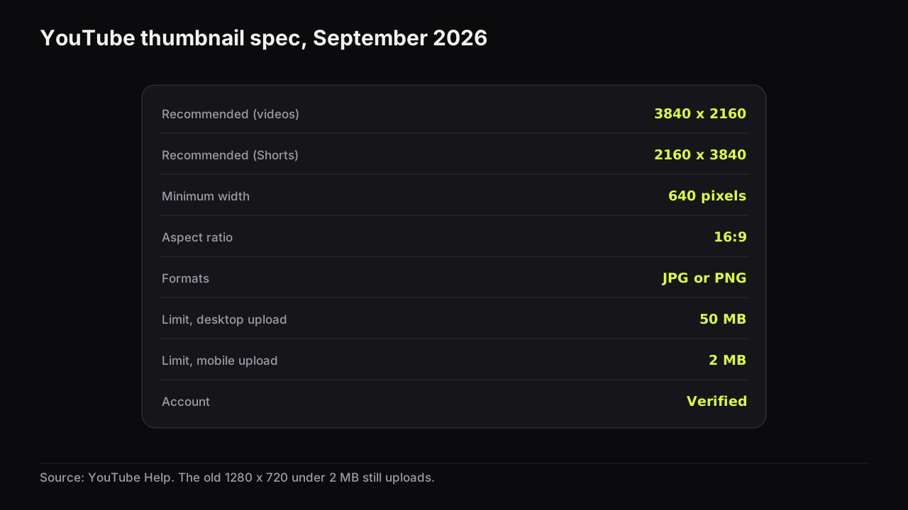
As of September 2026, YouTube's custom thumbnail requirements recommend 3840 x 2160 pixels for videos at a 16:9 aspect ratio, JPG or PNG, with a minimum width of 640 pixels; the file limit is 50 MB from desktop and 2 MB from mobile, and custom thumbnails need a verified account. The older 1280 x 720 recommendation still uploads fine because it clears the minimum width and the size caps. What changed, how the display sizes actually behave, and an export recipe are in the full size and spec reference.
Words used in this guide
Thumbnail or cover is the image shown for a video in feeds, search and suggestions. Packaging is the title and cover treated as one promise; it is creator jargon, not a YouTube term. Impressions are counted when a cover is shown for more than one second with at least half of it visible. Impressions click-through rate (CTR) is clicks divided by counted impressions. Watch time share is the fraction of a test's total watch time each variant earned, and it is how Test & Compare picks a winner. Feed size or thumb size is the width at which most viewers see a cover on a phone. Headline is the words on the cover. Eye path is the order in which the eye visits the elements. Dominant and accent colour are the one colour that owns the cover and the one that fires against it. Information gap is the distance between what a viewer knows and what they want to know; a cover opens it and the video closes it.
If it were our channel
Suppose we ran a home-repair channel, a few tens of thousands of subscribers, and the next video was a dishwasher that had stopped draining, fixed with a paperclip in ten minutes. This is the guide above applied to one upload, not a report of something we did.
Package before filming. The idea in one sentence: "The drain fault that makes people buy a new dishwasher is a clogged filter you can clear with a paperclip." Two hooks again: the fix is trivial, and the alternative is expensive. The rarer one in the home-repair row is the money, because every repair cover already promises "easy". So the title takes the ease ("Your dishwasher isn't broken. Clean this.") and the cover takes the stakes: our face at half height on the right, doubtful rather than shocked because a repair audience trusts doubt, a paperclip held up as the object, and the headline "£400 OR 10p" with the 10p in the accent colour. Counted strictly that is four words and it breaks our own rule. We would keep it, because the two figures are the whole promise and each reads as a shape rather than a word. If the phone check disagreed, "OR" would go small and the numbers would stand alone.
We would film the paperclip-and-filter shot first, because the cover needs that frame and shooting for it is cheaper than compositing it later. Research is ten minutes: search the fault, look at the row, note that most covers are white-appliance photos with red text. Ours goes dark: near-black kitchen ground, warm lit face, pale headline. Design is two candidates that differ in one thing, the doubtful face and a quietly pleased one. Not shock; shock at a dishwasher reads as a joke. Both go through the tester at thumb width.
We would upload with the doubtful face, because it is the one we would be happiest defaulting to if Test & Compare came back Inconclusive, and enter the pleased face as the second variant. Whatever the result state says, the lesson we write down is about expressions on repair videos, not about this dishwasher.
What to do next
Run the video you are about to upload through the pre-upload checklist linked above, on a phone, before you touch the upload button. If it fails the phone check, apply one of the three fixes (cut a word, enlarge the face, raise the brightness contrast) and check again. Then package the next video before you film it: title and cover on paper first, camera second. The best next read for most creators is the design principles pillar, because layout is where most covers are lost.
Four shorter pieces extend this guide: the thumbnail statistics that are actually documented and the ones nobody can source, how Shorts thumbnails differ, what to check when a thumbnail will not update, and the packaging mistakes YouTube's policies actually cover.
Six more fundamentals pieces answer questions this guide only touches: a glossary of the forty terms creators use, thumbnails for live streams and Premieres, what choosing a custom cover over an auto-generated frame actually changes, how to turn a video frame into a cover, whether to export as JPG or PNG, and the copyright questions around screenshots, game art, stock photos and fonts.