On this page
- What a reference does to a render
- Subject looks: eleven ways to treat the person or object
- Text effects: fourteen ways to build the letters
- Backgrounds: thirteen settings
- Hooks: fourteen devices, one at most
- When a card helps and when it fights the scene
- Combinations that hold together
- A short procedure for choosing cards
- What to do next
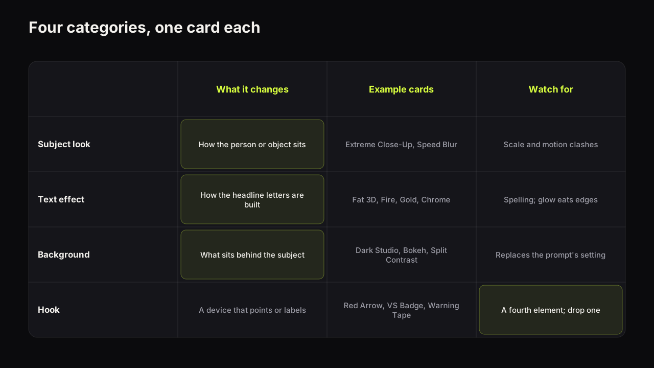
A reference card is a small reference image you attach to a render so the model follows a specific look for one part of the picture: how the subject is treated, how the headline letters are built, what sits behind the subject, or which device points at the point. On Thumbnail Bench the reference library holds 52 cards in four categories (subject looks, text effects, backgrounds and hooks), they cost no credits, and a render takes at most one card per category. A card is not a filter. It shapes what gets painted, which is why the right one sharpens a cover and the wrong one argues with the scene you described.
What a reference does to a render
A prompt tells the model what to paint in words. A card shows it an example of how one part of a finished cover should look. The model treats the card as evidence about the result, alongside your words, and paints a picture that fits both. That is why the library's own description says the card preview is rough and the real thing is painted by the model: a card is not laid on top of the image afterwards, it shapes what gets painted in the first place, so the render is still your scene.
That has consequences, and they explain most of what happens when a card goes wrong.
A card and a prompt that disagree get averaged. If the prompt says "soft daylight in a plain kitchen" and the background card says Speed Lines, the model has two instructions about the same region and resolves them by compromise. The compromise is usually a muddy version of both, which is one of the routes to the generic look that the guide to how generators work and fail describes.
A card fills in what the prompt left out. If the prompt says nothing about the background and you add Dark Studio, the card does the setting's job cleanly. Cards are strongest where they are the only instruction for that region.
One card per category is a constraint that protects you. Two text effects on one headline or two backgrounds in one frame are contradictions by definition. The limit forces the choice that the design would need anyway.
In our own use the effect of a card is strongest on text effects, because letters have few degrees of freedom and the model follows the example closely. It is broadest on backgrounds, where a card replaces the whole setting sentence of a prompt. It is subtlest on subject looks, which nudge how the person or object is treated but leave the pose and the expression to the prompt and the saved face.
Subject looks: eleven ways to treat the person or object
A subject look decides how the main element sits in the picture. It does not decide who the subject is; when the subject is a face, that comes from a saved face of a person who agreed to be on your thumbnails.
| Card | What it does to the render | Use it when | It fights with |
|---|---|---|---|
| 3D Pop-Out | The subject appears to break out of the frame with depth and edge | A big face or a product that should dominate | Epic Scene, which wants the subject small |
| Speed Blur | Motion streaks trail the subject | Challenges, gaming, fitness, anything in motion | Studio Portrait calm, Bokeh stillness |
| Neon Outline | A glowing edge separates the subject from a dark ground | Gaming and tech on black backgrounds | Light backgrounds, Light Burst |
| Extreme Close-Up | The face fills most of the frame | The Big Face layout, verdicts, confessions | Epic Scene; needs the prompt to reserve space for words |
| Studio Portrait | Soft key light, clean skin, composed | Finance, business, education, interviews | Speed Lines, Neon Glitch text |
| Sticker Cut-Out | A hard white border around the cut-out subject | Commentary, versus, comparisons, collage layouts | Bokeh and other soft, photographic grounds |
| Before and After | The frame splits, the same person dull on the left and bright on the right | Transformations, fixes, glow-ups, any then-and-now story | Epic Scene and any card that wants one whole scene |
| Face-Off | Two people in profile stare each other down, red on one, blue on the other | Debates, versus, rivalries with two real people | Extreme Close-Up; it needs both faces mid-size |
| Tiny vs Giant | The person is small in a corner under a giant version of the object | Scale stories, "this thing is huge", unboxings of big things | Any face-size rule; the face is small on purpose |
| Side Reaction | A shoulders-up cut-out at one edge reacting to the rest of the frame | Commentary, reaction covers, screenshots with a face beside them | 3D Pop-Out and Extreme Close-Up, which want the face central |
| Holding It Up | The person holds the object beside their face and looks at the camera | Reviews, product tests, "I bought this" | Speed Blur; the object must stay sharp |
Extreme Close-Up and the Big Face layout are the same idea from two directions: the style sets the composition, the card pushes the framing tighter still. Use the card when the render keeps coming back with the face too small.
Text effects: fourteen ways to build the letters
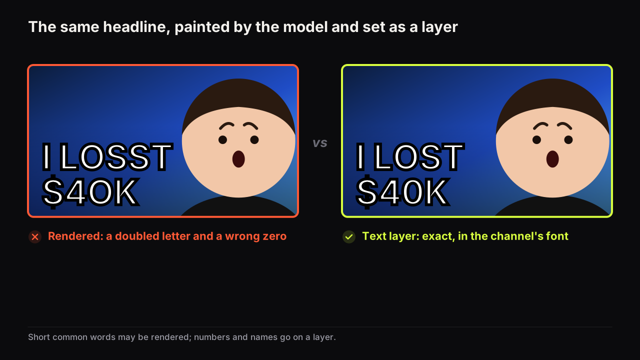
A text effect is the category people search for, and it is the one to use most carefully, because it is painted by the model. That means it inherits the spelling caveat: an effect makes the letters more elaborate, and elaborate letters give the model more ways to get a shape wrong. Why generators misspell and the workflow that fixes it applies in full; the short rule is that an effect goes on the one or two big common words in the headline field, and anything that must be exact goes on a text layer in the editor, with no effect at all.
| Card | What the letters look like | What it signals | Legibility at thumb size |
|---|---|---|---|
| Fat 3D | Thick extruded block letters with a hard shadow | Loud, confident, general purpose | Among the best; the shadow gives the edge |
| Fire | Letters burning at the top edge | Danger, heat, anger, a rant | Glow softens the top of every letter |
| Gold | Polished metallic gold letters | Money, luxury, a win | Needs a dark ground; reads as texture on light |
| Gradient Bevel | Two-tone letters with a bevelled edge | Polished, gaming, tech | Good; the bevel adds an edge without glow |
| Ice | Frosted pale letters with a cold glow | Cold, calm, winter, a chill | Good on dark or blue; disappears on white |
| Neon Glitch | Tube-light letters with digital distortion | Energy, tech, night, gaming | Distortion eats thin strokes; keep words short |
| Sticker Outline | Flat letters with a thick contrasting border | Commentary, comedy, comparisons | Best of the set; a border survives anything |
| Chrome | Mirror-finish silver letters | Cars, tech, hard surfaces | Needs a dark ground; a bright reflection can blank a letter |
| Marker Pen | Hand-written red marker strokes, slightly uneven | Personal, urgent, a note scrawled on the picture | Good on plain grounds; thin strokes vanish on busy scenes |
| Boxed Label | White capitals inside a solid red box | News, exposés, a caption or label | Best of the set with Sticker Outline; the box is its own contrast |
| Rubber Stamp | Red inked stamp in a tilted border | Verdicts, "denied", "approved", official tone | Rough ink thins the strokes; keep to one short word |
| Frosted Glass | Translucent pale letters with a soft glow | Premium, tech, calm | Low contrast on light or white grounds |
| Graffiti | Spray-painted pink and green letters with drips | Street, music, youth culture, bold energy | Busy by nature; needs a plain dark ground |
| Comic Pop | Chunky yellow letters in a jagged white burst | Comedy, reactions, cartoons, a shout | The burst is a big shape; leave room for the face |
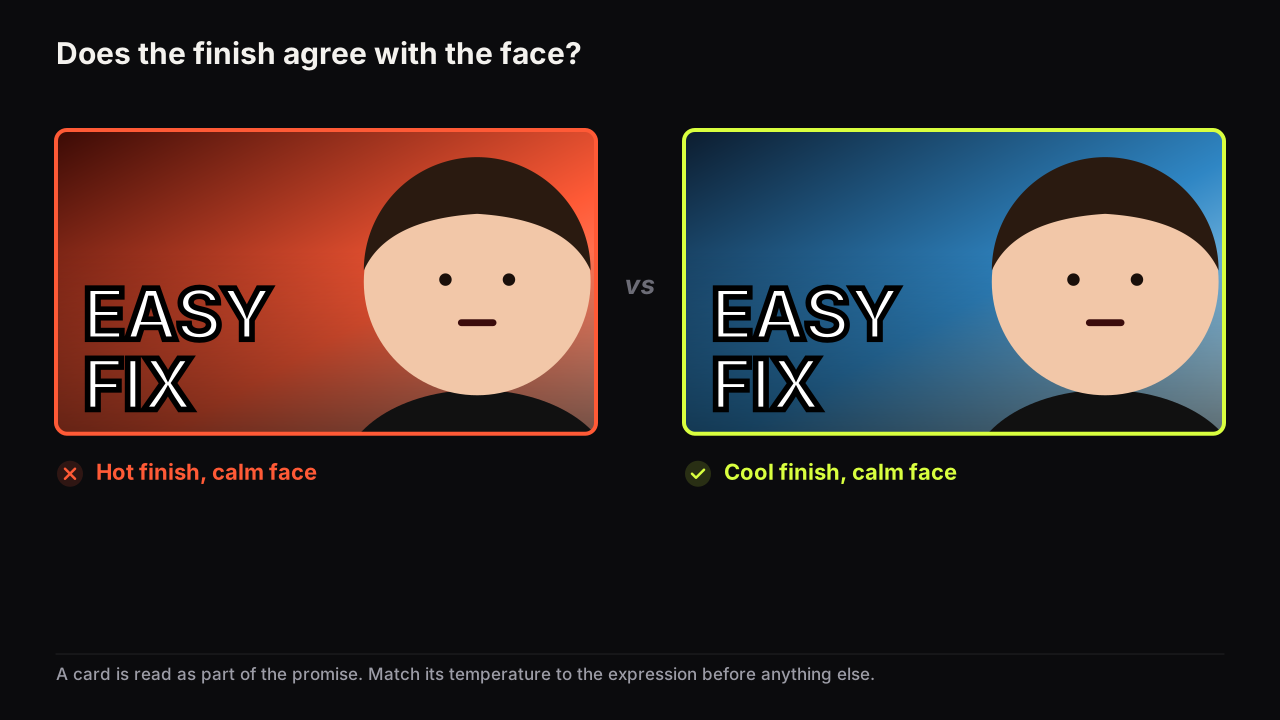
Match the effect to the emotion on the face and the temperature of the scene. Fire text over a Sad face, Ice over an Excited one, Gold on a warning: each is a small contradiction that the viewer feels before reading. When in doubt, Fat 3D or Sticker Outline: they carry any emotion and read at any size, which is the same reason the fonts that survive feed size are heavy and plain.
On finance and education covers we would leave the text effect empty, even though Gold is the obvious card for a money story and a plain headline looks underdressed next to the row, because a plain white word beside a doubtful face reads as a verdict and a gold one reads as a pitch.
Backgrounds: thirteen settings
A background card replaces the setting part of your prompt, so use one or the other for the same region, not both. What a background is for and the four kinds that work is the design argument; here is how each card behaves.
| Card | What it puts behind the subject | Fits | Watch for |
|---|---|---|---|
| Light Burst | Rays radiating from behind the subject | Reveals, wins, energy | Washes out a pale face; adds a second light source to the scene |
| Bokeh | Soft out-of-focus lights | Interviews, finance, night vlogs, premium feel | Low contrast against a dark subject; pair with a rim-lit face |
| Split Contrast | Two halves in opposing colours | Versus, before and after, this or that | Words crossing the seam; keep the headline on one half |
| Epic Scene | A wide dramatic environment | Travel, story, scale | The face shrinks; the prompt must insist on face size |
| Poor vs Rich | A money contrast across the frame | Finance, lifestyle, money stories | Close to a cliché; watch for sameness in the row |
| Speed Lines | Comic radial motion lines | Gaming, challenges, fitness | Reads as noise behind a calm face |
| Dark Studio | Black with a rim of light on the subject | Any face that needs separation | The safe default; also the most common look in some niches |
| Flat Yellow | A plain bright yellow field | Sticker Cut-Out faces, comedy, tutorials, anything that must pop in a dark feed | Yellow text disappears; use dark or white letters |
| Clean White | Seamless white with a floor shadow | Product shots, reviews, minimal education | Pale faces and white text both lose their edge |
| Money Rain | Banknotes falling through the air | Money stories, wins, giveaways | Doubles up with Cash Burst; use one |
| Tech Grid | Dark blue with a glowing grid and floating code | Tech, coding, AI, gaming | Cyan text vanishes; the grid competes with Neon Outline |
| Red Alert | Dark crimson with a red glow and smoke | Warnings, danger, a rant, "it's over" | Fire text adds a second red; the whole frame goes one colour |
| Sunset Sky | Warm orange to purple sky with clouds | Travel, vlogs, lifestyle, calm stories | Warm letters sink into it; use white or cool text |
Split Contrast with a divider is the finish for the split-screen and versus layout; Epic Scene is the one card that deliberately breaks the face-size rule, which is only right when scale is the promise.
Hooks: fourteen devices, one at most
A hook is a device: a badge, an arrow, a circle, a burst. It directs, isolates or labels. It is also a fourth element, which is why the case against arrows and circles as a patch matters here. When a hook goes in, something else should come out, and the hook should never be the fix for an eye path the layout failed to build.
| Card | What it adds | Earns its place when |
|---|---|---|
| Cash Burst | Banknotes bursting into frame | Money is the stakes and no other object shows it |
| Red Arrow | A single red arrow | Two things must be connected and the gaze cannot do it |
| Red Circle | A red ring around one detail | The detail is small and the video is about that detail |
| Shadow Figure | A dark unidentified silhouette | Someone unnamed is the subject and you have no consent for a face |
| VS Badge | A versus badge at the seam | Two sides are being compared |
| Warning Tape | Hazard tape across part of the frame | A warning or exposé the video actually delivers |
| Timer | A red digital clock reading 00:59 | The video really is a race against time |
| Trophy | A gold cup with confetti | A win, a rank, a competition result |
| Padlock | A closed gold padlock | A secret, a locked feature, a paywall, a hack |
| Check vs X | A green check beside a red X | A right-or-wrong, do-or-don't comparison |
| Phone Screen | A tilted phone with a blank bright screen | An app, a text, something seen on a phone |
| Explosion | A fireball with smoke and sparks | Destruction, a blow-up, a dramatic fail |
| Question Mark | A glossy red 3D question mark | A mystery the video answers; use once, not on every cover |
| Shock Emoji | A giant yellow shocked face | Reaction covers when there is no real face to show |
Shadow Figure deserves a note. It is the honest way to put "a person" on a cover when the person is not yours to show: a mystery buyer, an anonymous source, a scammer in a story. It carries the presence of a face without the likeness of one, and it needs no consent because it is no one.
When a card helps and when it fights the scene
Five checks catch nearly every bad combination before it costs a credit.
- Emotion. Does the effect or background agree with the face? A hot finish on a calm face, or a cold one on a scream, is a contradiction the viewer reads first.
- Light sources. Count them. Light Burst plus Fire text plus Neon Outline is three glows and no shadow, which is the flat, oversaturated look the model produces on its own.
- Motion. Speed Blur, Speed Lines and Neon Glitch say movement; Studio Portrait, Bokeh and Dark Studio say stillness. Pick a side.
- Scale. Epic Scene wants the subject small; Extreme Close-Up and 3D Pop-Out want it large. They cannot both be right.
- Niche fit. Poor vs Rich outside a money story, Warning Tape on a tutorial, Neon Glitch text on a Clean Edu lesson: each reads as the wrong genre, which is the expectation-fit failure in the design principles guide.
The most common combination we see fail is not two cards fighting each other but a card fighting the prompt: a detailed setting sentence and a background card for a different setting. The render lands halfway between a kitchen and a studio, and the creator blames the model. Delete the setting sentence or drop the card.
Say you describe a kitchen: a burnt loaf on a wooden board, daylight from a window, your face behind it in a wince, and "I RUINED IT" in the headline field. Then you add Fire as the text effect and Light Burst as the background. The render comes back with flaming orange letters, rays behind your head, and a kitchen gone amber to make room for both, and the viewer infers a rant, or a house fire, from a face that is only embarrassed. Two glows, no daylight, one contradiction. Drop Light Burst, keep the window sentence, and swap Fire for Sticker Outline in white with a black border, so the burnt loaf is the darkest thing on the cover and the wince is the only drama.
Combinations that hold together
Each row is a finish for a layout, not a template. The style sets the composition, the prompt describes the scene, the saved face carries the expression, and the cards decide the surface.
| Goal | Subject look | Text effect | Background | Hook |
|---|---|---|---|---|
| A verdict face | Extreme Close-Up | Fat 3D | Dark Studio | None |
| Gaming energy | Speed Blur | Neon Glitch | Speed Lines | None |
| A money story | Studio Portrait | Gold | Poor vs Rich | Cash Burst |
| A versus | Sticker Cut-Out | Sticker Outline | Split Contrast | VS Badge |
| A warning | 3D Pop-Out | Fat 3D | Dark Studio | Warning Tape |
| A mystery | None | Ice | Bokeh | Shadow Figure |
| A calm lesson | Studio Portrait | None | None | None |
The gaming row is the finish behind the Neon Glitch style and where it misfires, and the money row runs on the doubt-over-shock rule from finance covers where the number does the talking. The last row is deliberate: a Clean Edu cover with no cards at all is often the odd one out in a row of glowing neighbours.
A short procedure for choosing cards
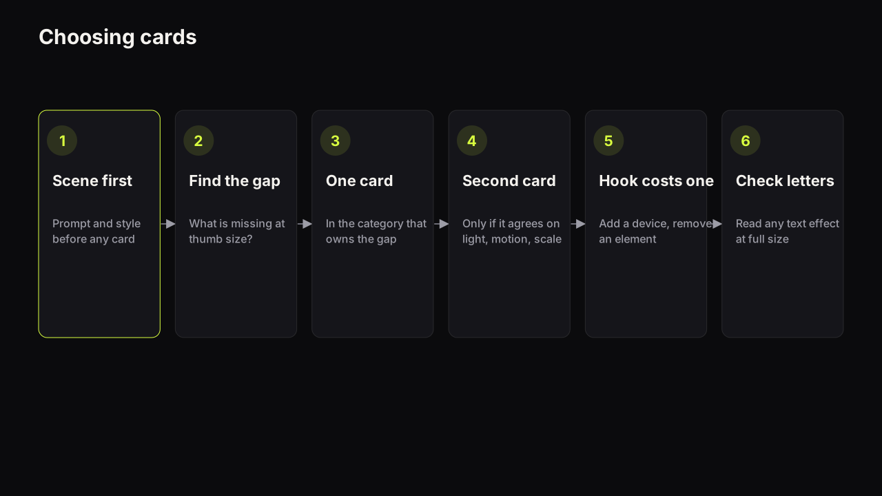
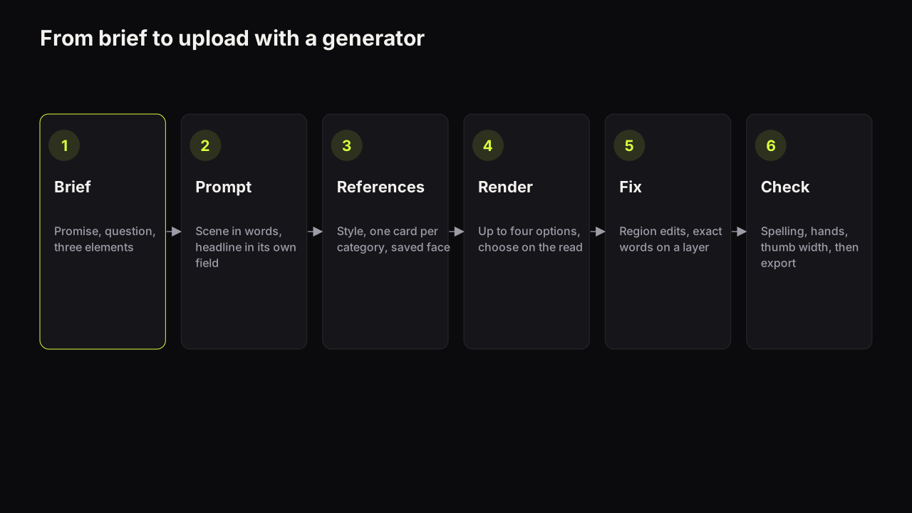
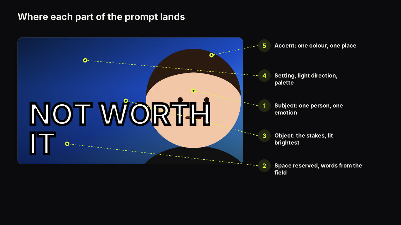
- Write the scene and pick the style first, using the six-part prompt structure. Cards refine a scene; they do not replace one.
- Shrink the last render, or imagine it at thumb width, and name the one thing missing: separation, energy, a money signal, a seam.
- Add one card for that gap, in the category that owns it.
- Add a second card only if it agrees with the first on emotion, light, motion and scale.
- If the card is a hook, remove an element: usually the small second line of text or a background prop.
- Render, then read every letter of any text effect at full size before anything else.
What to do next
Take your last render and run the five checks against the cards it used. If two of them disagree, drop the one that is not doing the job you named in step two, and render again with Tweak so only the finish changes. Then build your own version of the combinations table: three rows for the three kinds of video your channel makes, with the cards written down, so the finish becomes a decision you made once rather than one you remake every upload.