On this page
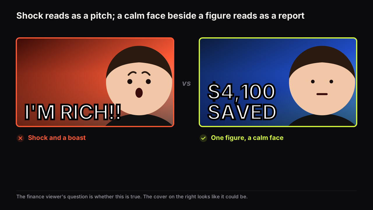
Finance and business thumbnails work best when one number carries the promise and the face carries doubt or confidence rather than shock. That is the pattern across the finance rows we look at: a single large figure with a unit, a calm or sceptical expression, money or a chart shape as the object, and a title that supplies the context the number withholds. The reason is trust. The viewer is being asked to believe a claim about money, and a shocked face reads as a sales pitch, while a calm face beside a plain figure reads as a report.
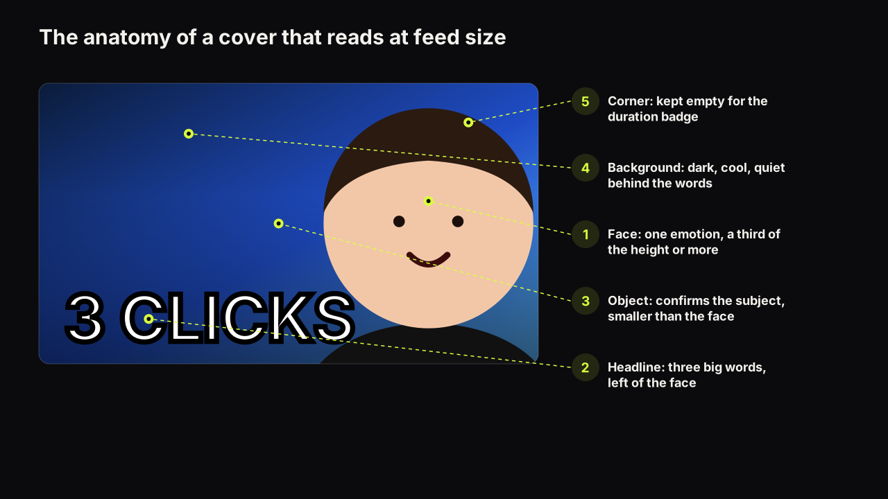
Everything else follows from that. The number is the hero, so it gets the size and the accent colour. The face is the witness, so it is calm and at least a third of the height. The object confirms the subject in a glance. And because a number is a claim, finance is the niche where the line between a curiosity gap and a false promise matters most. The general rules of hierarchy and contrast are in the design principles guide; this article is about how they play out when the subject is money.
Why the number is the hero
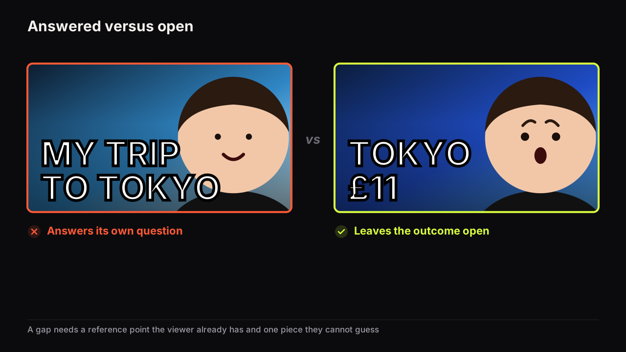
A number is stakes and specificity in one element. "$40K" is a stake; "my finances" is not. "7 YEARS" is specific; "a long time" is not. Those two levers are the ones a finance audience responds to most, because the viewer's own question is nearly always "how much, and could that be me?". A cover that answers "how much" and withholds "how" is an information gap with the cause missing, which is the strongest gap the finance niche has.
Three rules make a number work as the hero.
- One number. Two figures are a comparison, a different pattern (below). Three are a spreadsheet.
- A unit and a direction. "$4,100" needs "SAVED", "LOST" or "A MONTH" beside it, or the title has to supply it. A bare figure is decoration.
- The accent colour on the number, and only the number. The figure arrives first because it is the largest and the only accented thing.
We think a precise figure reads as more believable than a round one. "$4,112" looks like something that happened; "$4,000" looks like something that was chosen for the cover. The precise figure also stays inside the three-word budget, because a number is one word however many digits it has.
The number is one of the cover's words, so it shares the budget covered in how many words a cover can carry: three big, or five if two are small. A finance cover with a figure, a direction word and a face is complete.
Doubt or confidence, not shock
The finance viewer's question is "is this true, and does it apply to me?". A shocked face answers a different question. Shock says something surprising happened. The finance viewer is shopping for a person who knows, and surprise is the wrong signal to send them.
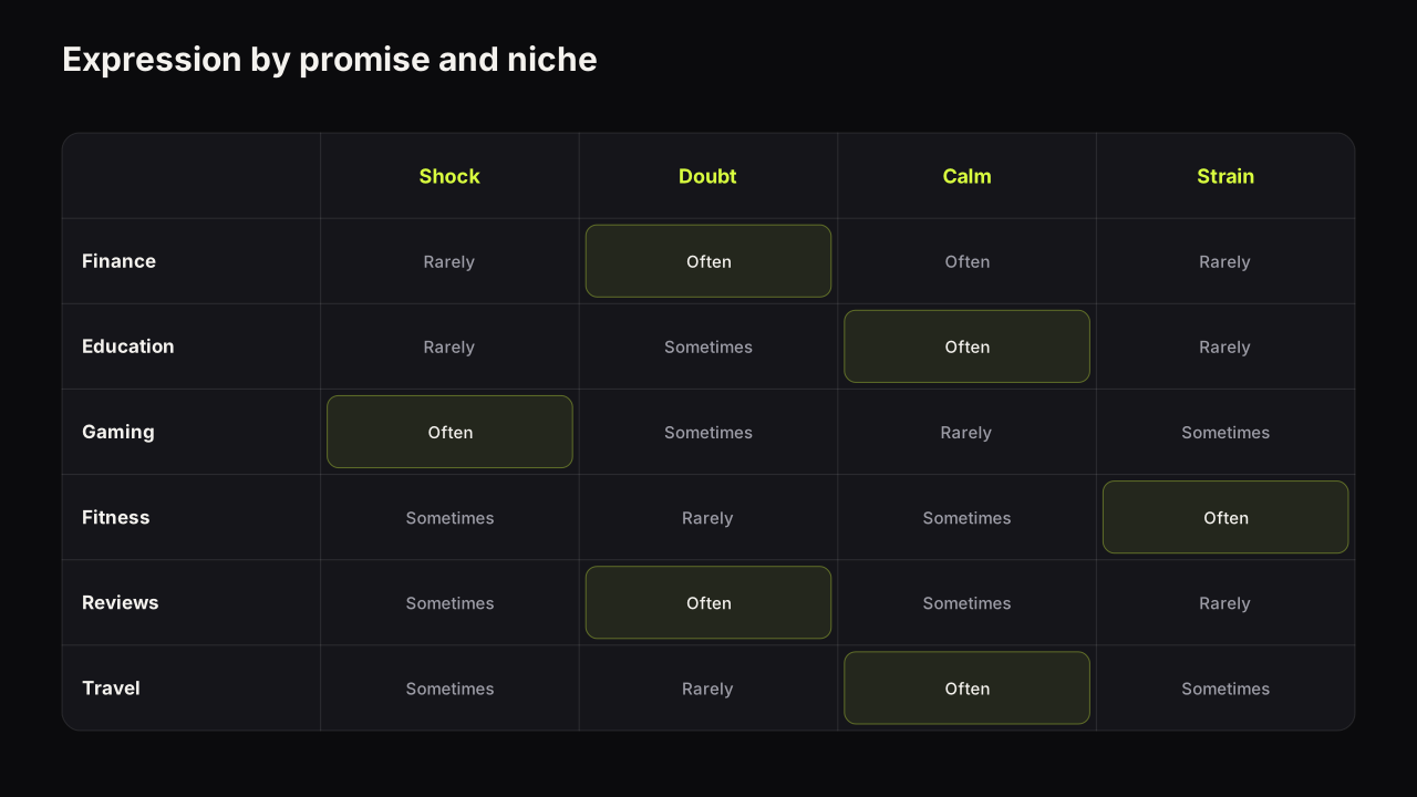
In the finance and business rows we look at, the shocked face is common and it underperforms in tone: it sits next to numbers and reads as a pitch. The expressions that fit are doubt (one eyebrow, a sceptical mouth) for "is this worth it" and "they lied about this"; calm confidence for "here is how"; mild concern or a wince for losses; and a small, closed-mouth smile for gains. The faces that win look like someone about to tell you something quietly, not someone shouting it.
Matching the expression to the promise is the general skill; in finance the range is narrower and calmer than in most niches. The face still needs the size floor: a third of the height at least, so the doubt or the calm is readable at thumb width rather than being an oval beside a number.
Five finance patterns, annotated
The five below are the layouts finance and business rows converge on. Each is an observed pattern, not a measured one, and each has a way of failing.
| Pattern | Number | Face | Object | Breaks when |
|---|---|---|---|---|
| Single big number | One figure with a unit | Calm or doubtful, a third of the height | None, or small | The figure has no unit or direction |
| Money as the object | Optional | Calm, holding or beside it | A stack, a card, a receipt, a coin | Cash rain, stock money, or the object is bigger than the claim |
| Before and after | Two figures, a gap between | Same face, two halves | The two states | The halves are the same brightness; the "after" is not obviously better |
| Contradiction | One figure that fights the picture | Flat or doubtful | The expensive thing, or the empty thing | The contradiction is explained on the cover |
| The doubt cover | A claim from elsewhere | Sceptical, looking at the claim | The claim itself | The verdict is on the cover |
Single big number
The default. One figure, its unit or direction, a face carrying the feeling about it, a dark ground. "$4,100 SAVED" with a calm face. "DOWN $6K" with a wince. The figure fills a third of the height or more, the face fills half, and the title says what the number is about. Cover says how much; title says what.
Money as the object
A stack of notes, a bank card, a receipt, a coin, a chart shape: one object that confirms the subject in a glance. It fits budgeting, saving and "what I spend" videos, where the object is the story. It breaks in two ways. Cash falling from the sky and briefcases of notes read as a scam cover because scam covers use them. And an object larger than the claim, a mountain of cash beside "$200 SAVED", reads as a mismatch, and mismatches cost belief.
Before and after
Two figures with a gap between them: net worth then and now, debt then and now. The eye reads left, right, and the gap is the promise. The face is the same in both halves, or absent. It breaks when the halves are lit the same so the difference reads as decoration, and when the "after" is not clearly the better state at a glance. Make the "after" brighter and give it the accent.
Contradiction
A number that fights the picture: "BROKE" beside an expensive car; "$0" beside a full office. The viewer's question forms on its own: how? It fits stories, lessons and "what they don't tell you" videos. It breaks when the cover explains the contradiction, because then the gap is closed, and it breaks as a matter of trust when the contradiction is not true.
The doubt cover
Someone else's claim, shown on the cover, with a sceptical face looking at it: a promised return, a product's pitch. The face carries the verdict the video will give. It fits reviews, debunks and "I tested it" videos. It breaks when the verdict is on the cover, and as a matter of fairness when the claim shown is not one the source made.
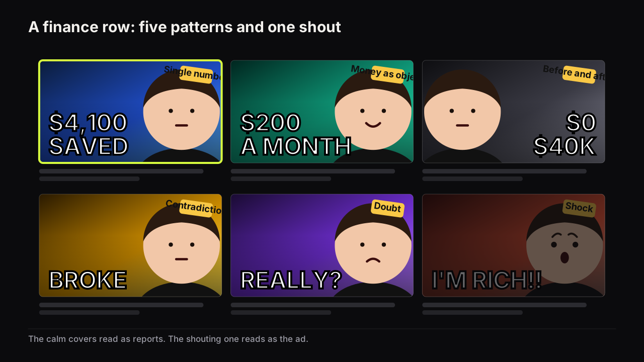
Trust signals on a finance cover
The signals that earn belief are mostly restraint.
- A plain, heavy typeface with no glow. Glow, fire and chrome on a dollar figure are the grammar of get-rich-quick covers. Heavy, flat type reads as a fact.
- The unit. A currency symbol or a time unit. Ambiguity reads as evasion.
- The same face across uploads. Recognition is trust. A channel that changes faces, or has no consistent face, forfeits the credibility its previous covers built.
- Real objects. A receipt, a statement blurred to a shape, a card, a coin. Not a rendering of a vault.
- No screenshot dashboards. A brokerage screenshot at feed size is a grey smear. Take the one figure off it and set it large.
- Restraint in colour. One dominant colour, one accent on the number. The finance row leans green, gold and black, and the reasoning in colour and contrast that survive a phone screen says be a different colour from the row, so a deep blue or a plain white ground is often the interruption. We would leave green off a finance cover altogether, even though green reads as money at a glance, because the row is already green and the colour that says money is also the colour that disappears in it.
Take a hypothetical cover for a video about cancelling subscriptions. The draft: an open-mouthed face, cash raining down the background, "I SAVED SO MUCH MONEY!!!" in gold with a glow, a red arrow pointing at a phone. A finance viewer reads it as an ad before reading a word. The rebuild: the same face at half the height with a small closed-mouth smile, a phone blurred to a shape, "£1,140 A YEAR" in flat heavy white on dark navy with "A YEAR" set smaller, no arrow, no rain. The title carries the rest: which subscriptions, and what each was costing. The viewer infers a real audit and a figure they could match, which is the belief the video needs before it starts.
Build every finance cover from a number the video actually contains, a face that looks like it is about to explain it quietly, and one object that confirms the subject. Then remove anything that looks like it is selling something. If the cover would work as the ad for a course, it is the wrong cover for the video.
Where the gap ends and the false promise begins
In finance the number on the cover is a claim, and a claim the video does not deliver is not a taste problem. YouTube's thumbnails policy page covers thumbnails, and misleading packaging, meaning titles, thumbnails and descriptions that promise content the video does not contain, is covered by the spam, deceptive practices and scams policy. The working rule for a finance channel follows from that.
Thumbnails that violate Community Guidelines are removed, violations can earn a strike, and misleading packaging falls under the spam, deceptive practices and scams policy, per YouTube's help pages linked above. We do not describe enforcement beyond what those pages say.
The working rule: the number on the cover must appear in the video and mean what the cover implies. "$4,100 SAVED" on a video where the saving is hypothetical is a false promise; on a video that shows the audit that saved it, it is a gap the video closes. A withheld cause is a gap; an invented figure is deception. The general version of this line, and what the policies say about it, is in the thumbnail mistakes that can get a cover removed.
There is a packaging rule underneath the policy rule. The cover says how much; the title says what and for whom. That split is why the cover should not repeat the title: a title reading "How I saved $4,100 on my tax bill" beside a cover reading "$4,100 SAVED" is the same information twice, and the second look is wasted. The title carries the context, the cover carries the stake, and the two together are one promise, which is the whole argument of treating title and thumbnail as one unit.
Business and career covers
Business, entrepreneurship and career channels share the finance grammar with different nouns. The number is revenue, hours, headcount, a salary, a day count. The object is a laptop, a storefront, a contract. The expressions are the same calm and doubt, with a little more confidence, because the promise is often "I did this and so can you".
Business rows we look at differ from personal finance rows in two ways. The face is larger and more often looking at the camera, because the creator is the product. And the before-and-after pattern is more common, with a day count in place of a dollar figure ("DAY 1" and "DAY 90" of a business), which borrows from fitness rather than from finance.
The same trust rules apply: a revenue figure on a cover is a claim the video has to show. And the row is worth a look before choosing a colour, which is the case for studying the covers already winning in your niche rather than assuming the finance palette applies.
Building finance covers on the bench
Two of the eight styles on the bench are the finance layouts above. Number Pop puts one large figure on the cover with the cause left to the video; Money Stack puts money as the object beside the face. In the reference library, which is free and uses no credits, the Cash Burst hook card adds the money object as a reference, and the Poor vs Rich background sets up the before-and-after or the contradiction. The headline field renders the figure into the image; for a figure that has to be right to the digit, the editor's text layers add it in a heavy font on top, free.
The finance cover check
Run it at thumb width, beside three covers from the finance row.
- One number, with a unit or a direction word, the largest and only accented thing.
- Does the figure appear in the video, meaning what the cover implies?
- The face carries doubt or calm, at a third of the height or more. No shock unless the video is about a shock.
- One object, real-looking, no bigger than the claim.
- Heavy, flat type; no glow, fire or chrome on the figure.
- The title supplies the context the cover withholds, and does not repeat the figure.
- The dominant colour differs from the green-gold-black of the row.
- Would this cover work as an ad for a course? If yes, quieten it.
Common questions
Should a finance thumbnail show a face?
Usually yes, at a third to half of the height, carrying doubt or calm confidence rather than shock. The face is what makes a number believable, because it shows a person standing behind it. Faceless finance channels replace it with the number at face size and a money or chart object.
Is it fine to put a dollar figure on the thumbnail?
Yes, if the figure appears in the video and means what the cover implies. A number the video does not deliver is misleading packaging, which YouTube's spam and deceptive practices policy covers. Keep the unit, keep it to one number, and let the title supply the context.
What colours work for finance thumbnails?
The finance row leans on green, gold and black, so a cover in those colours matches the row. We recommend a dark cool ground with a warm accent on the number, and a check against the actual row before choosing, because the colour that works is the one the neighbours are not using.
What to do next
Take your next finance video and write down the one figure it can honestly put on the cover, the direction word that goes with it, and the feeling a viewer should have about it. That is the cover: figure, direction, face, one object. Then write the title to say what the figure is about without repeating it.
How finance compares with the other nine niches is laid out in thumbnail patterns by niche.