On this page
- The current YouTube thumbnail spec
- What changed in late 2025, and why the old advice still uploads
- The file is huge, the display is tiny
- Safe areas: keep the bottom-right corner and the bottom edge clear
- How to export a thumbnail that clears every limit
- If it were our channel
- Common questions
- What to do next
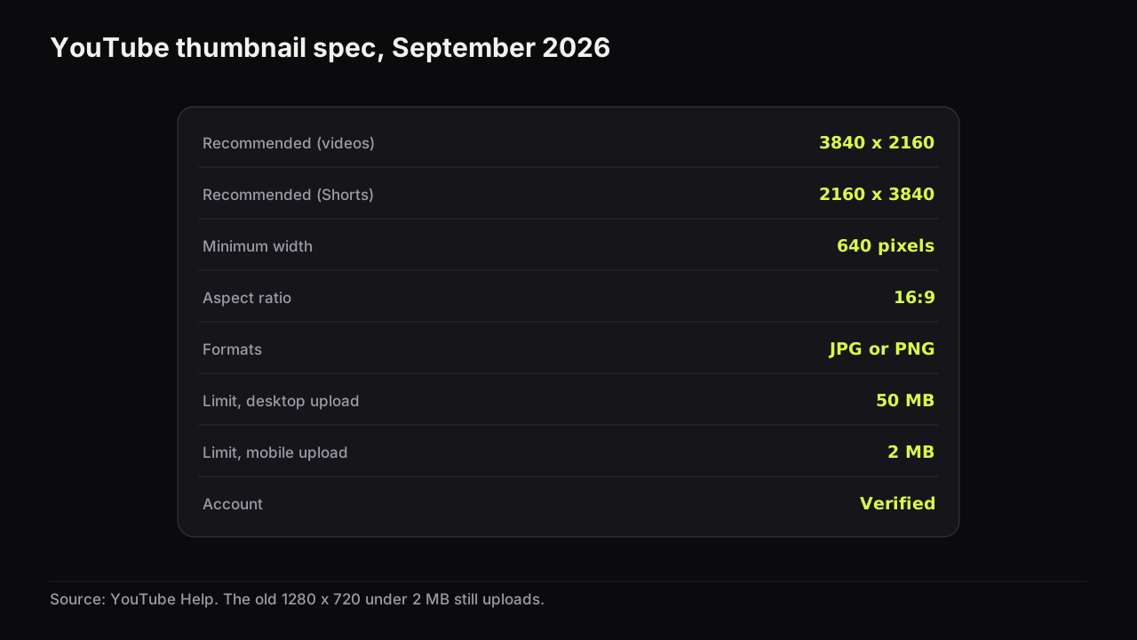
Picture how most creators meet this spec: a finished cover, a PNG of three or four megabytes, uploaded from the phone on the train, and a failure message with no reason attached. The file was fine. The phone was the problem. As of September 2026, the recommended YouTube thumbnail size is 3840 x 2160 pixels at a 16:9 aspect ratio, saved as JPG or PNG, with a minimum width of 640 pixels and a file size limit of 50 MB when uploaded from desktop or 2 MB from mobile. The older 1280 x 720 recommendation still uploads. Most of what matters about the spec is how those two limits interact with the device in your hand.
The current YouTube thumbnail spec
| Setting | Videos | Shorts |
|---|---|---|
| Recommended resolution | 3840 x 2160 | 2160 x 3840 |
| Minimum | 640 pixels wide | 640 pixels tall |
| Aspect ratio | 16:9 | Portrait, matching 2160 x 3840 |
| Formats | JPG or PNG | JPG or PNG |
| File limit, desktop upload | 50 MB | 50 MB |
| File limit, mobile upload | 2 MB (10 MB for podcasts) | Not stated separately |
| Account requirement | Verified account | Verified account |
YouTube's help page on adding custom thumbnails recommends 3840 x 2160 for videos and 2160 x 3840 for Shorts, a minimum width of 640 pixels (minimum height 640 for Shorts), JPG or PNG, a 16:9 aspect ratio for videos, and file limits that depend on the upload device: 2 MB for video thumbnails from mobile (10 MB for podcasts) and 50 MB for video, Shorts and podcast thumbnails from desktop. Custom thumbnails require a verified account.
Two of these numbers do the real work. The minimum width, 640 pixels, decides whether a file is accepted at all. The 2 MB mobile limit is the one that catches people, because a 3840 x 2160 PNG is almost never under it. Over 2 MB means a desktop browser, where the 50 MB limit applies. That is the whole fix for the train.
What changed in late 2025, and why the old advice still uploads
For years the recommendation was 1280 x 720 with a 2 MB cap, and nearly every ranking page still says so. The change to 3840 x 2160 and 50 MB from desktop was reported by 9to5Google in late October 2025, and YouTube's help page now carries the new numbers.
The old spec did not stop working. The constraints that reject a file are the minimum width and the size cap, and 1280 x 720 under 2 MB clears both. If your workflow produces 1280 x 720 files, nothing broke.
What changed is the headroom, and the place it shows is the living room. Connected TV became the largest US YouTube watch surface in early 2025, per Nielsen-derived figures reported by Deadline, and a TV home screen shows a cover at a size where a soft 1280 x 720 source can look slightly blurred from the sofa.
We would export at 3840 x 2160 for every desktop upload, even though the files are several times heavier to store and send around, because the TV surface is now the largest one in the US and a soft cover there is paid for on every impression for the life of the video. We would not upscale to get there: a soft 1280 x 720 image enlarged to 3840 x 2160 is a large soft image, and the enlargement makes the softness easier to see. The spec changed; the design rules did not.
We would not re-export a back catalogue at 3840 x 2160 for resolution alone, even though that leaves older covers slightly soft on a TV, because the hours are better spent on the covers themselves. When a video earns a new cover for other reasons, the new one goes up at full size. Which old videos deserve that is the subject of updating old thumbnails.
The file is huge, the display is tiny
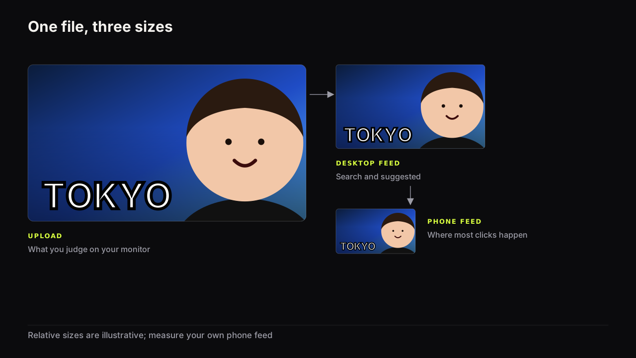
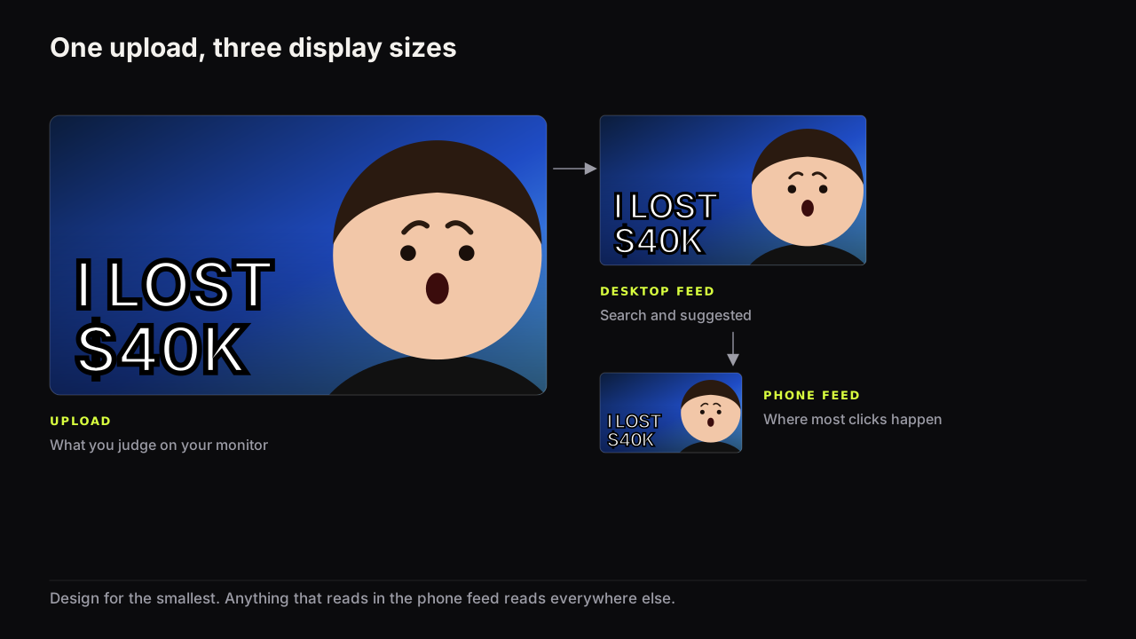
A 3840 x 2160 upload is never displayed at 3840 x 2160. YouTube resizes it for every surface, and the surfaces that generate most impressions show it small: the width of a phone screen minus margins in the Home feed, a fraction of that in the Suggested column on desktop, smaller again in phone search. A TV shows it large in pixels and small in the eye, because the viewer is across the room.
We do not quote pixel sizes for those surfaces. They change with device, app version and layout, and every table of "mobile thumbnail size" numbers circulating online is unsourced. Screenshot your own Home feed instead, note how wide a cover is against the screen, and judge yours at that width.
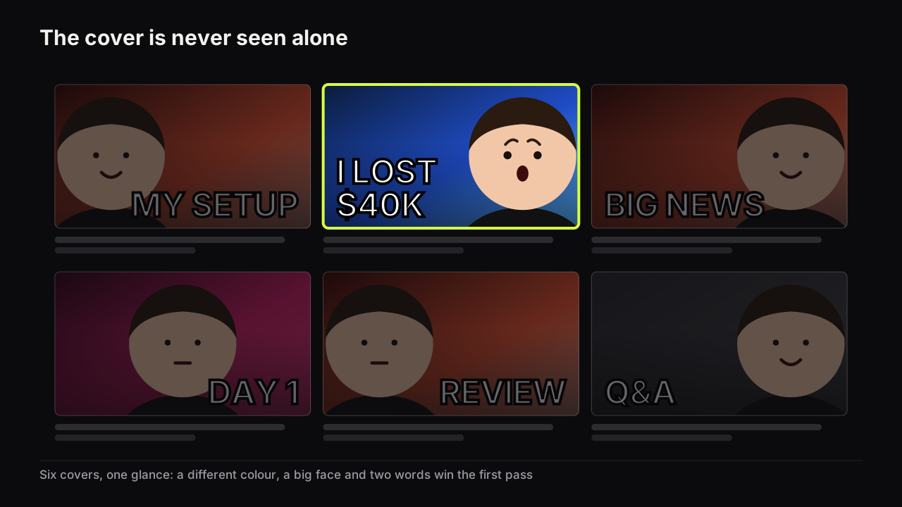
Two invented covers show why the spec and the design rules are separate subjects. One is built at 3840 x 2160 with the headline in a thin, elegant typeface at about a twentieth of the height; it clears every line of the spec, and shrunk to a phone feed the word becomes a smudge. The other is a 1280 x 720 JPG from an old workflow, three heavy words filling the left half and a face filling the right; a quarter of the recommended width, and it reads, because nothing on it was small to begin with. We would expect the second to be read and the first scrolled past, and it is the first that a spec page would call correct.
The three things that break first when a cover shrinks (thin text, a small face and low brightness contrast) are covered in why phone readability decides most clicks, and the case for keeping the headline to three big words is a feed-size argument, not a taste one.
Safe areas: keep the bottom-right corner and the bottom edge clear
The spec says nothing about safe areas. The interface does. In feeds and search results YouTube places the duration badge over the bottom-right corner of the thumbnail; on partly watched videos a red progress bar runs along the bottom edge; hover previews on desktop replace the cover with moving video after a moment.
Interface details like the duration badge and the progress bar are what we observe in the YouTube apps as of September 2026; YouTube does not document their exact size or position, so we do not give pixel numbers for them.
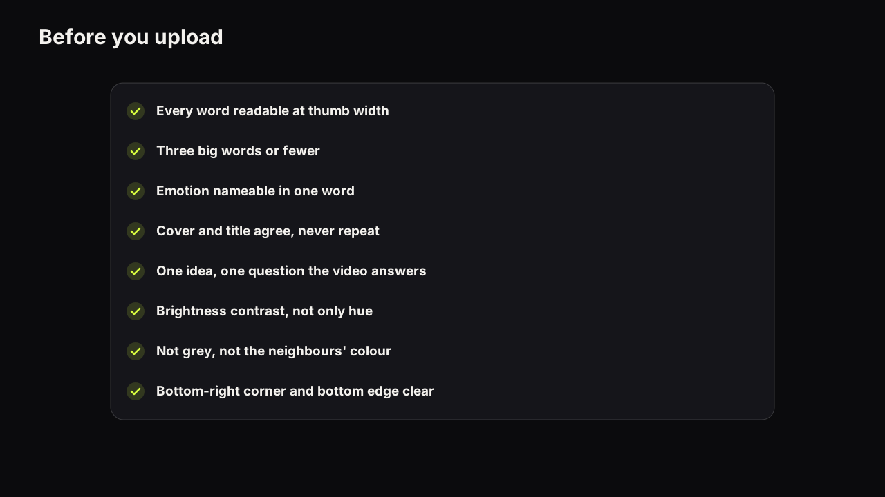
We recommend keeping the headline, the face's eyes and mouth, and any number that carries the stakes out of the bottom-right corner and off the bottom edge. We would hold to that even when the composition begs for a price tag in that corner, because a "$3" that some viewers see as "12:47" is not a price tag. The cost is a corner of layout you cannot use, and most layouts never needed it. Leave a patch roughly the size of a short word clear in the bottom right, and put nothing that must be read in the bottom sliver of the frame. Strong layouts do this by accident: words left, face right, eyes in the upper half.
How to export a thumbnail that clears every limit
- Compose at 16:9 from the start. A 4:3 photo or a square graphic cropped to 16:9 loses the sides, where the headline usually lives. Shorts are composed portrait at 2160 x 3840 and are a separate design job.
- Export at the native resolution of your source, up to 3840 x 2160. Sharp at 3840 x 2160: export that. A 1920 x 1080 or 1280 x 720 source: export at that size. Do not upscale.
- Pick the format by the content. PNG keeps flat colour fields and text edges clean and costs file size. High-quality JPG is far smaller and fine for photographic scenes; on flat colour it can leave faint banding, which matters when your dominant and accent colours are large flat fields (JPG or PNG goes deeper).
- Check the file size against the device you will upload from. Over 2 MB means desktop only.
- Look at it at feed size before you upload. A file that clears the spec can still fail the read.
There is one place we break rule 2. If the cover is flat colour, hard-edged shapes and text, with no photograph in it, an upscale costs nothing, because there is no fine detail to soften and the text can be re-set at the new size rather than stretched. A faceless channel working from graphics can go to 3840 x 2160 from a smaller master without guilt. The rule exists for photographs and renders, where the detail is real and finite.
An invented case for rule 4. A cooking channel's cover, a photographed bowl, a face and two words, comes out of the PNG export at 3840 x 2160 around 9 MB. From the desk that is a desktop upload and it is done. From a phone it is going nowhere, and the choice is a 1280 x 720 export of the same cover (a JPG at high quality lands well under a megabyte) or waiting for the laptop. We would take the JPG. The phone feed cannot tell the difference, and swapping in the full-size file later is a two-minute job.
On the bench, this is two buttons. Export HD gives a 1280 x 720 file under 2 MB, ready for YouTube's mobile limit; Export 2K gives the full-size render for desktop upload. A 9:16 render exports at 1080 x 1920 and a 1:1 render at 1080 x 1080, each composed for its frame rather than cropped from 16:9 (one thumbnail, three ratios has the reasoning). Free plan exports carry a small thumbnailbench.com corner mark; paid plans do not. If you generate covers elsewhere, export is where AI tools most often hand you a soft or oddly sized file, a failure mode covered in how AI thumbnail generators work and where they fail.
| Situation | Export | Why |
|---|---|---|
| Uploading from a phone | 1280 x 720, JPG or PNG, under 2 MB | Only the mobile cap applies |
| Uploading from desktop, sharp source | 3840 x 2160, PNG or high-quality JPG | Full headroom for TV screens |
| Source is soft or upscaled | Native size, no upscaling | A bigger soft file is still soft |
| Shorts | 2160 x 3840, composed portrait | The recommended Shorts size |
| Flat colour with big text | PNG | Avoids banding on colour fields |
I design for the standard 16:9 frame, typically at 1280 by 720, and the tool varies because much of my process now runs through what we're building. The problem I keep running into is files that are far bigger than they need to be, especially highly detailed generated images. My preference is to keep enough quality that the image stays crisp and compress everything YouTube doesn't need. A giant file has no benefit if nobody can see the difference.
If it were our channel
Suppose we ran a small tech channel that films on a phone, edits on a laptop and uploads from wherever the video finishes rendering. We would set the canvas at 3840 x 2160 once and stop thinking about it, because every render and text layer scales down cleanly from there. Each cover would leave the laptop as two files with obvious names: the full 3840 x 2160 PNG for desktop, and a 1280 x 720 JPG under 2 MB for the phone. Most weeks the desktop file goes up. The week the upload happens from a kitchen table on somebody else's wifi, the phone file goes up and nobody notices. If one cover's source was a screen recording at 1920 x 1080, the "full" file would be 1920 x 1080 and we would resist making it bigger. And before either file went anywhere, the cover would sit at thumb width on the phone for a few seconds, because that is the check the spec cannot do for you.
Common questions
Does a 1280 x 720 thumbnail still work on YouTube?
Yes. The help page sets a minimum width of 640 pixels and file limits of 50 MB from desktop and 2 MB from mobile, so a 1280 x 720 JPG or PNG under 2 MB uploads from any device. It is no longer the recommended resolution, which is now 3840 x 2160, but nothing rejects it.
What is the maximum file size for a YouTube thumbnail?
It depends on where you upload from. As of September 2026, the help page states 50 MB for video, Shorts and podcast thumbnails uploaded from desktop, and 2 MB for video thumbnails uploaded from mobile (10 MB for podcasts on mobile). If a file is over 2 MB, upload it from a desktop browser.
What size should a YouTube Shorts thumbnail be?
YouTube recommends 2160 x 3840 pixels, which is the video recommendation turned portrait, with a minimum height of 640 pixels. Compose the image for the portrait frame rather than cropping a 16:9 cover, because the crop removes the sides where the headline usually sits.
Does a bigger thumbnail file improve quality or click-through rate?
A larger, sharper source can look cleaner on big screens, and TVs are now the largest US watch surface. It does not change the size at which the cover is shown in a phone feed, and there is no documented link between file size and click-through rate. Upscaling a soft image adds nothing.
What to do next
Export the cover for your next upload at its native size, check the file against the limit for the device you will use, and look at it at feed size before you press upload. Then run the rest of the pre-upload checklist, which covers the read, the promise and the feed as well as the spec. For the reasoning behind the design rules rather than the file rules, start with the full guide to how covers earn the click.