On this page
- Why the face shrinks here and nowhere else
- Travel or vlog: which one is the constant?
- The place as the object
- Weather and light set the mood
- "I went to" or "this happened there"
- Keeping a series recognisable when every episode is somewhere new
- Building travel covers on the bench
- The travel cover check
- Common questions
- What to do next
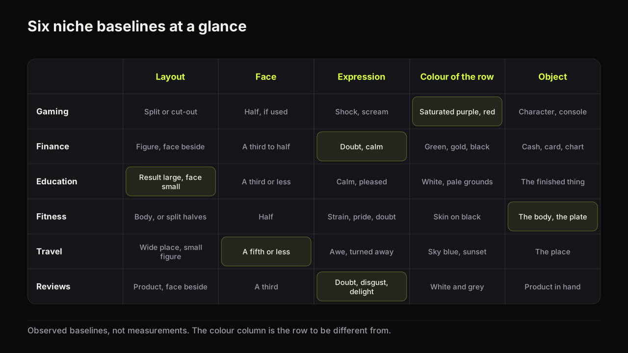
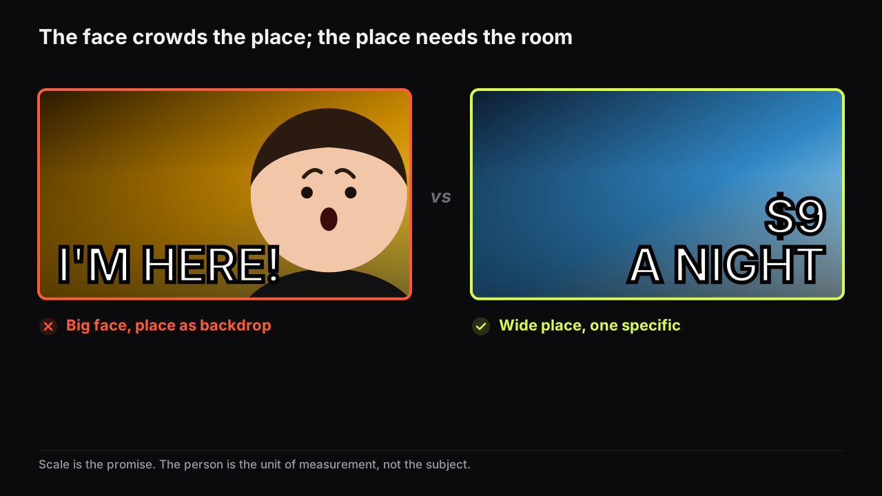
Travel and vlog thumbnails are the one niche where the face should get smaller, because the promise is scale: a place big enough to make a person look small, and the small person is how the viewer measures it. Everything else in this library argues for a larger face, and the argument holds in every other niche's row. In travel the face gives up its size to the place, and gets in return a job as the unit of measurement, the invitation to stand there, and the constant that makes a series recognisable when every episode is somewhere new.
The exception has a boundary. A vlog that is about the person, a confession filmed on a train, a bad day in a hostel, brings the face back to its normal size and turns the place into a background. So the first decision on any travel or vlog cover is which of the two is the subject, and the rest of the design follows from that answer.
Why the face shrinks here and nowhere else
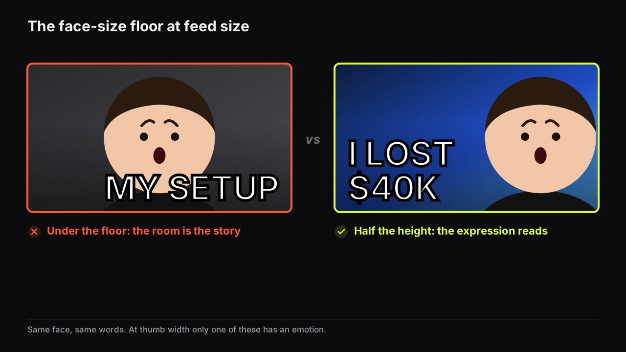
The general rule is that a face needs a third of the height for its expression to be readable, and how big the face needs to be and why makes the case. Travel goes under that floor on purpose, and pays for it with four compensations that let a figure read as a person when its face cannot be read at all.
- A silhouette. The figure against sky, water, snow or a bright wall, so its outline is a clear shape. A figure against rock or foliage disappears.
- A colour the place does not contain. A red jacket on a green hillside, a yellow raincoat in a grey city, white against a dark cave. The colour does the work the face would have done in the first pass.
- A position with space in front. The figure on a third, facing into the larger part of the frame, so the eye travels from the person into the place.
- A pose that reads without a face. Arms out, walking away, sitting on an edge, looking up. The pose replaces the expression: it says awe, or exhaustion, or arrival.
The figure turned away from the camera is common in the travel rows we look at, and it works for a reason the rest of YouTube would find odd: the viewer is not being asked to read a person, they are being invited to stand where the person stands. A face turned to the camera makes the cover about the creator; a back turned to the camera makes it about the place, with the creator as the viewer's stand-in.
Travel or vlog: which one is the constant?
A travel channel keeps the face constant and changes the place; a personal vlog keeps the place as context and changes the person's situation and expression. The two share a feed and are often the same channel, but they want different covers, and mixing them produces the common failure: a big face in front of a beautiful place, with neither of them the subject.
| Travel | Vlog | |
|---|---|---|
| Subject | The place | The person, or what happened to them |
| Face size | A fifth of the height or smaller | A third to half, as in other niches |
| Words | A specific about the place: price, time, distance, rule | The situation: "DAY 3", "IT BROKE", "LAST NIGHT" |
| Colour | The place's palette, with the figure as the accent | The face's warmth against the place as a cool ground |
| Series marker | Route or country label, a constant figure colour | The same face position and type treatment |
The decision rule is a sentence: if the video would be worth watching with the place removed, it is a vlog and the face is the subject; if it would not, it is travel and the place is.
The place as the object
A place on a cover has to read as a kind of place at thumb width, which means a shape, not a view. A mountain is a triangle against sky, a skyline is a jagged line, a beach is a curve of pale against blue, a market is a corridor of colour. Choose the frame in which the place is its most recognisable shape, and crop until that shape fills the cover. A wide, faithful photograph of the whole view is the postcard, and the postcard is the travel niche's version of the raw screenshot in gaming: accurate and unreadable.
The postcard has a second problem, which is that it makes no promise. The viewer has seen a thousand beautiful places in this row today. What makes one worth clicking is the unusual specific, the detail that is hard to picture and hard to dismiss: what it cost, how long it took, what the rule was, how cold it got. "$9 A NIGHT", "48 HOURS", "NO TOURISTS", "-30°" beside the place turns a postcard into a question, and the unusual specific as a curiosity device is the gap type this niche responds to most.
Take an illustrative cover for a night in a fjord cabin. The first draft is the wide golden-hour shot: the cabin a speck, the creator's grinning face pasted large in the corner, FJORD PARADISE in white across the sky. The viewer infers a holiday montage, reads the face as the subject, and has no question to ask. The redraw crops to the fjord wall as one dark diagonal, keeps the cabin's lit window as the only warm point, puts the creator in a yellow jacket on the jetty at a fifth of the height with their back to the camera, and says £38 A NIGHT. Same footage. Now the viewer is standing on that jetty wondering what £38 buys there.
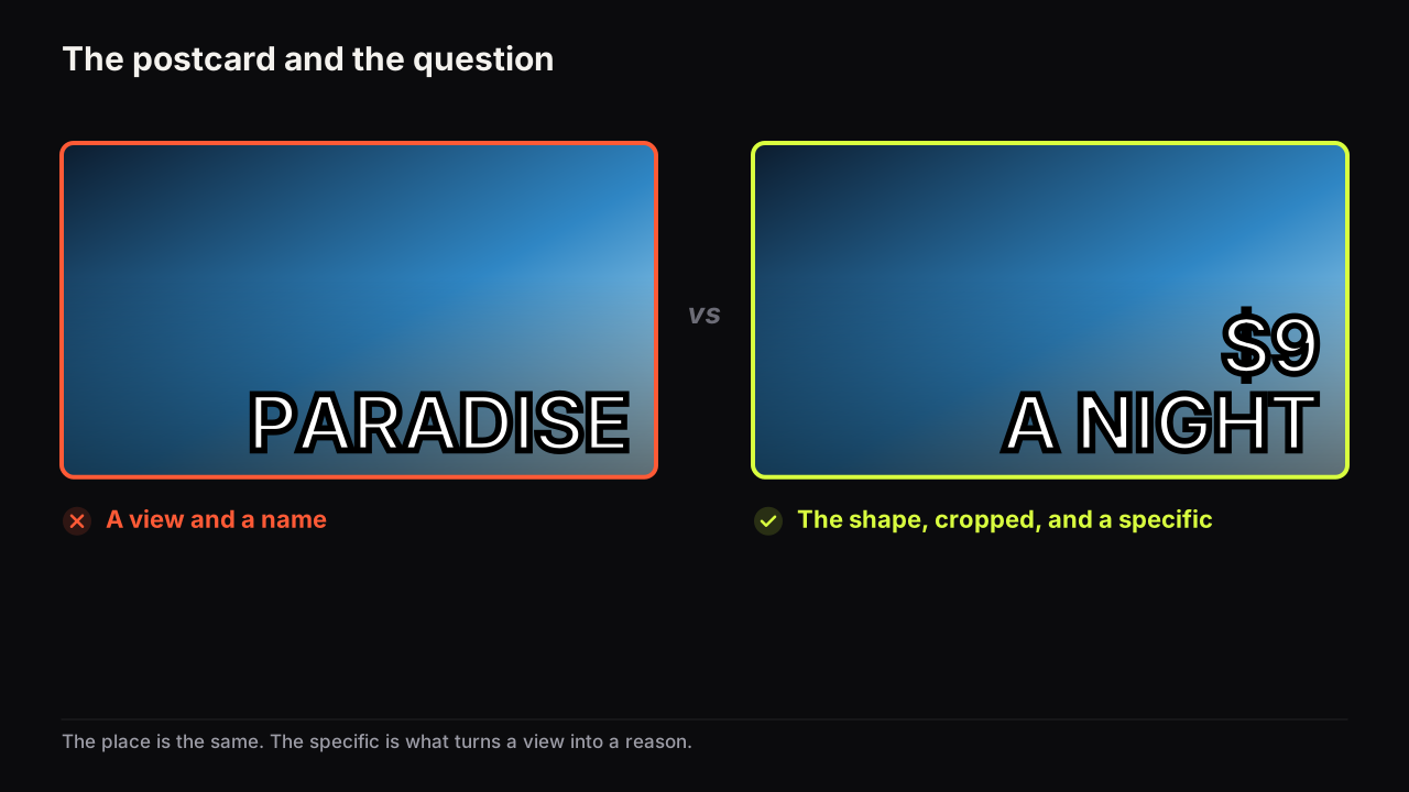
A wide place also happens to suit the largest screen a viewer might use: covers seen on a TV want a bigger subject and fewer words, and a travel cover built as a shape with one specific is already that.
Vehicles and meals are the niche's secondary objects. A van, a train window, a bike, a plate of something local: each says how the trip is being made, and each can be the object on a cover where the place is already known from the series.
Weather and light set the mood
Light is the travel cover's expression. The same place at golden hour, in blue hour and under a storm makes three different promises, and the row you are in has usually chosen one of them.
| Light | What it says | The row risk | What to do |
|---|---|---|---|
| Golden hour | Warmth, arrival, the reward | The whole row is golden | Use the figure's colour, or choose another hour |
| Blue hour and night | Mystery, the city, a long day | Dark on dark; the figure vanishes | A lit figure or a lit window as the accent |
| Storm and overcast | Struggle, honesty, "it went wrong" | Reads as dull at thumb width | Often the interruption in a bright row; crop tight |
| Snow and white | Scale and cold | Everything is pale | The figure's colour does all the work |
| Harsh midday | Flat, no shadow, holiday-snap | Nothing separates | Avoid, or crop to a shaded detail |
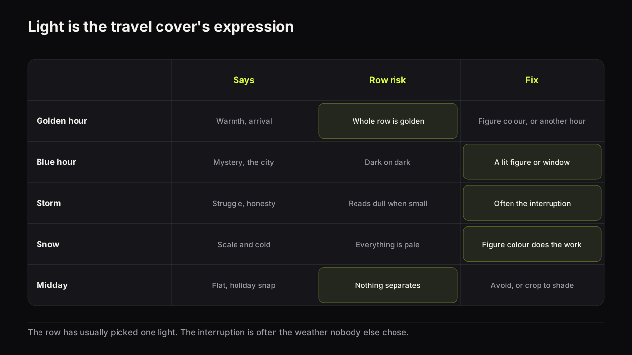
Travel rows are the warmest and bluest on YouTube: sunset orange, sea and sky blue, green hills. In the rows we look at, the cover that is grey, night-dark or white with one strong figure colour is the one the eye finds, for the same reason a plain cover is found in a saturated gaming row.
The reasoning behind the figure's colour is brightness and temperature contrast: a warm figure on a cool place, or a light figure on a dark one, survives the shrink and a dim phone screen, and colour and contrast that survive a phone screen gives the pairs that hold and the pairs that fail. In travel the pair is chosen by what you wear and when you shoot, so the decision is made on location, not in the editor.
"I went to" or "this happened there"
Travel covers make one of two promises. "I went to X" makes the place the promise, and it works when the place is famous, remote or extreme enough to carry a video on its own. "X happened in Y" makes the event the promise and the place the context: the boat that did not come, the border that closed, the meal that cost more than the room. The second framing is the one that keeps a channel going once the famous places are used up, and it is the one that puts a nameable feeling back on the cover.
We think the "I went to" framing tires faster than any other in this niche, because after a dozen uploads every cover is a figure in front of a place and the viewer stops asking what happened. Channels that last switch to the event framing early and let the place become the setting, which is also what makes the covers more different from each other.
The words follow the framing. When the place is the promise the title usually names it, so the cover should not repeat the name; it should carry the specific instead, and when a cover should and should not repeat the title covers the division of labour. When the event is the promise, the cover names the event in two words and the title names the place.
Keeping a series recognisable when every episode is somewhere new
Travel series have the opposite problem from most channels: not sameness but disappearance. Every cover is a different place in different light, and the channel has no visible constant, so a viewer who liked episode four cannot find episode five in the row. What stays fixed and what has to change so a channel is recognisable without tiring is the subject of consistency versus sameness; the travel version has three usable constants.
- The figure. The same person, the same jacket colour, the same position on a third. The red jacket is the constant the place cannot take away.
- A series marker. A route number, a country label, a day count in a fixed corner, in the same type treatment every episode.
- The type. One heavy face, one placement, one accent colour, whatever the place's palette does.
We would put the figure in the same jacket colour on every episode of a series, even though it costs some naturalism and viewers will eventually comment on it. The comments are a sign the constant is working. A series that changes the figure's colour to suit each place looks better episode by episode and disappears in the row.
The variables are the place, the light, the framing and the specific. That is enough variety that the constant never tires, and enough constancy that the series reads as a series in a row full of other people's places.
Building travel covers on the bench
Travel is the niche where the still you needed is most often the one you did not take: the figure was in the wrong place, the light had gone, or nobody was there to hold the camera. On the bench, a saved face can be placed into any render, and the model paints it into the scene's lighting and angle, so your face in any scene is a way to build the cover you planned rather than the one the trip allowed. Describe the place, the light and where the figure stands in the prompt, keep the headline to the one specific, and check that the figure's colour separates from the place at thumb width. The face has to be yours or that of someone who agreed to be on your thumbnails; Face Lab needs one selfie, head and shoulders, facing the camera, and renders eight expressions from it.
Two honesty notes. A rendered place is a rendered place: use it for the planned cover and the packaging decision, not as a claim that you stood somewhere you did not. And the figure's pose still has to do the expression's work, so ask for the pose (arms out, walking away, looking up) as plainly as you ask for the place.
The travel cover check
Run it at thumb width, beside four covers from the travel or vlog row.
- Which is the subject, the place or the person? Does the face size match the answer?
- Does the place read as a shape at thumb width, not as a view?
- Is the figure a silhouette against something plain, in a colour the place does not contain?
- Does the pose say something without a face: awe, arrival, exhaustion?
- Is there one specific on the cover that the title does not already say?
- Is the light different from the row's, or is the figure's colour doing the separating?
- Can you see the series constant: figure colour, marker, type?
- Would a viewer know what happened, or only where?
Common questions
How small can the face be on a travel thumbnail?
Small enough that the place is the subject, as long as the figure still reads as a person at thumb width. That takes a clear silhouette against sky or water, a colour the place does not contain, and a pose that is legible without a face, such as arms out or walking away. When the video is about you rather than the place, the face comes back to its normal size.
Should the place name be on the thumbnail?
Only if the title does not already carry it, or if the name is the surprise. Usually the title names the place and the cover carries the specific that makes it worth clicking: a price, a duration, a rule or a temperature. The place itself is shown, not written.
Do vlogs need a designed thumbnail or is a frame enough?
A frame is enough when it already has the three things a cover needs: a figure or face that reads at thumb width, a place that reads as a kind of place, and a quiet zone for one or two words. Most frames have one of the three. Picking the frame carefully and adding the word on a text layer is usually the whole job.
What to do next
Before the next trip, decide the constant: the jacket, the corner marker, the type. On location, shoot the cover still at the hour the row is not using, with the figure against something plain and facing into the frame. Back home, write the one specific the title will not say, and check the cover beside the row at thumb width. If the still you needed does not exist, build it on the bench from the plan, and read the consistency guide linked above before the series gets long.