On this page
- The ten-foot view: what a TV does to a cover
- What changes on a TV, and what does not
- Why one file serves every surface
- Sharpness and compression: where the big screen shows the file
- The TV check, step by step
- Fonts and strokes from across the room
- The TV-ready cover checklist
- Common questions
- What to do next
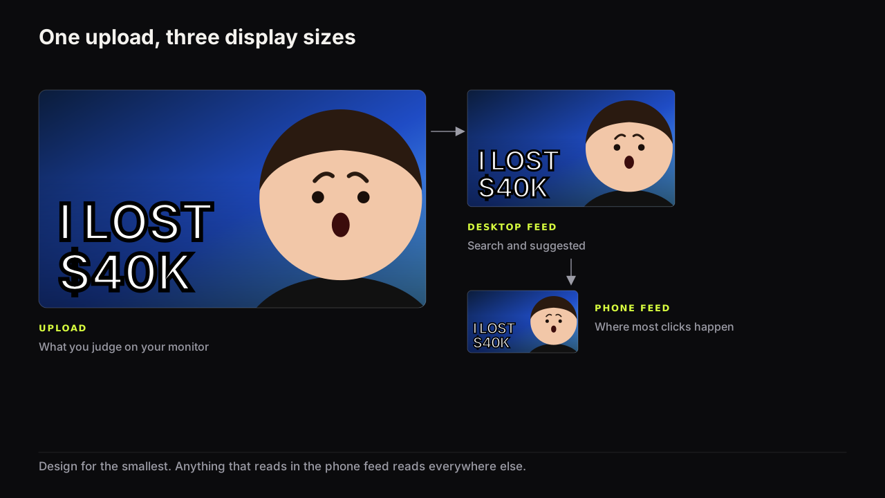
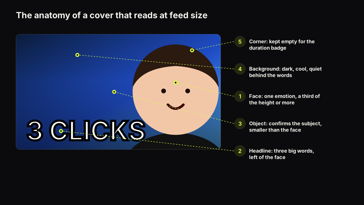
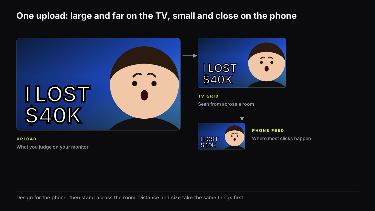
A thumbnail viewed on a TV is displayed large and seen from across a room, so it needs what the phone feed needs: three words or fewer, a face at half the height, one object with a shape that reads at distance, and no thin strokes. It then adds two demands of its own. Fine detail becomes visible noise, because the screen is big enough to draw it and the viewer is too far away to resolve it, and low brightness contrast looks flat under living-room light. You do not upload a TV version; the same file serves every surface. The job is to make one cover that survives both the smallest screen and the most distant one.
Connected TV is not a side surface any more. Deadline reported that in early 2025 connected TV became the largest US YouTube watch surface, based on Nielsen-derived figures. Whether your own channel is watched that way is a question for your analytics, where the device type report answers it. If a meaningful share of your views come from TV screens, the living room is a place your cover is judged, and it is a place most creators have never looked at their own cover.
The ten-foot view: what a TV does to a cover
Interface designers call a TV screen a ten-foot UI: a display read from a sofa, across a room, with a remote instead of a thumb. Three things follow for a thumbnail.
The cover is far away. Distance does to the eye what shrinking does: a stroke that is thin at arm's length is invisible at three metres, and an expression that needs the eyebrows to be read is an oval. That is why the readability rules for the phone feed already cover most of what a TV needs. The failure modes overlap almost completely.
The cover is in a grid. On the TV home screen a cover sits in rows of covers, and the viewer moves a highlight from tile to tile with a remote. Each cover is compared with its row neighbours for longer than on a phone, and the comparison is made across the room, where only shape, brightness and dominant colour register.
On the TV apps we check, the viewer steps a focus highlight across a row one tile at a time, and the focused tile is drawn larger or brighter than its neighbours. The rest of the row is still visible and still competing. A cover that separates from its row by brightness or colour is found first; a cover that matches the row is skipped over as the focus moves. None of this is documented as a fixed layout, and it varies by device and app version.
Then there is size, the part that differs from the phone. A TV draws fine detail rather than dropping it, and the viewer is too far away to resolve it, so detail that vanished harmlessly on the phone becomes visible texture on the TV. A busy background that read as a soft blur on a phone reads as clutter from the sofa.
What changes on a TV, and what does not
The same cover should serve both surfaces, so the rules below are written to satisfy both at once. Where the TV asks for more than the phone, it is noted.
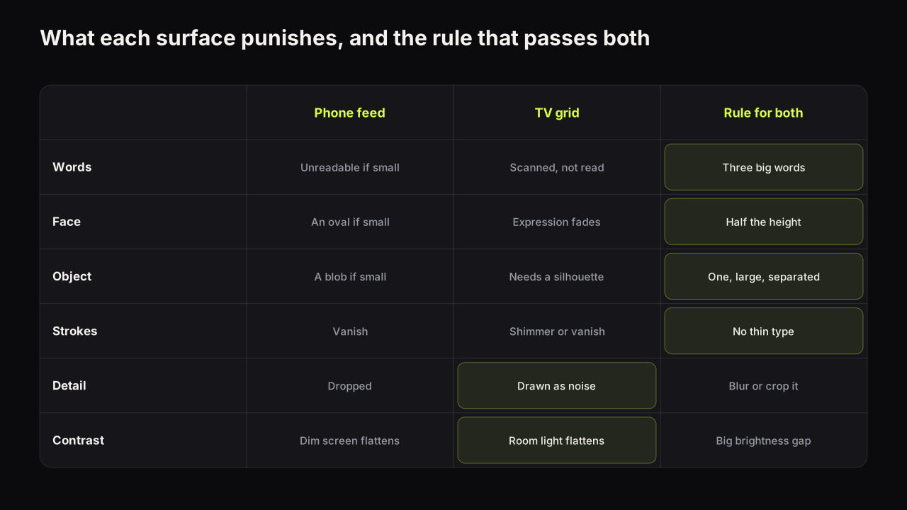
| Element | Phone feed | TV grid | Rule that satisfies both |
|---|---|---|---|
| Words | Small type is unreadable | Legible, but the viewer is scanning, not reading | Three big words or fewer, heavy type |
| Face | A small face is an oval | Expression fades with distance | Half the height, one clear emotion |
| Object | A small object is a blob | Needs a recognisable silhouette | One object, large, cut out or lit to separate |
| Strokes | Thin strokes vanish | Thin strokes shimmer or vanish | No thin type, no fine outlines |
| Detail | Dropped by the shrink | Drawn, then unresolved: visible noise | Blur, darken or crop the background |
| Contrast | Dim screens flatten hue | Living-room light flattens small gaps | A large brightness gap, one dominant colour |
Two of these deserve a closer look because they are where the TV asks for more.
Fewer words, not bigger words. A TV can display a fourth or fifth word legibly, which tempts creators who know their audience is on TV to write more. Resist it. A viewer with a remote is scanning a grid, and each tile gets a glance, not a read. Three big words, or up to five if two are small, is the ceiling on every surface, and on a TV the reason is attention rather than pixels.
A bigger face. A face that fills a third of the height passes the phone check. From across a room, that same face carries the fact of a person and loses the expression. We recommend the face-size floor at half the height wherever a channel has a large TV audience, with the eyes and mouth lit and the expression unambiguous, because the expression is the part distance takes first.
Take a hypothetical cover for a woodworking video: the finished walnut table in a bright workshop, a wall of tools behind it, "HOW I BUILT THIS TABLE" in five thin white words along the bottom. On a phone it is a brown blur with a caption. On a large TV from the sofa it fails differently: the tool wall resolves into visible clutter, the thin type shimmers, and the table, the same brown as the floor, merges into it. One rebuild fixes both. Crop to the table's edge with the grain lit from the side, black out the wall, and set "WALNUT. £90." in two heavy words in warm white. The viewer infers a handsome build on a small budget, at arm's length and from across the room.
What does not change: the file, the layout, the promise, and the corners. The bottom-right corner still carries the duration badge on the surfaces we check, and the headline still stays off the bottom edge. Anything designed to survive the phone feed is still the right design; the TV removes any excuse for detail. We would still design every cover for the phone first, even though connected TV is now the largest US watch surface by Deadline's report, because a cover that passes the phone check nearly always passes the room check and the reverse does not hold: a cover built for the sofa can carry a fourth word and a mid-sized face that the phone destroys.
Design for the phone feed first, then stand across the room. If a cover reads at thumb width and from the sofa, it reads everywhere in between. The phone check finds small things; the room check finds faint and busy things, and those are the two errors that survive a monitor.
Why one file serves every surface
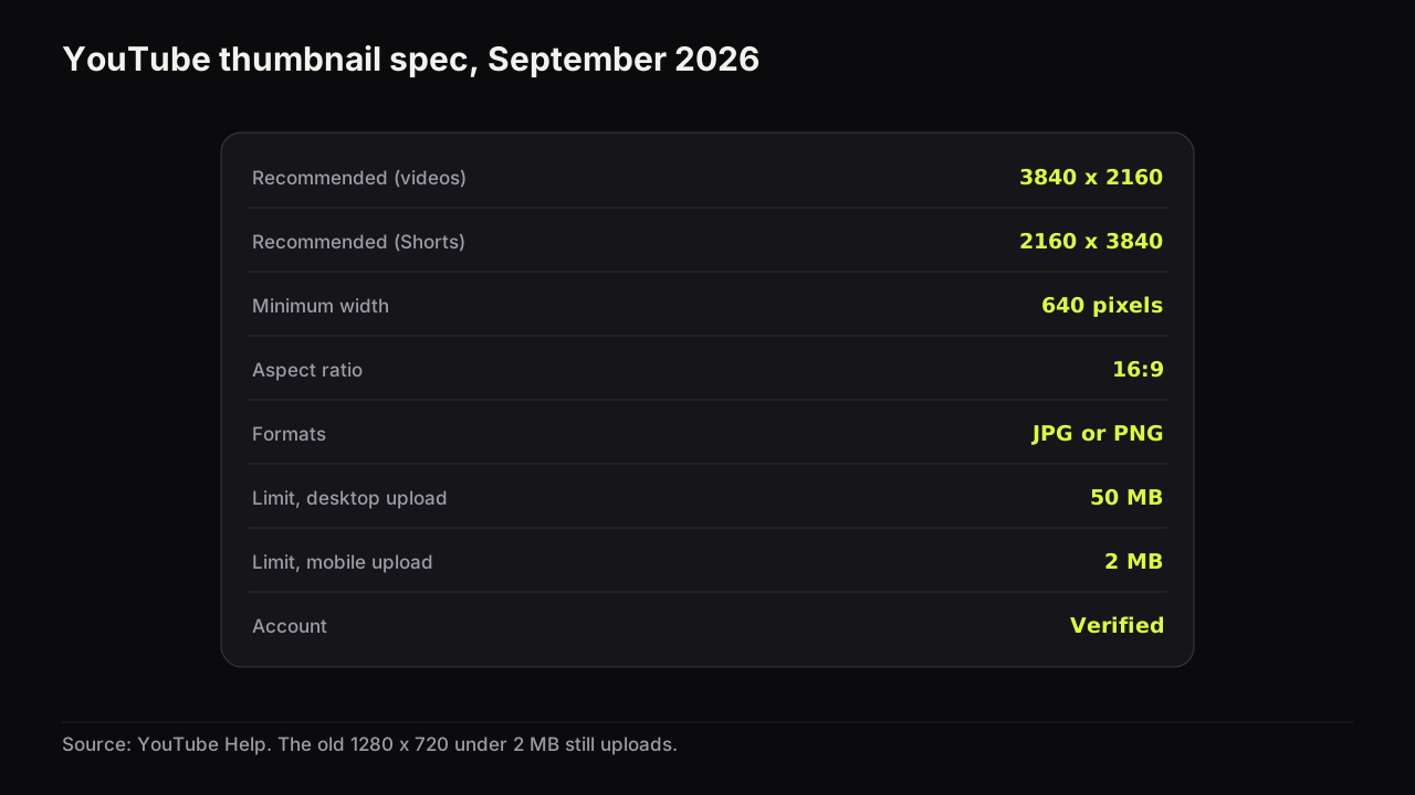
There is no TV thumbnail. YouTube's help page on custom thumbnails recommends a 3840 x 2160 upload for videos, with a minimum width of 640 pixels, JPG or PNG, and a 50 MB limit from desktop as of September 2026. That one file is resized by YouTube for every surface it appears on: the phone Home feed, the suggested column beside a playing video, search, and the TV app. You control the file. You do not control the display, and there is no per-surface setting.
The 3840 x 2160 recommendation and the 50 MB desktop limit arrived together in late October 2025, as reported by 9to5Google. The older 1280 x 720 recommendation and 2 MB limit still upload, because they clear the minimum width and the size caps.
The full spec, including the mobile upload limits and how to export for it, is in the thumbnail size and specs guide. The point that matters for TV is what the larger recommendation buys you. On a phone it buys nothing: the cover is displayed at a fraction of even the old size. On a TV home screen the cover is displayed large, and a source that was soft at 1280 x 720 can look soft there, while a sharp 3840 x 2160 source looks like a photograph. The 4K spec is, in practice, a TV spec.
Sharpness and compression: where the big screen shows the file
A large display shows two things a phone hides: softness and compression artefacts. Softness comes from upscaling a small source. Artefacts come from a JPG saved at a low quality setting, and they show most on flat colour fields and around hard edges, exactly where a bold thumbnail has its ground and its type.
Three habits avoid both. Export from the largest source you have rather than enlarging a small one. Use PNG, or a JPG at a high quality setting, for covers with large flat areas. And keep the design bold enough that a little softness would not matter; a cover that depends on a crisp thin line is fragile on every surface.
On the bench, renders come out at 2K, and Export 2K gives you the full-size render for the surfaces that display it large; Export HD gives a 1280 x 720 file under 2 MB for a mobile upload. The headline is rendered into the image at that size rather than pasted on afterwards, and the editor's text layers use heavy fonts that hold their edge when the file is shown big. The export options are the same on every plan.
The TV check, step by step
The phone check is a habit most creators have. The room check is not, and it takes a few minutes.
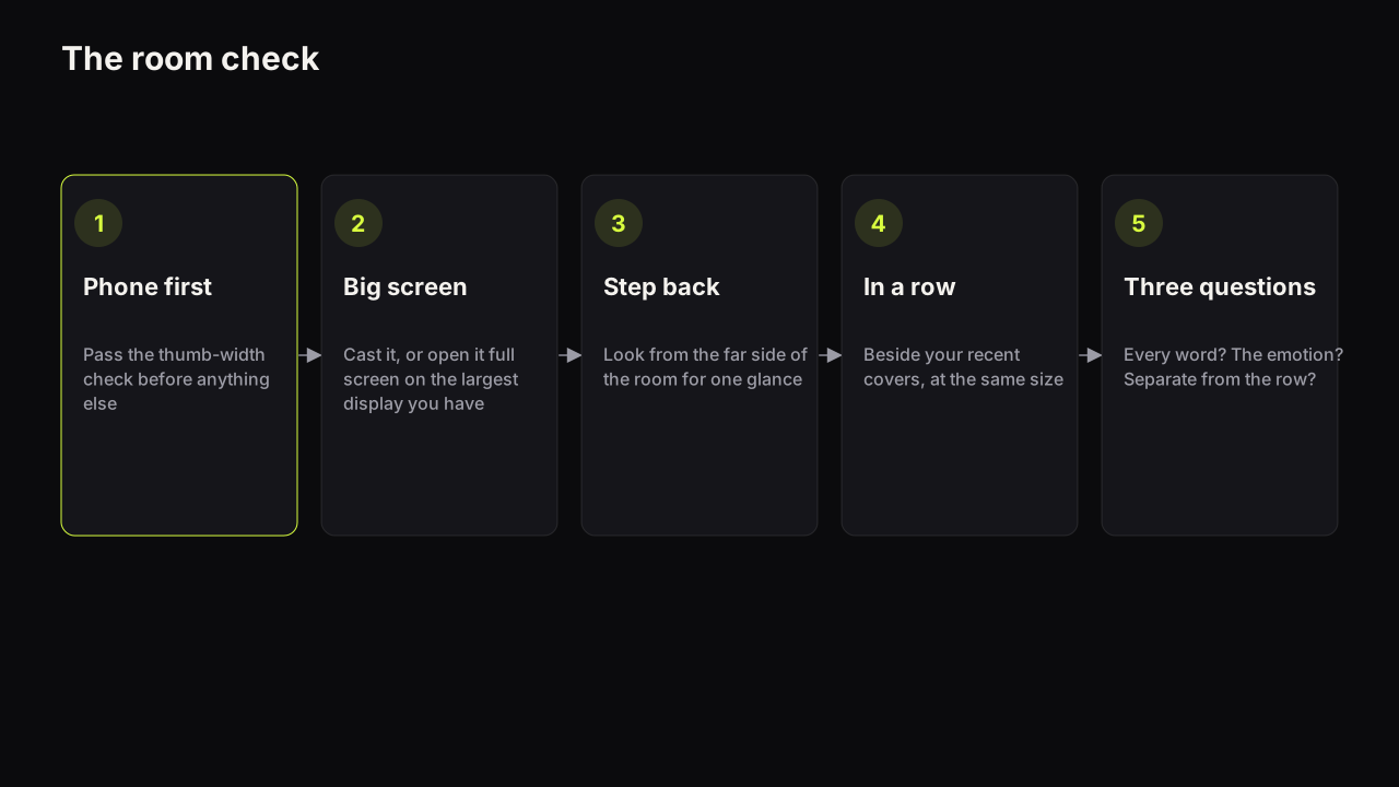
- Finish the phone check first. Shrink the cover to thumb width or drop it into the free thumbnail tester, which places it in a mock search result and a phone feed. Fix anything that fails there before going further.
- Put the cover on the biggest screen you have. Cast it to the TV, open it from a USB stick, or open it full screen on a laptop or monitor. The screen does not need to be a TV; it needs to be large enough to stand back from.
- Stand across the room. Go as far as the space allows and look at the cover for the length of a glance, not a study.
- Put it in a row. Place the cover beside three or four of your own recent covers at the same size, and if you can, beside the kind of covers your niche's row is made of. A cover alone on a screen always looks fine; the question is whether it is found in a row.
- Ask three questions. Can you read every word? Can you name the emotion on the face, or the feeling the object gives? Does the cover separate from its neighbours by brightness or colour, not just by subject? A no on any one of them is a fix, and the fix is almost always one of: cut a word, enlarge the face or object, or raise the brightness gap.
The third question is the one a TV changes most. Living-room light and a screen set up for films flatten small brightness gaps, so a cover that separated on a monitor by a small margin merges with its row from the sofa. The reasoning about which colour pairs hold up and which collapse is in the colour and contrast guide; the short version is that brightness contrast is what survives, and a warm face on a dark cool ground is the most reliable pair on any screen.
Fonts and strokes from across the room
Thin strokes fail twice on a TV: they are too fine to resolve at distance, and the TV's own scaling and sharpening can make them shimmer. A heavy, tight typeface reads as a shape from the sofa; a light or condensed one reads as a smudge. The same weight rule applies to outlines around the face and the headline: make the outline thick enough to be a shape of its own, or leave it out. Which fonts hold up at feed size, and why weight and spacing matter more than a font's character, is a topic of its own.
The principles behind all of this, hierarchy, contrast, simplicity and readability, are set out in the design principles guide, and a TV does not add a fifth. It applies readability at a distance instead of at a size, and it makes contrast harder to satisfy by putting a lamp behind the viewer.
The TV-ready cover checklist
Run it after the phone check, at the far side of the room.
- Three big words or fewer, in a heavy face, with no thin strokes anywhere on the cover.
- The face fills half the height, or the object has a silhouette you can name from across the room.
- The background is plain, blurred or darkened; nothing in it is drawn finely enough to become noise on a big screen.
- The brightness gap between the subject and the ground is large, not merely present.
- The dominant colour differs from your own recent covers and from the row your niche sits in.
- The source file is sharp at its export size; nothing has been upscaled.
- The bottom-right corner is empty and the headline is clear of the bottom edge.
Common questions
Does YouTube show a different thumbnail on TV?
No. The one file you upload is resized for every surface, including the TV app. There is no separate TV thumbnail to upload and no setting for one. What differs on a TV is the display size, the viewing distance and the grid the cover sits in.
Do I need to upload a 4K thumbnail for TV?
YouTube recommends 3840 x 2160 as of September 2026, and the TV home screen is the surface where that headroom shows, because it displays the cover large. A sharp 1280 x 720 still uploads and still reads. Upscaling a soft image to 4K adds nothing.
Should I make the text bigger for TV viewers?
Make it bigger for everyone. Three heavy words that read at thumb width on a phone also read from across a room. If a headline only reads on a TV, it fails on the surface most viewers use to decide.
What to do next
Open the device type report in your analytics and find out what share of your watch time comes from TV screens. If it is a meaningful share, add the room check to your pre-upload routine tonight: cast your next cover to the TV, stand at the back of the room, and ask the three questions. Then run the full pre-upload checklist, which adds the promise and spec checks the room check does not cover.