On this page
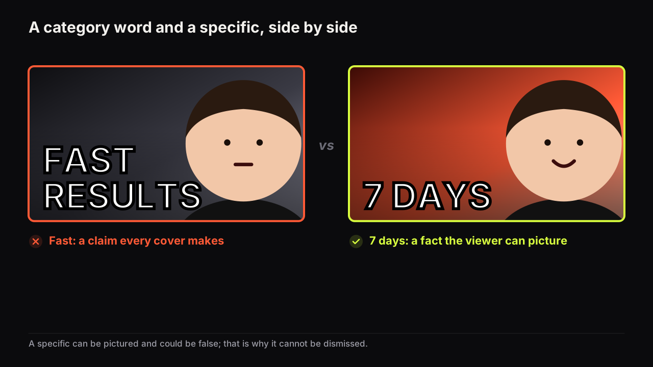
A specific detail on a thumbnail beats a category word because a specific can be pictured and cannot be dismissed. "Fast" is a claim the viewer has seen on every other cover in the row; "7 days" is a fact about this one, and the viewer has already imagined a week before deciding whether to click. The lever works on numbers, places, names and objects, it works without giving the ending away, and it fails in a handful of predictable ways.
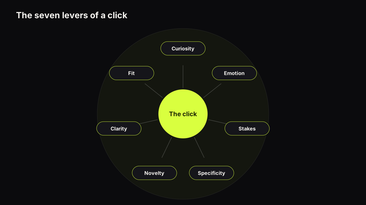
The psychology pillar gives specificity one section among seven levers; this is the deeper piece. For where the lever sits among the other six, read the account of why people click one cover over another.
Why a specific works: two things a category cannot do
A specific detail does two jobs a category word cannot, and both happen before the viewer has decided anything.
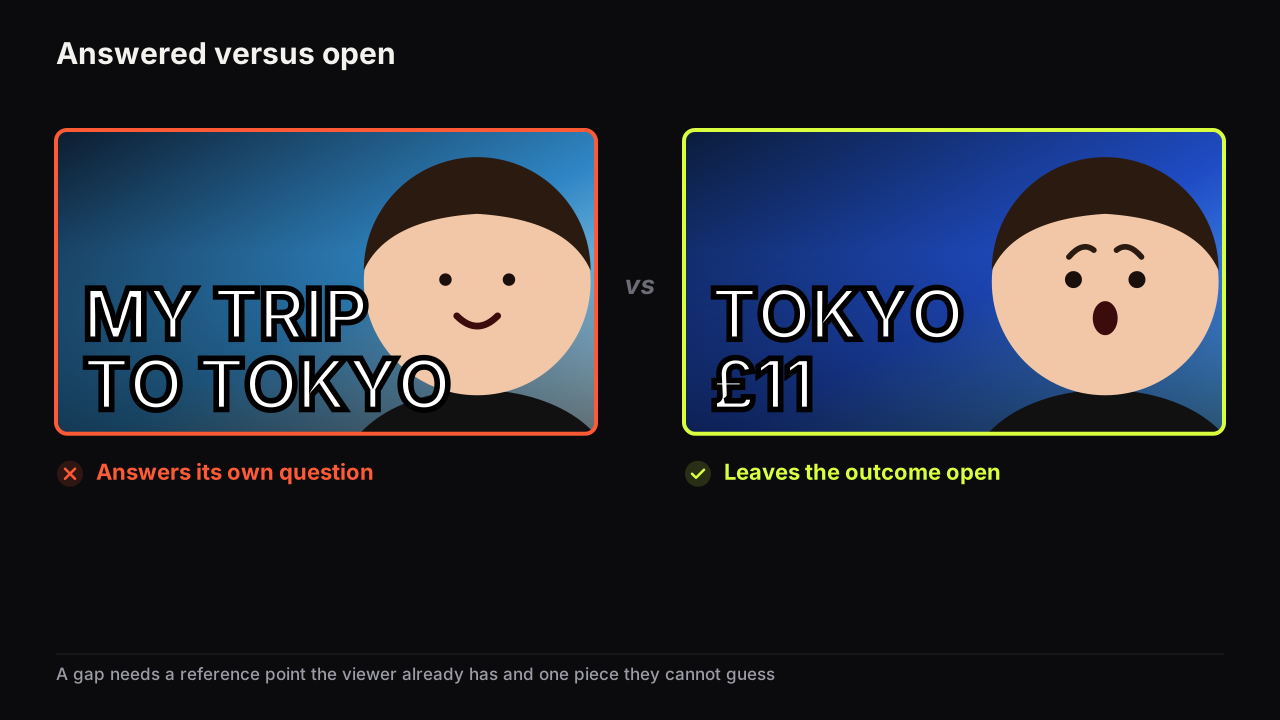
It can be pictured. "Cheap" has no image. "$3" is a coin, a note, a receipt. "Abroad" is nothing; "TOKYO" is a street the viewer has seen in films even if they have never been. When the viewer builds the image, the cover has already done part of the video's work in their head, and the question that forms is about that image: three dollars for what, exactly? A category word forms no image and so no question, only a mood.
It cannot be dismissed as a claim. A category word is an opinion, and viewers discount opinions on covers because every cover has one. "AMAZING", "INSANE", "BEST" cost nothing to write and the viewer knows it. A specific is a checkable statement. "$4,100" could be wrong, and because it could be wrong it reads as something the creator is prepared to be held to, which is to say a report. The viewer cannot wave away a report the way they wave away an adjective; they can only wonder whether it is true, and wondering is the click.
We think the second effect is the larger one and the less discussed. Most specificity advice is about vividness. In the rows we look at, the specific covers win less because they are vivid and more because they are the only covers in the row making a claim that could be false. Everything else is an adjective, and adjectives are invisible next to a figure.
A specific also does something for the title. When the cover carries the precise detail, the title is free to carry the context, and the two stop repeating each other. The finance example that runs through this library, "$4,100 SAVED" on the cover and "I paid off my car loan two years early" in the title, is a specificity decision as much as a packaging one; dividing the promise between title and cover is the packaging side of it.
The four kinds of specific
Not every video has a number. Every video has one of these.
| Kind | Category version | Specific version | What the viewer pictures |
|---|---|---|---|
| Number | A LOT, FAST, CHEAP | $3,200, 7 DAYS, 12 CENTS | A quantity they can weigh against their own |
| Place | ABROAD, MY CITY, A BEACH | TOKYO, DETROIT, ROW 14 | Somewhere they can locate |
| Name | A LAPTOP, MY CAR, THIS GAME | THE M2 AIR, A 2009 CIVIC, ELDEN RING | A thing they can recognise |
| Object | MONEY, FOOD, TOOLS | ONE COIN, THE RECEIPT, A SINGLE SCREW | One thing rather than a kind of thing |
Time belongs with numbers and deserves its own mention, because a clock time is the most specific detail a cover can carry for the fewest characters. "3:14 AM" implies a story on its own, and it does it in six characters. Day counts, deadlines and durations do the same job at slightly lower intensity.
Names carry a rights question the other three do not. A product name or a game title is usually fine to write; a person's name or face is not yours to put on a cover without consent, and the policy and consent side of packaging sets out where the line sits. When in doubt, the object or the number carries the specificity and the name stays in the title.
The precision dial
Specific is not the same as exact, and more digits are not always more specific. Precision is a dial and both ends fail.
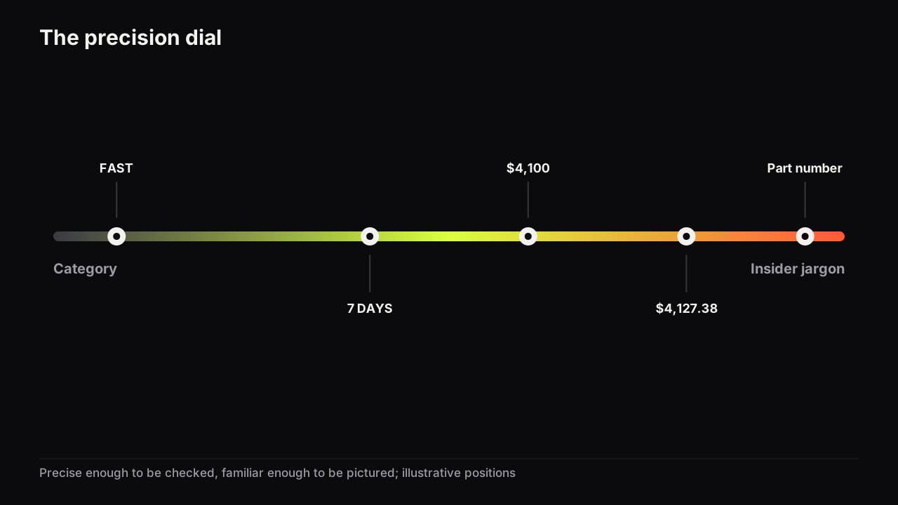
At the vague end sit the category words, and the fix is obvious. At the far end sit two different failures. The first is the specific nobody outside the niche can picture: a part number, a version string, a stat only insiders track. It is precise and it forms no image for most of the row, so it works only where the row is entirely insiders, which is a niche fit question. The second is false precision: a figure with so many digits that it stops being a shape at thumb size and starts looking invented. "$4,127.38" is not more believable than "$4,127"; it is less readable and, past a point, less credible, because nobody remembers their savings to the cent.
Set the dial by the job the number does. A result the viewer might doubt wants an exact figure with the digits that make it look real and no more: $4,100, not $4,000 and not $4,127.38. A frame the viewer takes on trust wants a clean number: 30 DAYS, not 31; $500 PC, not $487. And a figure that means nothing without a unit or a reference gets the unit on the cover and the reference in the title. This is our recommendation from what reads well at feed size, not a measured rule.
We would put the exact result figure on the cover even though it is the number a commenter will argue with. The argument is a kind of attention the adjective never gets, and a figure someone could dispute is a figure that reads as true. A rounded result avoids the argument by looking like an estimate, which is the same as looking like a claim.
The number-only treatment, where the figure is the largest thing on the cover and everything else supports it, is its own layout with its own rules; the dial above applies to it, and to a specific that is one word among three.
Specific without spoiling
The objection creators raise is that a specific gives the video away. It does not, unless the specific is the answer. The trick is to choose which part of the promise carries the precision.
A video has a setup, a cost, a method and an outcome. Be exact about one of the first two and leave the last two open, or be exact about the outcome and leave the method open. "7 DAYS" is a setup; what happened in them is the video. "$3 IN TOKYO" is a cost; how, and what it bought, is the video. "$4,100 SAVED" is an outcome; the method is the video. What gives the video away is being specific about the method: "PAID BIWEEKLY" answers the question the cover should be raising.
This is where specificity and the information gap meet. A gap needs a definite missing piece, and a specific is what makes the piece definite: the viewer who reads "DAY 47" knows exactly what they do not know. The method for opening a question the video has to answer sets out three ways to build a gap; the specific is what all three are built from.
The covers creators worry are "too revealing" almost never are. The ones that spoil tend to be the ones that went vague and then over-explained in the title to compensate. A precise cover and a short title leave more open than a vague cover and a long title, in the channels we look at.
Specificity by niche
Each niche has a kind of specific it reaches for and a kind it should avoid.
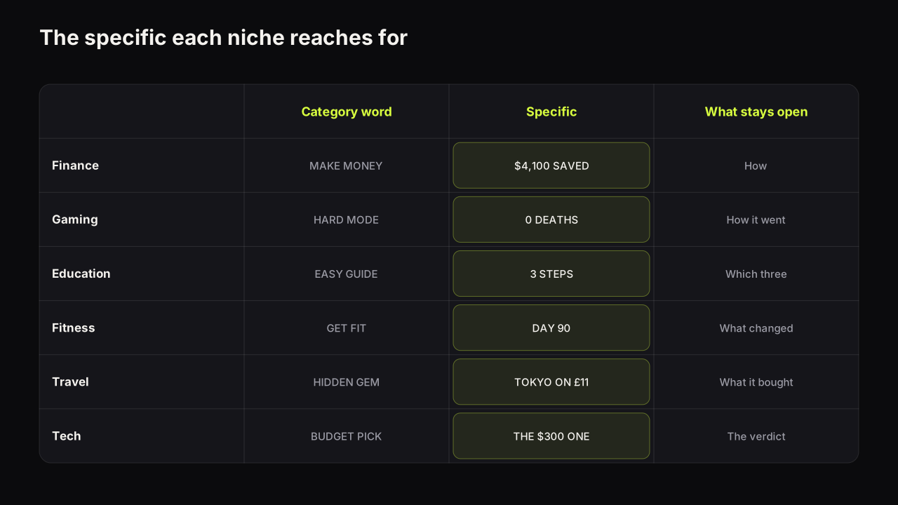
Finance and business. The number, with a currency sign and often a direction. The row is full of "MAKE MONEY" and "PASSIVE INCOME"; a figure with a sign reads as a report beside them. Avoid percentages without a base, because "40%" of nothing pictured is a category word with a symbol. The finance patterns piece covers how the number pairs with a calm face.
Gaming. The name and the count: the game, the character, the item, "0 DEATHS", "LEVEL 1 ONLY". The row is insiders, so the dial can sit further towards jargon than in any other niche, and the object (a specific weapon, a specific boss) carries specificity a number cannot. The failure is the patch note: a version number that even the audience skims past.
Education and tutorials. The count and the time: "3 STEPS", "ONE FORMULA", "12 MINUTES". Specificity here is a promise of size; a small precise number says "this is contained", which is what a learner wants. The calm register education rewards means the specific should feel like a table of contents, not a dare.
Fitness. The day count and the body measurement, and the body itself as the object. "DAY 90" and "-14 KG" are the row's grammar. The failure is the precise claim the video cannot show being true, which is a policy question before it is a design one.
Travel and vlog. The place and the cost: "TOKYO", "£11", "ROW 14". Travel rows are full of category words ("PARADISE", "HIDDEN GEM") and a proper noun stands out among them. The face is smaller in this niche and the place carries more, so the specific often is the picture rather than the headline.
Tech and reviews. The named product and the price. "THE $300 ONE" beside a shelf of them is a review in four characters. The failure is the spec-sheet specific: a chip name or a refresh rate that describes the product without saying anything about the verdict.
Three ways specificity fails
- The specific the picture contradicts. "TOKYO" over a kitchen that is obviously not in Tokyo, "$3" beside a plate that is obviously not three dollars of food. The viewer believes the picture and dismisses the words, and the cover has spent its specific on losing trust.
- Two specifics on one cover. "$3 IN TOKYO IN 24 HOURS" is three claims, and at thumb size three claims are a sentence. Pick the one that carries the promise and give the others to the title. The word limit and the specificity rule pull the same way: three big words is room for one specific and a qualifier.
- The specific that repeats the title. "$4,100 SAVED" on the cover and "How I saved $4,100" as the title is one specific used twice. The second look teaches nothing. Cover carries the figure, title carries the what and the who.
A fourth, quieter failure is the specific that is not specific to this video. "DAY 1" on every upload of a series is a label, not a detail. If the same specific could sit on the last cover and the next, it has stopped being one.
Designing so the specific arrives first
Specificity is a headline decision first and a hierarchy decision second. Once the detail is chosen, it should be the biggest text on the cover, set in numerals not words (7 not SEVEN, $ not DOLLARS), on its own line if there is a stack, and in the accent colour if only one thing gets it. The object, where there is one, should be the specific thing rather than the icon for the kind of thing: the actual receipt rather than a money graphic, the one screw rather than a toolbox.
Say the video is a week of meal prep. The first cover is a tray of six identical containers, a smiling face, and CHEAP HEALTHY MEALS in three colours at one size. The viewer infers a category video they have scrolled past before, and nothing on it could be false. The redraw opens one container in the foreground so it fills a third of the height, shrinks the face and turns it toward the food, and carries £1.40 A MEAL as the only words, the figure in the accent yellow and twice the size of the rest. Same tray, same week. Now the viewer is doing the arithmetic against their own lunch, and the method is still in the video.
On the bench, the specific goes in the headline field ("Words on it") and the model renders it into the scene; describe the object in the prompt as the particular thing, not the category, for the same reason. The Number Pop style is built for the case where the figure is the whole promise. When the digits have to be exactly right, the editor's text layers give you the precise figure in a real font over the render.
The specificity check
- Is there one number, place, name or object on the cover that could be false?
- Can a viewer outside your inner audience picture it?
- Is the precision set by the job: exact for a doubted result, clean for a frame?
- Is the specific about the setup, cost or outcome, and not about the method?
- Does the picture agree with the specific?
- Is there only one specific on the cover, with the rest in the title?
- Could this exact cover sit on a different video of yours? If yes, it is a label.
Common questions
Does a specific thumbnail give away the video?
Only if the specific is the answer. Be specific about the setup, the cost or the result, and leave the cause, the method or the outcome to the video. "7 DAYS" says how long; it does not say what happened. "$4,100 SAVED" says how much; it does not say how. The specific makes the question sharper, not shorter.
Should thumbnail numbers be rounded or exact?
Exact when the number is a result and the viewer might doubt it: $4,100 reads as a receipt where $4,000 reads as an estimate. Rounded when the number is a frame rather than a result, such as a day count or a budget, where 30 DAYS reads cleaner than 31. Never so many digits that the figure stops being a shape at thumb size.
What if my video has no number in it?
A specific does not have to be a number. A place, a named object, a time of day or a single concrete thing all work: TOKYO, THE BLUE ONE, 3 AM, ONE SCREW. If the video has nothing that concrete, that is a note about the video rather than the cover, and it is worth catching before you film.
What to do next
Take the headline of your next cover and underline every word that could be false. If nothing is underlined, replace the biggest adjective with the most concrete detail the video contains. Then decide whether that detail is the setup, the cost or the outcome, and check that the method stays in the video. If the detail is money, time or risk, it is also a stake, and how stakes work on a cover is the next read; a specific with something at risk is the strongest headline this library knows.