On this page
- What counts as a stake
- Whose stake it is changes how it reads
- Loss against gain
- Show the stake as an object, not an icon
- The face is the stake's emotional price
- Stakes without exaggeration
- Where stakes are the whole game, and where they scold
- Designing a cover around a stake
- The stakes check
- Common questions
- What to do next
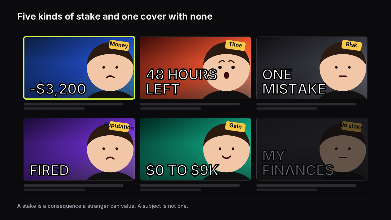
A stake on a thumbnail is something a person could lose or gain that a stranger can value without knowing them: money, time, their body, their standing, or something that cannot be undone. Stakes work because the viewer does not need to care about the creator or the subject to care about the consequence. A figure with a minus sign is felt before it is understood. There are five kinds of stake, two ways to frame one, and a policy line that inflating one crosses faster than any other lever.
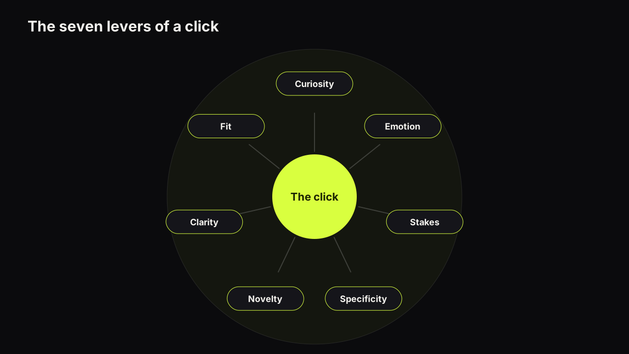
The psychology pillar names stakes as one of seven levers and gives the failure it sees most, the number with no owner. For the lever's place among the other six, start with the full account of why viewers click one cover in a row; this piece stays on the stake itself.
What counts as a stake
A stake has three properties, and a cover element missing any one of them is not a stake, whatever it looks like.
- It can be lost or gained. A subject cannot. "RETIREMENT" is a subject; "RETIRED AT 41" is a gain and "NO PENSION" is a loss.
- A stranger can value it. The viewer has to be able to feel the size without context. "$3,200" works for most audiences; "MY WHOLE COLLECTION" works only for viewers who know what was in it.
- Someone owns it. The person on the cover, the viewer, or a named third party. A figure floating with no one to lose it is a price, and the pillar's point that a number with no owner reads as a price tag is the one-sentence version of this section.
Five kinds of thing pass all three tests, and each has a characteristic set of words and a characteristic object.
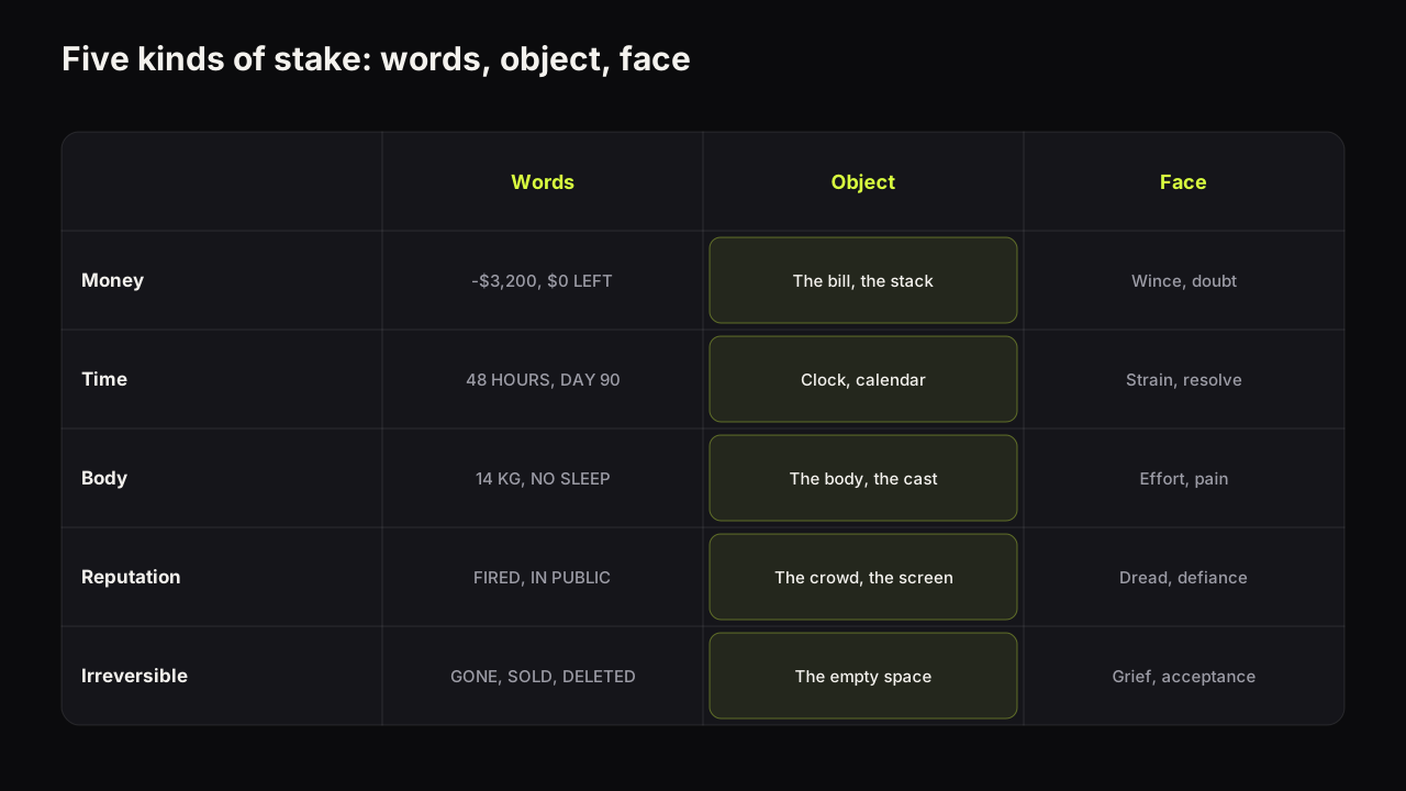
| Stake | Words that carry it | Object that shows it | Face that fits |
|---|---|---|---|
| Money | -$3,200, $0 LEFT, $9K | The bill, the empty wallet, the stack | Wince, or quiet relief |
| Time | 48 HOURS, DAY 90, 3 YEARS | A clock, a calendar, a grown-out result | Strain, resolve, tiredness |
| Body | 14 KG, BROKE MY ARM, NO SLEEP | The body, the cast, the plate | Effort or pain |
| Reputation | FIRED, IN PUBLIC, THEY SAW | The audience, the boss, the screen | Dread, embarrassment, defiance |
| The irreversible | IT'S GONE, SOLD, DELETED | The empty space where it was | Shock, or flat acceptance |
The last row is the least used and, we think, the most under-rated. Irreversibility is a stake even when the thing lost is small, because the viewer knows it cannot be put back. "DELETED" over an empty folder is a stronger cover than "I LOST SOME FILES" over a laptop, even though the second might be the larger loss.
Whose stake it is changes how it reads
The same consequence reads differently depending on who is exposed to it.
The creator's stake. "I LOST", "MY", "I HAVE 48 HOURS". The most common and the most trusted, because the person telling the story is the person who paid for it. It pairs with eye contact and a face that has been through something. It is also the easiest to keep honest, because the video is about what happened to you.
The viewer's stake. "YOU'RE LOSING", "YOUR MONEY", "BEFORE IT'S TOO LATE". Reads as a warning, and warnings work in rows where the audience is already anxious (finance, health, security). The cost is that a viewer's stake with no evidence reads as fear-mongering, and the audience that trusts a report distrusts a threat. Use it when the video shows the mechanism by which the viewer is exposed; otherwise it is a scold.
A third party's stake. "THEY LOST $2M", "HE GOT FIRED". Commentary and news rows live here. The stake is real and the distance makes it comfortable to watch, which is the appeal. The risks are fairness and consent: a real person's loss on your cover is a claim about them, and the packaging mistakes that cross into policy include framing someone's situation as something it was not.
Default to the creator's stake when the video allows it. It is the most believable of the three, it keeps the face on the cover honest (the person wincing is the person who lost), and it cannot misrepresent anyone else. Reach for the viewer's stake only when the video demonstrates the exposure, and for a third party's only when the facts on the cover are the facts.
Loss against gain
A stake can be framed as something lost or something gained, and the two do different jobs on a cover.
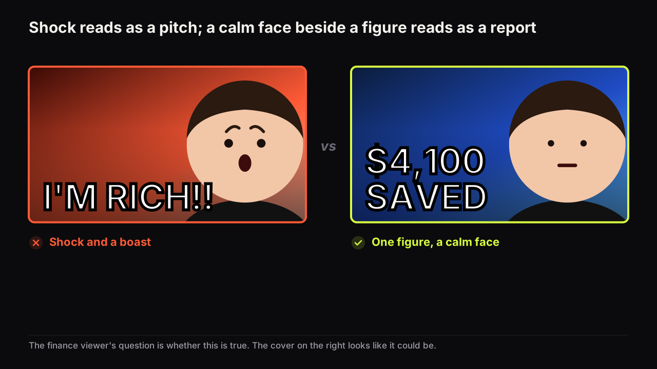
A loss framing makes the viewer ask what happened. It carries a story: something went wrong, and the video is the account. It pairs with the specific figure and the wince, and it stops the eye in rows full of promises because it is the only cover admitting something. A gain framing makes the viewer ask how. It carries a method: something went right, and the video is the recipe. It pairs with the clean number and the calm face, and it suits the rows where the audience is looking for instruction rather than drama.
Across the finance, fitness and business rows we look at, loss covers stop the scroll more often and gain covers fit the calmer niches better, and we cannot put a figure on either. The loss covers that fail tend to be the ones on videos that end well: the viewer arrives for a disaster and gets a success story, and the mismatch shows in how early they leave.
The framing has to match the video's shape, not the niche's habit. A video whose arc is "I made a mistake and here is what it cost" is a loss cover. A video whose arc is "here is how I got this result" is a gain cover. A loss cover on a gain video earns the click and loses the viewer, which under a testing tool that decides by watch time share is the worst of both.
We think most creators under-use the gain framing out of a belief that loss always wins. In a row where every cover is a loss, the one calm gain cover is the odd one out, and the pattern-interruption lever does the work the loss lever was supposed to. The framing to pick is the one the row is short of, provided the video supports it.
Show the stake as an object, not an icon
A stake can be written or shown, and the strongest covers do both with the same thing. The written stake is the figure or the word. The shown stake is the object the viewer would see if they were in the room: the actual bill, the wrecked bumper, the empty shelf, the cast on the arm, the countdown on a screen.
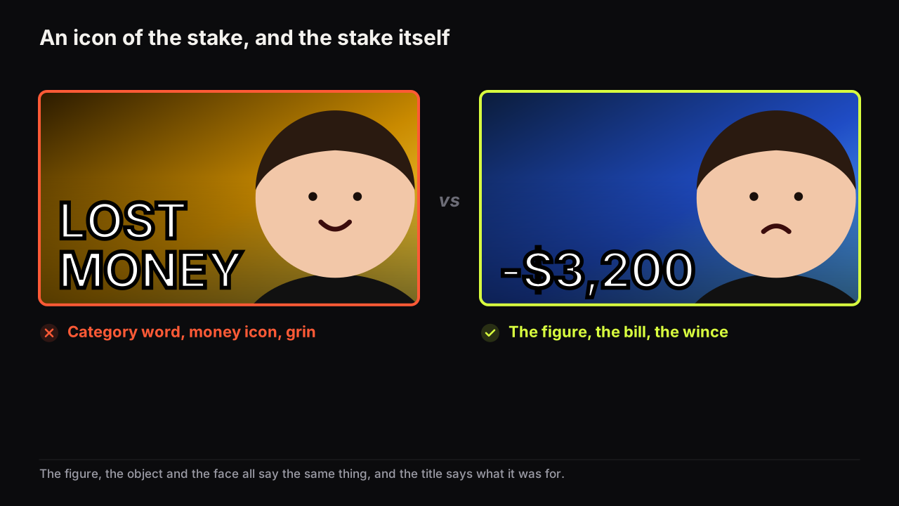
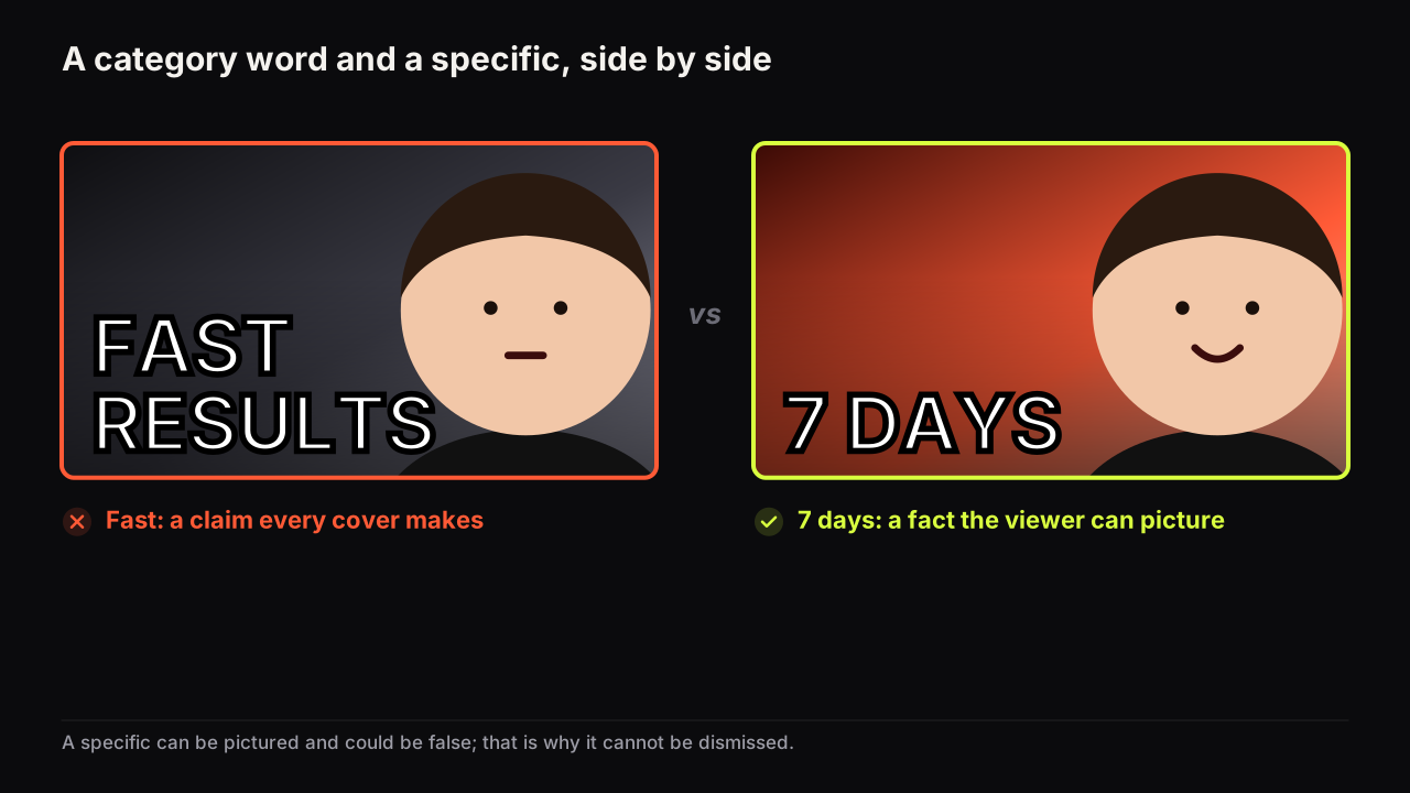
The difference between an object and an icon is the difference between evidence and decoration. A money icon says "this is a money video", which is a category. A bill with a total says "this much, on this", which is a specific and a stake at once; why a specific beats a category is the companion piece, and stakes are specifics with something riding on them. In practice:
- The receipt, not the coin graphic. The screen showing the balance, not a chart shape.
- The clock or calendar with a number on it, not an hourglass.
- The body or the cast, not a dumbbell.
- The boss's door, the crowd, the notification, not a generic "reputation" image, which does not exist anyway.
- For the irreversible, the gap: the empty parking space, the blank folder, the shelf with one item missing.
Take a hypothetical cover for a video about a van conversion that went wrong. Version one: the creator grinning beside the van, VAN LIFE FAIL across the top, a red money-bag icon in the corner. A stranger reads a category (van videos), a mood (it is a joke) and no consequence at all. Version two: the same van with its new floor ripped back out, the creator's face turned towards it in a wince, and -$4,800 in the accent colour as the only words on the cover. Now the viewer infers that this much went into a floor that had to come out, and wants to know how. We would cut the word FAIL entirely. The minus sign already says it, and the freed space goes to the face.
When the object is the stake, the figure can sometimes be smaller or go to the title, which frees the headline for the twist. When there is no object to shoot, the figure carries the whole thing and the layout becomes number-led; the number-led layout has its own rules for size and placement.
The face is the stake's emotional price
A stake tells the viewer what is at risk; the face tells them what it felt like. The two must agree. A wince beside a loss reads as someone who paid; a grin beside a loss reads as either a joke or a lie, and the viewer decides which in the row. A calm face beside a gain reads as competence; a scream beside a gain reads as a lottery win, which is fine on a gaming cover and fatal on a finance one.
The expression should be proportionate to the stake. A small stake with a huge expression is the mismatch viewers name as clickbait even when the cover is honest; a large stake with a mild expression can work as understatement in rows that trust calm. The expression that fits each promise is covered in the expression guide; the stakes rule is that the face carries the cost, not the category.
Stakes without exaggeration
Stakes are the lever that sits nearest the policy line, because inflating a consequence is the oldest way to sell a click.
YouTube's thumbnails policy says misleading titles, thumbnails and descriptions that promise content the video does not contain fall under the spam, deceptive practices and scams policy. Source: YouTube's thumbnails policy and the spam, deceptive practices and scams policy it refers to.
The practical rule is that the stake on the cover has to be in the video, at the size the cover shows, early enough that the viewer who clicked for it meets it. Four habits keep a stake on the right side of that line.
- The figure is the figure. $3,200 lost is "$3,200", not "$3,500" and not "ALMOST $4K". Rounding down is fine; rounding up is the first step across the line, and "ALMOST" and "NEARLY" on a cover are tells that the round went the wrong way.
- The stake was at risk. "I COULD HAVE LOST $40K" on a video where the money was never in danger is a hypothetical dressed as a loss. If the video is about a near miss, say near miss: "$40K, ONE CLICK AWAY" is honest and still a stake.
- The stake belongs to the video's event. A loss from three years ago on a cover for this week's routine video is borrowed drama. The viewer finds out in the first minute.
- The stake is delivered early. If the $3,200 appears late in the video, the viewer who clicked for it has been waiting for the promise, and under watch time share that wait counts against the cover.
Beyond policy, exaggerated stakes fail on their own terms. A stake that is too large for the channel reads as false before it reads as exciting; a small channel showing "$2 MILLION" with no visible reason to have had it is not believed, and an unbelieved stake is a category word with digits. The stake should be in proportion to what the audience believes this creator could have had at risk.
Where stakes are the whole game, and where they scold
Some niches are built on stakes and some tolerate them badly.
Stakes are the whole game in personal finance and business (money, time to a goal), fitness and transformation (the body, the day count), challenge and endurance formats (time, the body, the irreversible), survival and outdoors (the body), and commentary on failures (third-party money and reputation). In these rows the question is not whether to show a stake but which of the five and whose. The finance patterns piece and the fitness playbook each show the niche's version.
Stakes read as a scold in education and tutorials, where "YOU'RE DOING IT WRONG" and "STOP MAKING THIS MISTAKE" turn a helpful video into a telling-off, and the learner scrolls to the calm cover next to it. The stake that works in these rows is time saved or effort avoided, framed as a gain: "12 MINUTES", "ONE FORMULA". Cooking, craft and hobby rows behave the same way. Stakes there are cost and time, framed as small.
Stakes are the twist in travel, food and reviews, where the primary lever is the place, the dish or the object, and a stake is the second lever that sharpens it: "£11" on the Tokyo cover, "$300" on the review. One stake, small, in the accent colour, and the picture does the rest.
Designing a cover around a stake
The stake is usually the headline, sometimes the object, and it should be the first thing read after the face. Put the figure in the largest tier, with its sign or unit attached, in numerals. Put the object in the frame at a size the eye can reach from the face, and make it the particular thing rather than the kind of thing. Give the face the expression that matches the cost. Then read the title: the cover carries how much, the title carries what and for whom, and the second look is rewarded rather than repeated.
We would put the figure on the cover and the noun in the title every time the two compete for space, even though it means a viewer who reads only the cover knows how much was lost and not on what. The figure is the part a stranger can value at a glance; the noun is the part they will read a second later, and the title has 100 characters for it.
On the bench, two of the eight styles are built around the money stake: Money Stack, which puts the cash in frame as the object, and Number Pop, which makes the figure the largest element. The Cash Burst card in the reference library adds the object to any style. For the other four kinds of stake, the object goes in the prompt as the particular thing, and the figure goes in the headline field.
The stakes check
- Can the thing on the cover be lost or gained, and can a stranger value it?
- Does someone visibly own it: the face, the viewer, a named party?
- Is the framing (loss or gain) the shape of the video, not the habit of the niche?
- Is the stake shown as the object, not an icon?
- Does the face carry the cost at a proportionate size?
- Is the figure the figure, at risk, from this video, and delivered early?
- Is the stake in proportion to what this channel could believably have had at risk?
Common questions
Do stakes have to be money?
No. Money is the easiest stake to show because it has a unit, but time, physical risk, reputation and anything irreversible all work. "48 HOURS LEFT", "ONE MISTAKE", "IN FRONT OF EVERYONE" and "IT BROKE" are all stakes without a currency sign. The test is whether a stranger can value it.
Is a loss thumbnail better than a gain thumbnail?
In the rows we look at, loss framings tend to stop the eye more often and gain framings tend to fit calmer niches better; we have no measured figure for either. Loss makes the viewer want to know what happened; gain makes them want to know how. Choose by the video: a loss cover on a video that ends well is a mismatch the viewer notices early.
How big can the stake on the cover be before it is misleading?
As big as the video shows, and no bigger. YouTube's thumbnails policy sends packaging that promises content the video does not contain to the deceptive practices policy. A rounded-up figure, a stake that appears only in passing, or a loss the video reveals was never at risk all sit on the wrong side of that line and lose watch time before they lose anything else.
What to do next
Write down, for your next video, what was at risk and whose it was, in one line with a figure or a concrete thing. If the line is a subject rather than a consequence, that is a packaging problem to solve before filming; deciding title and cover before the shoot is where it gets solved cheapest. If the line has a figure, that figure is your headline, the thing it refers to is your object, and the face it deserves is the one that paid for it. The stake raises the question; the method for leaving that question open is the next read.