On this page
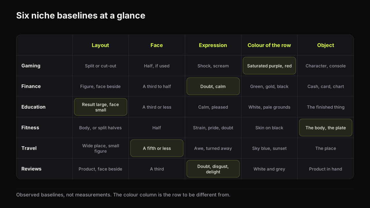
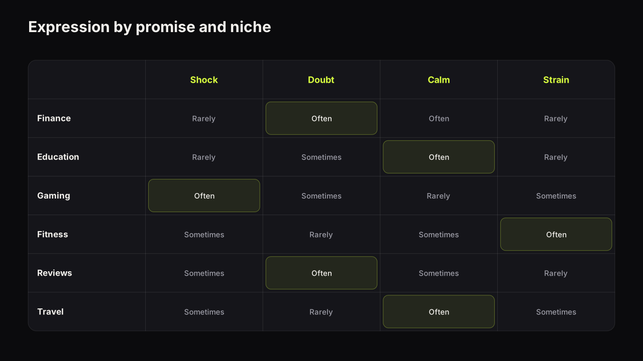
A review thumbnail works when the product is the largest thing on it and the face beside it is the verdict the video will explain. The viewer's question is "should I buy it?", and the cover answers half of it: here is the thing, here is how I feel about it, and the reason is in the video. That half-answer is the withheld verdict, the gap type the review row responds to most, and it is what separates reviews from the rows around them in the pattern table by niche.
Reviews have a pair of problems other rows do not. The product arrives with its own photography, and on launch week every cover in the row is built from the same manufacturer render, so the row has no odd one out. And the face on a review cover is a claim: a wince beside a product the video ends up praising is a promise the video breaks.
The object at the size a face would take
The object-led layout, the product first and the verdict on the face second, is one of the six layouts in the design principles guide, and it breaks when the product is small and centred. What that guide does not cover is how to make a product carry the cover, because a product is not a face and does not pull the eye on its own. Five choices do the work.
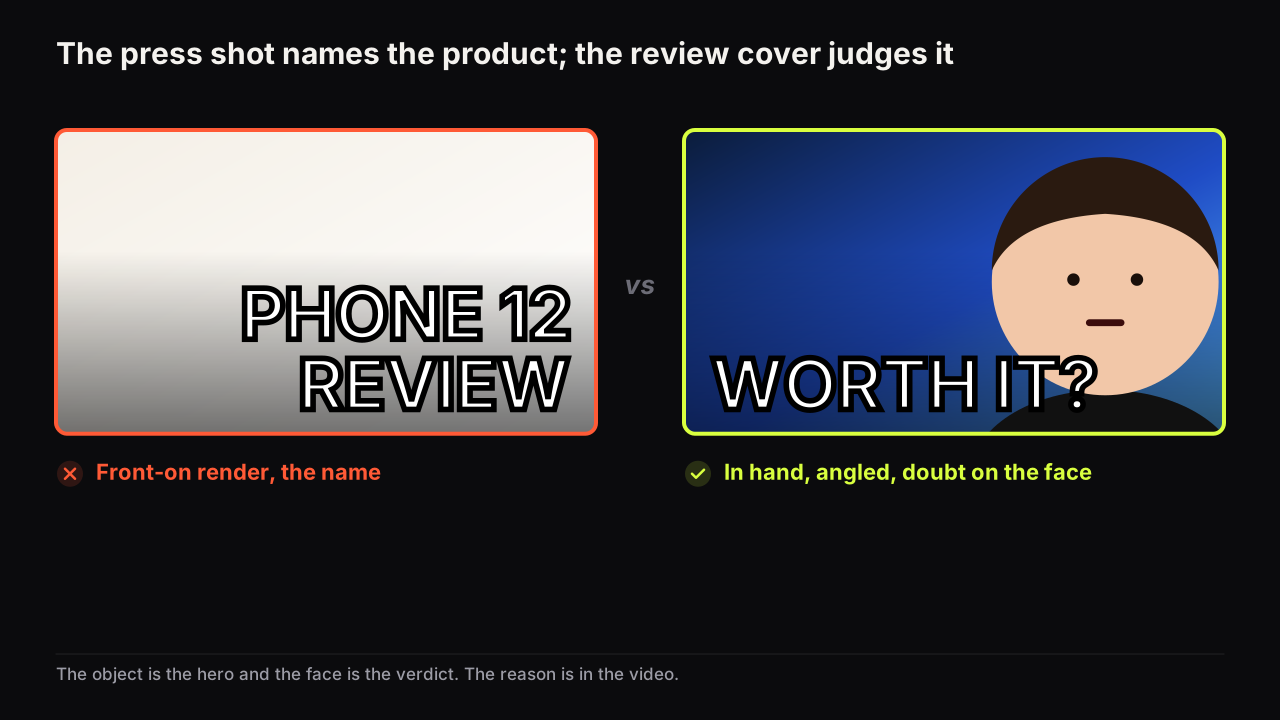
- In the hand. A hand gives scale and proves the product is real and here. A phone floating on white is a render; a phone in a hand is a review.
- At an angle. Three-quarter view, not the front-on press pose. The angle shows depth, and depth is what separates the product from the flat ground behind it.
- Lit at the edge. A rim of light along the product's outline so it separates from the ground at thumb width. Without it a dark product on a dark ground is a rectangle.
- Cropped to half the height, even if that cuts the product. A laptop cropped to its keyboard and screen corner reads better than a whole laptop at a quarter of the height. Small products (earbuds, a watch, a key) go to an extreme close-up; large ones (a car, a fridge, a monitor) crop to the part a viewer recognises.
- The screen only when the screen is the story. A phone screen on a cover is a second image inside the image. Show it when the video is about the display; otherwise turn it off or angle it away.
In the tech rows we look at, the covers that lose the first pass are not badly designed; they are indistinguishable. Same render, same white ground, same product name in the same corner. The cover that shows the product in a hand, at an angle, on a dark ground is found first because it is the only one that looks like a person is holding it.
Channels without a face on camera lose less in this niche than in most. The hand does the face's first job, which is proof that a person is present, and the verdict goes into a single word. The faceless cover guide covers the substitutes; in reviews the hand and the object are nearly always the right two.
The face is the verdict
On a review cover the face is the review's conclusion, compressed. Which expression fits which promise is the general skill. The review-specific range is narrow and each setting is a distinct claim.
| The video concludes | Face | The words withhold |
|---|---|---|
| Not sure yet, testing it | Doubt: one eyebrow, mouth closed | The outcome: "WORTH IT?", "6 MONTHS LATER" |
| Do not buy it | Disgust or a wince | The reason: "ONE PROBLEM", "THEY CHANGED IT" |
| Buy it | Delight, or a quiet nod | The catch, if any: "BUT", "ALMOST" |
| It is fine, nothing more | Flat | Nothing; the flat face is the review |
| It is better than the expensive one | Surprise, looking at the cheap one | The comparison's winner |
The face looks at the product, not at the camera. Eye contact makes the cover about the reviewer; a gaze at the product invites the viewer to judge alongside them, which is what a review is. The exception is the long-term review, where a flat face to camera says "I have lived with this" and the product can be smaller.
Make the expression match the conclusion the video actually reaches, not the conclusion that would get the click. The face is a promise about the verdict. A wince on a positive review, or delight on a warning, is the review niche's version of the false transformation, and the line it crosses is the one drawn in the packaging mistakes that can get a cover removed. Within that rule, doubt is the safest default for anything the video does not settle in the first minute, because doubt is a question and a question is a reason to click.
Whether to state the verdict in words as well is the one judgement call. A withheld verdict, doubt on the face and "WORTH IT?" as the headline, is an information gap the video closes, and it is the default. Spelling it out closes the gap.
We think the stated verdict earns its place in one situation: the video is a warning and the row is full of praise. "DON'T" beside a product every neighbour is celebrating is the odd one out, and the gap moves from "what is the verdict" to "why". Everywhere else, keep the verdict on the face and off the headline.
Versus and "worth it?": the two framings
Most review videos fit one of two framings, and each has a native layout.
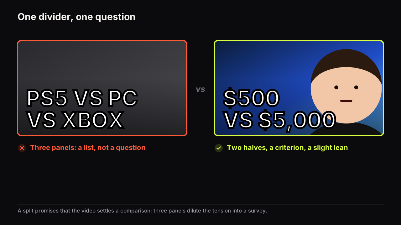
The versus. Two products, or the old one and the new one, or the cheap one and the flagship, one per half, and the question forms on its own. The mechanics of the divider, the centre badge and what to put on each side are in the split-screen and versus guide; the tech-specific point is which pair to show. The four versus types in this niche are upgrade (last year's against this year's), choice (two rivals), price gap (budget against flagship, with the price difference as the number) and switch (what I used against what I use now). The price gap is the strongest, because it puts a stake on the cover: "$200 VS $1,200" is a question with money in it.
Worth it? One product, doubt on the face, and the price as the number. Price is the review niche's stake, and it belongs on the cover when the video is about value. Two rules: the price is the one you paid, not a manufacturer's list price for a region the viewer may not be in, and it is the only number on the cover. A price and a rating and a spec is a table, not a thumbnail.
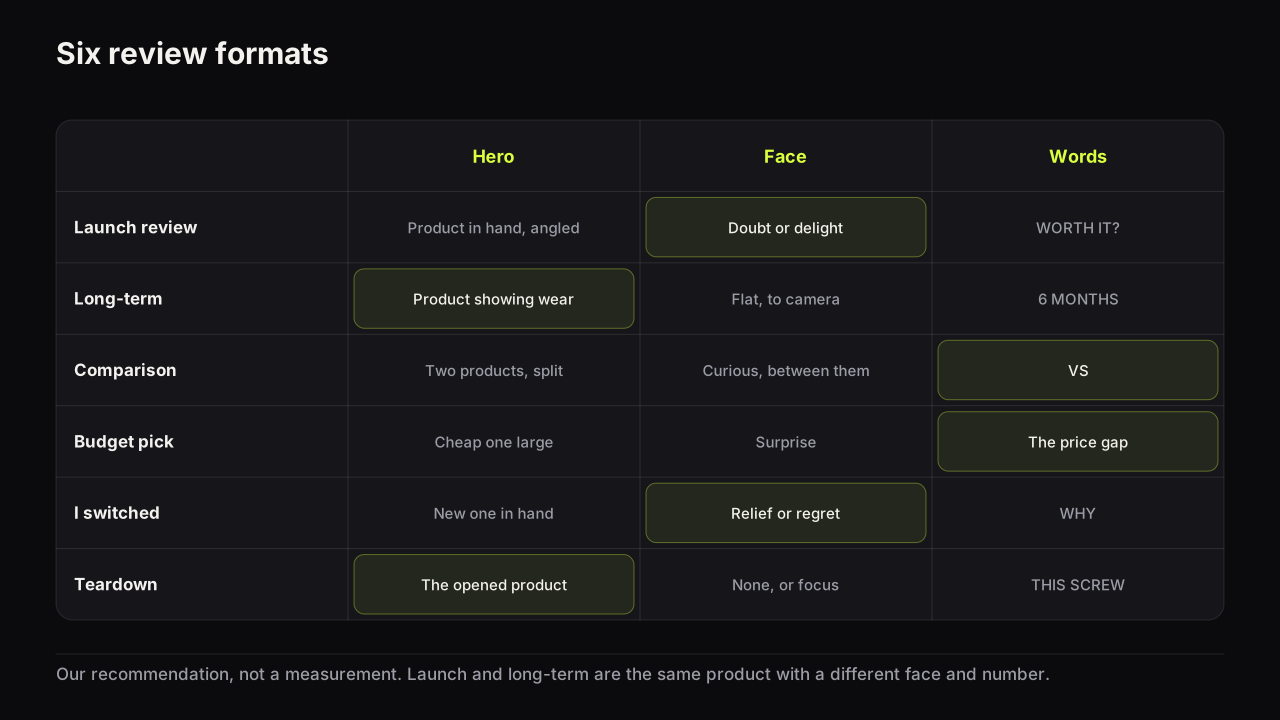
| Format | Hero | Face | Words |
|---|---|---|---|
| Launch review | The product in hand, angled | Doubt or delight | "WORTH IT?" or one feature |
| Long-term review | The product showing wear | Flat, to camera | "6 MONTHS", "1 YEAR" |
| Comparison | Two products, split | Curious, looking between them | "VS" and nothing else |
| Budget alternative | The cheap one large, the flagship small | Surprise at the cheap one | The price gap |
| "I switched" | The new one in hand, the old one behind | Relief, or regret | "WHY" or "BACK" |
| Teardown or repair | The opened product | None, or focus | The one part: "THIS SCREW" |
Escaping the press-shot row
Launch week is the review niche's particular problem. A product is announced, the manufacturer releases a set of renders, and within a day every cover in the row is built from the same three images on the same white ground. The row has no odd one out, and the viewer cannot tell one review from the next before reading.
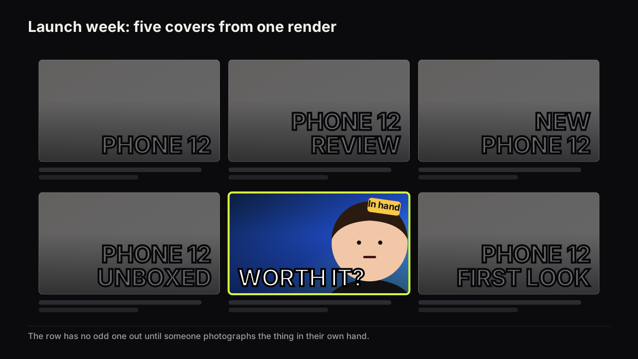
Three departures work, in order of cost.
- Your own photo. The product in your hand, in your light, on your desk. It is different from the row by default and it proves you have the thing.
- A different ground. Dark where the row is white, or one strong colour where the row is grey. The product's own colour then becomes the accent.
- Wear. For anything past launch week, the scratches, the worn key, the peeling case. Wear is proof of use and no press shot has it. We would show wear on any product more than a month old, even though a scuffed product photographs worse than a clean one; the scuff is the one thing the row cannot copy.
Take a review of a £140 mechanical keyboard. The first draft is the manufacturer's top-down render on white, the brand name in a corner, BEST BUDGET KEYBOARD? stacked in three lines. The viewer infers a sponsored list and cannot tell it from the five neighbours built from the same render. The redraw puts the keyboard at three-quarter view in your hand, cropped so the keys fill half the height, on a dark ground with a rim of light along the case edge; your face beside it has one eyebrow up and is looking at the keys, and £140 is the only text. The viewer infers a person who paid for it and is not yet sold.
Press images also come with terms, and using them on a cover is a rights question before it is a design one. The categories to think through (manufacturer images, screenshots, stock, other creators' images, fonts) and the questions to ask for each are in the thumbnail copyright guide, which is not legal advice and says so. The safe default, which is also the better design, is your own photograph of the product you own.
The colour the tech row already is, in the rows we look at, is white and mid-grey with the brand's accent, which is also the colour of the app's own interface. A dark cover with a rim-lit product separates from both the row and the app at once; the reasoning is the feed-contrast argument in colour and contrast that survive a phone screen, and tech is the niche where the row and the interface are most alike.
Building review covers on the bench
The Reaction style is the review layout with the face doing the judging: a subject on one side, a face on the other, the headline rendered into the image. Split Screen sets up the versus with a divide and, from the reference library, a VS Badge hook card; the library is free and uses no credits. Extreme Close-Up as a subject look suits small products, and Dark Studio as a background gives the rim-lit separation the row lacks. For a real product whose details matter, upload your own photo as the source and let the bench remake it as a cover rather than describing the product in a prompt; the result is still a render, so check the product against the real device before you upload to YouTube. A price that must be exact goes on a text layer in the editor, free.
The review cover check
Run it at thumb width, beside the launch-week row.
- Is the product at half the height, in a hand or at an angle, with a lit edge?
- Is it your photo, or a render every neighbour also has?
- Does the face carry the verdict the video actually reaches?
- Is the face looking at the product rather than the camera, unless it is a long-term review?
- Do the words withhold the reason, or the verdict itself if the video is a warning in a row of praise?
- Is the price the one you paid, and the only number?
- Versus: is there a lean, one half brighter or larger, so the eye has a favourite?
- Is the ground a different colour from the row and from the app's greys?
Common questions
Should a review thumbnail say the verdict?
Usually the face carries the verdict and the words withhold the reason, which is the gap the viewer clicks to close. Spelling the verdict out in the headline closes the gap, and it is the right move only when the video is a warning and the row is full of praise, because then the stated verdict is the odd one out.
Can I use the manufacturer's product photos on my thumbnail?
Press images come with their own terms and the rights are your responsibility to check; that is one reason, and the other is that every cover in the row on launch week is using the same image. Your own photo of the product you own, in your hand, at an angle, solves both problems at once.
Do I need my face on a review thumbnail?
The face is the verdict, so it earns its place whenever the video reaches one. Faceless review channels replace it with a hand holding the product, which gives scale and proof of possession, and put the verdict in a single word instead.
What to do next
Before you film the review, decide the verdict the video will reach and the face that matches it, then shoot the cover still with the product in your hand, at an angle, on a ground the row is not using. Write the one number, if there is one, and the two words that withhold the reason. If it is a comparison, read the versus guide linked above before choosing which half gets the light.