On this page
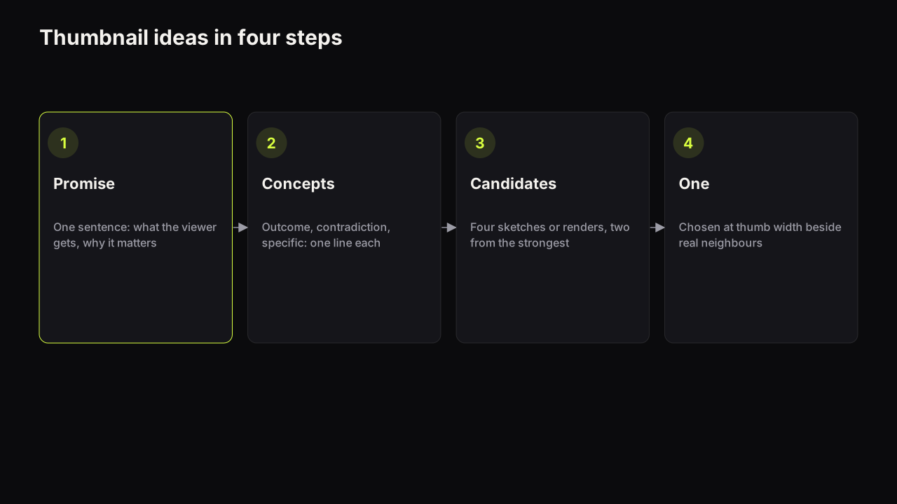
A thumbnail idea is a promise turned into a picture, and the reliable way to get one for any video is a method rather than a scroll through a gallery: write the promise in one sentence, turn it into three concept types (the outcome, the contradiction and the specific), sketch four candidates from them, and choose one at thumb width. The method takes about fifteen minutes and it works for a challenge video, a review, a tutorial, a money story or a travel vlog, because it starts from what the video promises rather than from what other covers look like. Galleries start from the other end, which is why they produce covers that all look the same.
Why galleries produce sameness
Idea galleries, template packs and inspiration boards all work the same way: they show you covers that earned clicks for someone else and invite you to borrow the composition. That is useful for layout and useless for the idea, because the idea in someone else's cover belongs to someone else's video. What you get from the gallery is a shocked face on the right, big words on the left and a red arrow, applied to a video that promised something the gallery never saw.
The cost shows up in the feed rather than on your screen. A cover is never seen alone; it sits in a row of covers from the same niche, and when the whole niche draws from the same galleries the row turns into one repeated shape. The lever that a different cover pulls, being the odd one out, is the lever the gallery removes. The design principles guide calls this the difference between consistency, which a channel wants, and sameness, which a niche drifts into.
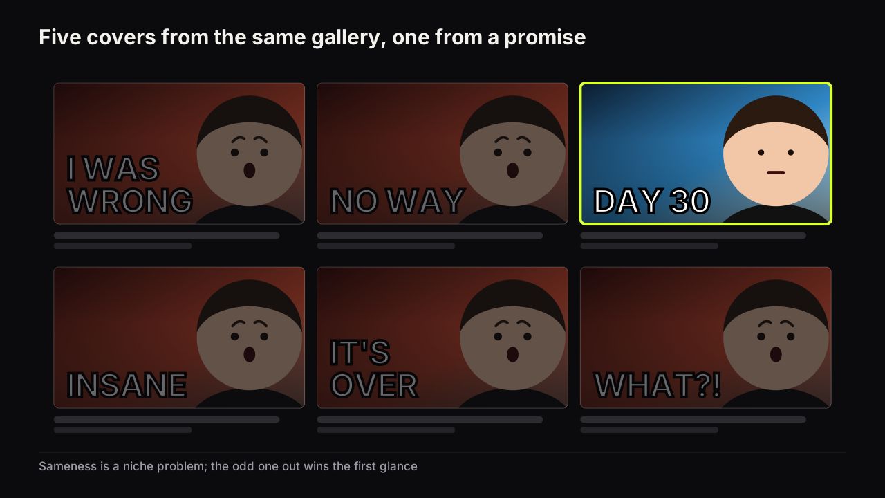
The channels whose covers we can pick out of a row without reading them are not the ones with the best designers. They are the ones whose covers start from the video's promise, so each cover is different because each video is. Gallery-led channels look polished one cover at a time and identical twelve at a time.
Step 1: write the promise in one sentence
Everything follows from one sentence written in the viewer's words: what they get from this video and why it matters to them. "See what thirty days of cold showers did to my sleep, and whether it was worth it." "Find out whether the $300 PC can run the games I play." "Learn the three-click fix for a laptop that takes five minutes to boot."
The sentence has to contain a what and a why it matters. If it only has a what ("a video about my PC build") there is nothing yet to put on a cover. This is the same sentence that packaging the video before you film it begins with, and if you already wrote a packaging brief you have it. If you cannot write it, stop: the idea for the cover is missing because the idea for the video is, and no method produces a promise from a video that does not make one.
Done when: the sentence names an outcome or a stake, and you could say it to a viewer as the reason to watch.
Step 2: turn the promise into three concept types
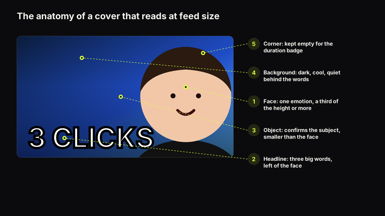
A concept is a one-line description of a cover: the face and its emotion, the headline, the object. Every promise can be turned into three concepts, one of each type, and the types map onto the three ways a cover opens a question that the video then answers. The psychology is set out in the guide to opening an information gap without clickbait; here they are as a working tool.
The outcome concept shows the moment just before or just after the result, with the result itself withheld or shown as a state rather than an explanation. For the cold-shower video: a tired face, a shower head, the headline DAY 30. The viewer sees that something happened and cannot see what.
The contradiction concept puts two things in one frame that should not both be true. A relaxed face beside a running cold tap; the headline BEST SLEEP EVER over an ice bath. The viewer has to reconcile them and the video is the reconciliation.
The specific concept leads with the one detail that is hardest to dismiss: a number, a place, a named thing. A thermometer reading, the headline 4°C, a face that has just felt it. Specific beats general because it is easier to picture and harder to scroll past.
Write all three, even when the first one is obviously right. The point of the other two is not that you will use them; it is that writing them tells you which lever this video pulls hardest, and the third one is often the cover that nobody else in the niche has made.
Write each concept as three fragments on one line: emotion, headline, object. "Tired, DAY 30, shower head." A concept that needs a paragraph is not a concept yet. A concept that needs a fourth element (a second face, a chart and a prop) is two concepts stuck together.
Done when: you have three lines, one per type, each with an emotion, a headline of three words or fewer, and an object.
Step 3: sketch four candidates
A candidate is a concept made concrete enough to render or draw: which side the face is on, what the dominant colour is, where the words sit. Four candidates is enough to give you a real choice and few enough to judge honestly. We recommend two candidates from the strongest concept, set out in different layouts, and one from each of the other two, so that the choice in step four is between ideas and not only between colours.
For each candidate decide:
- Layout. Face right and words left is the default in left-to-right languages; the alternatives are a split, a single large number, a before-and-after pair, or an object-led frame with the face small or absent.
- Dominant colour. One colour for the ground, chosen to differ from what the niche's covers look like this month, and one accent.
- The three elements and nothing else. Face, headline, object. Background supports.
We would spend most of the fifteen minutes on the sentence and the three lines and give each sketch thirty seconds, even though rough sketches make for an uglier choice in step four, because a polished candidate is hard to reject and the point of step four is to reject three.
If you are rendering rather than drawing, the candidate is the brief and the brief is the prompt: subject and emotion, setting, light, palette, where the empty space for the words is. The guide to writing a thumbnail prompt gives the six-part structure, and the headline goes in its own field rather than in the scene. On the bench, one render returns up to four options from that brief, one credit each, in about a minute, which makes four candidates one action rather than four; and Tweak lets you take the option that came closest and change one thing (the expression, the colour, the headline) while the rest stays.
Done when: four covers exist, as sketches or renders, that a stranger could tell apart by idea and not only by colour.
Step 4: choose one at thumb width
Judge nothing at full size. Shrink the four to the width of your thumb, put them beside three or four real covers from your niche, and ask four questions of each:
- Can I read every word and name the emotion?
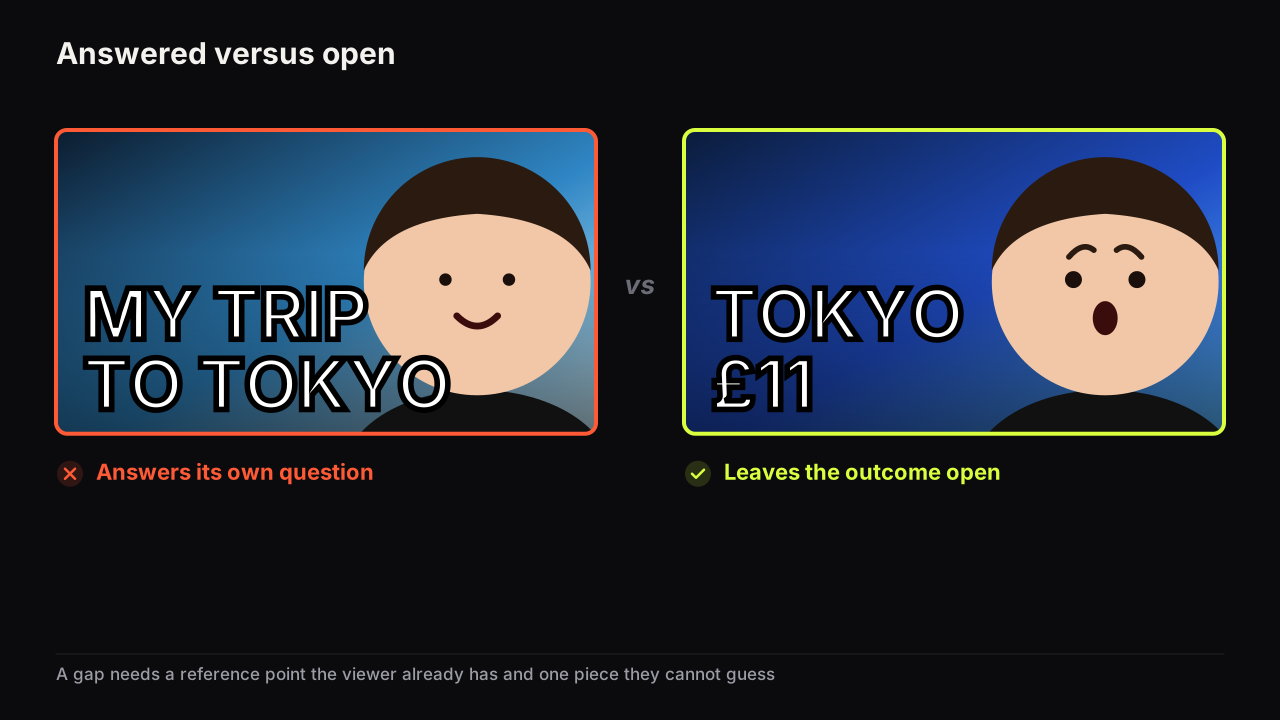
- Does the cover open a question, or does it answer its own question?
- Does it agree with the title without repeating it?
- Is it the odd one out in the row, in colour or in layout, while still looking like something this audience clicks?
Imagine the four for the $300 PC review at thumb width. One: the tower on the left, a doubtful face on the right at half the height, IT RUNS? in yellow on dark grey. Two: the same concept as a split, tower above and face below, on teal. Three: two towers, $300 vs $3,000 between them, a flat face behind. Four: a game on a screen with a frame counter reading 47 FPS and a curious face leaning in from the edge. In a row of black-and-red tech covers the teal split wins on colour but its words are small, because the layout halves the width they can use. The two towers answer their own question, since the viewer already assumes the expensive one wins. The 47 FPS cover reads at a glance and opens a real question for anyone who plays: is 47 good? Ship that one, keep the teal split as the runner-up, drop the towers.
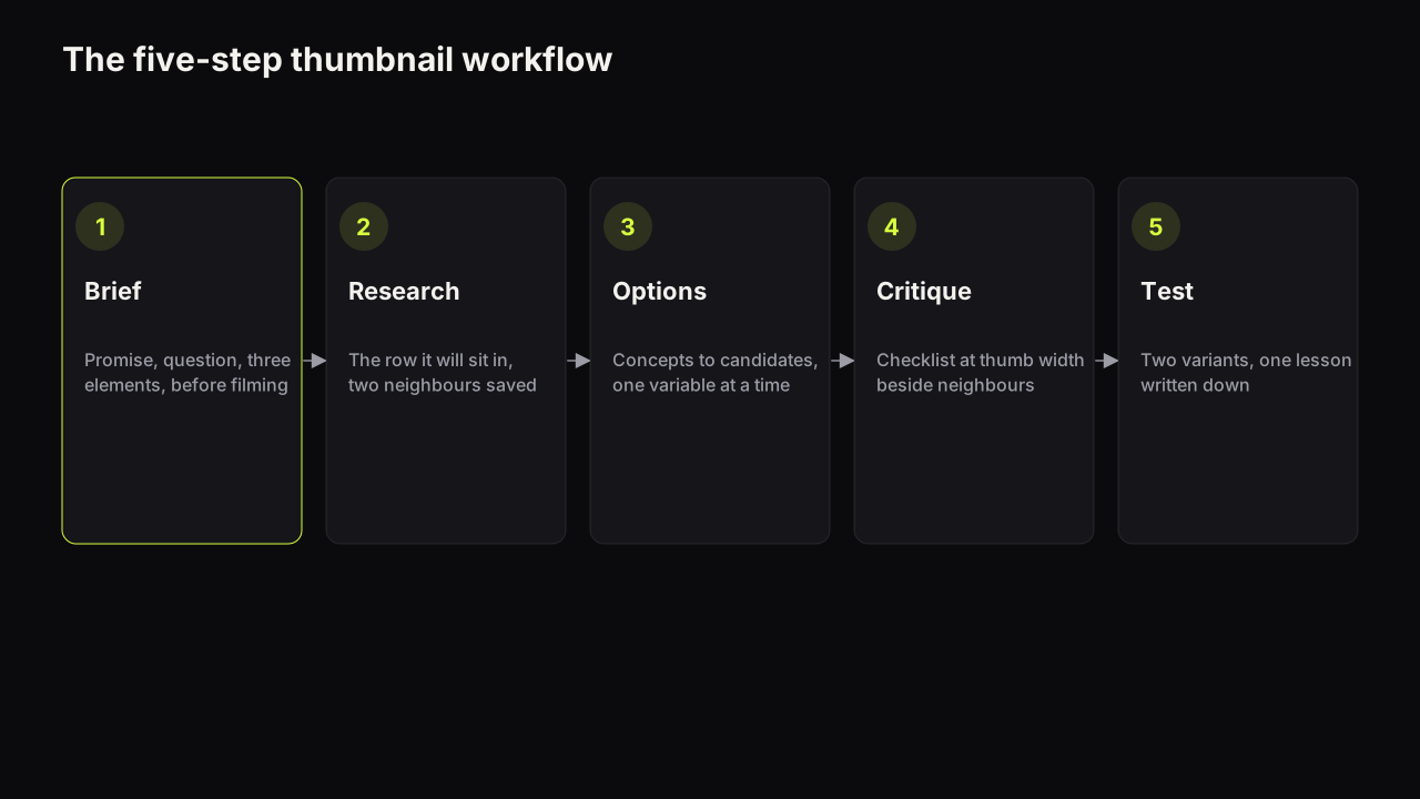
The candidate that passes all four is the cover. The one that passes three is the runner-up, and the runner-up has a job: if the video qualifies for Test & Compare it becomes the second variant, and if not it is the refresh you reach for later. How the four candidates relate to concepts, tests and the one you ship is worked out in the guide to how many thumbnails to make per video, and the full production loop, with time budgets by channel size, is the five-step thumbnail workflow.
Done when: one cover is chosen, the runner-up is saved with a note on why it lost, and the lesson (which concept type won for this kind of video) is written down.
Worked examples for five kinds of video
The matrix shows the three concept types applied to five common video types. Every cell is a headline plus an emotion; the object is in the table beneath. All examples are generic mocks, not real videos.
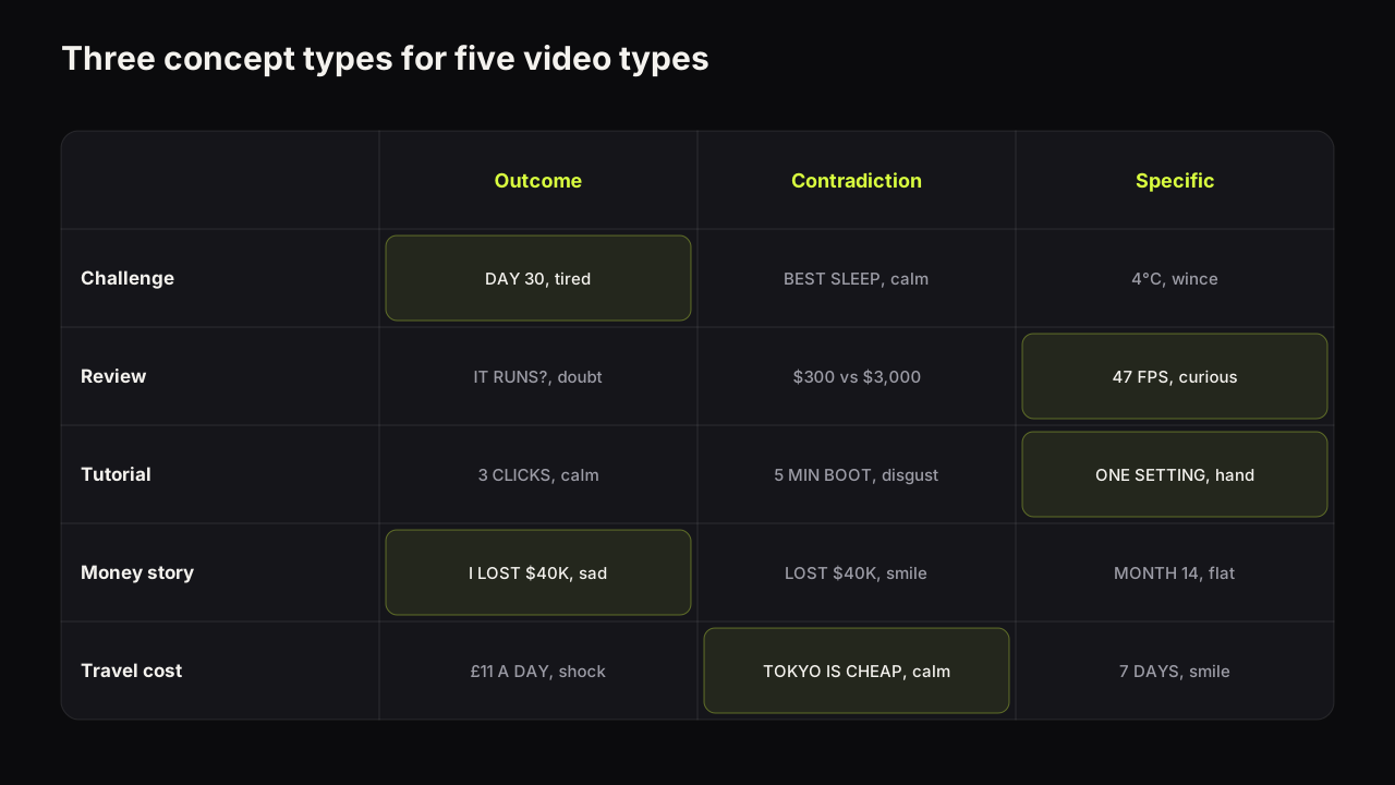
| Video type | Promise (one sentence) | Outcome | Contradiction | Specific |
|---|---|---|---|---|
| 30-day challenge | See what thirty days of cold showers did to my sleep | DAY 30, tired face, shower head | BEST SLEEP EVER, calm face, ice bath | 4°C, wincing face, thermometer |
| Product review | Find out whether the $300 PC runs my games | IT RUNS?, doubtful face, the PC | $300 vs $3,000, flat face, two towers | 47 FPS, curious face, game on screen |
| Tutorial | Learn the three-click fix for a slow laptop | 3 CLICKS, calm face, laptop | 5 MIN BOOT, mild disgust, loading bar | ONE SETTING, pointing hand, settings screen |
| Money story | Learn how I lost and recovered $40K in a year | I LOST $40K, sad face, empty wallet | LOST $40K, smiling face, coffee | MONTH 14, flat face, a bank statement |
| Travel cost | See what a week in Tokyo costs on a budget | £11 A DAY, shocked face, a receipt | TOKYO IS CHEAP, calm face, neon street | 7 DAYS, smiling face, a bento box |
Two patterns in the table are worth naming. The outcome concept tends to win for challenges and stories, because the viewer's question is "what happened?". The specific concept tends to win for tutorials and reviews, because the viewer's question is "will this work for me?", and a number answers "for whom" without answering "how". The contradiction concept is the one to reach for when the niche is crowded, because a contradiction is by its nature unlike the neighbours.
Notice too what the emotion column never does: it never defaults to shock. The expression is part of the concept, and the guide to which facial expressions suit which promise explains why a calm face on a tutorial and a doubtful face on a review earn more than a scream would.
When the method produces nothing
Sometimes all three concept lines come out flat: "Me, MY ROUTINE, a desk." That is information. The promise sentence was a what without a why, or the video's payoff is something that cannot be pictured. The fix is upstream: sharpen the promise, find the number or the contradiction inside the video, and if there is none, reconsider whether to film it. A video that cannot be packaged in three words and a picture is usually a weaker video idea than it feels, and finding that out before the shoot is the cheapest outcome of the method.
Our view is that most creators do not lack thumbnail ideas; they lack a settled promise, and they look at galleries to avoid settling it. Fifteen minutes on the sentence produces more usable covers than an hour in a gallery.
Common questions
How many thumbnail ideas should I come up with per video?
Three concepts, one of each type, then four sketched candidates, then one cover. More concepts than that usually means the promise is not settled; more candidates than that means you are varying decoration rather than ideas. If the video qualifies for Test & Compare, the runner-up becomes the second variant.
What if I cannot think of a thumbnail idea at all?
Write the promise sentence first. If it will not come, the video idea is the problem, not your imagination, and the cheapest fix is to sharpen the video before filming. If the sentence comes easily, the three concept types will produce at least one usable line.
Are thumbnail idea galleries and templates bad?
Not bad, but they are a starting point for layout, not for the idea. A gallery shows you compositions your niche already understands; the method decides what your cover promises. Use the gallery after the promise is written, never instead of writing it.
What to do next
Take the video you are packaging now and do the four steps on paper before you open any tool: one sentence, three lines, four sketches, one choice at thumb width. Keep the three concept lines with the video; the next time you make a video of the same type, the winning concept type is the first one to try. Then take the chosen candidate through the pre-upload checklist before it goes anywhere near YouTube Studio.